Independent. No onboarding vendor owns this site or pays to be on it.
Prices checked 19 Oct – 3 Nov 20266,688 G2 reviews readHow we review →
15 onboarding tools, reviewed
Each review has its pricing read on the vendor’s own page, the date it was checked, and what G2 reviewers say.
Our collection of user onboarding UX from the most notable SaaS tools, apps, and platforms that we love: welcome screens, product tours, tooltips, checklists and empty states, each with what makes it work.
Modal
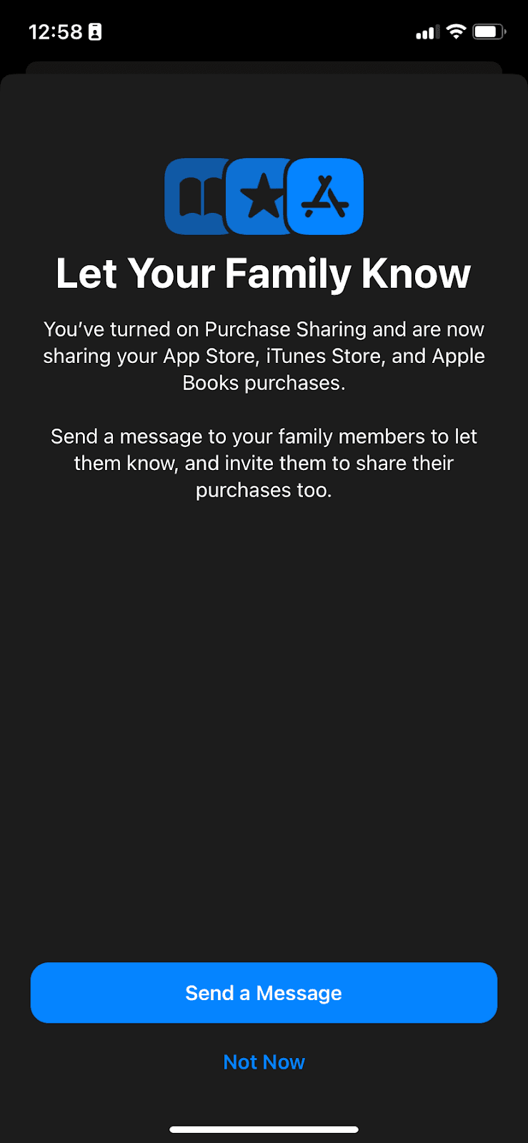
Apple Family Sharing explains Purchase Sharing in a full-screen modal, then offers to message the family once it’s turned on.
Full-screen steps
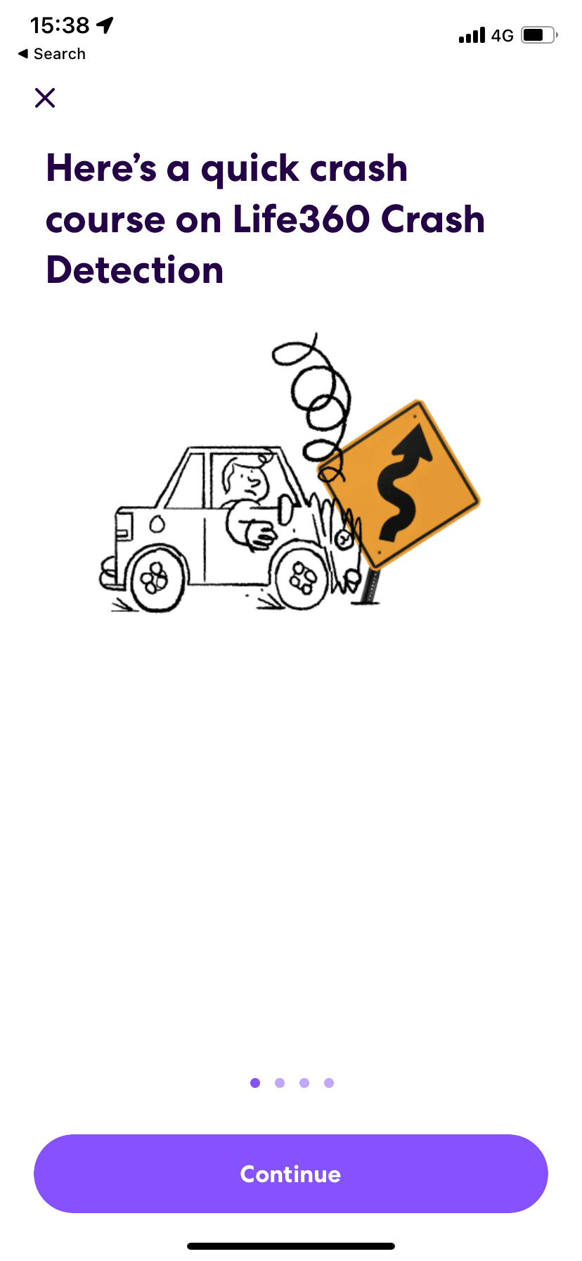
Life360 sets up Crash Detection in four onboarding screens that explain the feature, what it needs to work and its limits before the user turns it on.
Duolingo welcomes new paying subscribers with five onboarding screens: four on what the plan adds and a last one that switches on a special app icon.
Tooltip
Google Meet announces background noise filtering in an illustrated tooltip pointing at the call's options menu, with Learn more and Got it buttons.
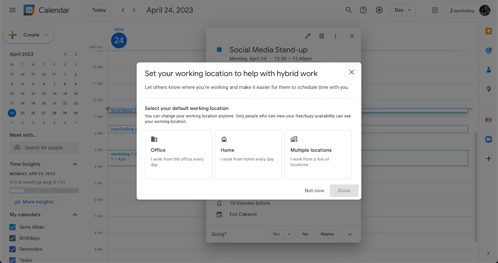
Google Calendar asks users to set a default working location in a modal, explaining that it helps colleagues schedule time with them.
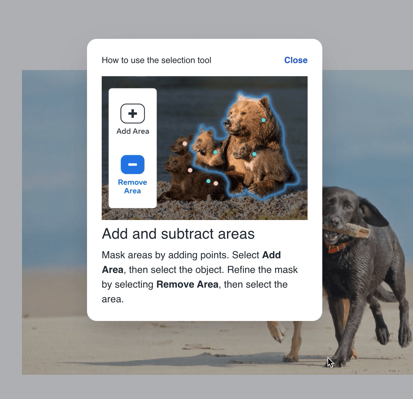
Meta AI's Segment Anything demo explains its selection tool in one modal: a visual example, a short heading and two sentences with the controls in bold.
Product tour · Tooltip
Google Analytics introduces its Landing page report with a three-step tooltip tour that has users click through the menu to reach the report.
Product tour · Video
UserGuiding’s contextual product tour introduces Resource Centers in five interactive steps and ends with a video of real use cases.
Signup flow
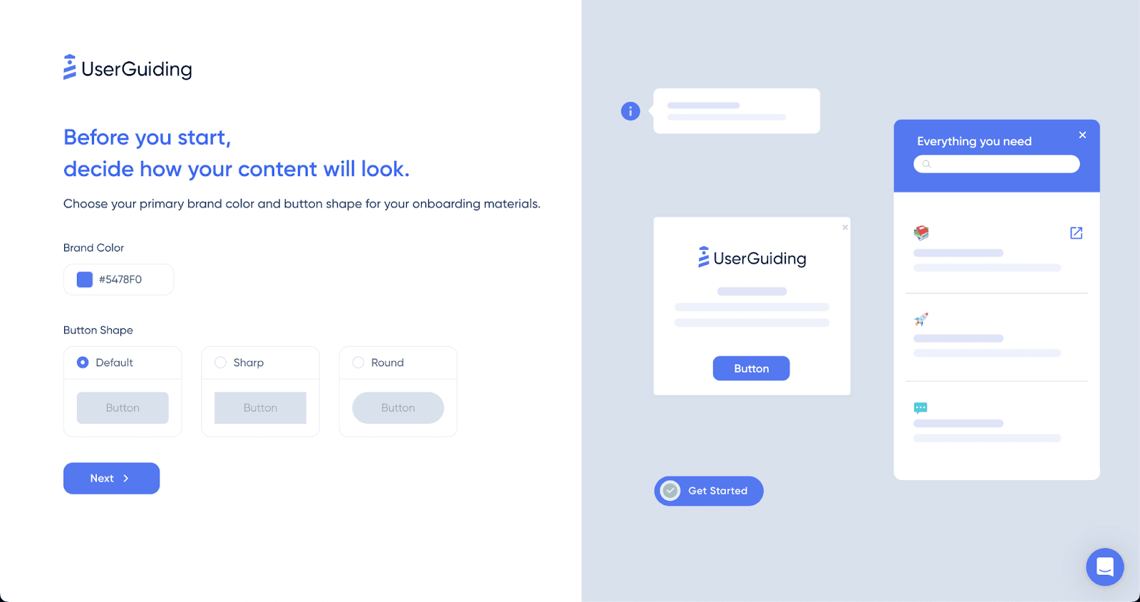
UserGuiding's signup asks new users to pick a brand colour and button shape for their onboarding content, with a live preview beside the form.
ChatGPT introduced GPT-4 in a dark modal with an animated header, a three-point list of what improved and two buttons: Maybe later and Try GPT-4.
Slideout
Google Sheets announces dropdown chips in a small slideout modal whose Show me how button drops users into an empty cell to build one themselves.
Inline hint
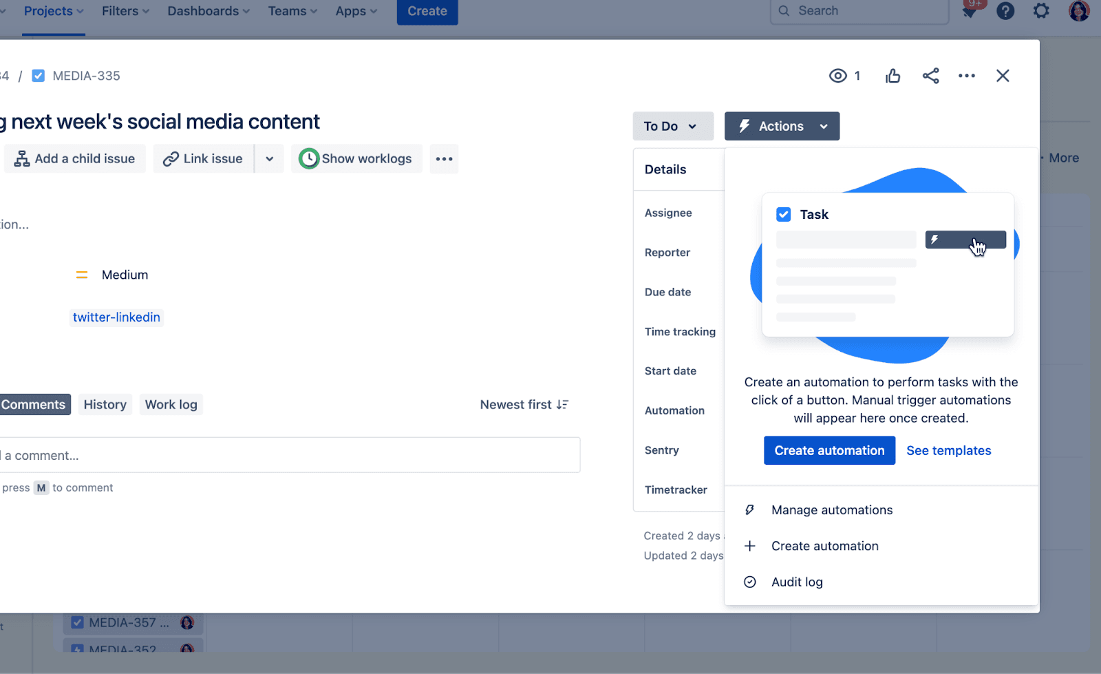
Jira explains manual automations inside an issue’s Actions menu, so users learn the feature when they open that menu, not before.
Adobe Illustrator’s What’s new modal lists five updates in a side menu, so users can step through every new feature without leaving one window.
Canva announces Magic Design with a sidebar card that opens a large modal, where users try the feature without leaving the overlay.
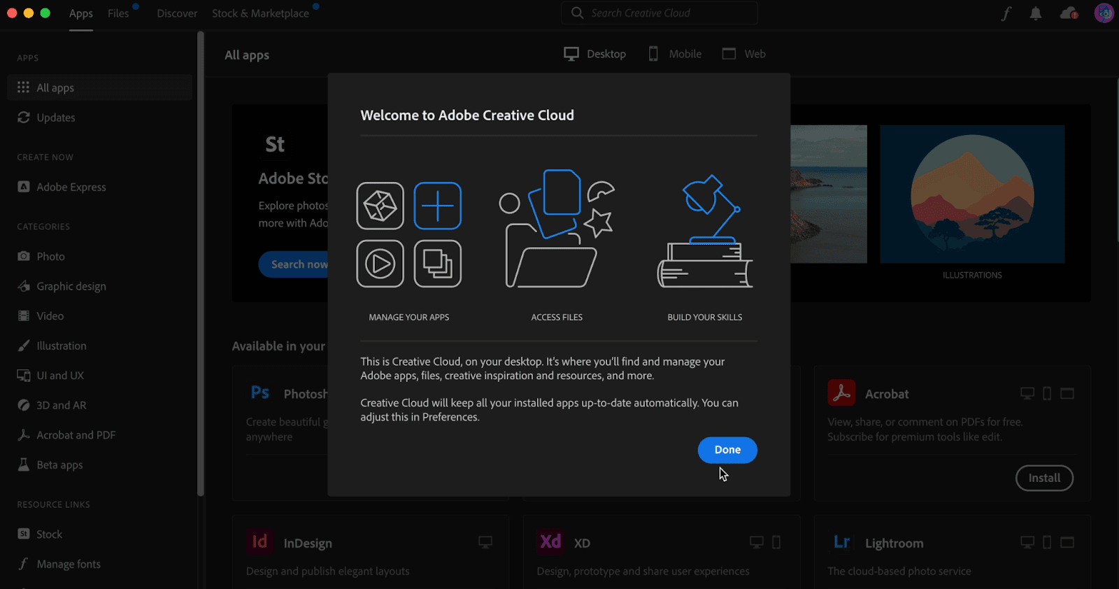
Adobe Creative Cloud's one-step welcome modal uses three icons and two short paragraphs to tell new users what the desktop app is for.
Adobe Illustrator opens a hover tooltip for each tool, with a small illustration, one line of copy and a Learn more button.
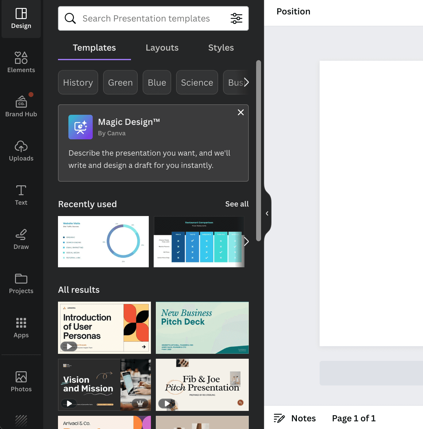
Canva announces Magic Design with a contextual tooltip inside its template panel, reaching users where the feature is useful without a pop-up.
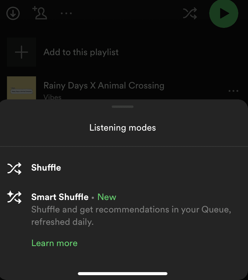
Spotify introduces Smart Shuffle inside the menu that opens from the shuffle button, with a New label, one line of copy and a Learn more link.
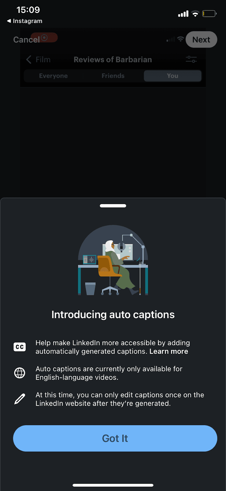
LinkedIn introduces auto captions in a slideout modal with an illustration, three icon-led notes and a single Got It button.
Instagram announces its Messenger integration with a full-screen modal listing five new features, an Update button and a clear Not Now.
Empty state
Letterboxd's empty review tabs pair No reviews. with a famous film line, and tapping the line opens the film it's from.
Product tour · Tooltip · Hotspot
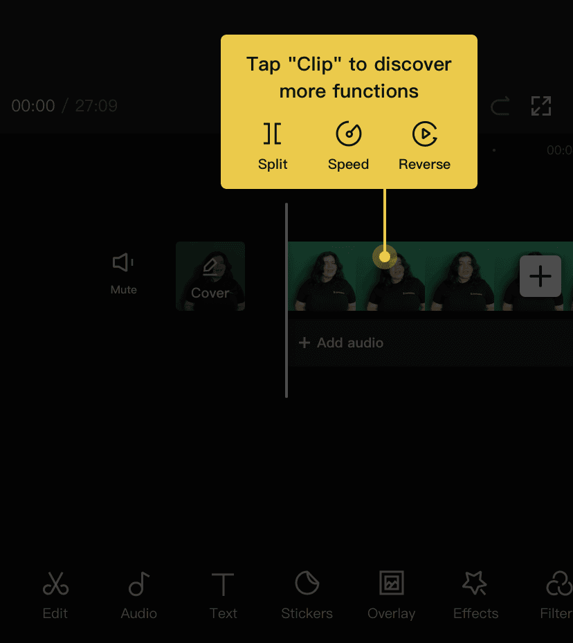
CapCut walks new users through its video editor with a short, hands-on product tour of yellow tooltips tied to hotspot beacons.
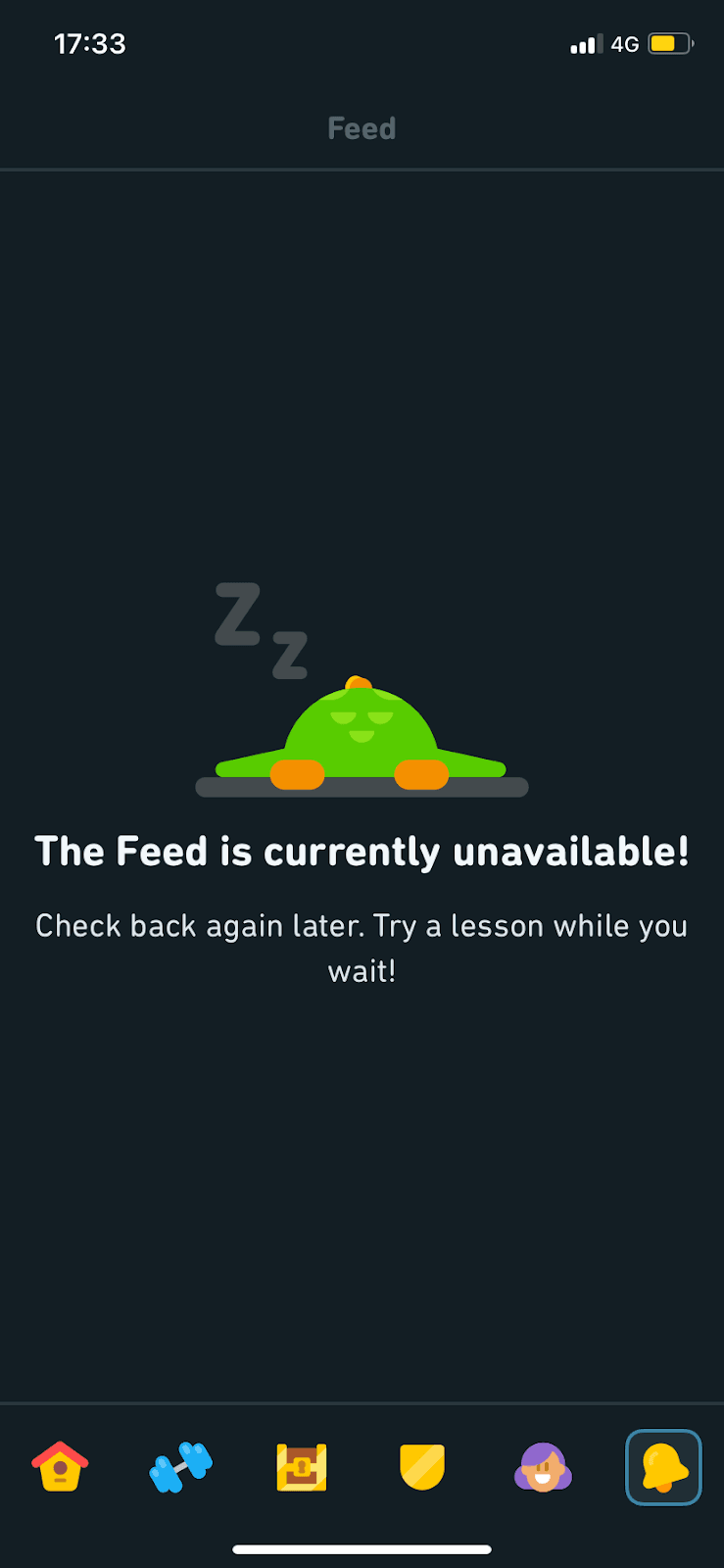
When Duolingo's Feed is unavailable, its empty state shows a sleeping Duo and suggests trying a lesson while you wait.
Modal · Tooltip
Notion introduces Notion AI with a feature modal and a tips screen, then teaches it hands-on with tooltips on a blank page.
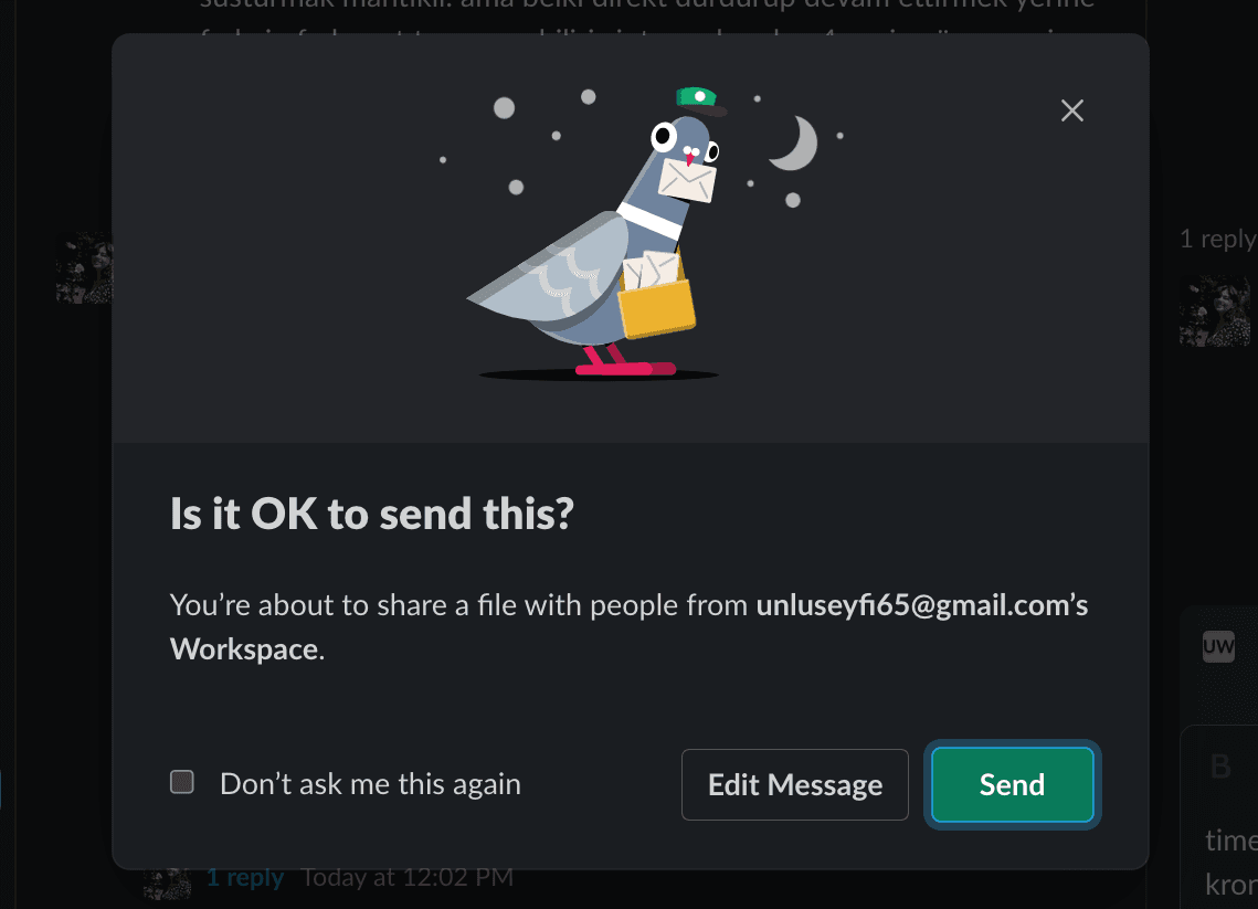
Slack double-checks before a file is shared with another workspace, using an illustrated confirmation modal with Edit Message, Send and a don't-ask option.
Tooltip · Slideout
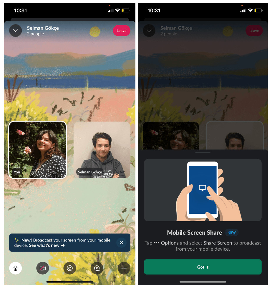
Slack announces mobile screen sharing in huddles with a small, dismissible tooltip that opens a slideout modal explaining how to use it.
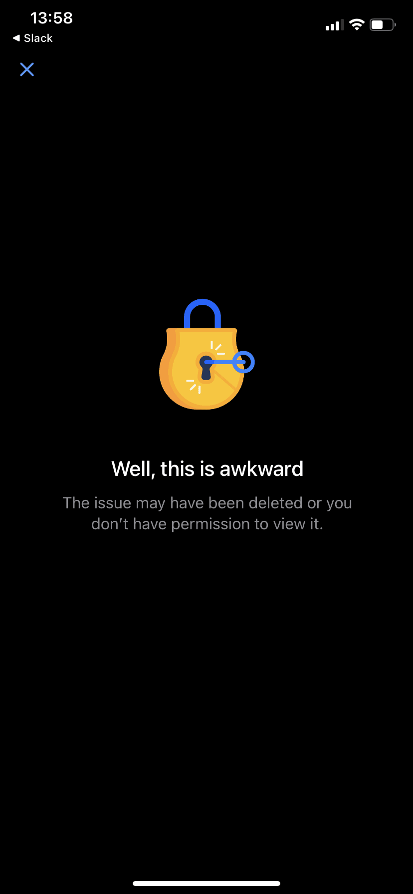
Jira's mobile app answers an issue you can't open with a padlock illustration, the line Well, this is awkward and a close button.
Modal · Video
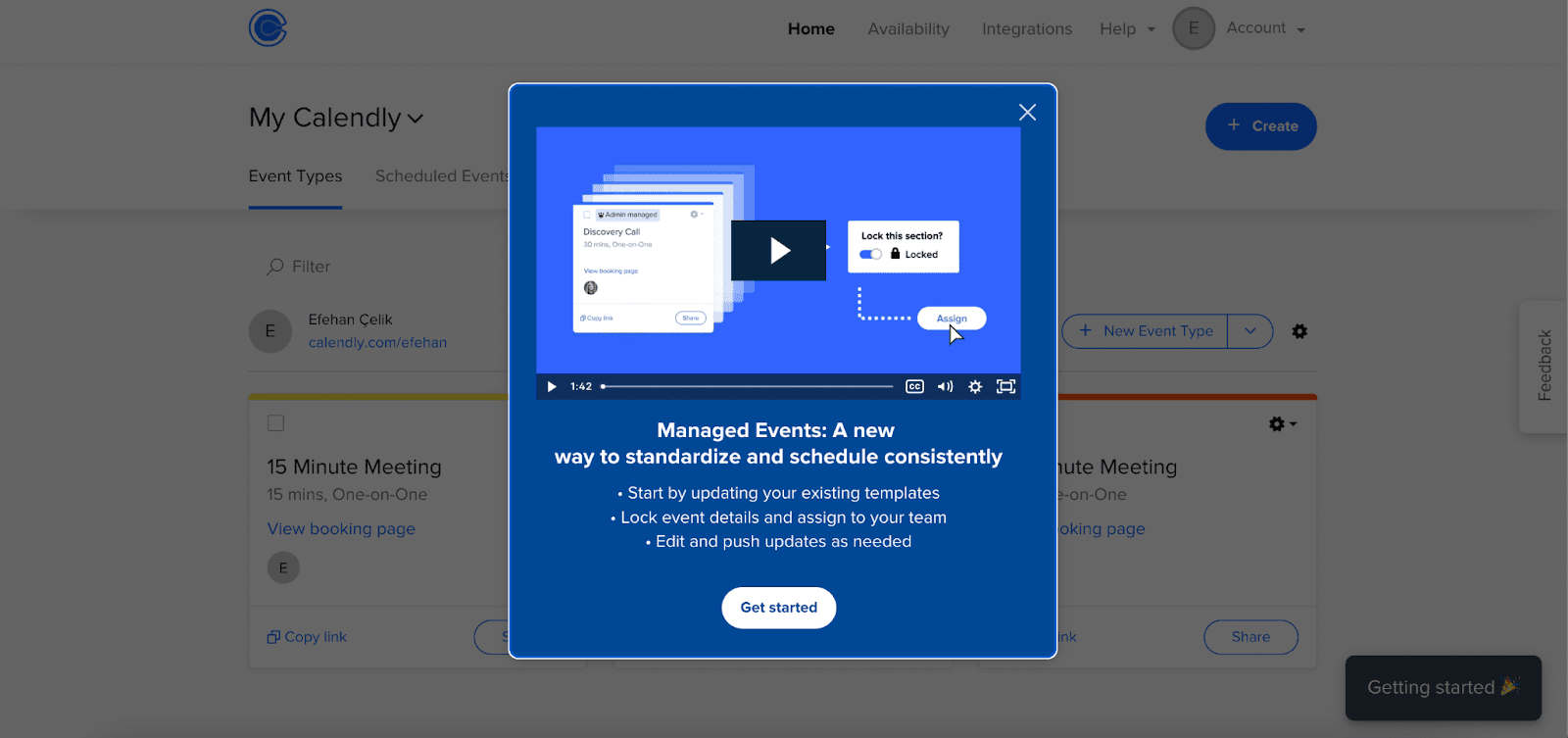
Calendly announces Managed Events in a modal that pairs a short video with three bullet points and a single Get started button.
Slack offers a simpler sidebar in a one-step tooltip with an animated preview, a recommended setting and a Save button.
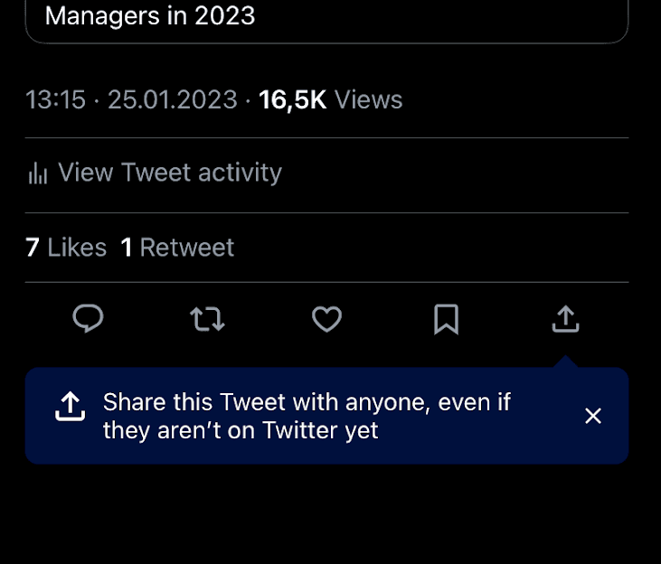
Twitter points a small dark blue tooltip at the share button on a tweet, reminding you that you can share it with people who aren't on Twitter.
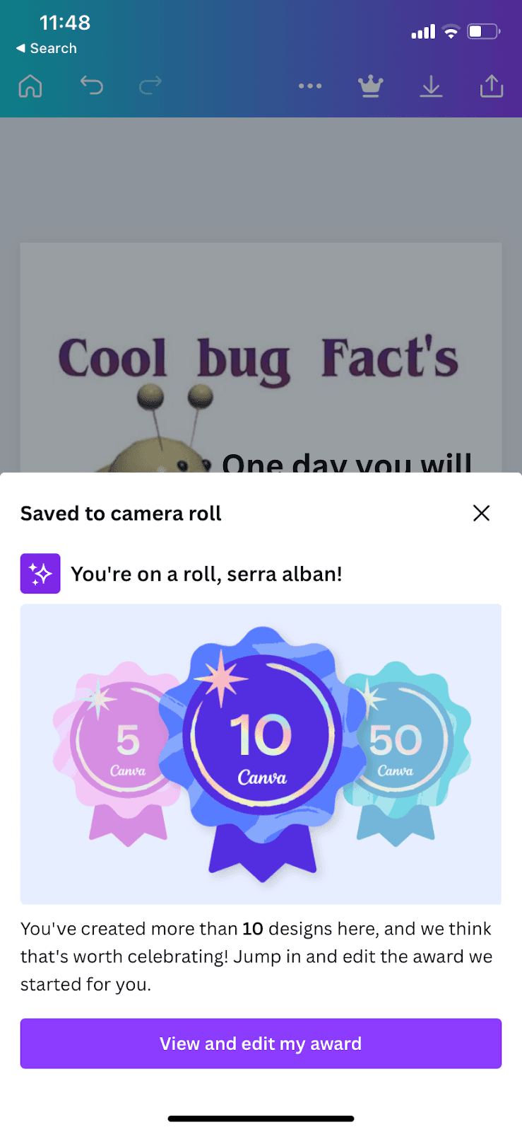
Canva's mobile app celebrates a user's tenth design with a bottom-sheet modal, shown right after a save, that invites them to edit an award.
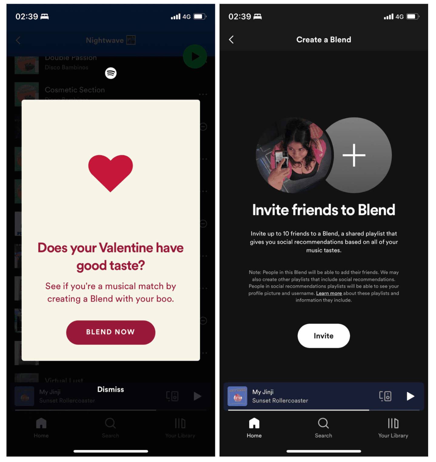
Spotify uses Valentine's Day to promote Blend with a heart-themed modal whose Blend Now button opens an invite screen for a shared playlist.
Figma offers new designers an optional 10-step walkthrough of its editor, each step a short tooltip with a picture, a Learn more link and a Next button.
Figma welcomes new users with a short modal sequence: name your team, invite people, pick a plan, then choose what to make first.
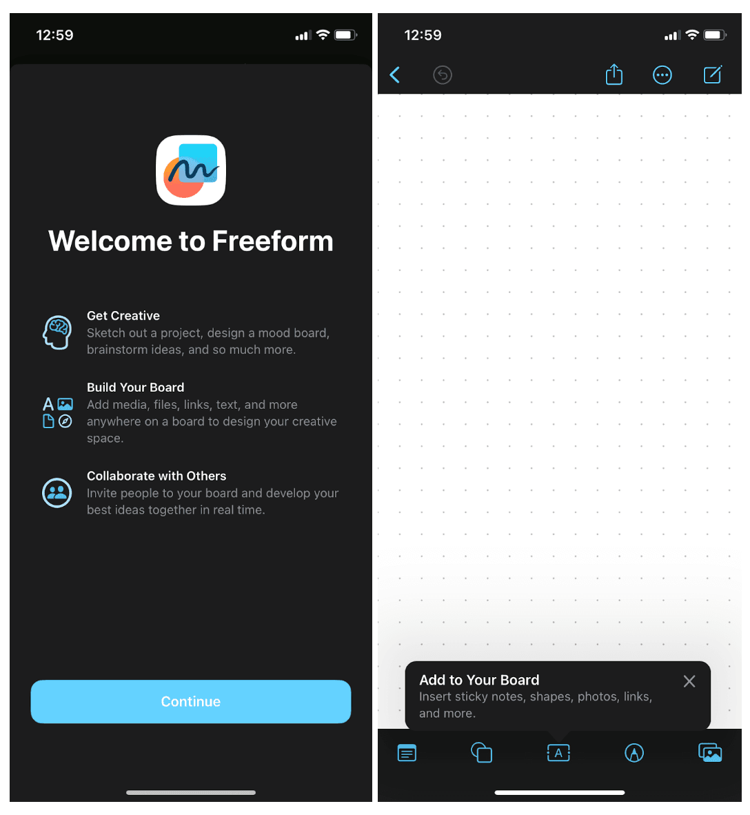
Apple introduces Freeform with a full-screen welcome modal of three short benefits, then a tooltip that points to the board's toolbar.
Full-screen steps · Signup flow
Yoga for Beginners opens with a short value carousel, then asks a few tappable questions about the user's fitness, with a progress bar and simple icons.
Daily Yoga's signup flow asks questions in three named parts, with a progress bar, so new users sort themselves into a personalised plan.
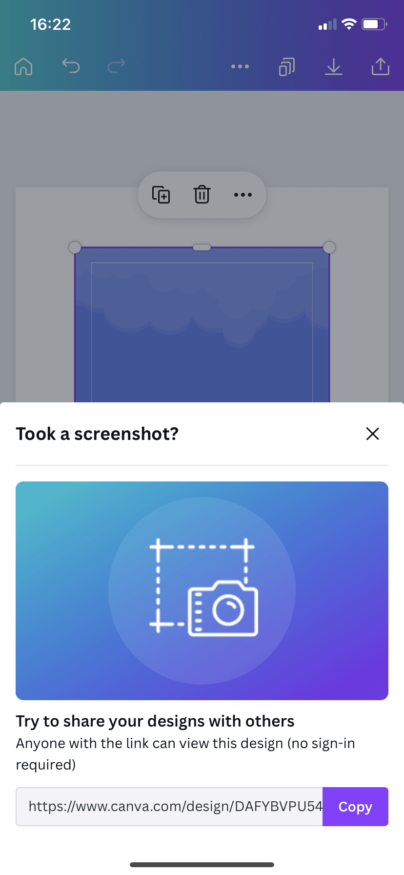
When you screenshot a design in Canva's mobile app, a slideout suggests sharing it by link instead and puts the link and a Copy button right there.
YAZIO's long signup flow asks about goals, habits and body measurements, and explains why it needs each answer, with a progress bar at the top.
Product tour · Tooltip · Modal
YAZIO walks new users through logging their first meal with interactive tooltips, then celebrates the milestone with a confetti modal.
Slideout · Video
Canva introduces Canva Docs in its mobile app with a short video slideout, then a demo doc where you try each feature as you read about it.
Duolingo walks new Super Duolingo subscribers through five full-screen steps on what the paid plan adds, ending with a Super app icon toggle.
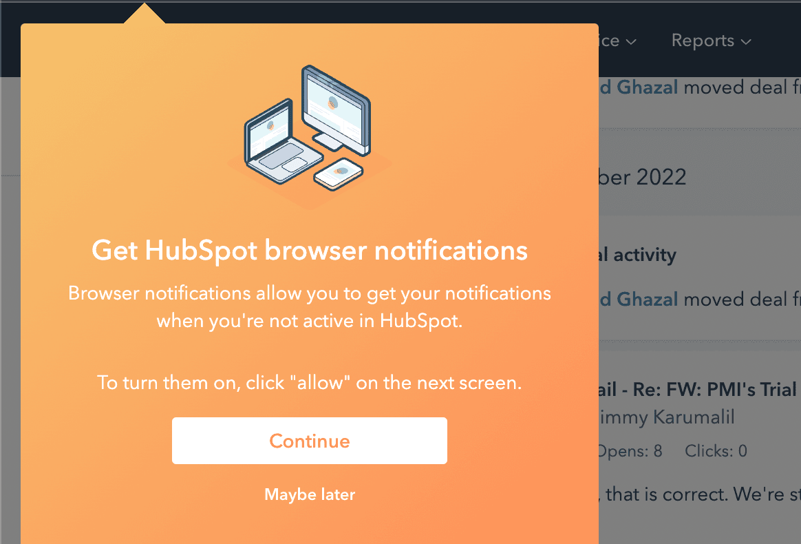
HubSpot asks users to turn on browser notifications in a tooltip shown when they open Notifications, and explains the browser prompt before it appears.
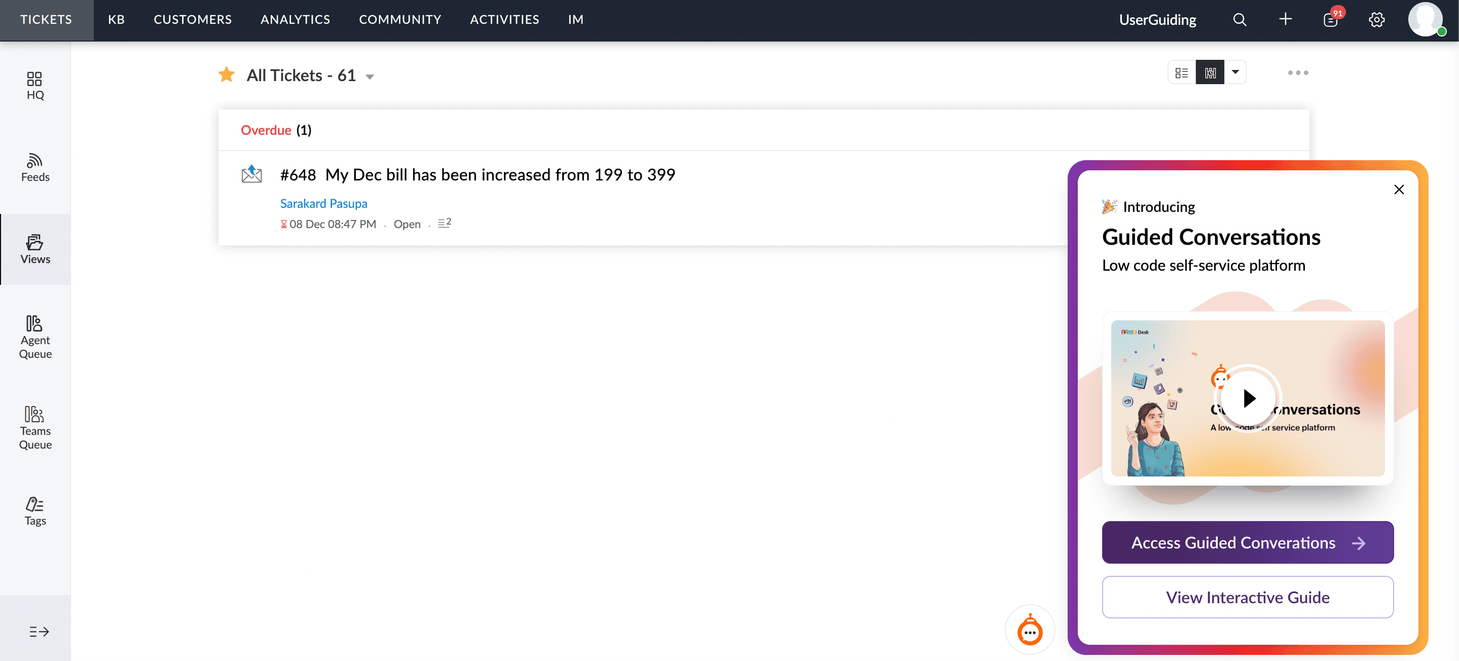
Zoho Desk introduces Guided Conversations with a corner widget that opens a panel offering a video, direct access or an interactive guide.
Checklist
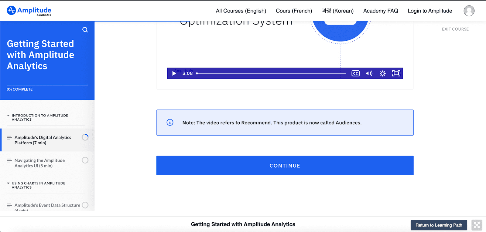
Amplitude Academy turns its course sidebar into an onboarding checklist, with a course progress bar, a ring per lesson and each lesson's length.
Survey
HubSpot uses a small widget to ask how users feel about its new Overview tab, with a three-face rating, a comment box and a thank-you.
HubSpot introduces the new Overview tab on its company record page with a single highlighted tooltip and a one-sentence explanation.
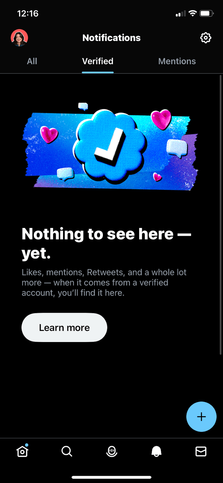
Twitter's mobile app fills empty notification tabs with bold halftone illustrations and a line explaining what will show up there.
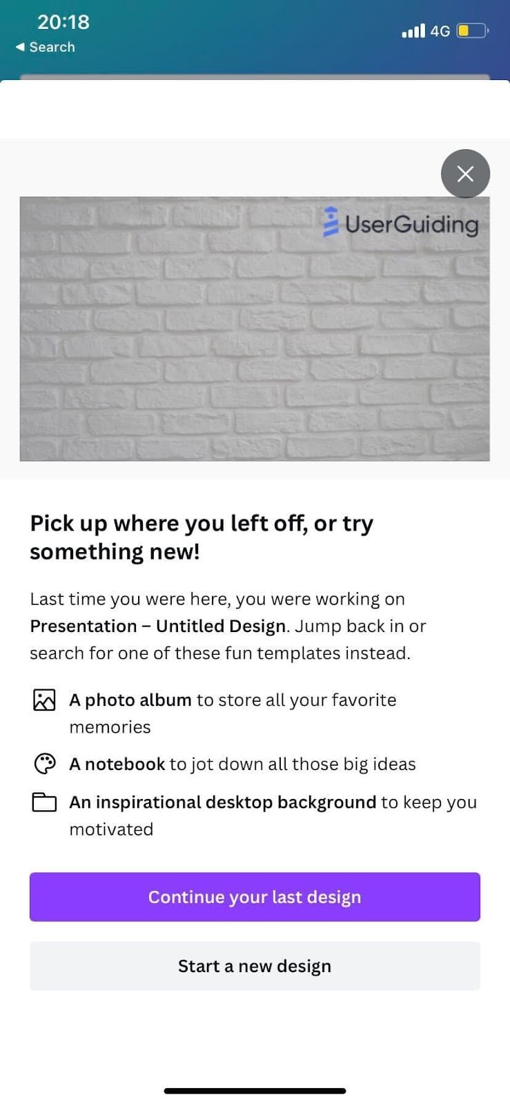
Canva's mobile app greets returning users with a modal showing their last design, three template ideas and a choice to continue or start afresh.
The PlayStation App fills its empty Captures tab with an animated illustration and an offer to upload PS5 captures, with Enable or Not Now.
Spotify explains its Wrapped Snapchat lens in a four-card carousel, one bright colour per step, with a Try it out button and a quieter Dismiss.
Spotify suggests auto-downloading podcast episodes in a bright modal on the show's page, with an animation of the setting being switched on.
Hotspot · Tooltip
Intercom pairs a hotspot with a tooltip whose Learn more link opens a full help article inside its own Messenger widget.
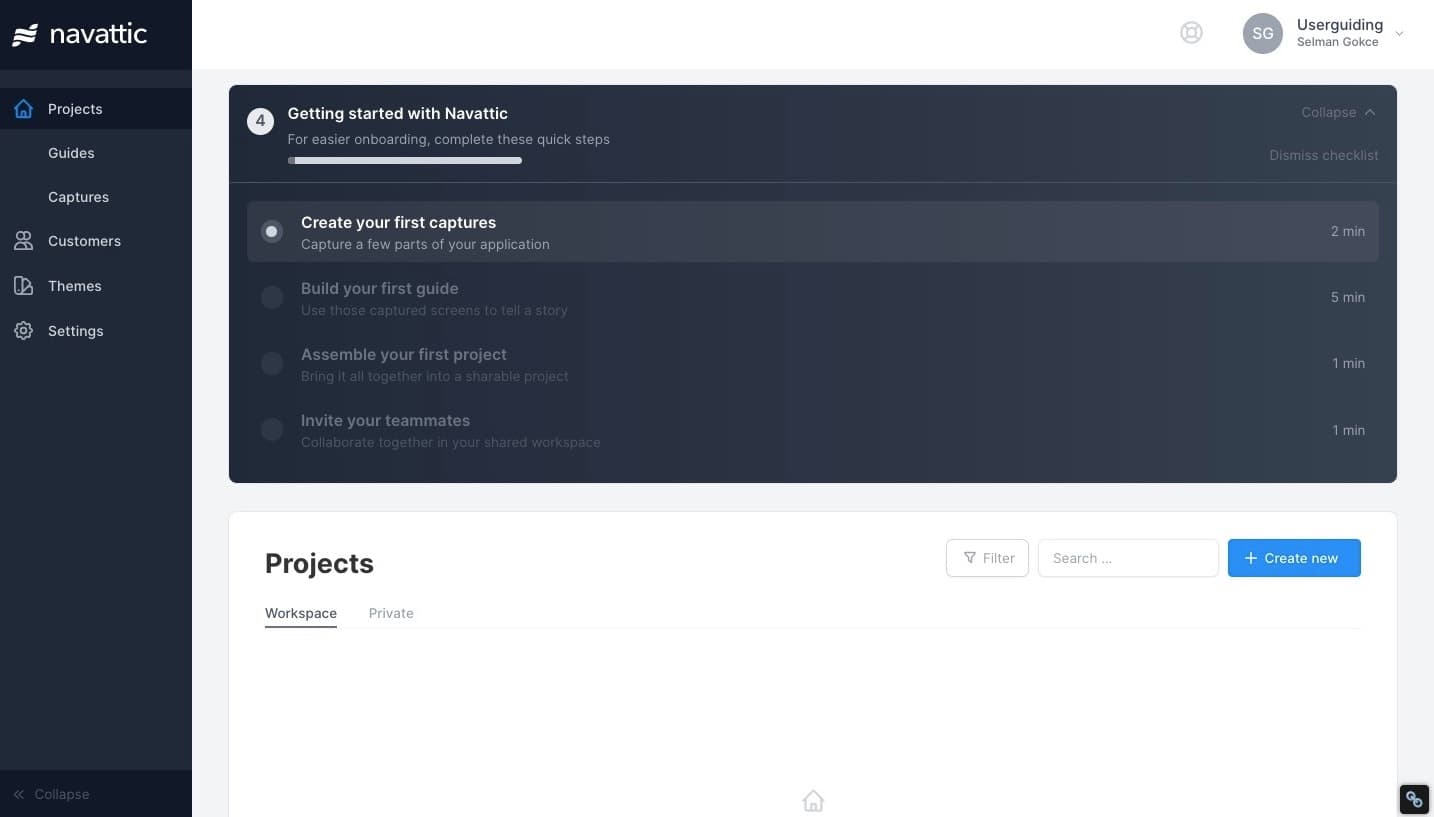
Navattic's getting-started checklist sits at the top of the dashboard with a progress bar, a time estimate for each step and options to collapse or dismiss.
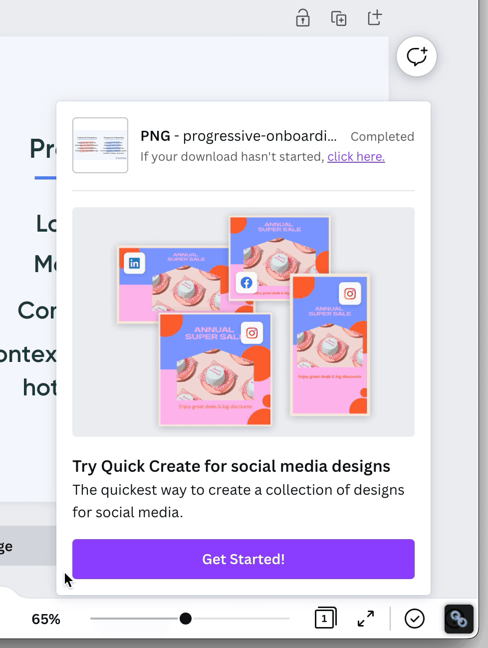
Canva tucks a Quick Create feature announcement into the slideout that confirms a download, so the pitch arrives once the user's task is done.
Grammarly's browser extension runs a four-step new feature tour inside Gmail, with black tooltips that explain email highlights and recaps.
Modal · Product tour · Tooltip
Upwork explains its redesigned contract page with a modal offering a quick tour, then three tooltips with a green progress bar.
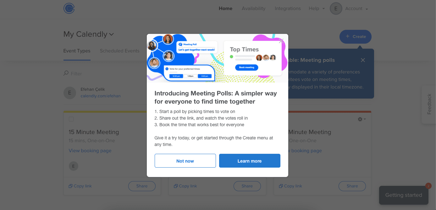
Calendly announces Meeting Polls with a modal and a tooltip on the Create button, so users learn the feature and where to start it.
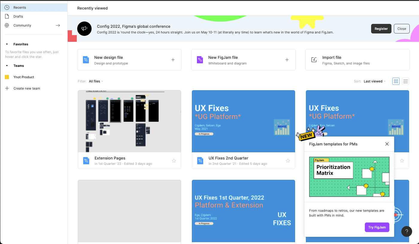
Figma promotes its FigJam templates for product managers with a corner slideout modal, a NEW sticker, one line of copy and a Try FigJam button.
Jarvis answers a cancellation with a churn modal offering 30% off for three months, with the offer up top and Decline Offer at the bottom.
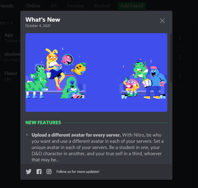
Discord's What's New modal pairs a dated illustration and a list of new features with links to follow Discord on social media for more updates.
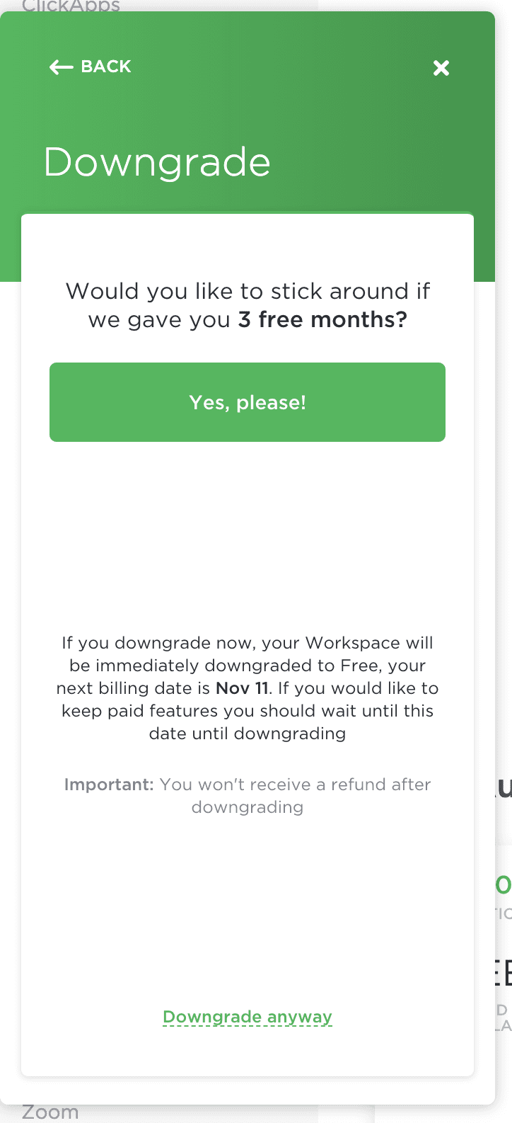
ClickUp's downgrade modal offers three free months before a user leaves a paid plan, and keeps the downgrade option as a quieter link below.
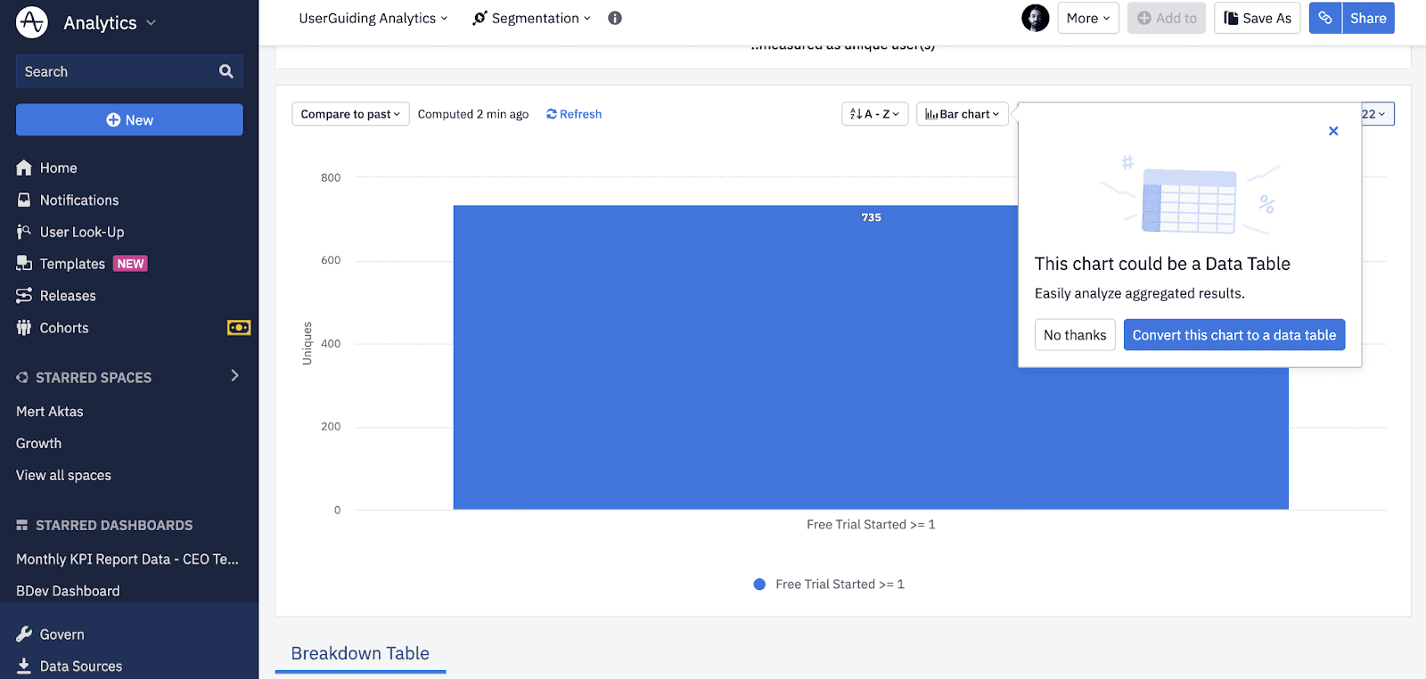
Amplitude's contextual tooltip suggests turning a bar chart into a data table while the user builds it, with a one-click convert button and a No thanks.
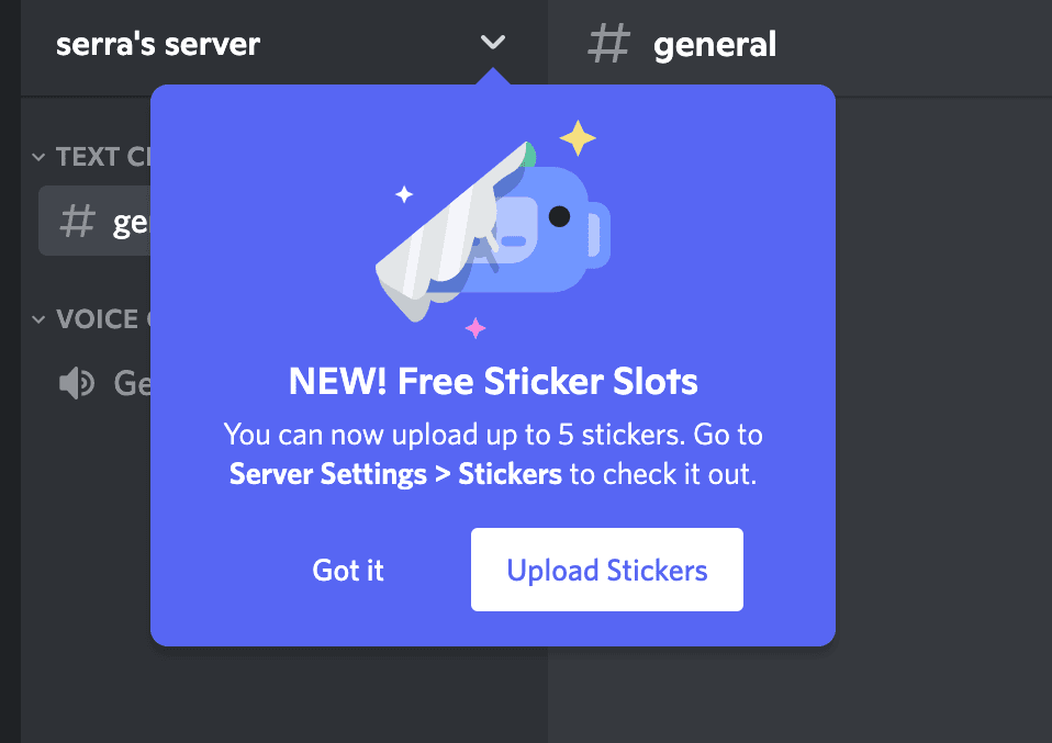
Discord announces server features in tooltips under the server menu, each with a playful illustration, one or two lines of copy and two clear buttons.
Tooltip · Video
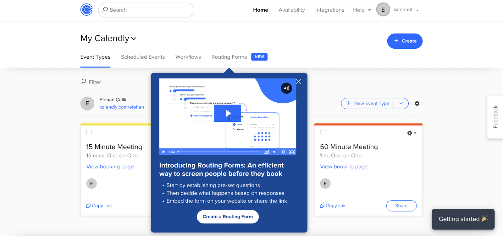
Calendly announces Routing Forms with a tooltip on the new tab that holds a short video, three bullet points and one clear Create a Routing Form button.
Slideout · Survey
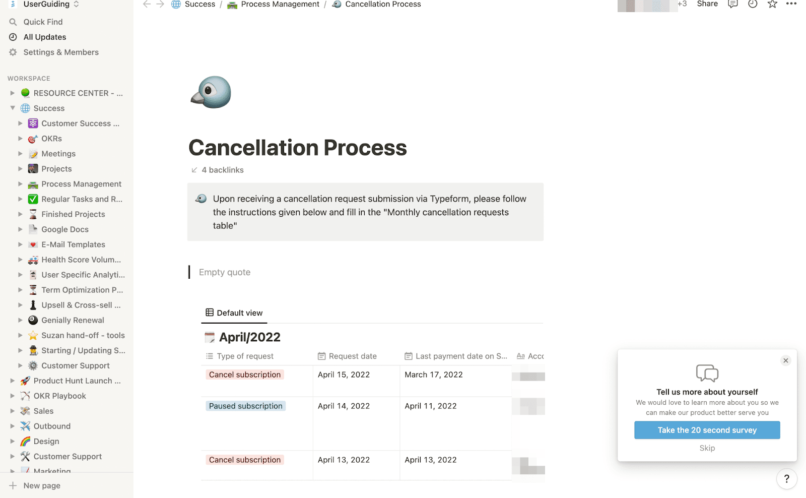
Notion asks users about themselves in a small slideout whose button promises a 20 second survey, then shows four quick questions in the same card.
Zoom promotes an upgrade discount in a small slideout card on its account pages, with a short offer, a deadline and a Get Offer link.
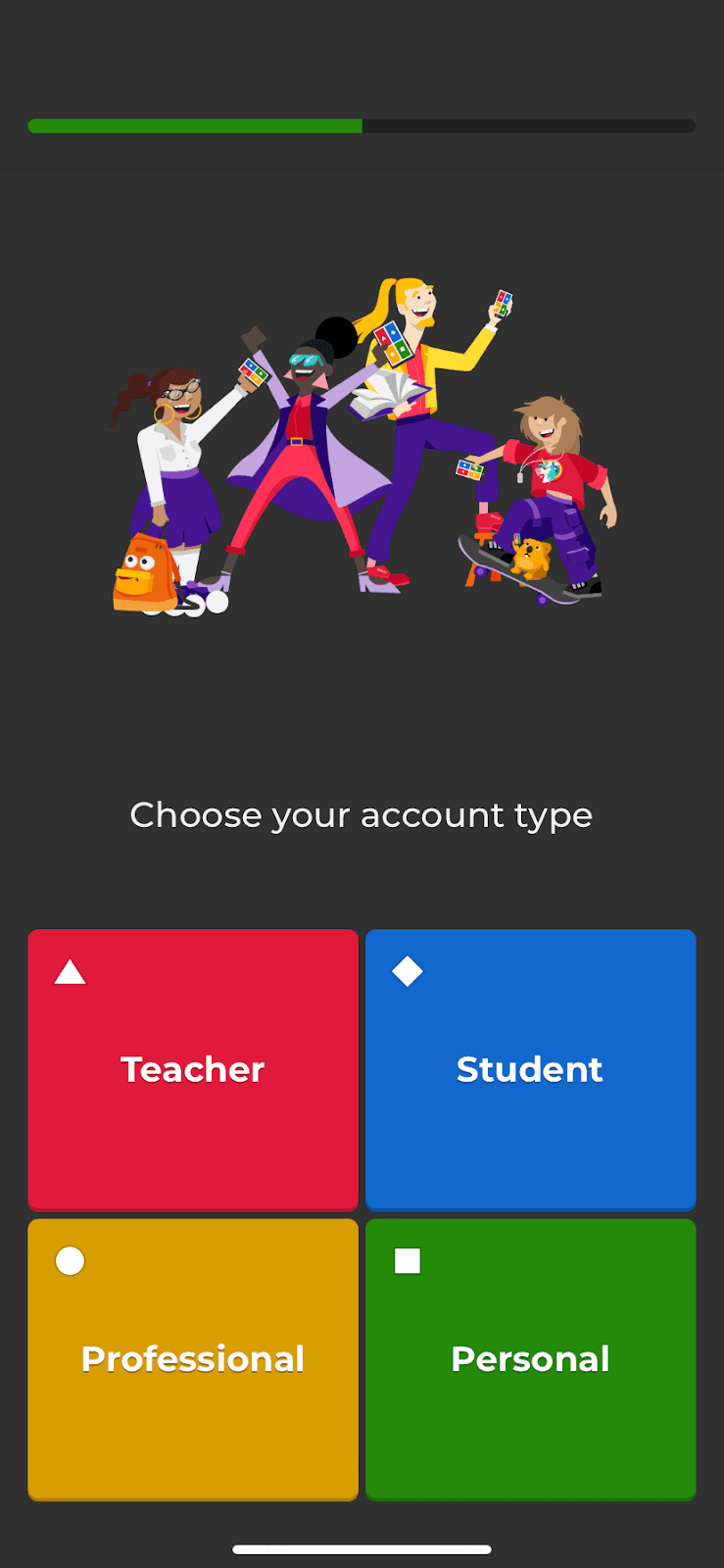
The Kahoot! app segments new users with questions styled as quiz answers, shows a progress bar throughout and lets them create an account later.
Tumblr asks how users feel about its app with three faces, then answers each choice with playful copy and a matching next step.
VSCO pitches two new presets in three photo-led slideouts, and only the last one asks users to try a paid membership.
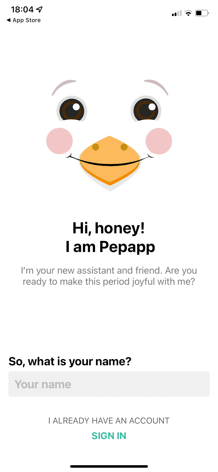
Pepapp's mascot asks for a name and birthday, then account details, then what the user wants from the app, in a friendly four-screen signup.
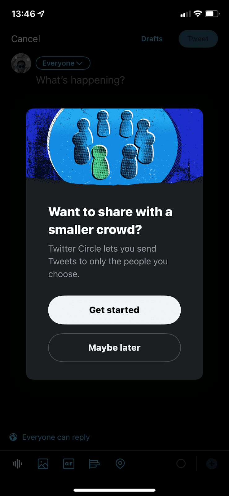
Twitter introduces Twitter Circle with a modal in the compose screen, then a bottom sheet explaining how the feature works in three short points.
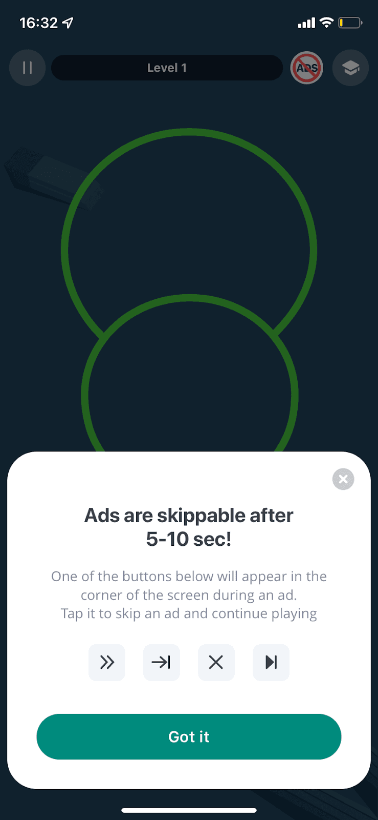
Impulse uses a slideout modal to warn users about ads before they see one, showing the skip buttons to look for and when they appear.
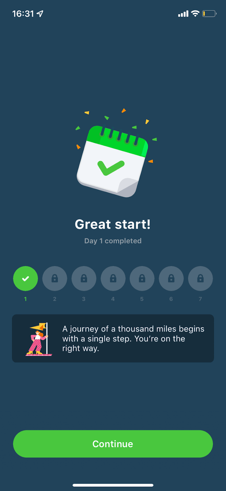
Impulse ends a new user's first day with a Great start! screen: a ticked calendar, a seven-day streak row and a short motivational line.
Impulse, a brain-training app, follows three illustrated intro screens with three quick questions that segment new users by goal, focus and age.
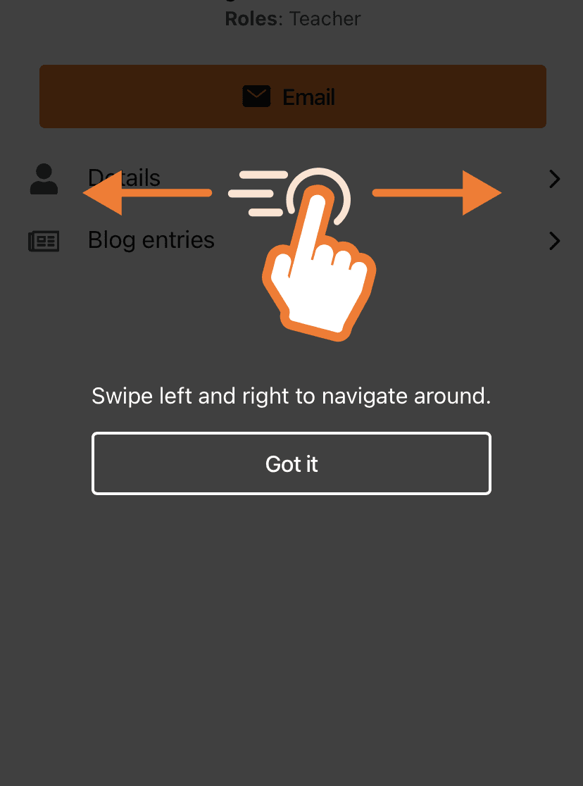
Moodle's mobile app explains its new navigation with three one-line tooltips and a full-screen swipe hint, each closed with a Got it button.
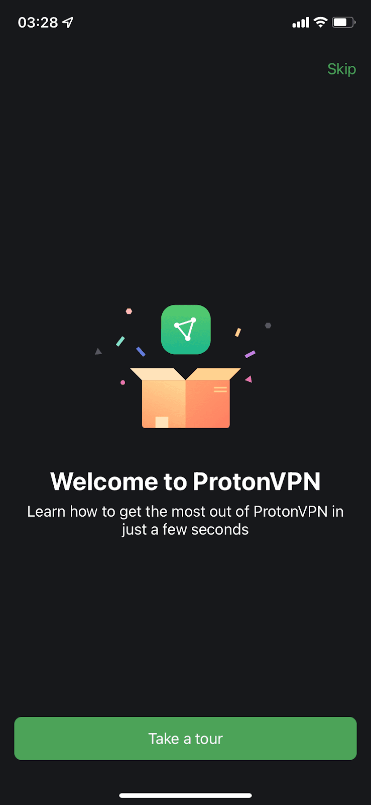
Proton VPN's mobile app welcomes new users with an optional three-screen tour and ends on a single Connect now button for their first connection.
Expensify’s mobile sign-up runs through Concierge, a chat-style assistant that asks a few illustrated questions to segment new users.
Hotspot
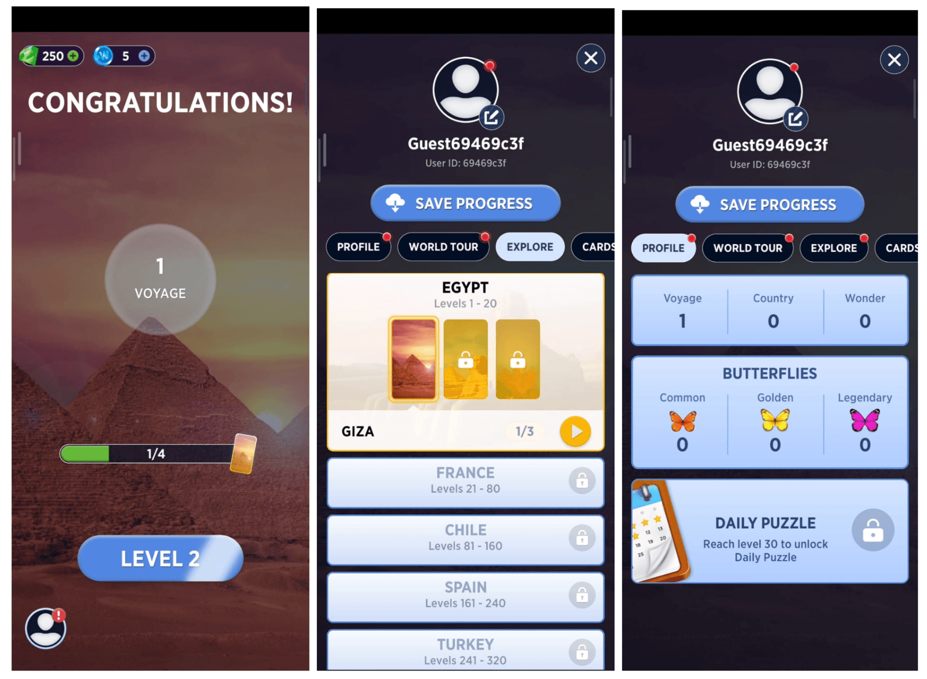
World of Wonders, a mobile game, marks menus and tabs worth checking with small red hotspots instead of tooltips or modals.
Google Chat's product tour is three illustrated cards over a dimmed screen, followed by one contextual tooltip about Google Workspace tools.
Product tour · Banner
ClickUp introduces Whiteboards, then in beta, with a short and skippable five-step tour and a banner asking users for feedback.
Canva's mobile app congratulates users on a finished design, then asks how confident they felt on a 1 to 5 scale with an open follow-up question.
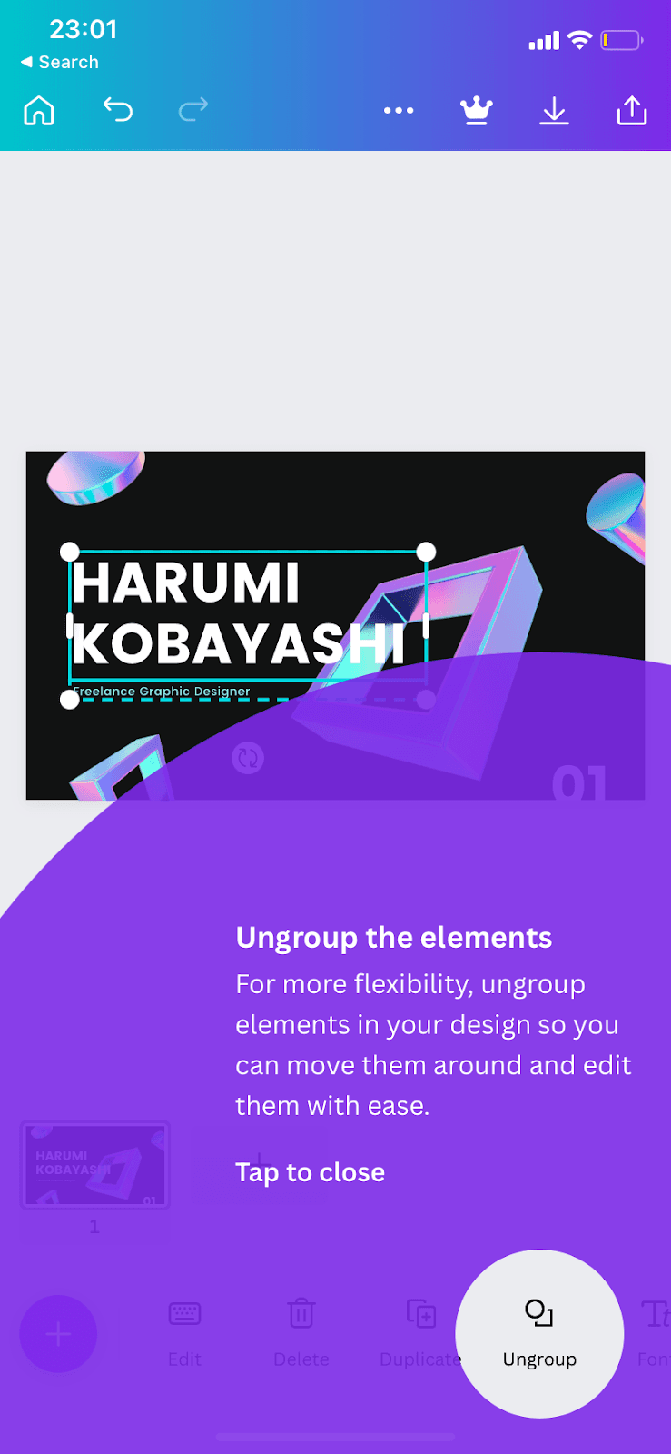
Canva's mobile editor shows a large, translucent overlay tooltip that circles one tool, such as Ungroup or Effects, while a user is mid-design.
Asana introduces its Inbox with a feature modal that pairs three one-line functions with an animated preview, so users learn it at a glance.
Asana turns an empty Workflow tab into a setup prompt that asks how tasks will reach the project, instead of pointing at it with tooltips.
Asana's Home page holds a five-step onboarding checklist widget that takes new users to key parts of the tool and ends with a small celebration.
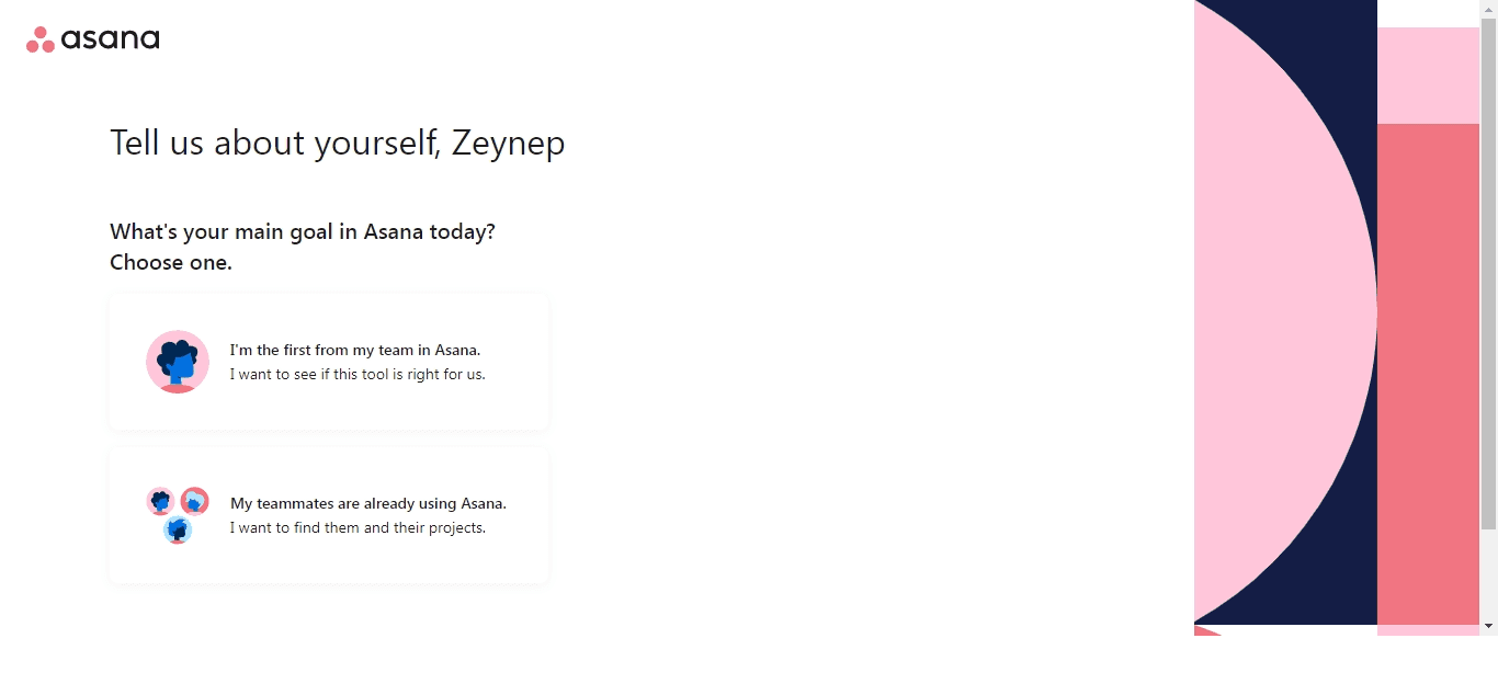
Asana's sign-up flow asks a few questions about you and your team, then has you build a first project and pick a view while a live preview fills in.
Product tour
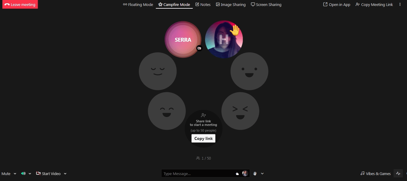
Meeting app Around offers a 45-second simulated meeting from its menu, so first-time guests learn the main shortcuts without a full onboarding flow.
Video
Around teaches new users its meeting shortcuts in a short demo call, where a team member on video shows each one and you try it yourself.
Candu’s content studio opens a six-step in-app guide whose GIFs show each action, with a progress counter, a Skip link and a dimmed background.
Canva's Pro trial modal pairs an animated demo of team editing with a skimmable list of Pro benefits and a single free-trial button.
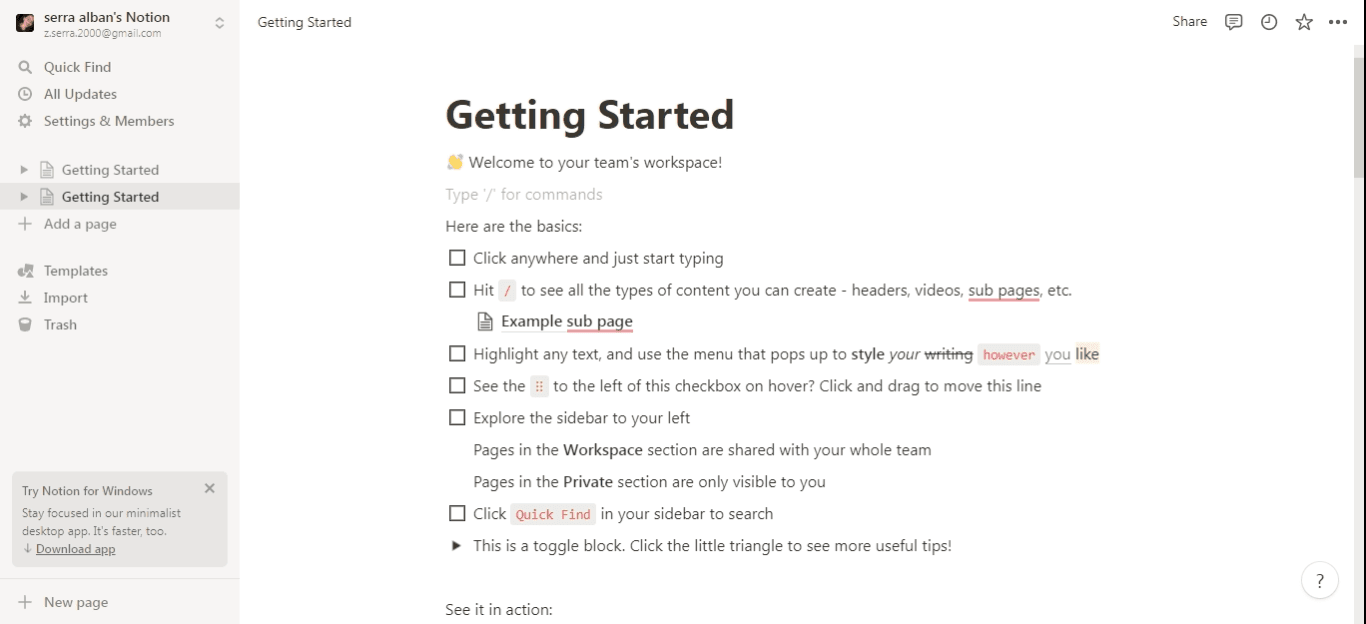
Notion onboards new users with a Getting Started page: a checklist of basics that users tick off by trying each one on the page itself.
ProductLed shows leaving visitors an exit modal for its next course cohort, with a live countdown to the enrolment deadline and one button.
Banner
Spotify shows a referral banner on the profile page, where users already think about friends, inviting them to give someone free Premium.
Integromat welcomes new users with a four-step modal slideshow that shows how to build a first automated scenario, from trigger to activation.
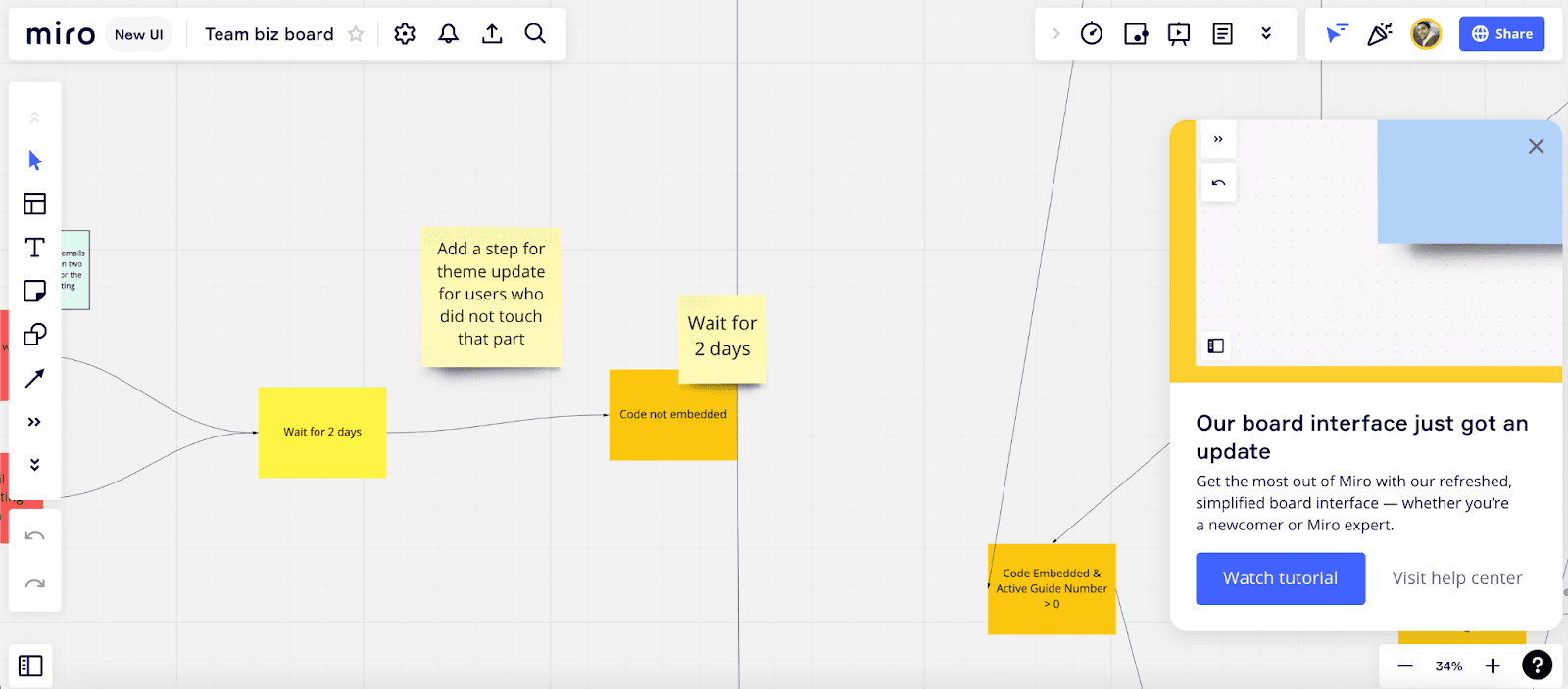
Miro announces its new board interface in a slideout modal that offers a short tour, a trip to the help centre or simply closing it.
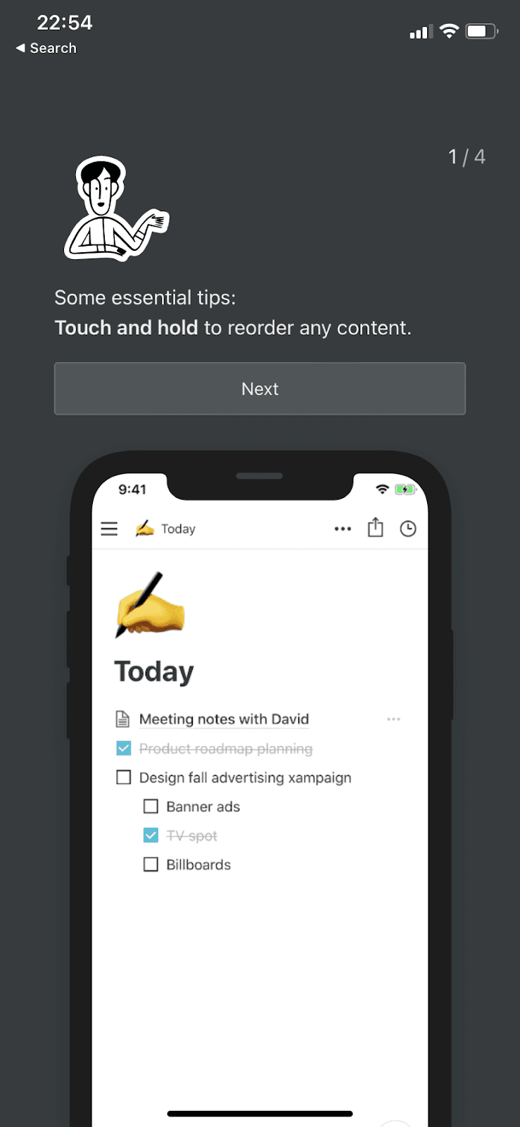
Notion’s mobile onboarding is four screens of essential tips, each a sentence or two long with a demo on a phone mockup underneath.
Frase announces its updated editor in a modal with a YouTube video, emoji reactions and a feedback field, shown when users log in.
Memsource introduces its Jobs page with a welcome modal, a short tooltip tour with dot progress and a closing modal that uses GIFs for batch operations.
Modal · Video · Empty state
Hopscotch welcomes new users with a short captioned video from its founder in a modal, then an empty state that gets them to their first tour.
Tooltip · Modal
Slack offers its preference settings through a small tooltip first, then an eight-step modal with two or three illustrated choices per step.
Life360 follows sign-up with three dismissible tip cards and a spotlight tooltip that explains its Help Alert safety button.
LinkedIn introduces pronouns and name pronunciation with two one-line tooltips on the user's profile, each with a single button to add the detail.
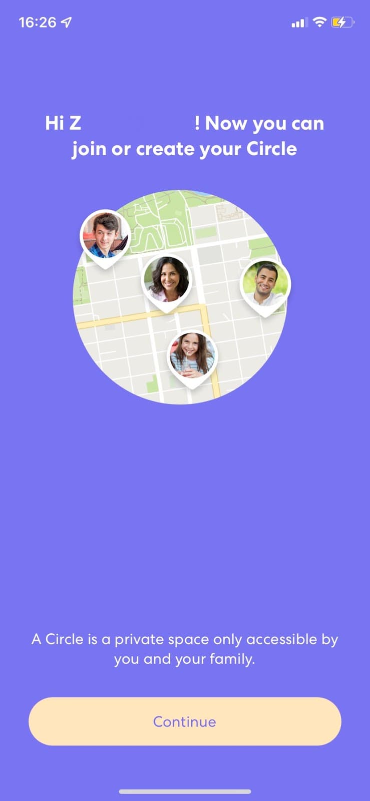
Life360's mobile signup flow sets up a family Circle one question per screen, with a line of reassurance or a tip under each step.
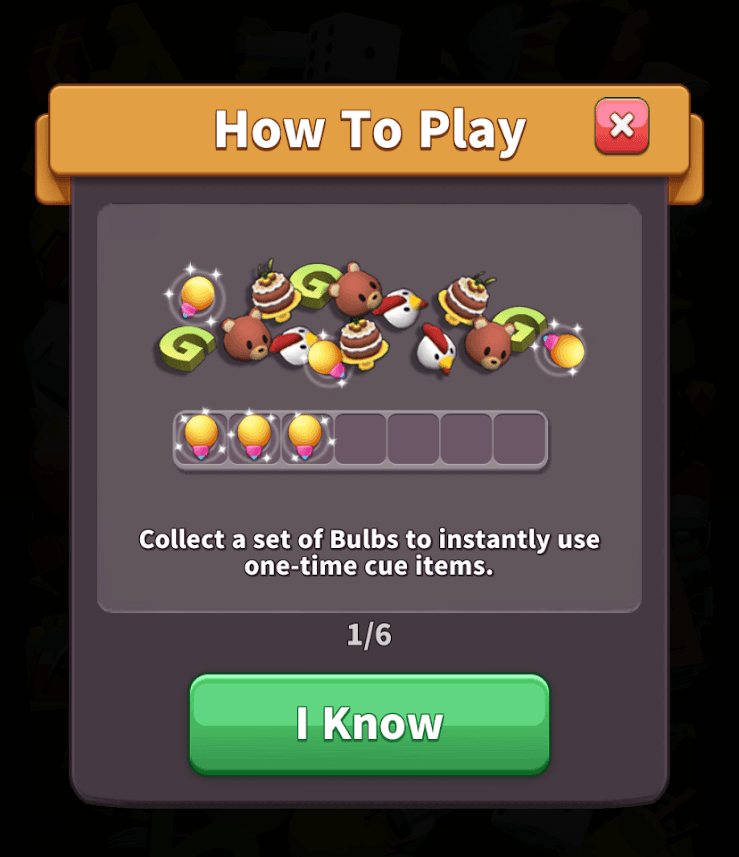
Tile Master 3D shows returning players a six-step How To Play modal with an illustration per rule and an I Know button to move on.
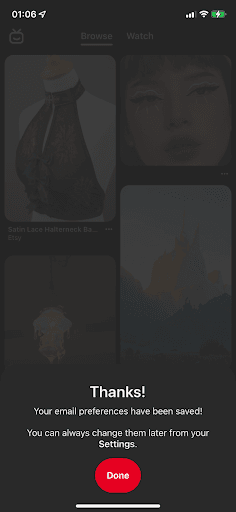
Pinterest's mobile app greets users by name in a slideout modal asking them to confirm their email, then confirms the change and points to Settings.
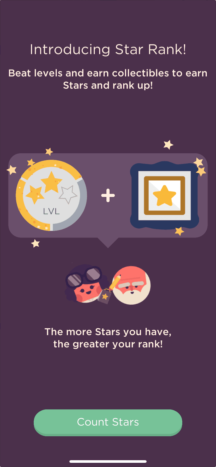
Puzzle game Two Dots introduces its Star Rank feature in four full-screen steps that count your stars, reveal your rank and hand out rewards.
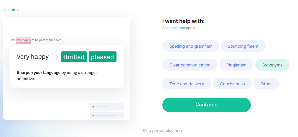
Grammarly's personalisation step asks users what they want help with, next to an example of a suggestion, and lets them skip if they'd rather not say.
LinkedIn places a one-question survey card in the feed, asking users on a five-point scale whether today's conversations feel respectful and welcoming.
Zara's app announces wishlist sharing with an illustrated modal on the Wishlist page, while a spotlight picks out the share button it describes.
Twitter introduced NFT profile pictures in a slideout that explains what an NFT is first, then a full-screen page for connecting a crypto wallet.
Tooltip · Hotspot
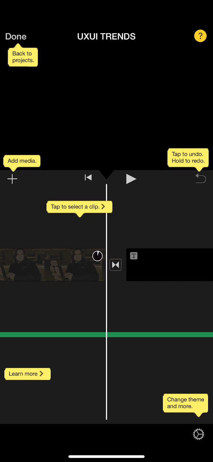
iMovie keeps a yellow question mark on screen that labels every control at once with short tooltips, some linking on to the user guide.
Genshin Impact points out a new party shortcut with one tooltip and a glowing highlight around the party list, without pausing the game.
Notion's 2.15 update modal walks users through new database features in one window, with a live preview for each, a Next button and Skip all.
Discord uses an in-app slideout modal with a mascot illustration and one playful line to invite users to connect PlayStation Network.
Twitter introduces Spaces with two slideout modals of short points with icons, plus help icons on the screen where a Space is created.
Modal · Survey
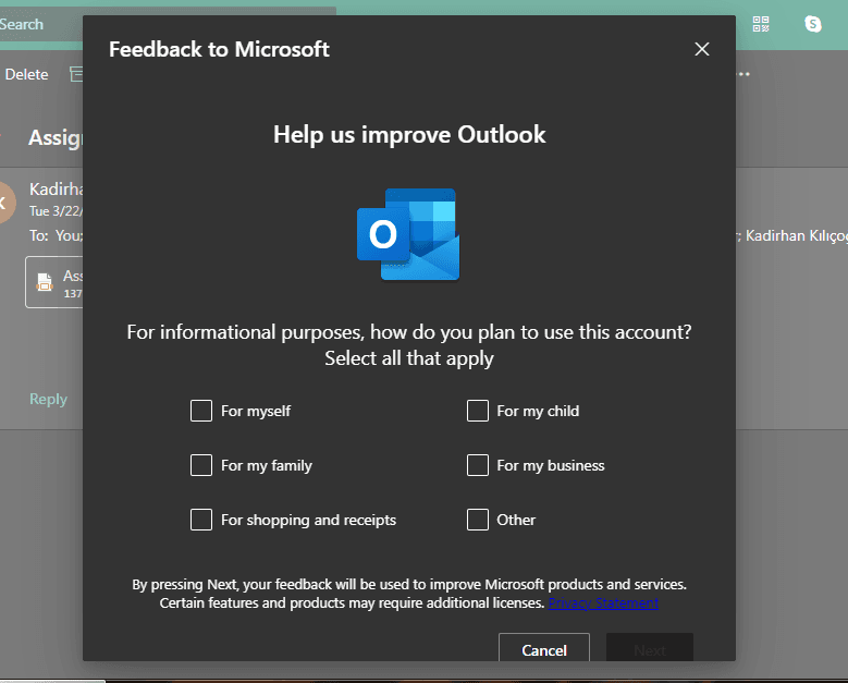
Microsoft Outlook asks how users plan to use their account in an in-app survey modal, with six tick-box answers and the Outlook logo up top.
WordPress explains its block editor in a four-step slideshow shown over the post being edited, with an illustration, progress dots and a close button.
Visme opens sign-up by asking what users want it for, with four illustrated cards explained in one line each, to personalise their tips.
Vieworks runs a 14-step interactive product tour with one-line tooltips and a dimmed backdrop, plus shorter tours for tasks such as creating a seat.
Vieworks onboards new users with an interactive walkthrough that highlights each step and waits for them to fill in real details, like a company name.
Userflow guides users through creating their first flow with a tooltip that explains the step and a pulsing hotspot on the button to click next.
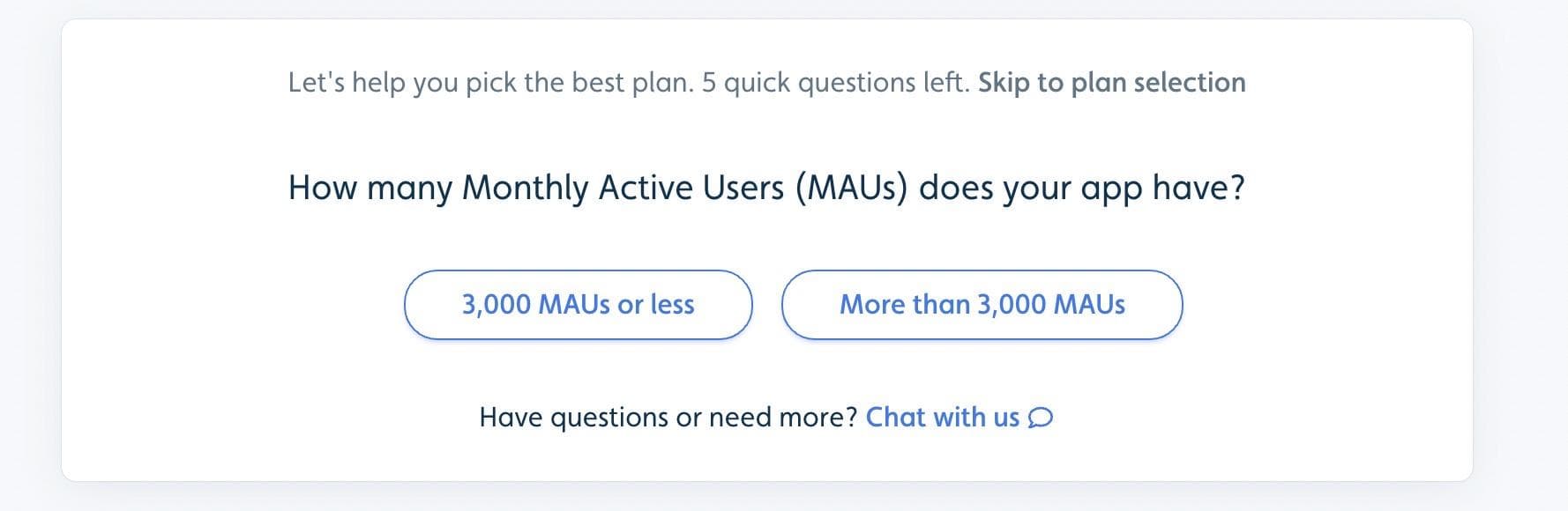
Userflow helps buyers pick a plan with a five-question survey of one-click answers, a skip link up front and a chat link for anything else.
Modal · Product tour
Typeform opens its product tour with a relaxed modal that promises a quick look at the highlights and makes saying no just as easy.
Typeform scatters small pulsing hotspots around its form editor, and each one opens a short tooltip with a Got it! button, in whatever order users choose.
Trello introduces its new navigation with a modal, a four-step tooltip tour, and a final choice to switch now or keep the old layout a little longer.
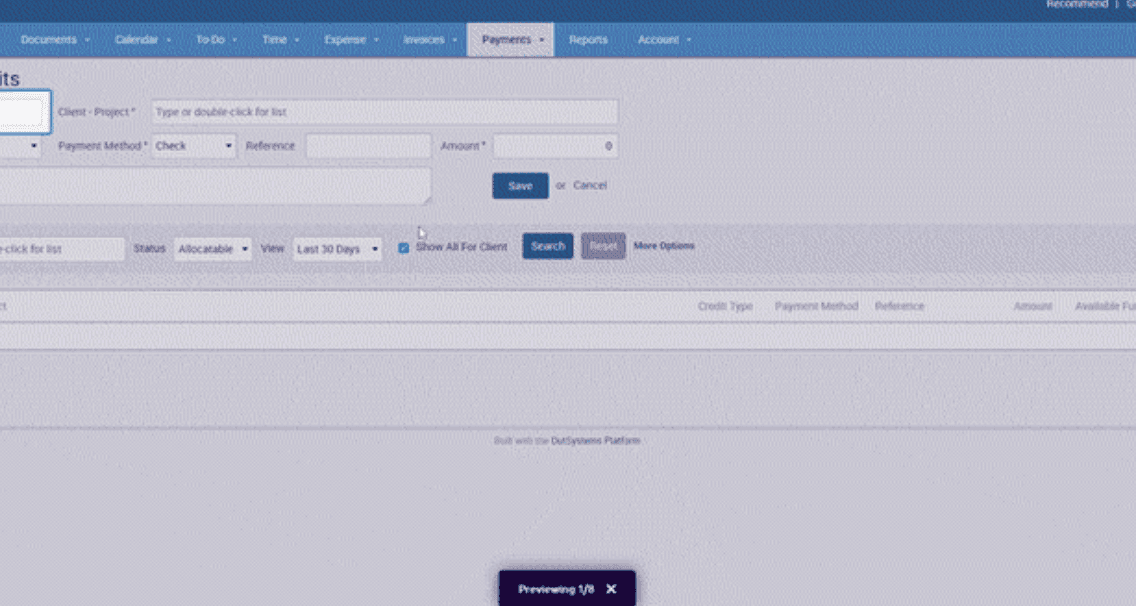
TimeSolv breaks a dense payments form into eight short tooltips that highlight one field at a time, with Previous and Next buttons on each.
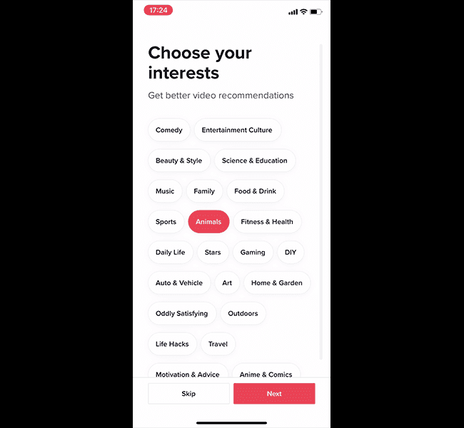
TikTok asks new users to pick interests, shows one swipe-up animation and starts playing videos, all before asking them to sign up.
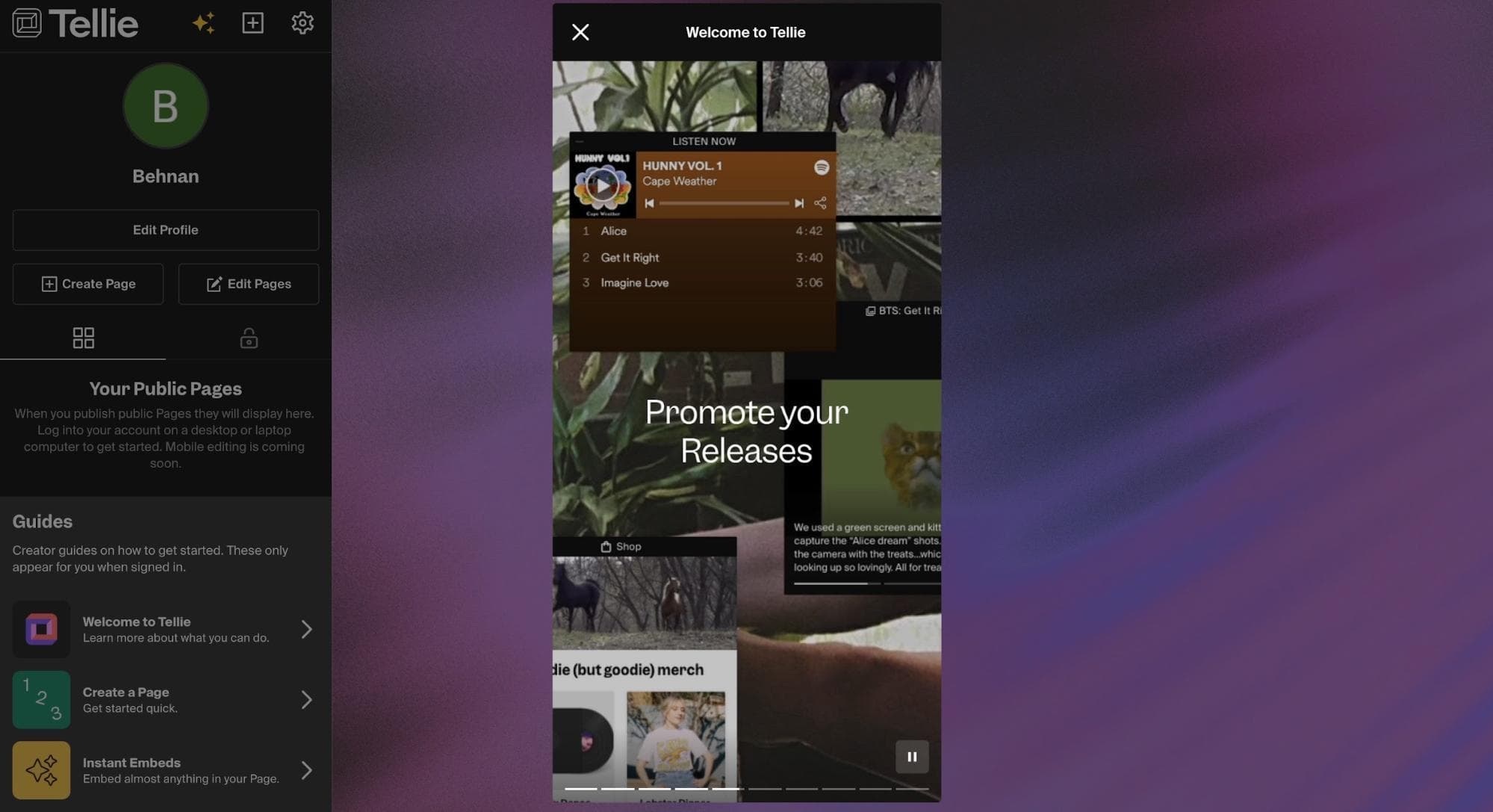
Tellie presents its use cases as a "Welcome to Tellie" story, with full-screen slides and a segmented progress bar like an Instagram story.
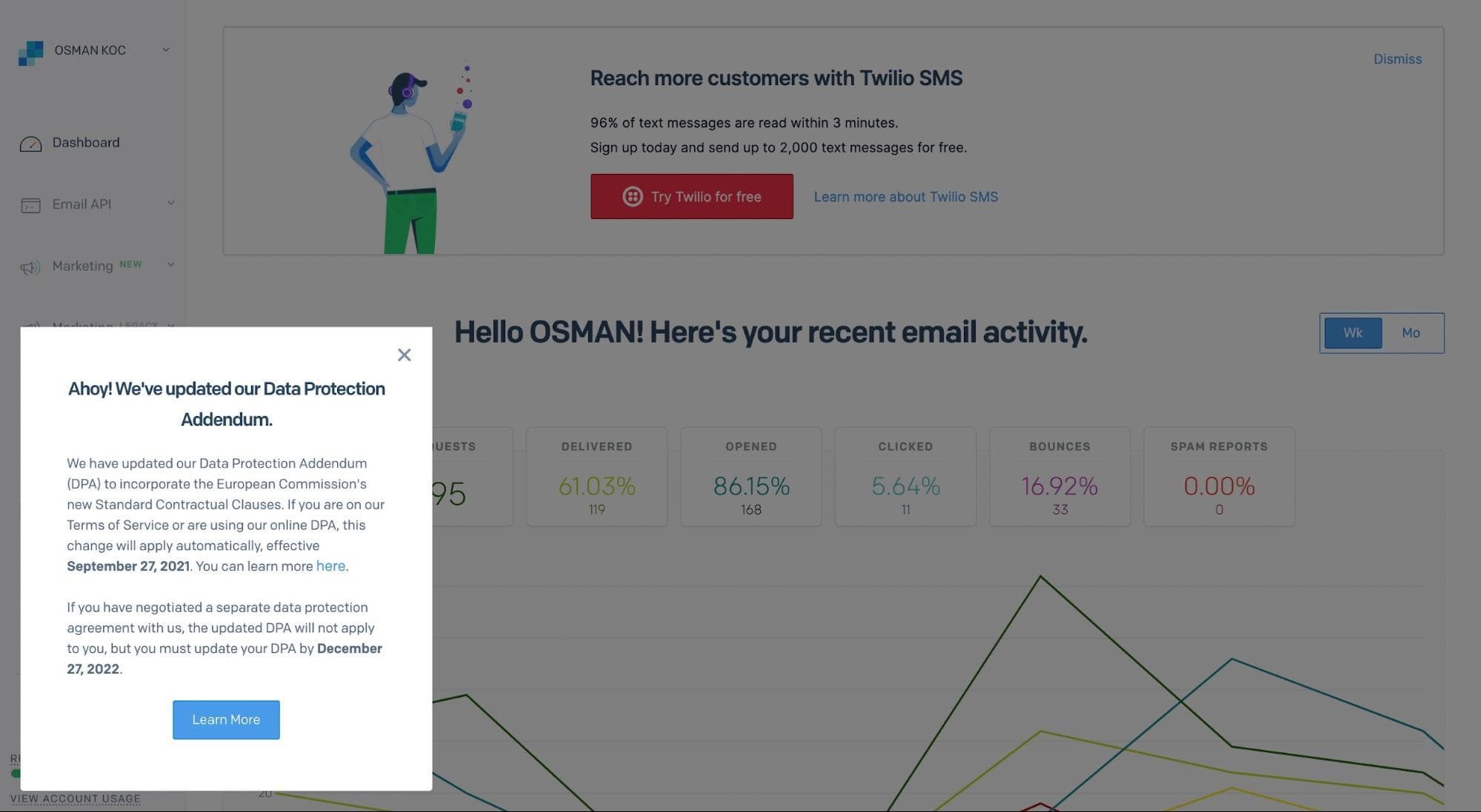
SendGrid announces an update to its Data Protection Addendum in a slideout modal at the bottom left, with bold dates, a dimmed page and a close button.
SendGrid marks a new automation trigger with a hotspot in its sidebar, which opens a short tooltip with a link to try it.
Checklist · Product tour
RAM introduces its new App.RAM platform through Sam, a cartoon guide who greets users, leads a checklist of tours and calls each user by name.
Product tour · Hotspot · Tooltip
Plandisc guides users through eight-step interactive tours, offered from a hotspot beside a feature and written in quick, playful copy.
Pinterest's mobile signup takes three steps (email, gender, five topics) with a progress bar, so your first feed is personalised from the start.
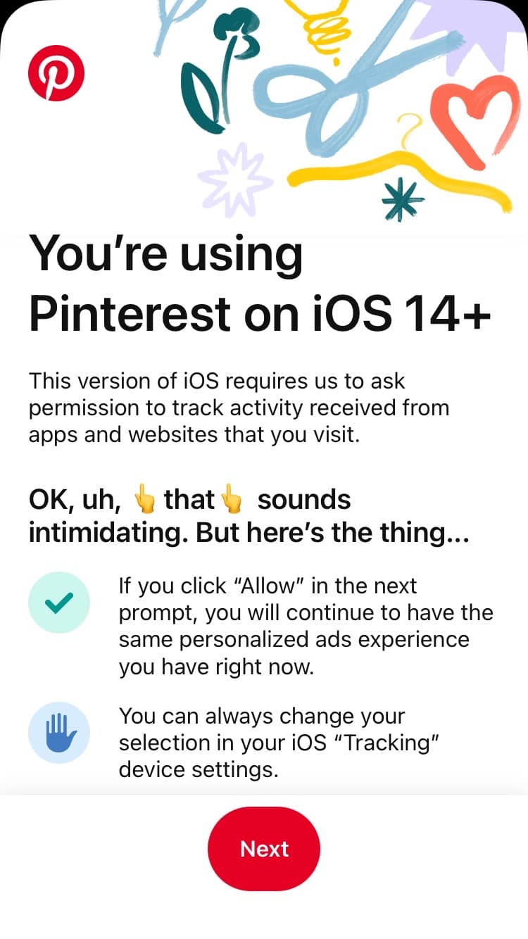
Pinterest explains Apple’s tracking prompt in plain, playful words before it appears, so users know what Allow means before they choose.
Notion stacks its update and maintenance messages in a corner, signs them "David from Notion" with a doodle, and shows Clear All only on hover.
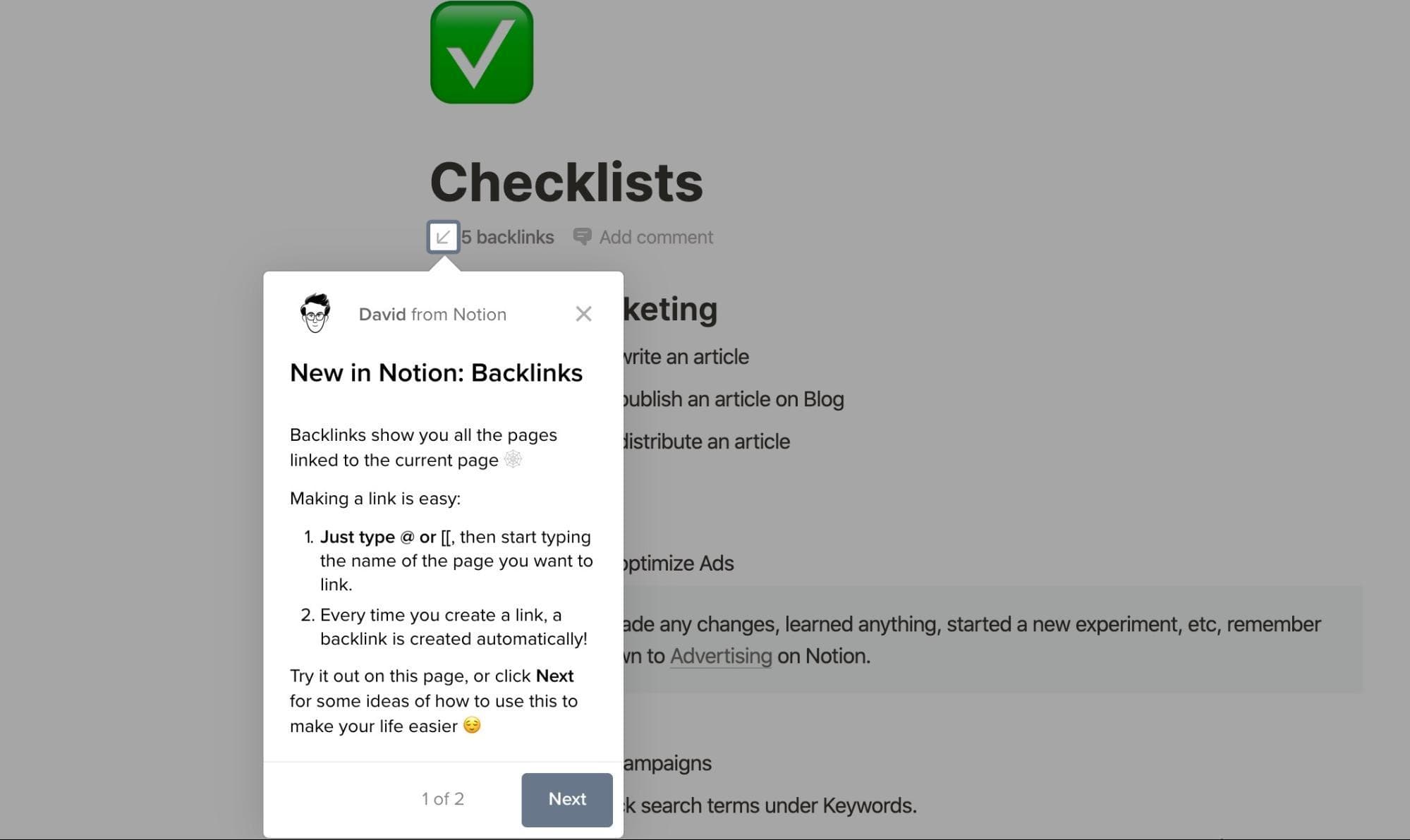
Notion announces backlinks with a tooltip signed by a team member, pointing at the backlinks count and explaining the feature in two steps.
Netflix's signup takes three numbered steps (account, plan, payment), then asks users to pick three titles they like to personalise recommendations.
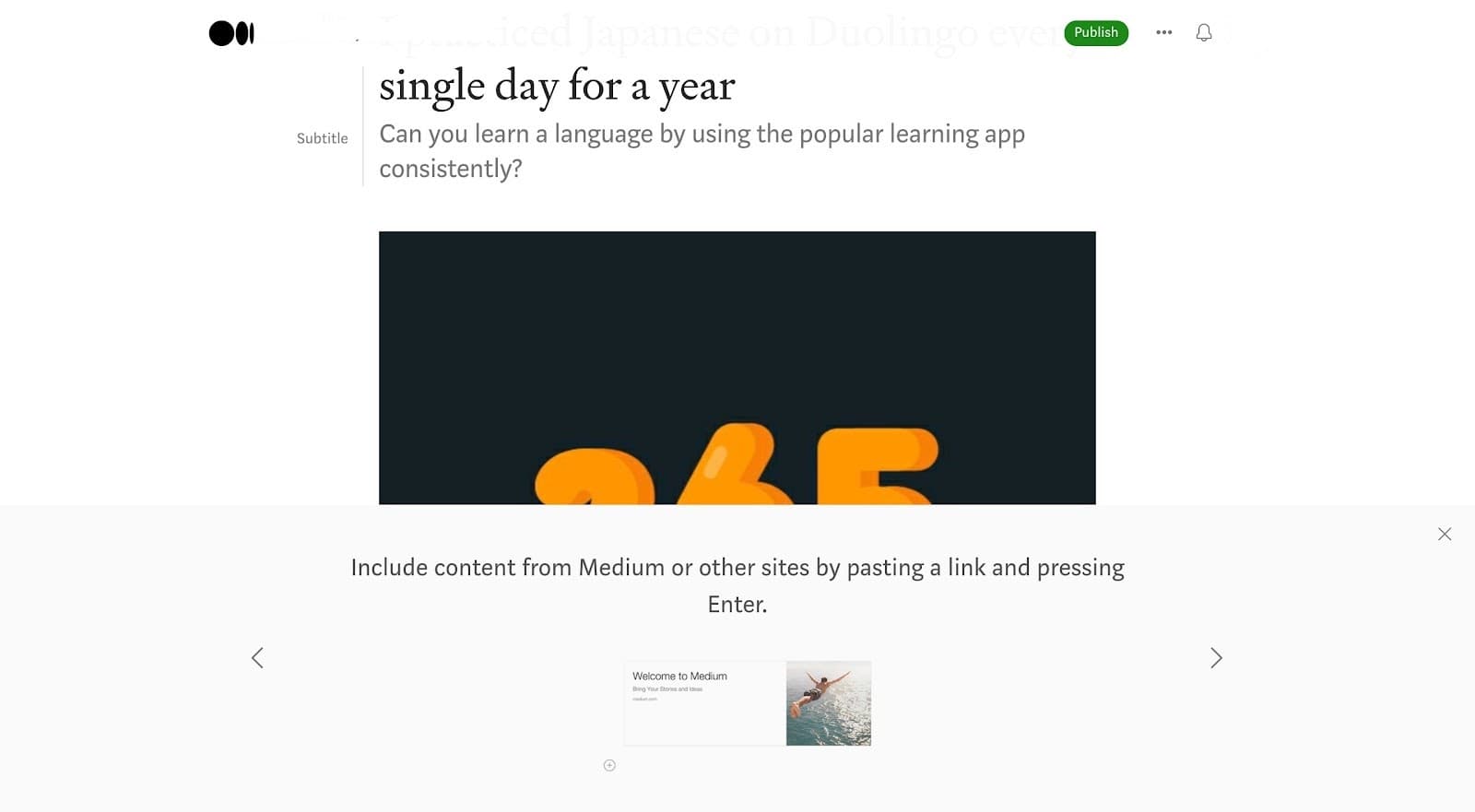
Medium’s editor shows a slideshow of tips along the bottom of the screen when users start writing, each with a visual example.
Signup flow · Checklist
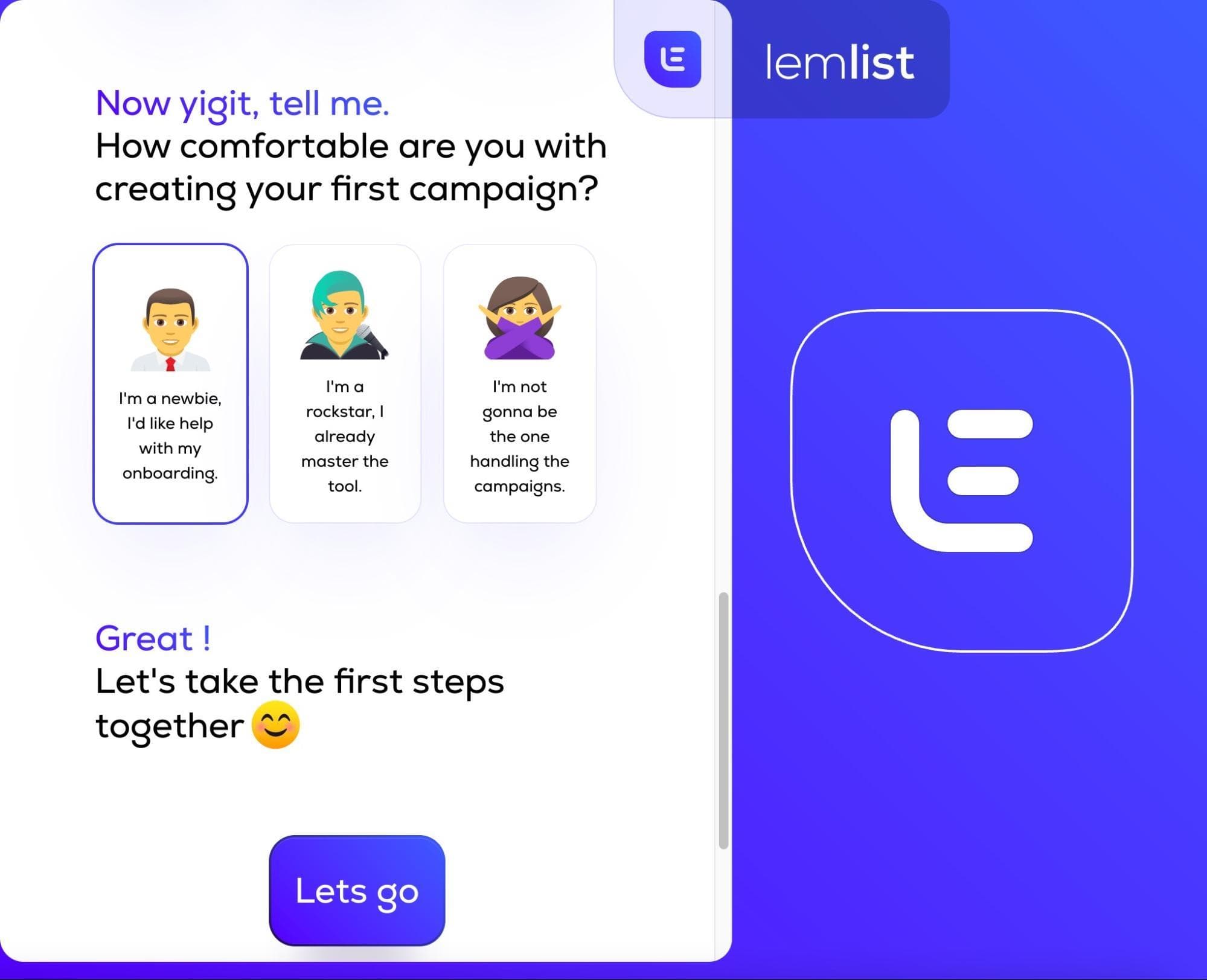
Lemlist asks how comfortable users are, offers skippable integrations, then walks them through a test campaign tracked by a checklist.
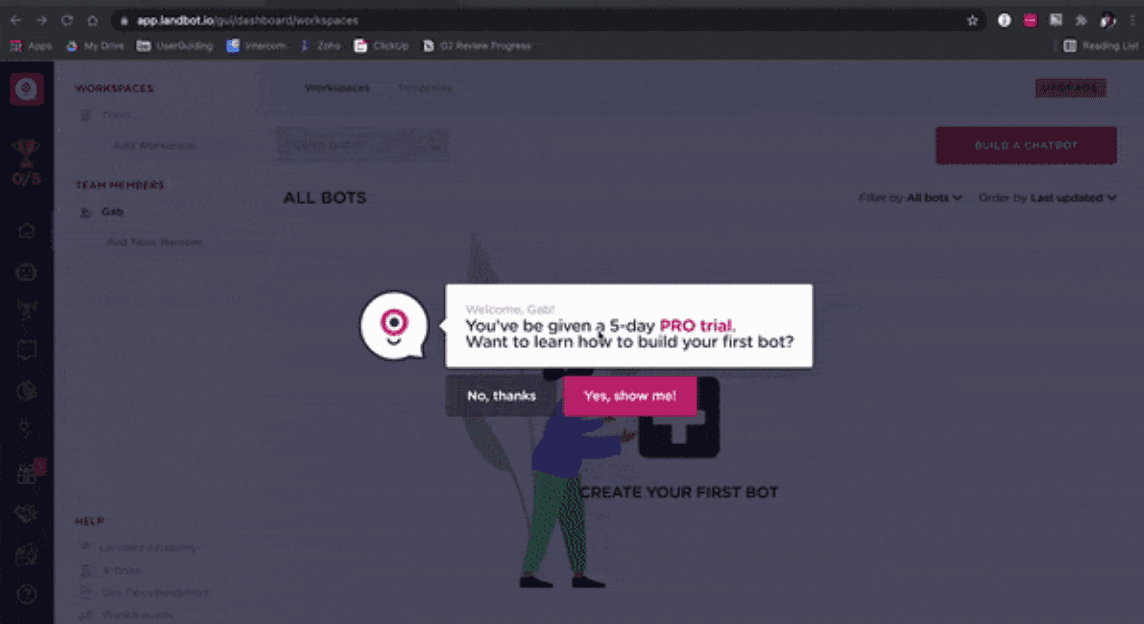
Landbot's mascot offers new users an 11-step product tour that builds a first chatbot and ends with confetti and a "Tutorial completed!" message.
Hotspot · Video · Slideout
Indicata announces a new feature through a hotspot that opens a 35-second video, and a new report through a modal at the side of the screen.
Ideta's six-step product tour highlights one element at a time on a dimmed screen and keeps its help widget lit, so help is one click away mid-tour.
HubSpot's domain hosting setup is a three-stage wizard with a progress bar, collapsible numbered steps and a link to skip straight to DNS records.
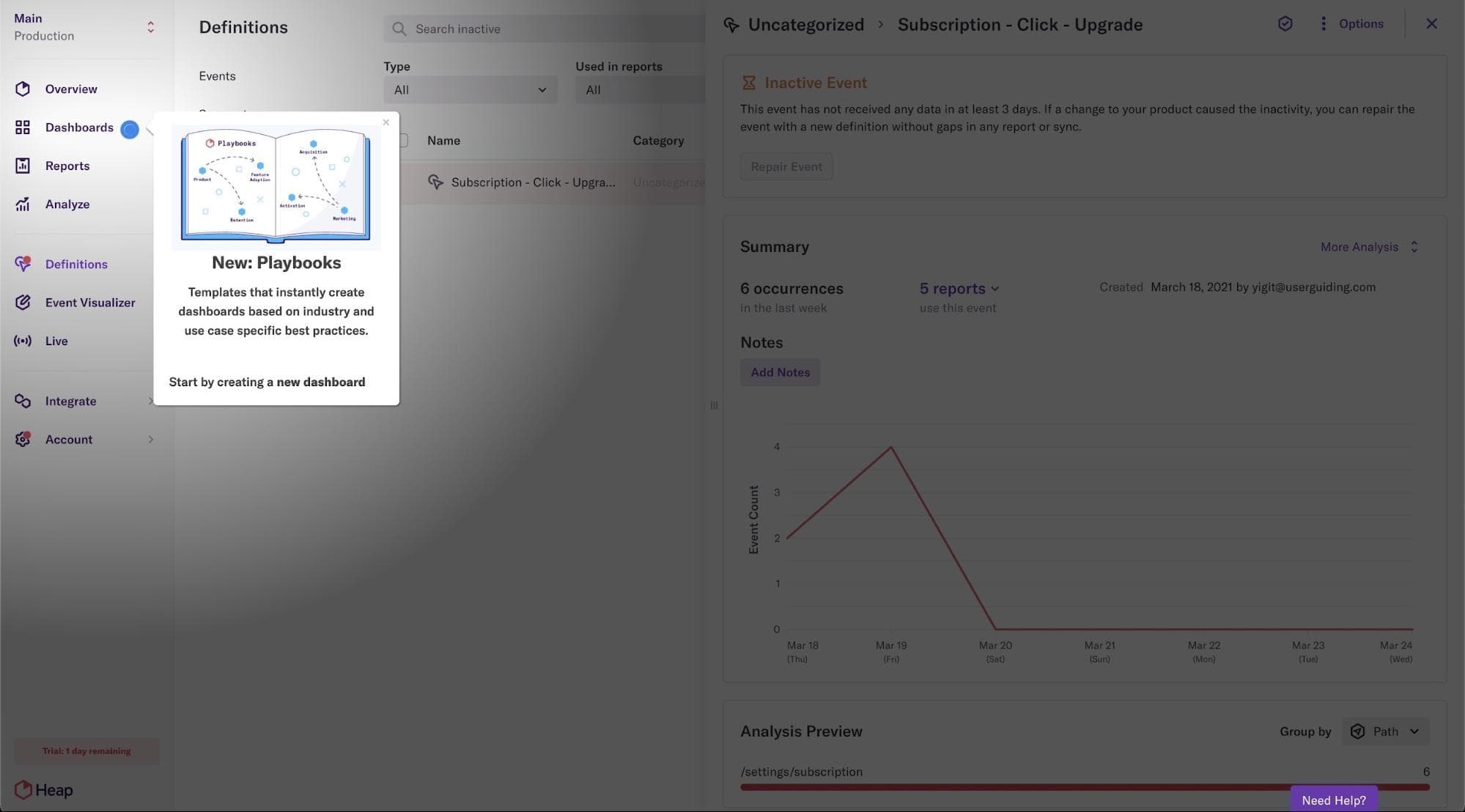
Heap announces Playbooks with a tooltip and hotspot on its Dashboards menu, using a vignette shadow to focus attention on them.
Grove HR puts short videos inside its modals, from the first welcome screen to the announcement for a new Performance Enablement module.
Modal · Hotspot · Tooltip
Grammarly opens a skippable quick-tour modal, then teaches its editor in a demo document using hotspots and tooltips on real suggestions.
Ghostwriter.ai gives each of its tools a separate short guide, with a welcome modal, highlighted tooltips, progress bars and the odd GIF.
Framer's six-part tutorial plays video lessons over a real project from a play button in a bottom bar; pausing hides the video so users can try the step.
Modal · Checklist · Product tour
Flourish follows a four-step welcome modal with an onboarding checklist whose items launch interactive guides, each with its own progress bar.
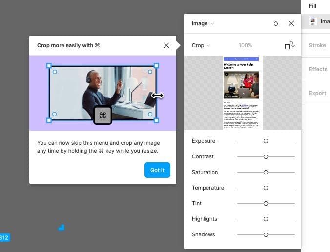
Figma shows a tooltip beside its crop menu explaining that you can crop by holding the Command key, with an illustration and a Got it button.
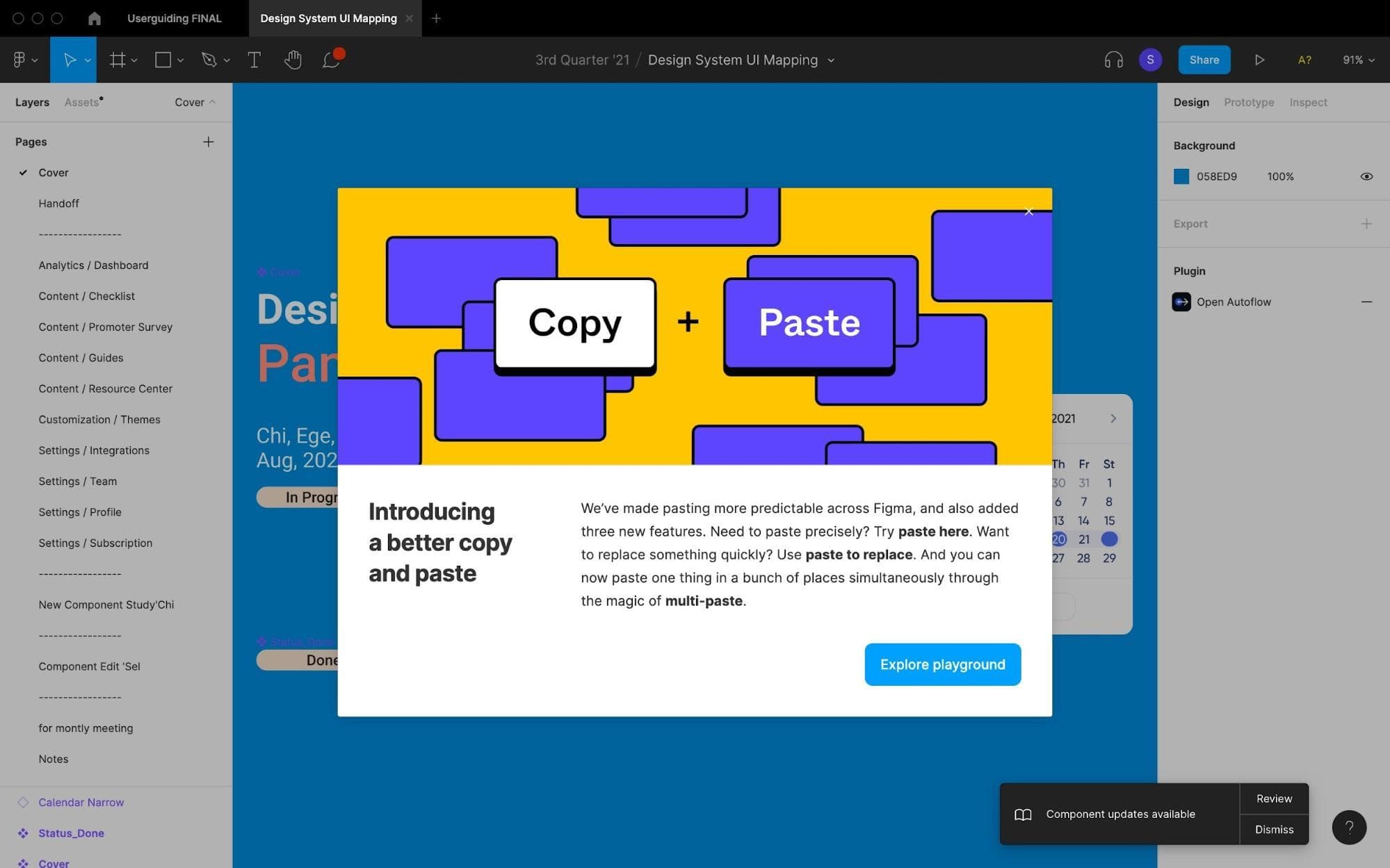
Figma announces a better copy and paste with a bright modal that names three new paste features in bold and links to a playground to try them.
Evernote's signup onboarding segments new users with two three-option questions, starting with whether their notes are for work, school or home.
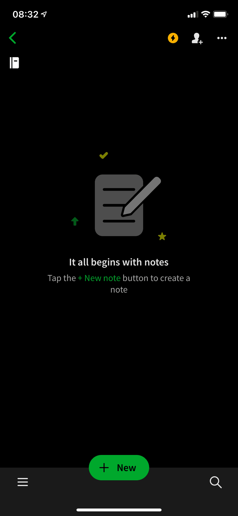
Evernote's mobile app turns an empty notebook into a prompt: an illustration, a one-line headline and a tip that points to the green New button.
Modal · Video · Product tour
BeerOrCoffee opens its booking tour with a modal holding a one-minute video on how to reserve a workspace, then a Next button into the tour.
Calendly's Getting Started Guide is a five-step onboarding checklist with a progress bar, and each open step has its own action button.
Candy Crush teaches its moves inside a real level, with a mascot pointing at the candies to swipe, an example box and a large Skip button.
CitizenShipper keeps onboarding short: a welcome modal with a skip button, a seven-step tooltip tour and a resource centre for anyone who skipped it.
ClickUp's NPS survey sits in a bar at the bottom of the screen and answers each score with its own follow-up message and an optional comment box.
ClickUp offers a $10 plan credit to users who watch its onboarding videos, in a modal with a big WAIT! headline, a $10 bill and a No thanks link.
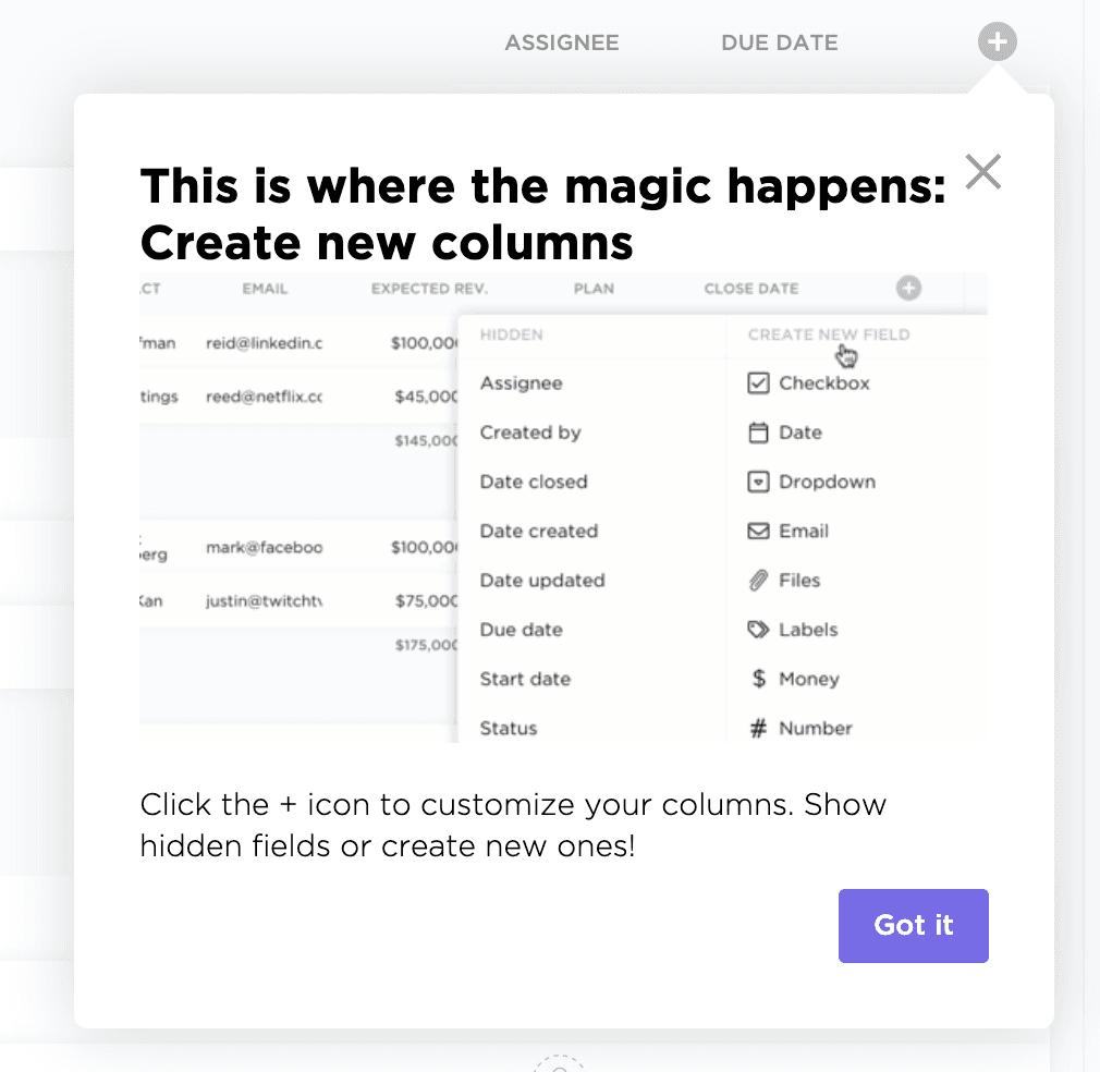
ClickUp uses a tooltip anchored to the + icon in a list view to show users they can add columns, with a preview of the menu and a Got it button.
Modal · Hotspot
CuePath’s welcome modal asks visitors if they already have an account and sends them to log in or sign up, with a hotspot on the order button.
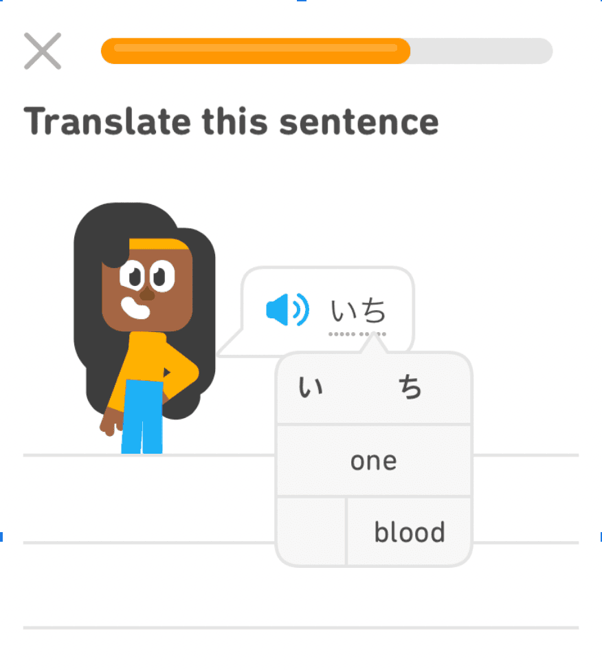
Duolingo’s early lessons underline new words and show their meaning in a tooltip when tapped, so learners get help exactly when they need it.
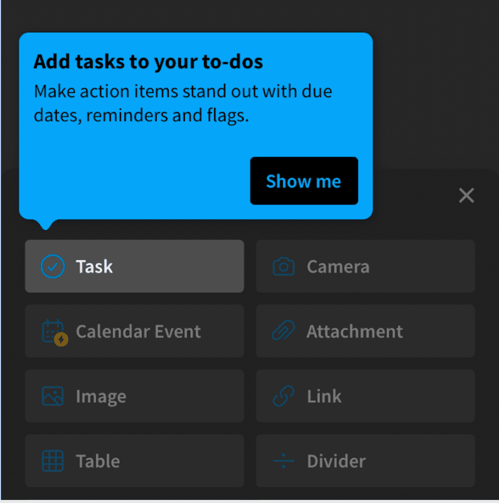
Evernote's mobile app points a tooltip at the Task option in its insert menu, explains what tasks do and offers a Show me button.