Tooltip
HubSpot’s tooltip onboards to a new feature
HubSpot introduces the new Overview tab on its company record page with a single highlighted tooltip and a one-sentence explanation.
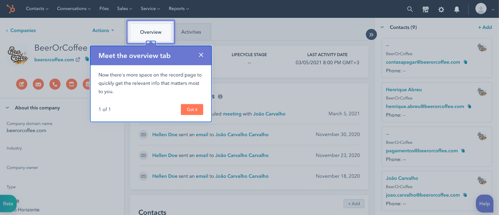
At the time of the screenshot, HubSpot introduced the Overview tab, then in beta, with a new feature tooltip on the company record page. The tab is outlined in blue, and the tooltip below it reads "Meet the overview tab: Now there's more space on the record page to quickly get the relevant info that matters most to you." It's a one-step tour ("1 of 1") with a single orange Got it button.
Why it works
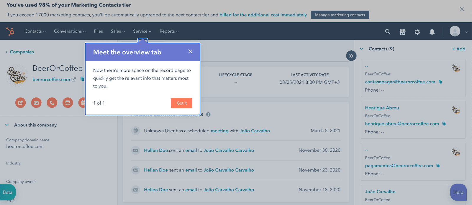
✅ Highlighted target: the outline around the tab shows exactly what's new, so users don't have to work out which part of the page the tooltip means.
✅ Good copy: one sentence covers the change and why it helps the user, without listing every detail.
✅ Fitting CTA: "Got it" is what a user busy with a record would say to a quick update, and one click gets them back to work.
More on this pattern: new feature onboarding and tooltips in web design.