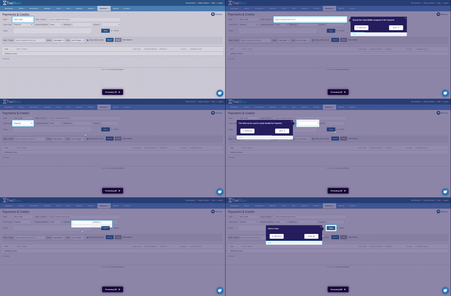
TimeSolv has a naturally complex dashboard and it is no different for specific features of the tool. To solve this, TimeSolv makes use of tooltips for each area on a page in a contextual onboarding method and highlights the areas for better focus.

✅ Simple copy - Because each area on the page is explained separately, TimeSolv uses a very simple copy on the tooltips. This is a great practice when there is a need for over 7 tooltips.
✅ Previous option - Although it doesn’t sound revolutionary, TimeSolv’s “previous” option makes a difference for frustrated users who want to go back to the previous tooltip on an onboarding flow. Because TimeSolv has many separate tooltips, it is notable that they use such a button.
✅ Highlighting right - To show the difference between each area, it is necessary that TimeSolv uses the right highlighting, and they succeed in doing so. They also don’t forget to highlight the help button, which may be needed during the onboarding process.