User onboarding
UserGuiding’s signup process is a customization blast
UserGuiding's signup asks new users to pick a brand colour and button shape for their onboarding content, with a live preview beside the form.
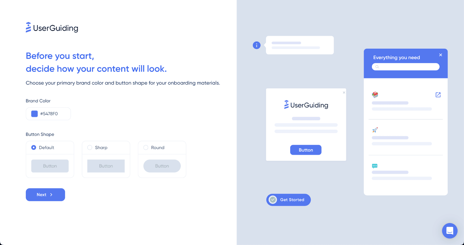
UserGuiding, a tool for building in-app onboarding, includes a customisation step in its signup flow. At the time of the screenshot, the step reads "Before you start, decide how your content will look." and asks for two things: a primary brand colour (as a hex code) and a button shape (Default, Sharp or Round). The right half of the screen previews sample onboarding elements, such as a tooltip, a modal, a resource centre panel and a checklist button, in the chosen style. A Next button moves on, and further styling is left for later inside the tool.
Why it works
- Starts with the user's brand: asking about brand colour first signals that the content will look like the customer's product, a common worry for teams adding a third-party tool.
- A light step in a heavy process: picking a colour and a shape takes seconds and feels more like play than paperwork, which breaks up the form-filling of signup.
- Interactive from the start: the preview reacts to your choices, so you're using the product before you've finished signing up.
More on this pattern: personalised onboarding and first-time user experience.