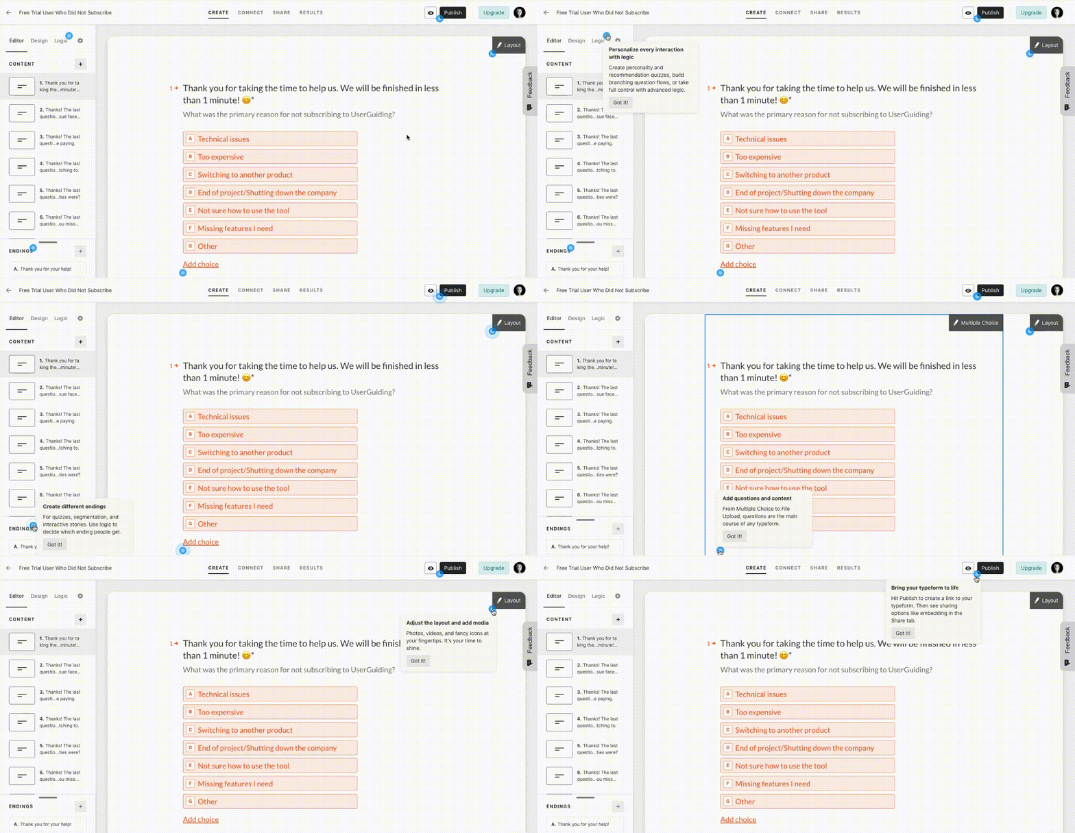
During the initial onboarding where the users learn to use Typeform’s features, the tool prompts the users with several hotspots around the screen. By clicking whichever they want, users learn how to use the tool in their own pace.

✅ not a lesson but a discovery - By displaying several hotspots at once, Typeform lets the users pick what they want to discover about the tool themselves. By doing so, they give the users the feeling of freedom which eventually makes them engage more with the tool.
✅ non-aggressive design - contrary to other hotspot designs out there, Typeform’s hotspot design is a chill one with a passive color that still pop out, a slow pulse’ and small size.
✅ Interactive - the “got it” button within the tooltips that appear once the users click on the hotspots makes the process more interactive and better than static text.