Tooltip · Built with Userflow
Userflow’s tooltip and hotspot combo shows the next click
Userflow guides users through creating their first flow with a tooltip that explains the step and a pulsing hotspot on the button to click next.
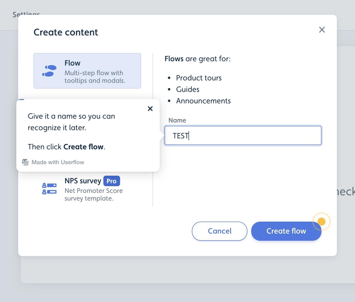
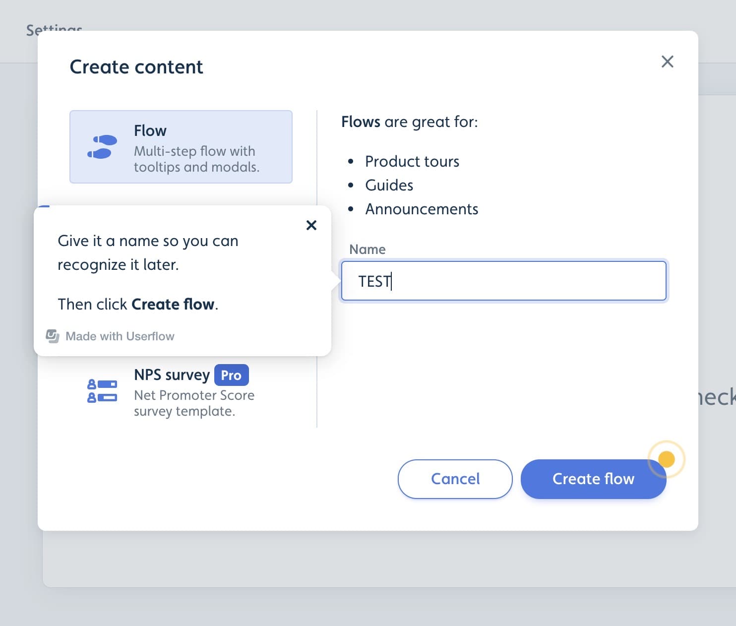
At the time of the screenshot, Userflow onboarded new users to flow creation with its own guides ("Made with Userflow"), pairing a tooltip with a hotspot. In the Create content modal, a tooltip beside the Name field says: "Give it a name so you can recognize it later. Then click Create flow." A pulsing yellow hotspot sits on the Create flow button itself, so the next click is marked even in a busy modal.
Why it works
✅ Tooltip and hotspot together: the tooltip explains what to do, and the hotspot shows where to do it. Each pattern covers the other's weak spot.
✅ Dismissible tooltip: users who already know what to type can close the tooltip with its × and carry on, since the step doesn't depend on it.
✅ No need for a backdrop: instead of dimming the screen around the target, the hotspot works as a beacon, so the rest of the modal stays readable and usable.
More on this pattern: UX/UI hotspots and tooltips in web design.