User onboarding
Notion’s initial onboarding keeps it nice and short
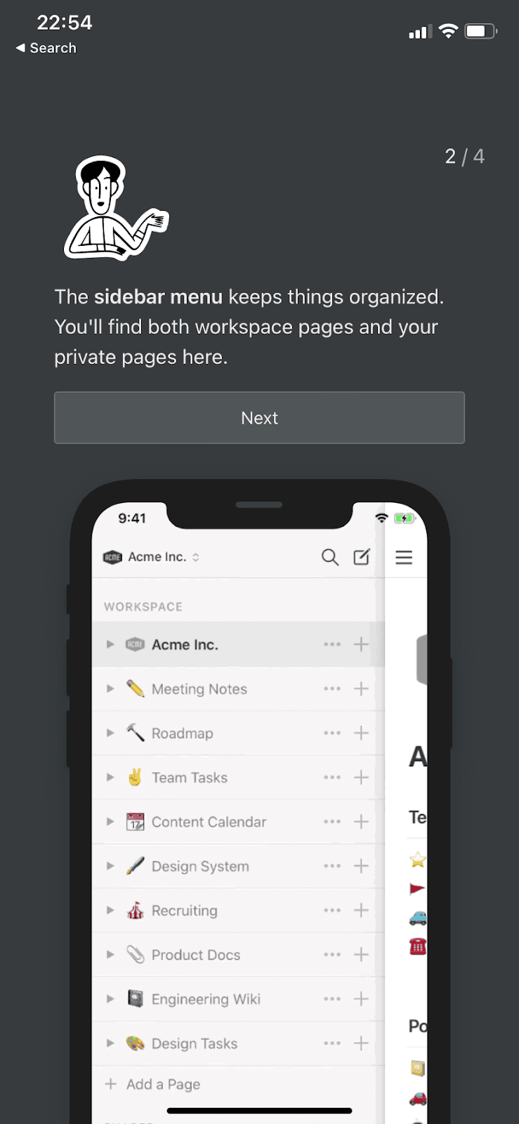
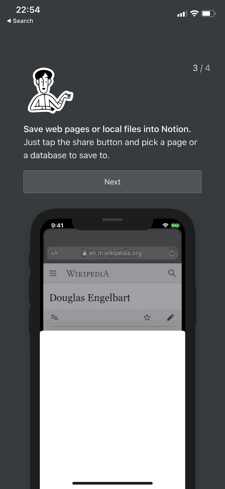
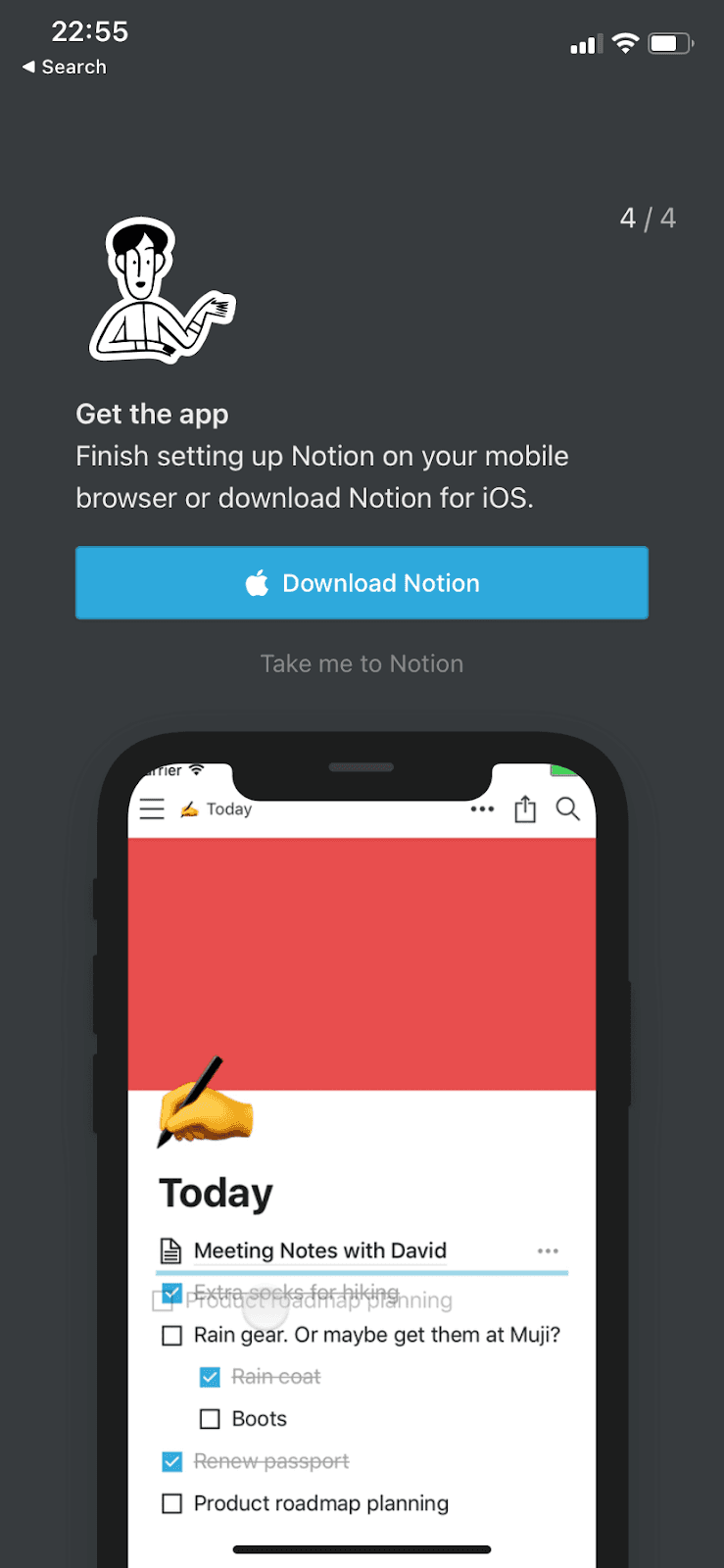
Notion’s mobile onboarding is four screens of essential tips, each a sentence or two long with a demo on a phone mockup underneath.
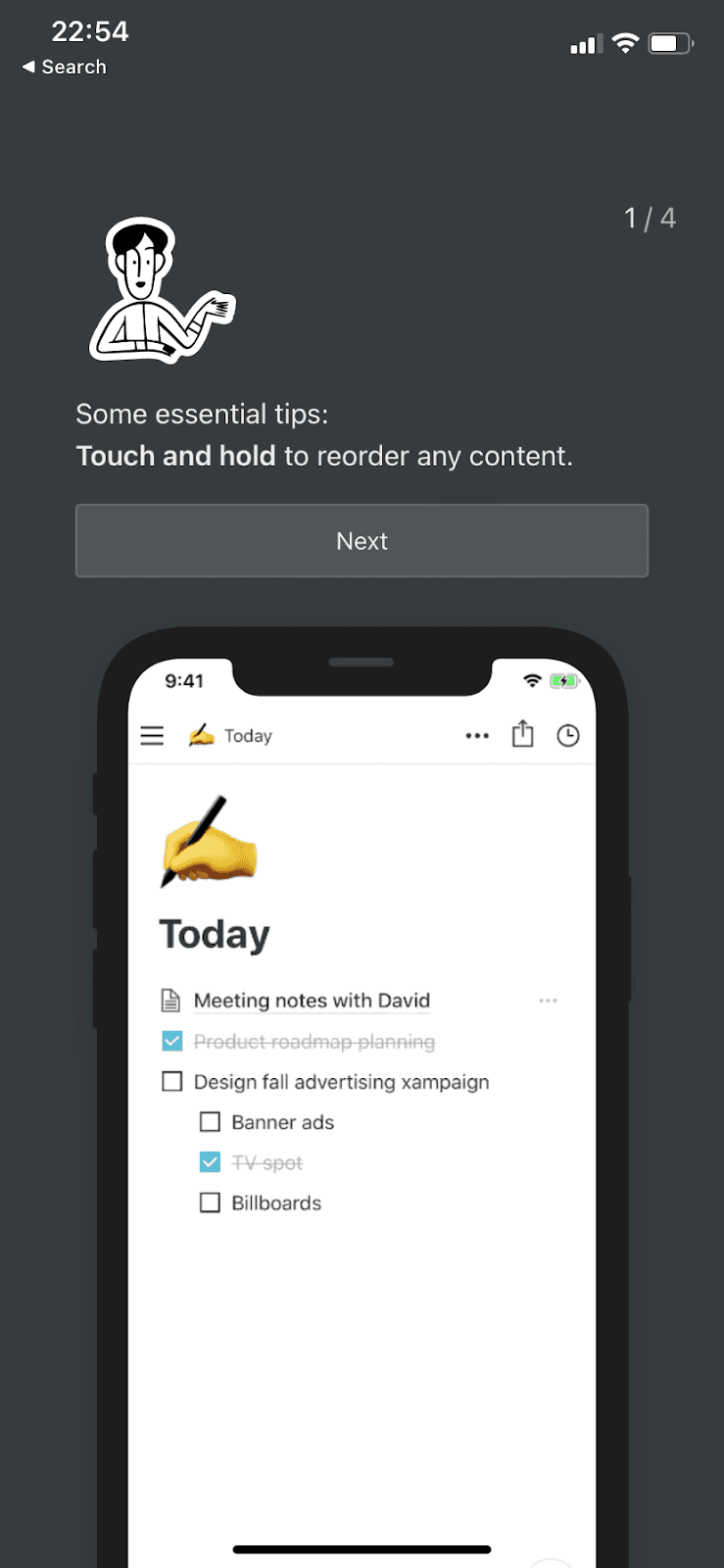
At the time of the screenshot, Notion’s mobile onboarding was a sequence of four onboarding screens, numbered 1/4 to 4/4. Each has the same illustrated character, a sentence or two with the key action in bold, a Next button and a demo on a phone mockup. The tips cover the essentials: touch and hold to reorder content, use the sidebar menu to find workspace and private pages, and save web pages or local files into Notion from the share button. The last screen offers Download Notion (for iOS) or Take me to Notion.
Why it works
- Actually helpful: the tips cover actions people use all the time (reordering, finding pages, saving from other apps), which helps them make a quick start.
- Short and precise: four screens of one or two sentences each fit Notion’s minimal style and can be read in seconds.
- Media support: the phone mockup under each tip shows the action in the app, so users recognise it when they meet it.
More on this pattern: mobile app onboarding and app onboarding screens.