Modal · First use
Adobe Creative Cloud’s welcome modal is formal but nice
Adobe Creative Cloud's one-step welcome modal uses three icons and two short paragraphs to tell new users what the desktop app is for.
Screenshot added to the library in April 2023; its exact capture date wasn’t recorded, and the product may look different today. Write-up reviewed 22 Oct 2026.
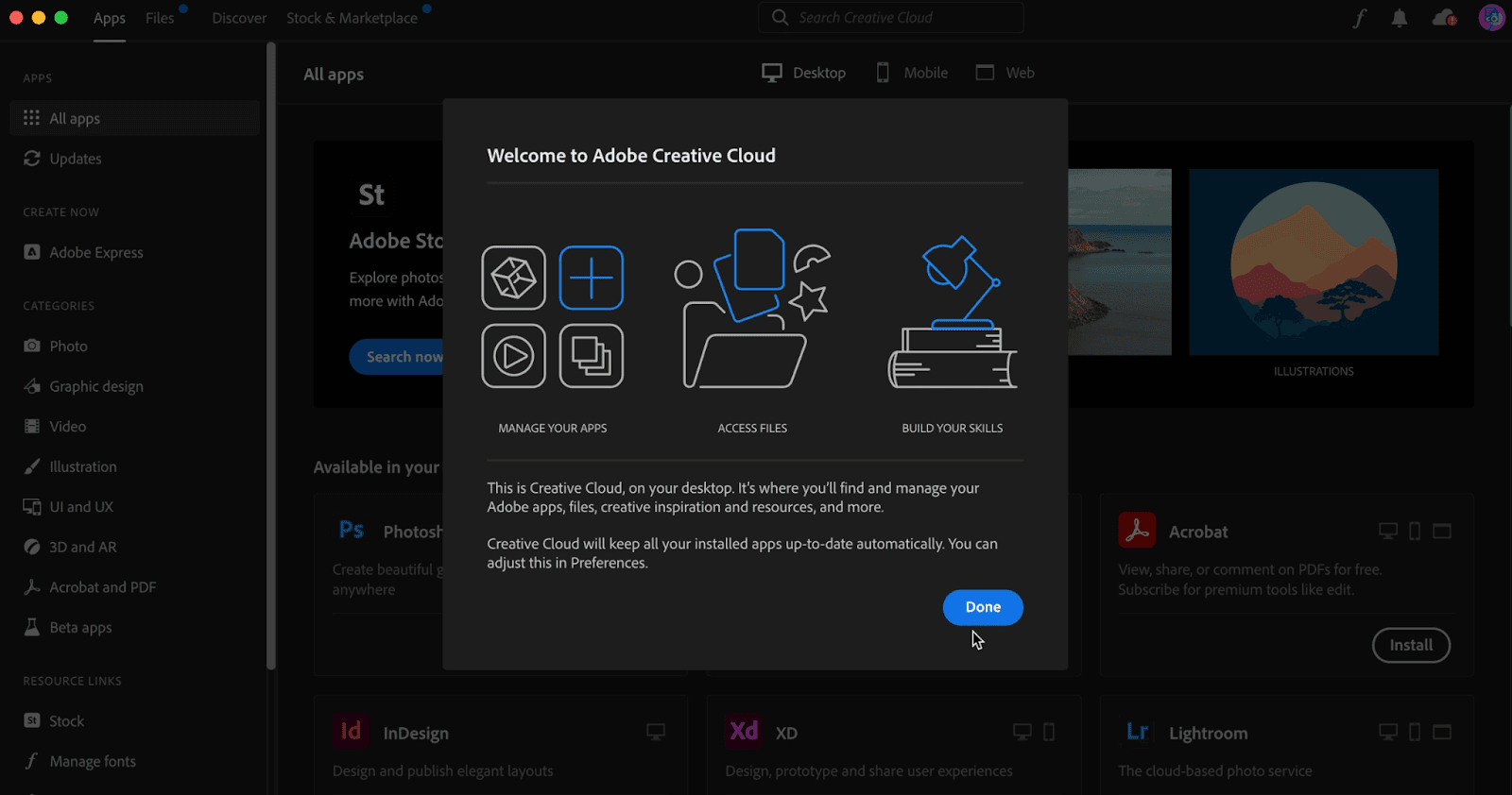
At the time of the screenshot, the Adobe Creative Cloud desktop app greeted new users with a one-step welcome modal over its All apps screen. Three line icons name what the app does (Manage your apps, Access files, Build your skills). Below them, two short paragraphs explain that Creative Cloud is where you find your Adobe apps, files and resources, and that it keeps installed apps up to date. A single Done button closes it.
Why it works
✅ Illustrated use cases: the three icons and their labels sum up the app's main jobs before the user reads a sentence. The tone of the copy is formal, but the illustrations keep the modal light.
✅ Short, useful copy: two paragraphs cover what the app is and one thing it does for you automatically, with a pointer to Preferences if you want to change it.
✅ One step, one button: there is no sequence to click through, so the modal costs the user a few seconds before they reach their apps.
More on this pattern: UI modals and onboarding UI.