User onboarding
Tumblr’s feedback survey is fun and friendly
Tumblr asks how users feel about its app with three faces, then answers each choice with playful copy and a matching next step.
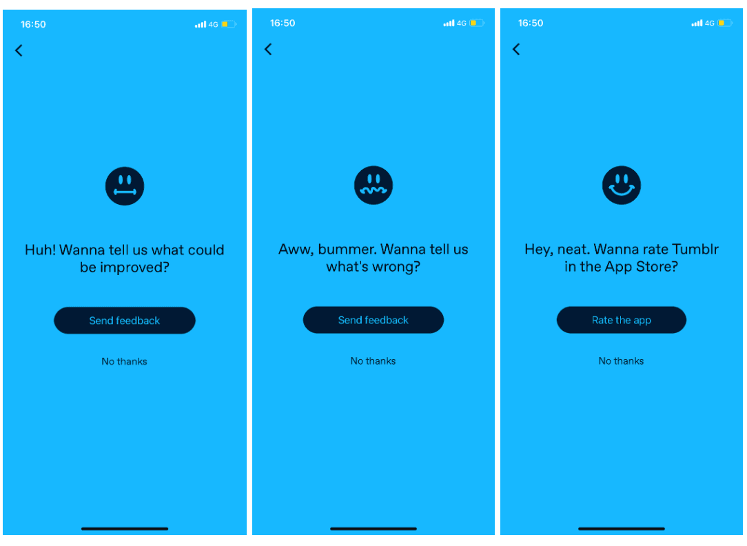
At the time of the screenshot, Tumblr’s mobile app ran a one-question feedback survey on a bright blue screen: "Real quick. What do you think of the Tumblr app?", answered with a sad, neutral or happy face. Each answer gets its own reply. Neutral: "Huh! Wanna tell us what could be improved?" Sad: "Aww, bummer. Wanna tell us what’s wrong?" Both offer Send feedback. Happy: "Hey, neat. Wanna rate Tumblr in the App Store?", with Rate the app. Every screen has a No thanks link and a way back or out.

Why it works
- Fun copy: lines like "Aww, bummer" sound like Tumblr, so answering feels more like a chat than a form.
- Easy to skip: the first screen has a close button, and every follow-up has a back arrow and No thanks.
- Follow-ups that match the answer: neutral and unhappy users are asked for feedback, and only happy users are asked to rate the app in the App Store, which steers public ratings towards people who like it.
More on this pattern: in-app survey types and onboarding UX writing.