Product Tours · Built with WalkMe
Typeform’s product tour is super laid-back
Typeform opens its product tour with a relaxed modal that promises a quick look at the highlights and makes saying no just as easy.
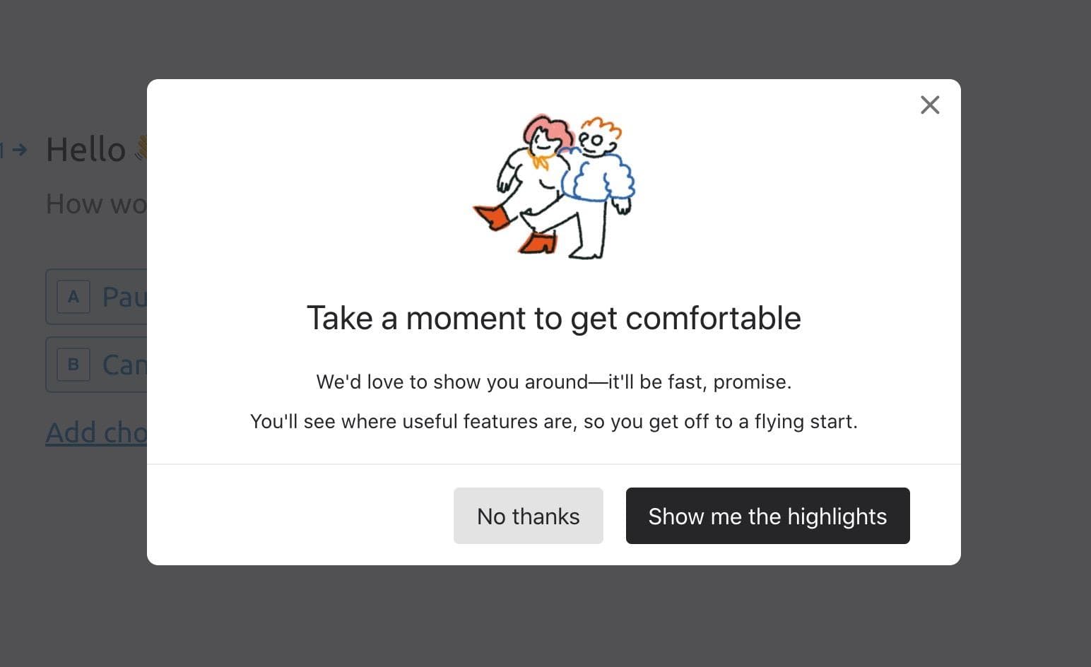
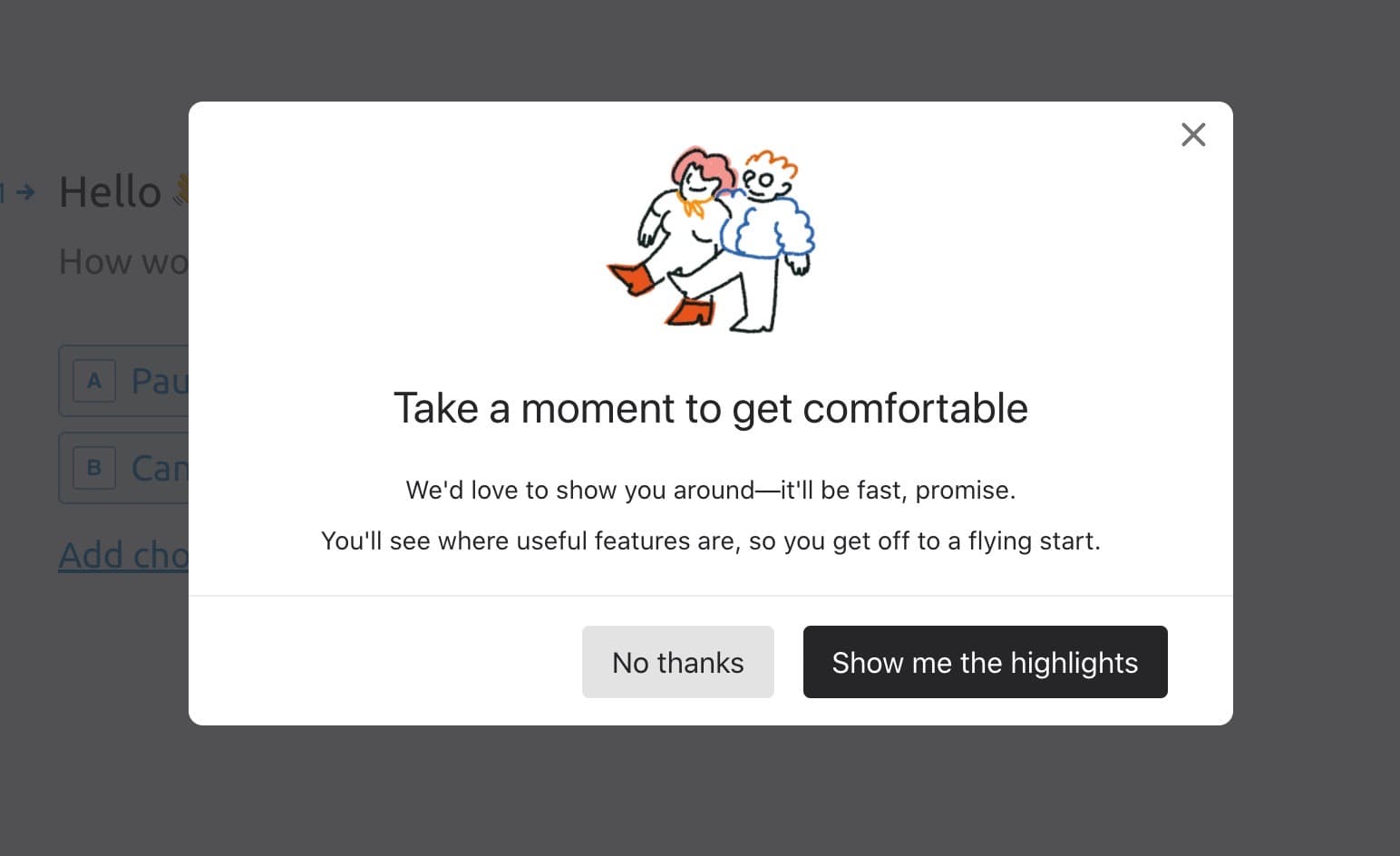
At the time of the screenshot, Typeform began its product tour with a modal over the form builder. A small hand-drawn doodle of two people sits above the heading "Take a moment to get comfortable" and two friendly lines: Typeform would love to show you around, it’ll be fast, and you’ll see where the useful features are. The main button reads "Show me the highlights", with a No thanks button beside it and a close icon in the corner.
Why it works
- Friendly and understanding: the heading invites users to settle in before anything is asked of them, a calmer start than most tours.
- Good copy: "Show me the highlights" instead of "Start the tour" promises something short that covers only the important parts.
- A skip option that’s easy to find: No thanks is a full-size button next to the main one, on top of the close icon, which keeps frustration low for anyone who doesn’t want the tour.
More on this pattern: product tours and onboarding UX writing. This tour is listed as built with WalkMe; see the WalkMe review.