User onboarding
ProductLed’s exit modal is extra encouraging with countdown
ProductLed shows leaving visitors an exit modal for its next course cohort, with a live countdown to the enrolment deadline and one button.
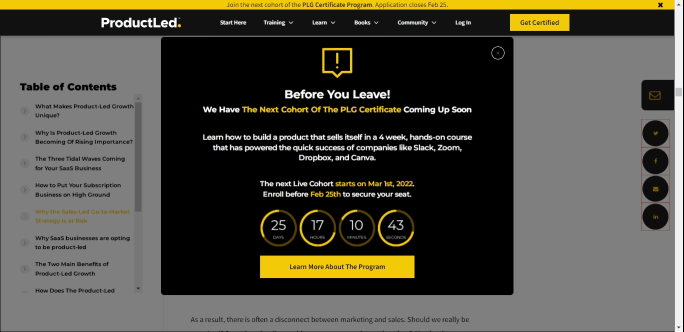
Exit modals don't look like part of onboarding, but they can be where it starts. ProductLed uses an exit modal on its website to remind leaving visitors about the next live cohort of its PLG Certificate course. At the time of the screenshot, the black and yellow modal is headed "Before You Leave!", describes the course in one sentence, gives the start date and the enrolment deadline, and shows a countdown in days, hours, minutes and seconds. A single "Learn More About The Program" button and a close button sit below. An announcement bar across the top of the site carries the same message.
Why it works
- Copy and formatting: the site's black and yellow theme does the highlighting, with key phrases and dates in yellow so the short copy can be read at a glance.
- A countdown that moves: a live timer is more engaging than a static date, and it suits a deadline-driven offer.
- The right patterns together: the announcement bar introduces the idea quietly while visitors browse, and the exit modal makes the ask only when they're about to go.
More on this pattern: website onboarding and how companies use UI modals.