Onboarding teardown · Figma
Figma onboarding, screen by screen: from signup to a first wireframe
We had an AI agent sign up for Figma's free Starter plan as a fictional product manager and go through onboarding until it had put a first line of text in a wireframe. A person stepped in twice, to accept the terms and to solve a puzzle CAPTCHA. These are the screens it saw, in order, with what each one does well and what gets in the way.
By the UserOnboarding Academy teamRecorded 5 Nov 2026How we recorded it
UserOnboarding Academy isn't owned by Figma or any onboarding tool, and Figma didn't sponsor or review this page. The account was created for this recording only.
In short
Figma signs a new user up in a modal over its homepage, then asks for a three-round puzzle and an emailed link before anything else. Setup is six short screens, and the first four carry a live preview that shows each answer at work: your name on a cursor, invitees as more cursors. The plan screen preselects nothing, and skipping the last screen opens a blank design file. There the welcome is about Figma's AI agent and code layers rather than the role the user just picked, and the first frame and text come from tools the user finds alone.
- Screens to first value
- 15
- Setup questions
- 3
- Form fields shown
- 8
- Steps a person did
- 2
The flow at a glance
marks a step a person did
 01Homepage with two Get started buttons
 02Welcome to Figma modal over the homepage
 03The modal adds a password and the terms
 04A three-round puzzle before the account exists
 05Check your inbox for a verification link
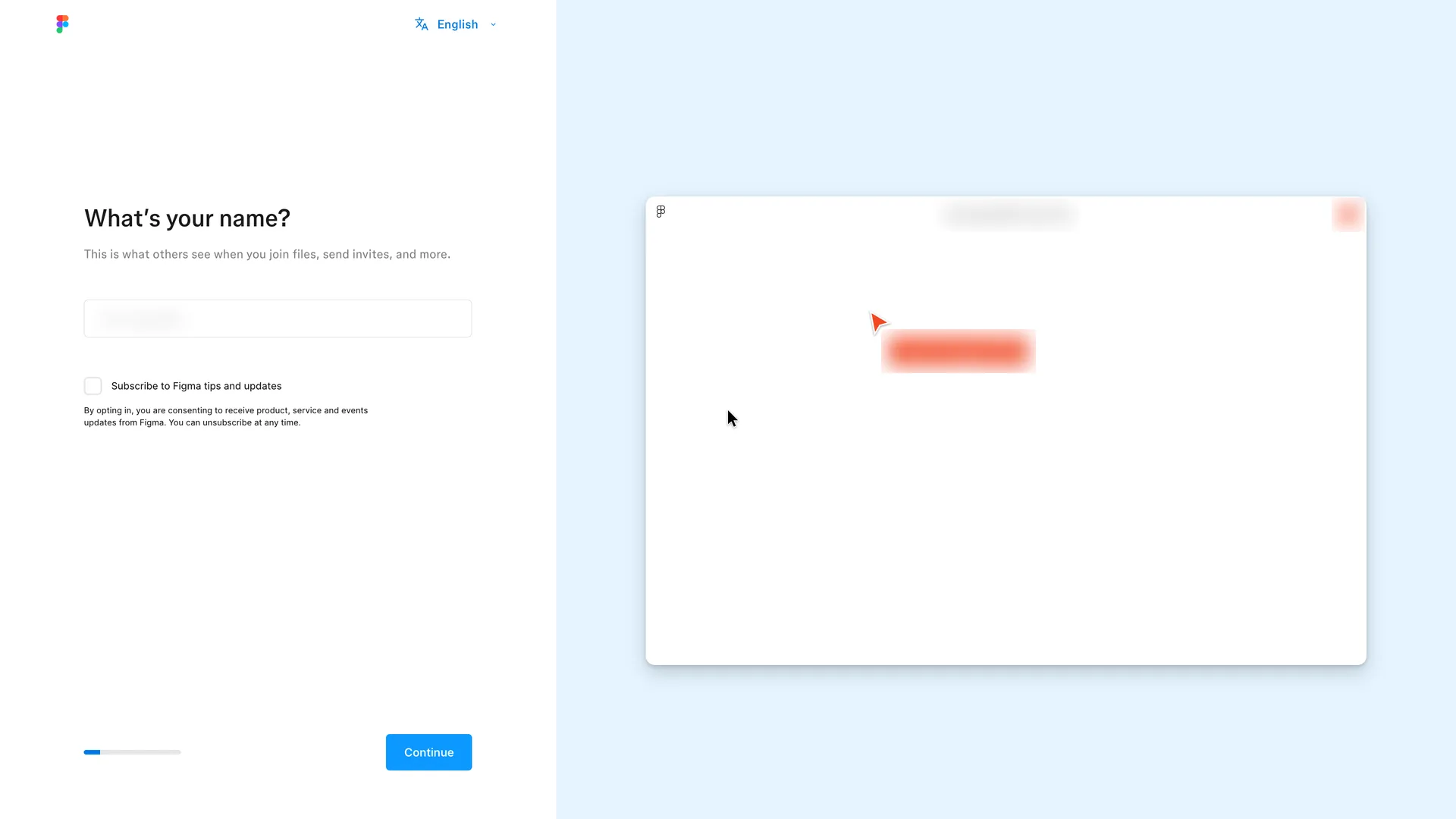 06What's your name, step 1 of 6, with a live file preview
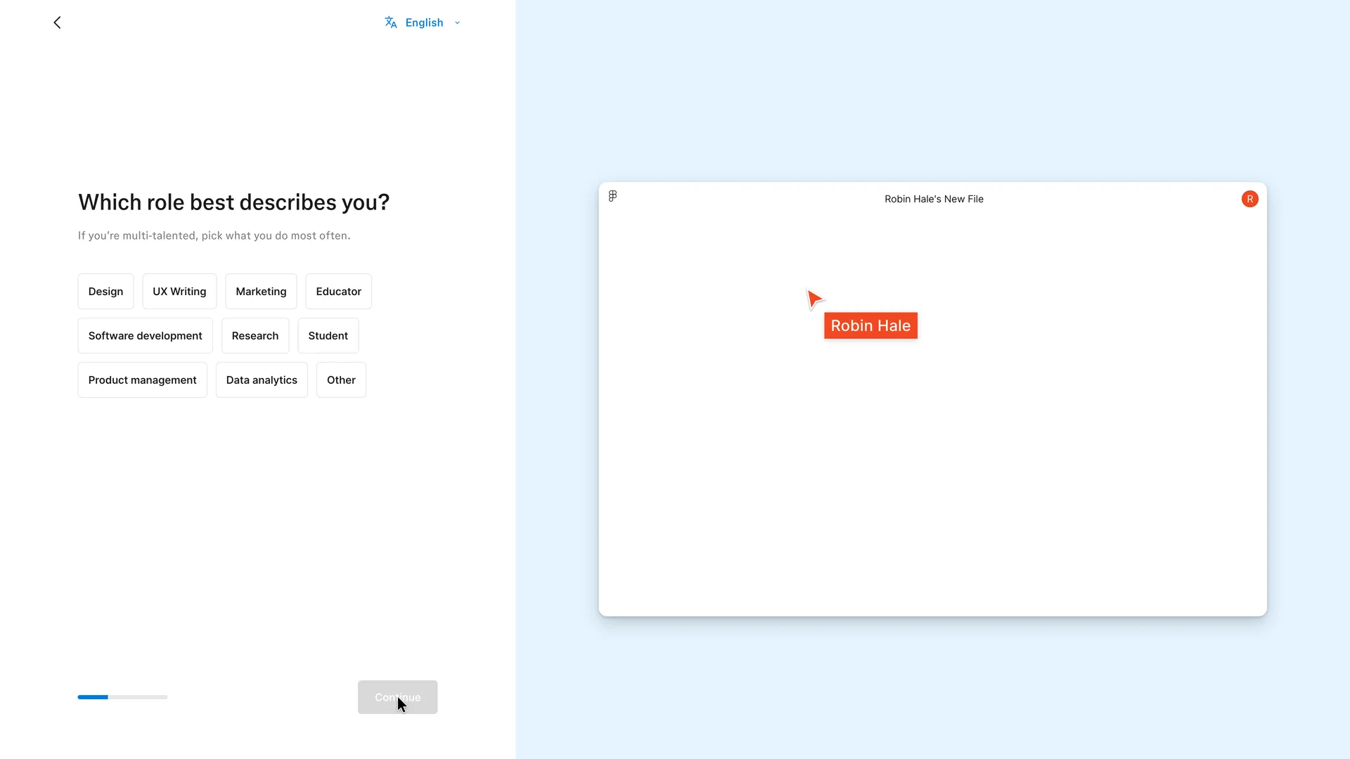 07Which role best describes you, step 2 of 6
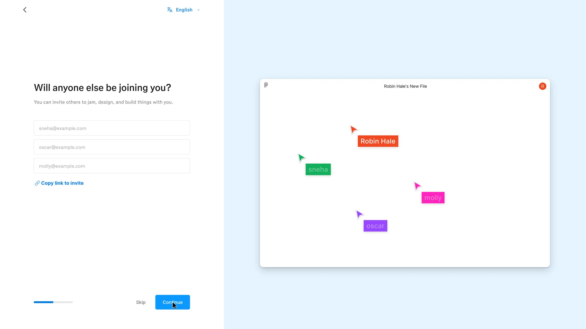 08Will anyone else be joining you, step 3 of 6
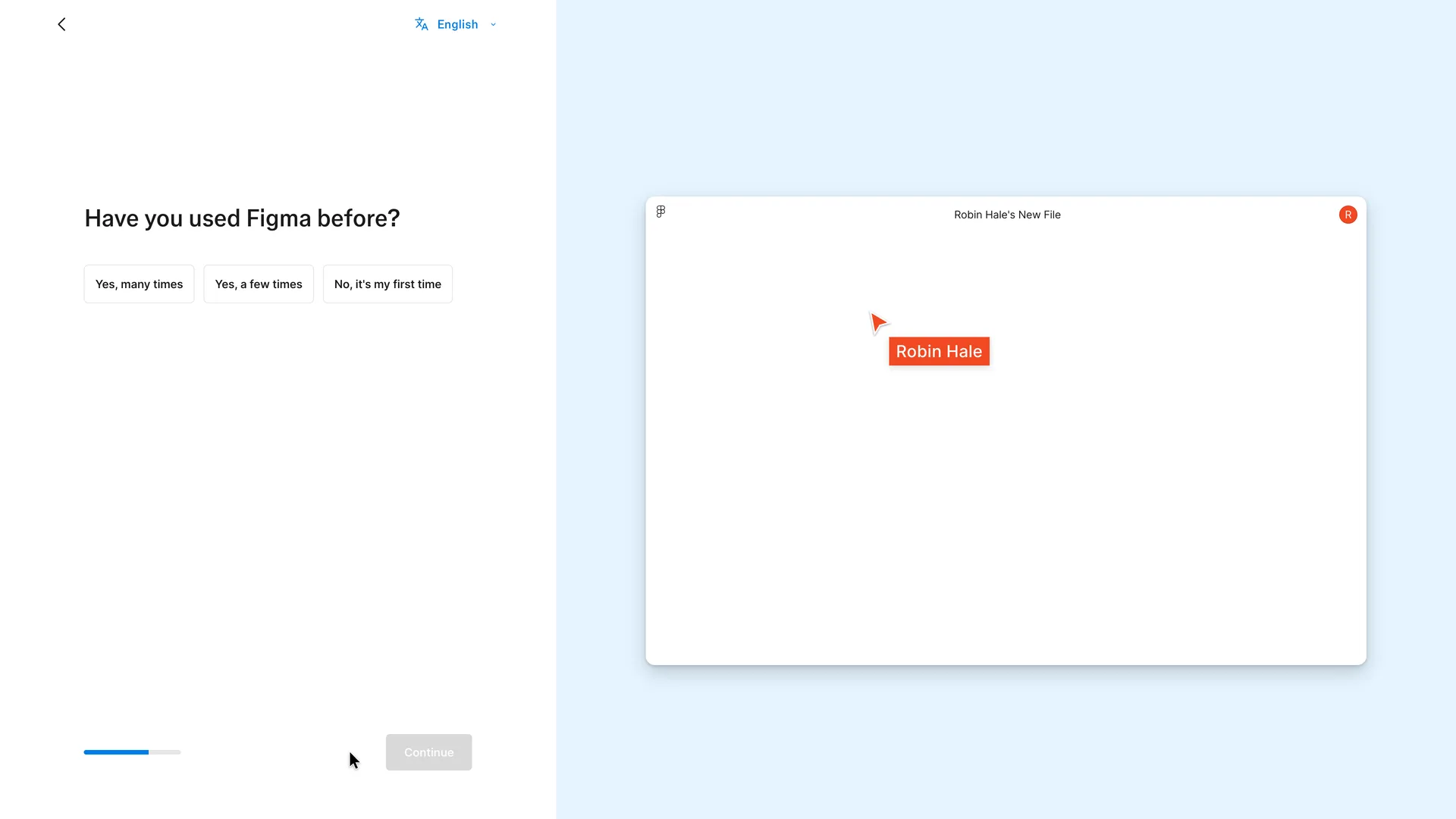 09Have you used Figma before, step 4 of 6
 10Which plan would you like, step 5 of 6
 11Prompt a design with Figma's agent, the last setup screen
 12An untitled design file with the agent panel and a Code tooltip
 13The Frame tool lists device sizes
 14A blank Wireframe frame, already attached to the agent prompt
 15 · first valueFirst value: Robin's first text layer in the wireframe
Step 1 of 15:Other
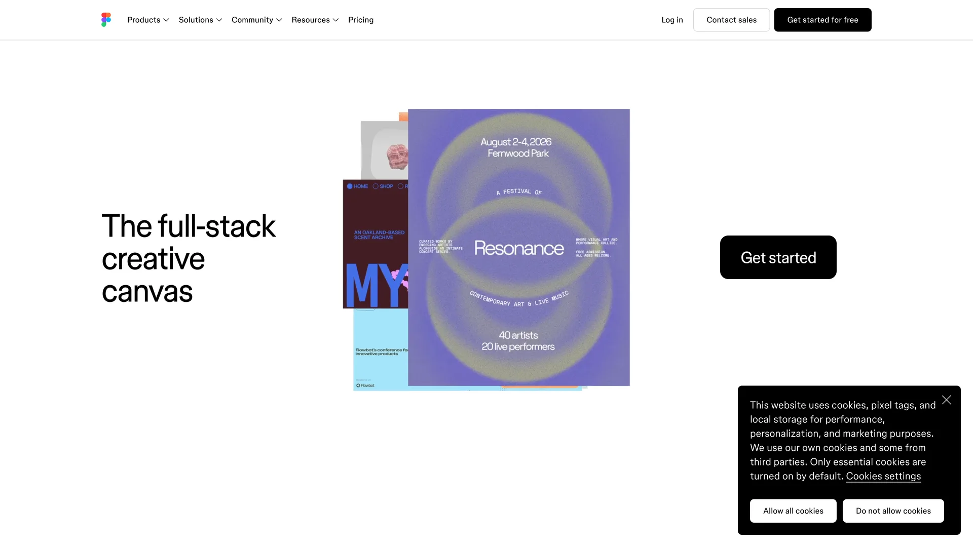
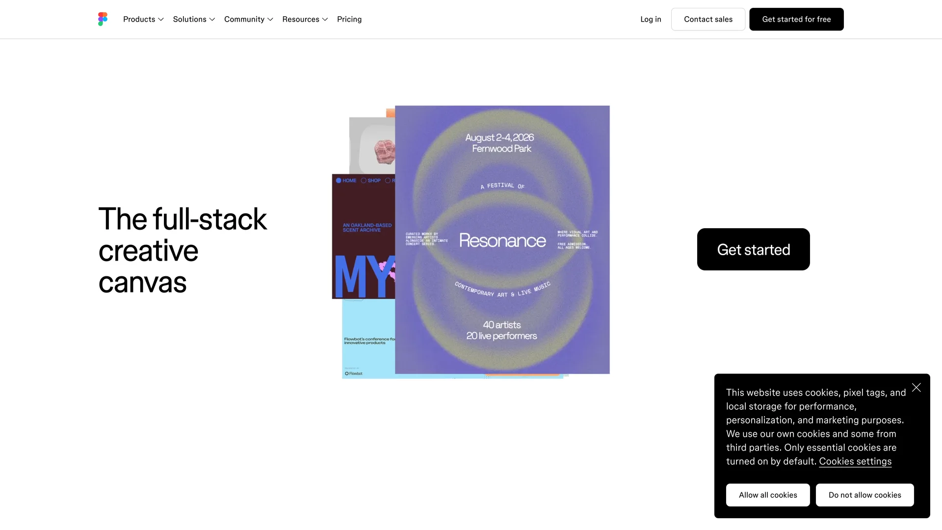
Homepage with two Get started buttons
Pressed Do not allow cookies on the cookie banner, then Get started for free in the header
Why it works
One action repeated twice, and both buttons go to the same plain signup. The cookie choice is even-handed: refusing is as easy as accepting.
What gets in the way
The hero names no product. A visitor who searched for Figma sees "creative canvas" and a festival poster, not design files or whiteboards.
What’s on this screen
The hero reads "The full-stack creative canvas" beside a collage of sample designs and one large Get started button. The header has Products, Solutions, Community, Resources, Pricing, then Log in, Contact sales and a black Get started for free. A cookie dialog sits bottom right: only essential cookies are on by default, with Allow all cookies and Do not allow cookies as two equal white buttons and a Cookies settings link. Every signup link on the page goes to figma.com/signup with no plan or trial flag.
Step 2 of 15:Signup form
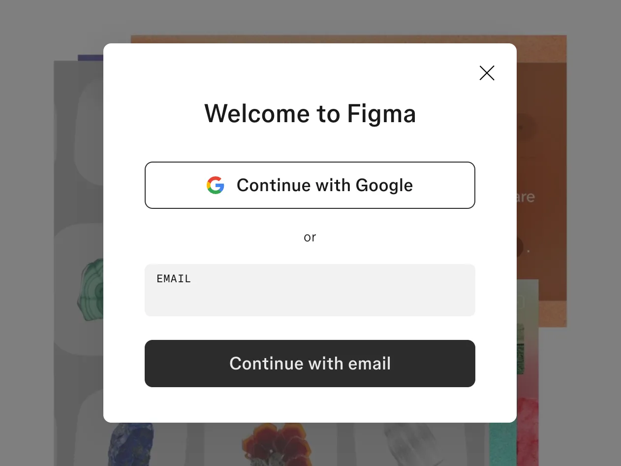
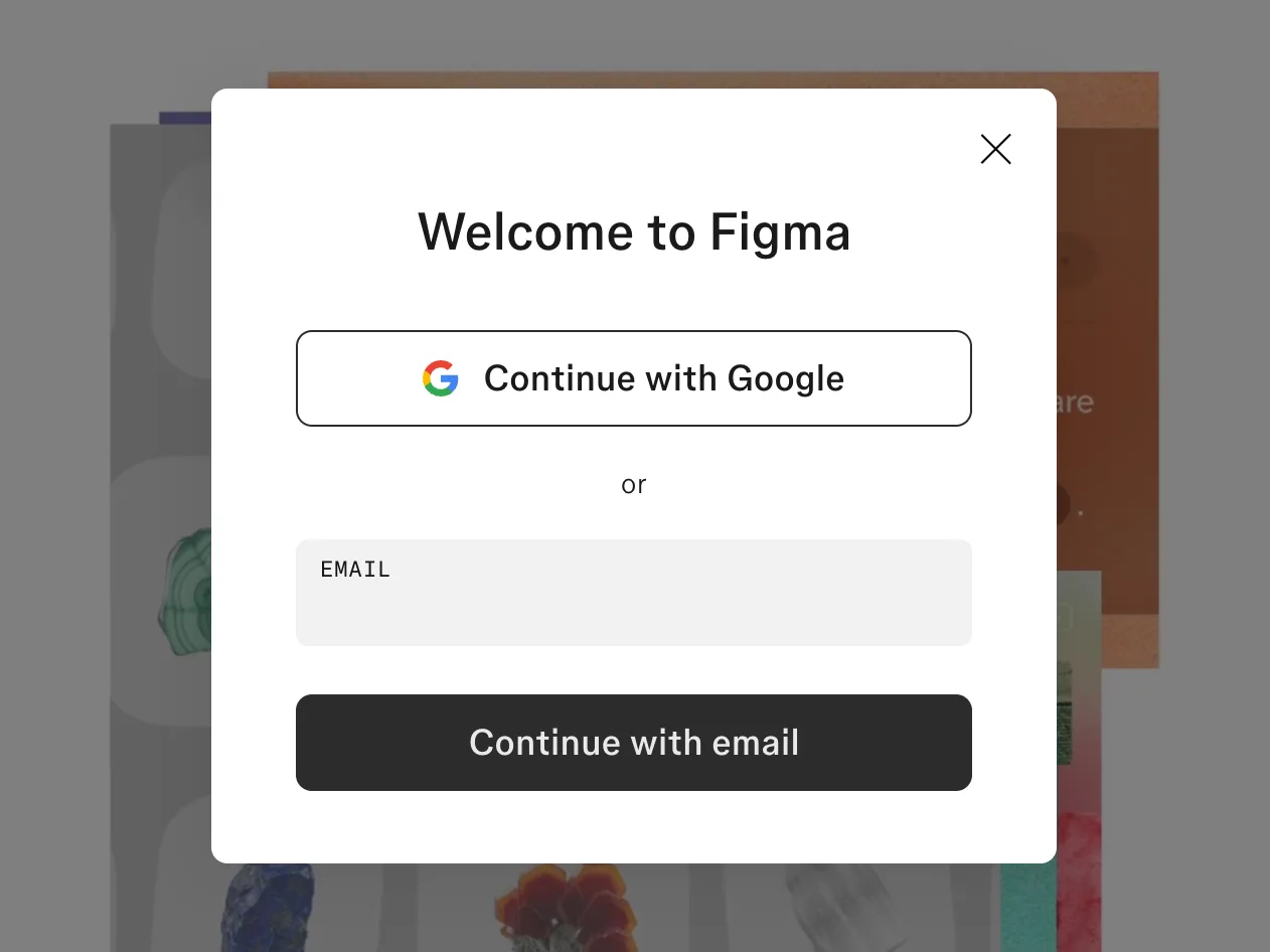
Welcome to Figma modal over the homepage
Typed the email and pressed Continue with email
Why it works
One field and one button. Staying on the homepage keeps the visitor in context, and the same modal works for new and returning users, so nobody has to choose between Sign up and Log in first.
What gets in the way
Nothing on the modal says this creates an account or that Figma has a free plan; the button label from the homepage (for free) doesn't carry over.
What’s on this screen
Get started for free doesn't leave the homepage: a modal titled "Welcome to Figma" opens over the dimmed hero. It offers Continue with Google, or one Email field and Continue with email. There is no terms notice, no password field and no mention of plans or price at this point. The dialog is labelled Log in for screen readers, and the same modal serves people who already have an account.
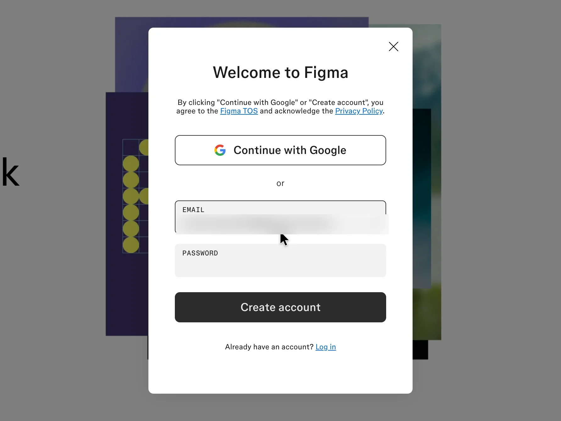
Step 3 of 15:Signup formDone by a person
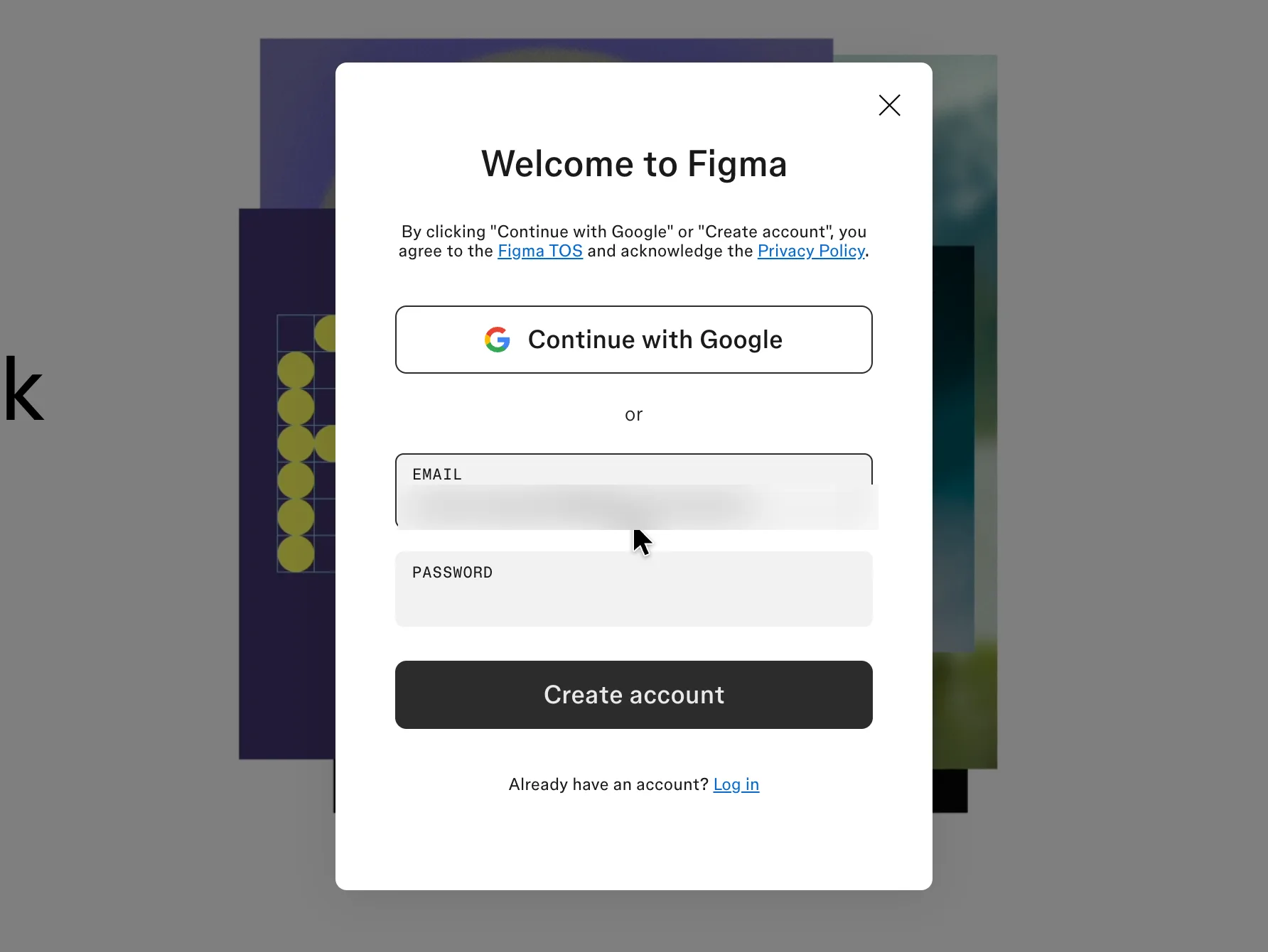
The modal adds a password and the terms
Typed a password; a person (Mert) pressed Create account, which accepts Figma's terms
Why it works
The form only asks for a password once Figma knows the address is new, and the terms sit above both ways in, so either button reads as the agreement.
What gets in the way
No password rules until something goes wrong, and no show-password toggle.
What’s on this screen
For an address with no account the modal grows in place: a terms line appears at the top (clicking Continue with Google or Create account agrees to the Figma TOS and acknowledges the Privacy Policy), the email stays filled in, a Password field appears, and the button becomes Create account. Below it: Already have an account? Log in. No name field, no password rules shown and no marketing opt-in.
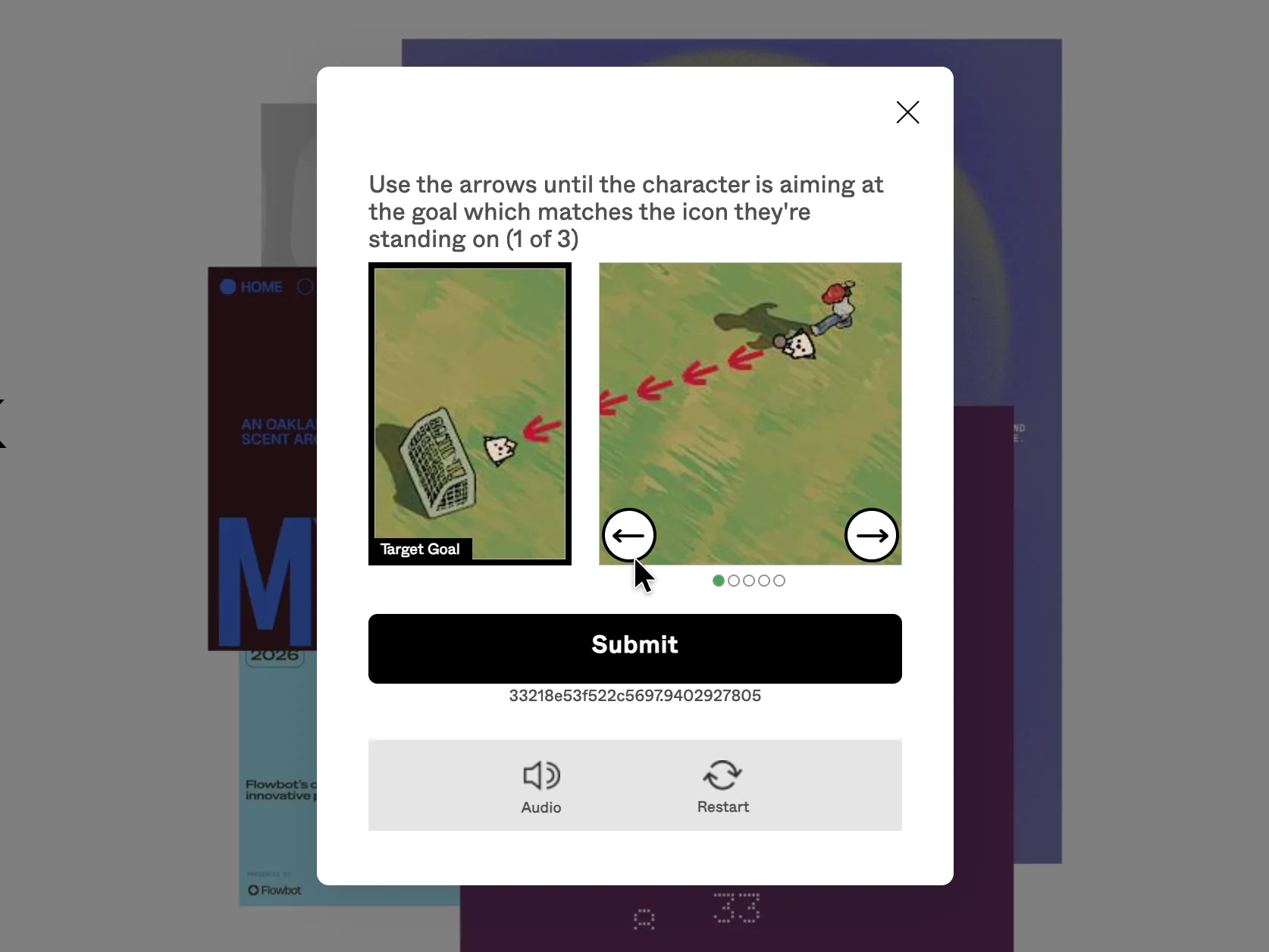
Step 4 of 15:OtherDone by a person
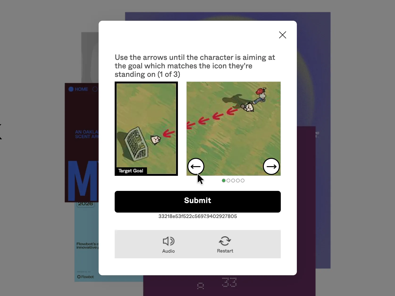
A three-round puzzle before the account exists
A person (Mert) solved the puzzle's three rounds and pressed Submit
Why it works
An audio alternative is offered, and the puzzle stays inside the same modal instead of sending the person to another page.
What gets in the way
Three rounds of a spatial puzzle come before a new user has seen anything of the product, with no word on why the check is there.
What’s on this screen
After Create account the modal first shows "Verifying browser...", then a visual puzzle: "Use the arrows until the character is aiming at the goal which matches the icon they're standing on (1 of 3)". A Target Goal picture sits beside a scene with left and right arrows, five dots, a Submit button, an ID string, and Audio and Restart buttons. Three rounds in all. The puzzle runs on Figma's own verification domains.
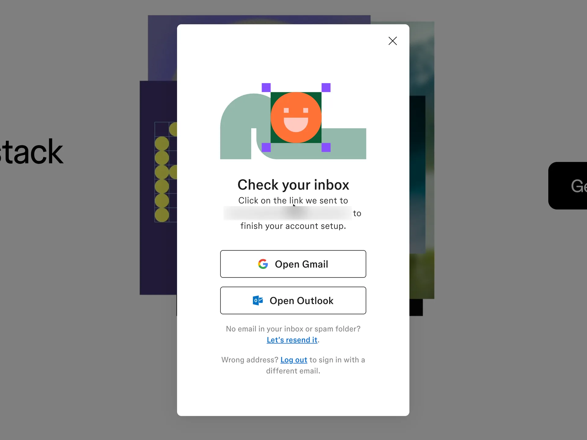
Step 5 of 15:Email verification
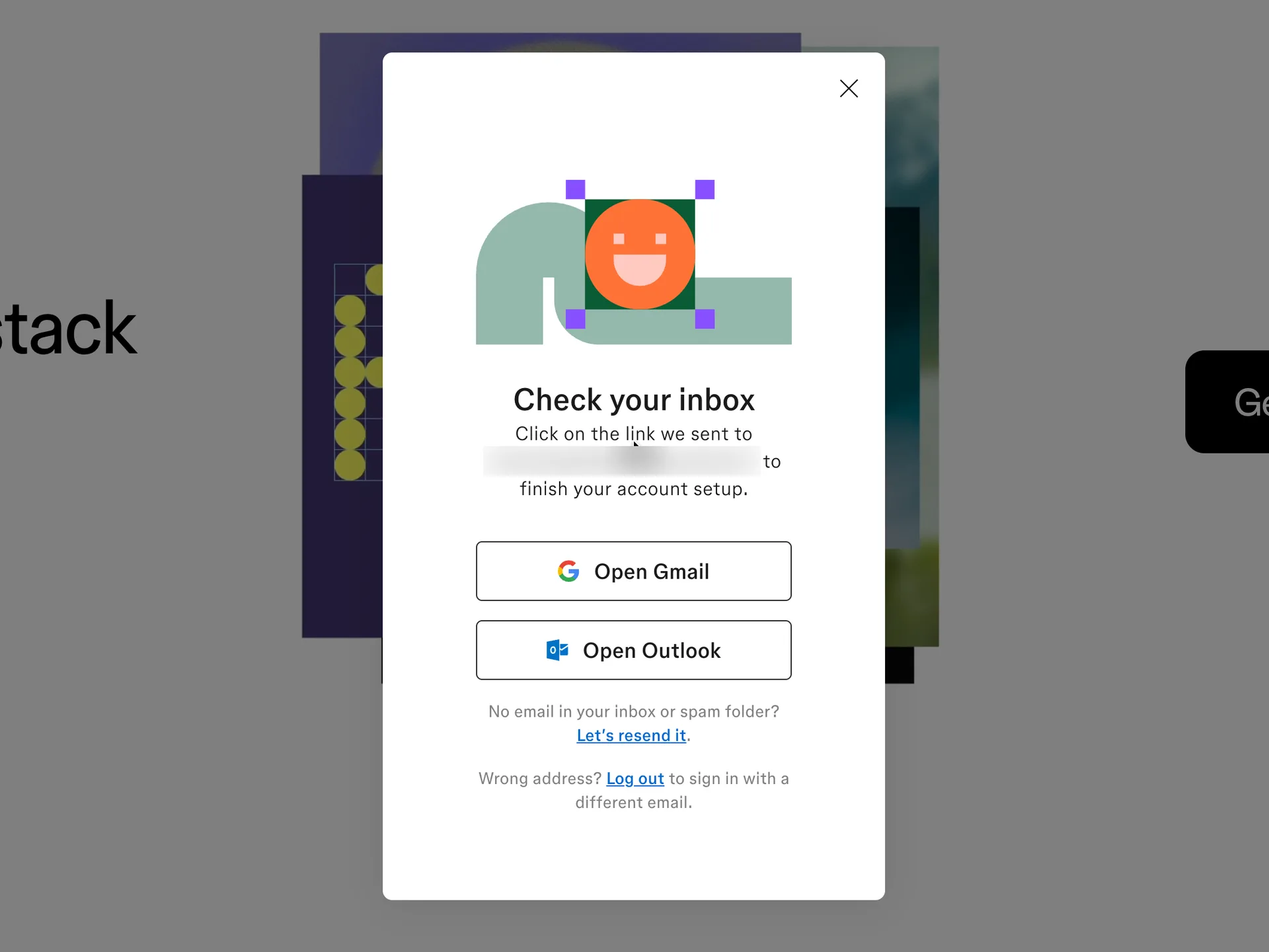
Check your inbox for a verification link
Opened the Verify email link from Figma's email ("Verify your email address") in the capture browser with browser_navigate
Why it works
Shortcut buttons to the two big webmail apps, a resend link that mentions the spam folder, and a way out for a mistyped address.
What gets in the way
Verification is a hard stop here: no code to type, so someone signing up on one device and reading mail on another has to move devices.
What’s on this screen
The modal changes to an illustration and "Check your inbox": click on the link we sent to the address to finish your account setup. Buttons Open Gmail and Open Outlook, then "No email in your inbox or spam folder? Let's resend it." and "Wrong address? Log out to sign in with a different email." There is no code field: the account can't go further until the link is opened. The email itself says only "To start using Figma, just click the verify email button below" with one Verify email button.
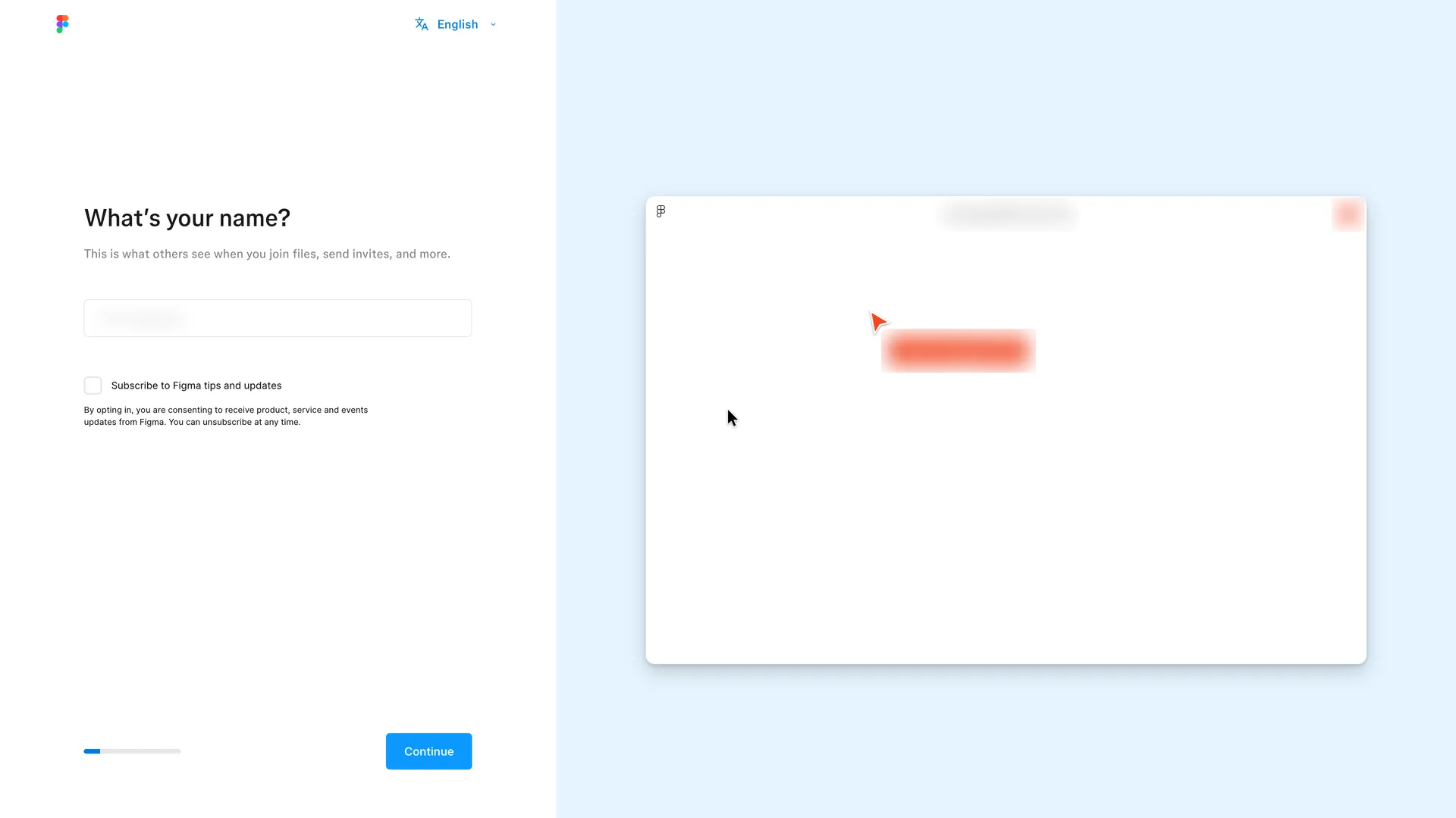
Step 6 of 15:Setup question
What's your name, step 1 of 6, with a live file preview
Typed Robin Hale, left the tips box unticked and pressed Continue
Why it works
The preview shows straight away why a name matters: it's the label on your cursor in a shared file. Marketing email is opt-in, and the progress bar says how far setup goes.
What gets in the way
Until the user types, Figma uses the email's local part as the name everywhere, including the preview file's title.
What’s on this screen
The verification link lands on the file browser (Recents) with a full-screen setup over it. Left: "What's your name?" and "This is what others see when you join files, send invites, and more." One Name field whose placeholder is the email's local part, an unticked "Subscribe to Figma tips and updates" box with a consent line, a thin progress bar and Continue (the snapshot labels it Step 1 of 6). Right: a live preview of a file called "<local part>'s New File", with a red multiplayer cursor labelled with the same name and an avatar initial.
Step 7 of 15:Setup question
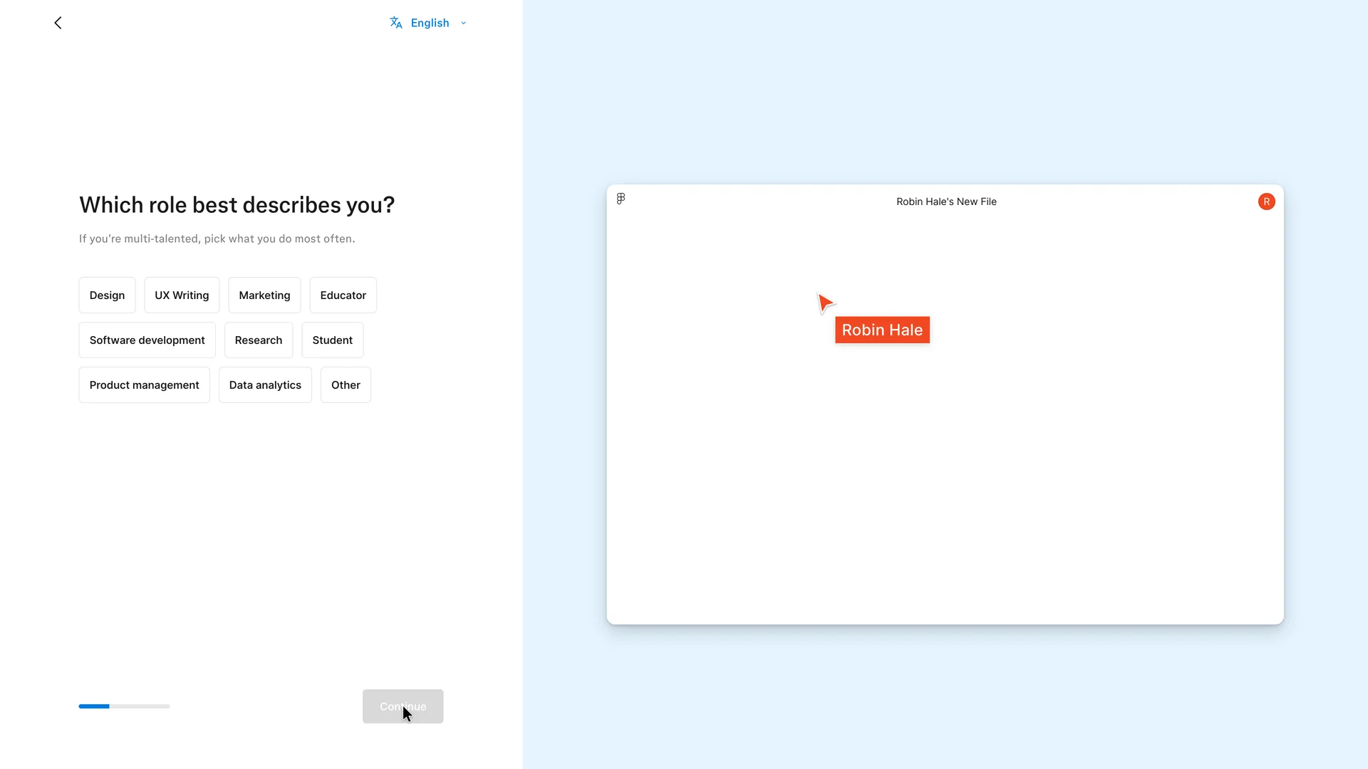
Which role best describes you, step 2 of 6
Chose Product management and pressed Continue
Why it works
One tap, plain role names, and the preview proves the previous answer landed. Product management is listed as a role in its own right, not folded into Other.
What gets in the way
Picking a role changes nothing in the preview, so the question's purpose isn't shown the way the name's was.
What’s on this screen
"Which role best describes you?" with the hint "If you're multi-talented, pick what you do most often." Ten chips: Design, UX Writing, Marketing, Educator, Software development, Research, Student, Product management, Data analytics, Other. Continue stays disabled until one is picked. A Back arrow appears top left. The preview on the right now reads "Robin Hale's New File", with the cursor label Robin Hale and the avatar R.
Step 8 of 15:Invite teammates
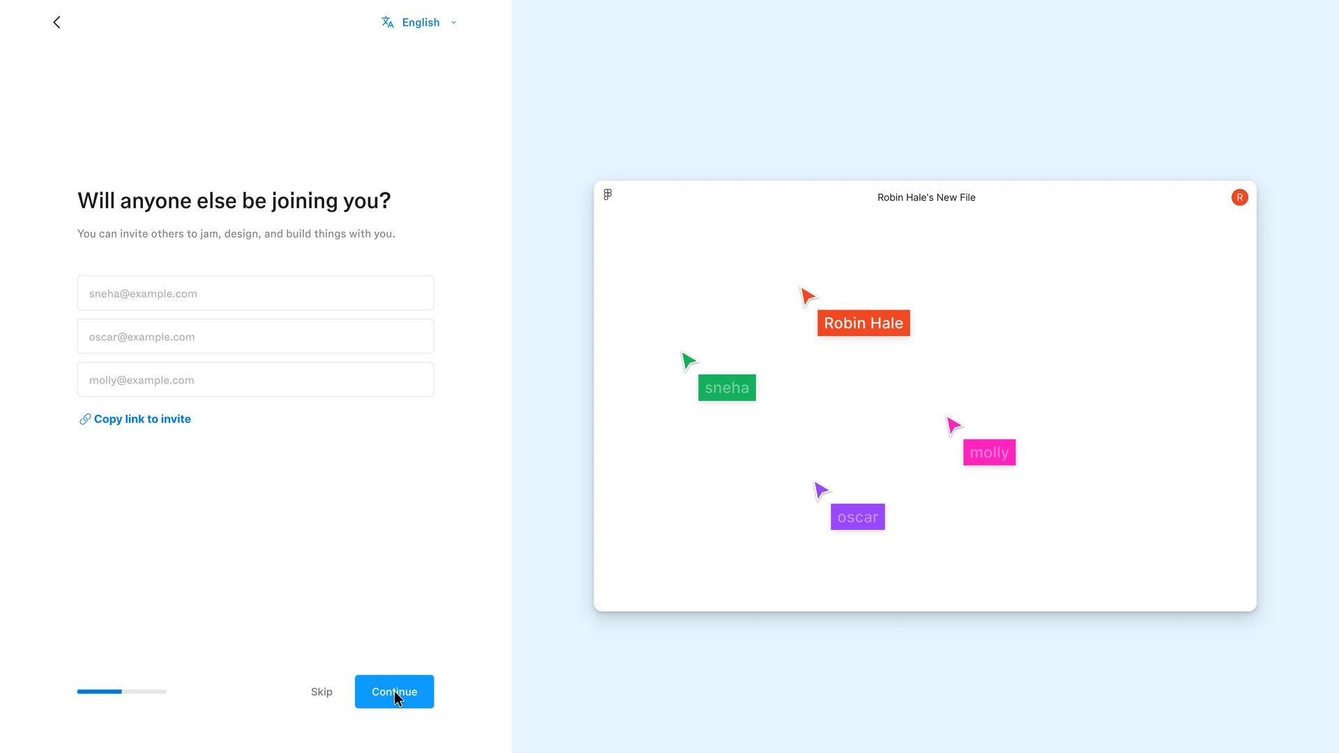
Will anyone else be joining you, step 3 of 6
Invited no one and pressed Skip
Why it works
The preview shows what inviting is for (other people's cursors in the same file) without saying it. Skip sits in plain view, the fields are empty rather than prefilled, and a link is offered for people who'd rather share it themselves.
What gets in the way
The invite question comes third, before the user has made anything to invite people to, and Continue is the highlighted button even with every field empty.
What’s on this screen
"Will anyone else be joining you?" and "You can invite others to jam, design, and build things with you." Three empty email fields with sample addresses as placeholders, a Copy link to invite link, then Skip (grey text) beside a blue Continue. In the preview, three more cursors appear next to Robin's, labelled with the placeholder names sneha, oscar and molly.
Step 9 of 15:Setup question
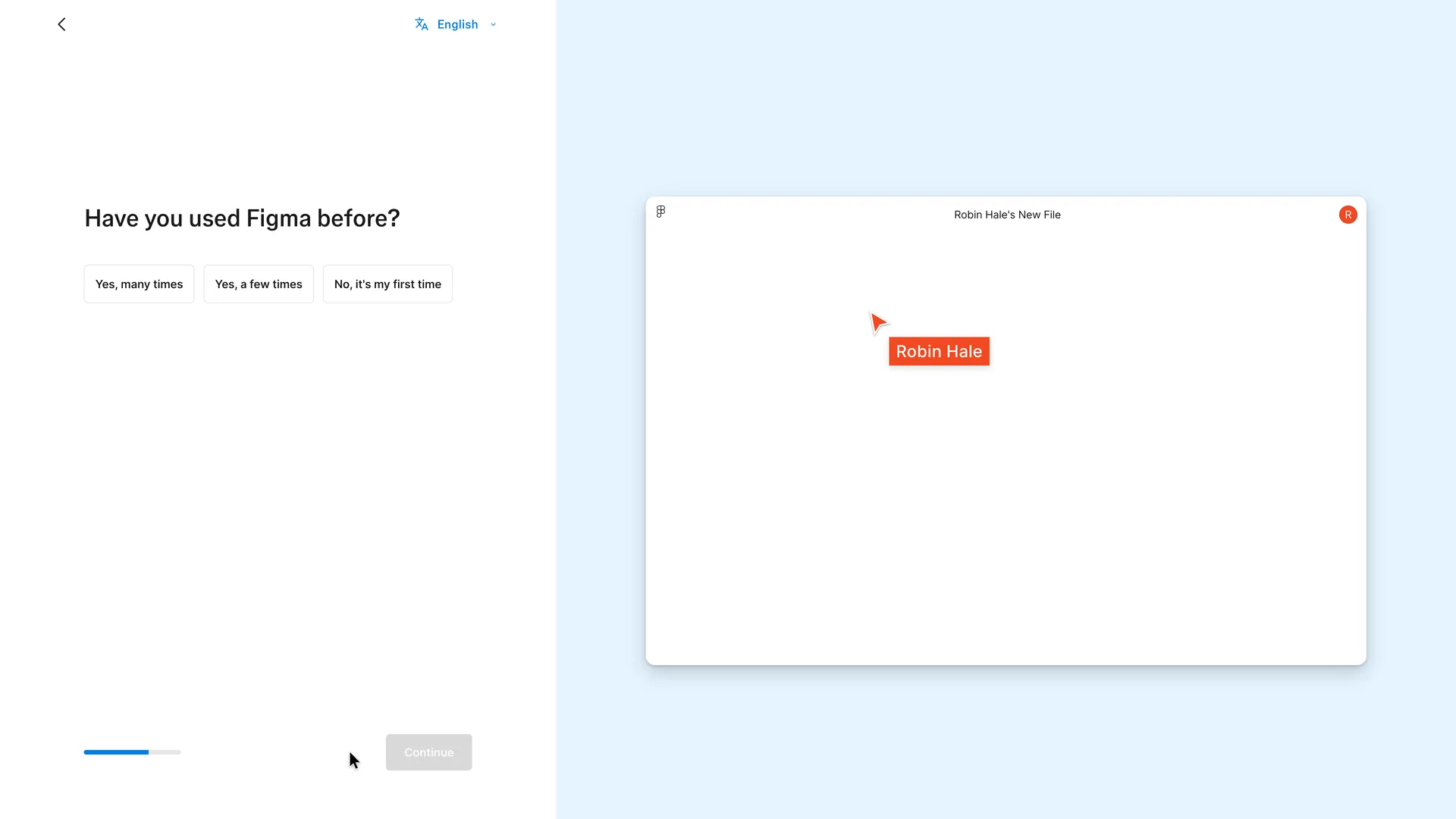
Have you used Figma before, step 4 of 6
Chose No, it's my first time and pressed Continue
Why it works
An experience question tells Figma how much hand-holding to give, and three plain answers make it a single tap.
What gets in the way
Nothing says what changes with the answer.
What’s on this screen
"Have you used Figma before?" with three chips: Yes, many times; Yes, a few times; No, it's my first time. No hint line. Continue is disabled until one is chosen. The preview goes back to Robin's single cursor in Robin Hale's New File.
Step 10 of 15:Plan choice
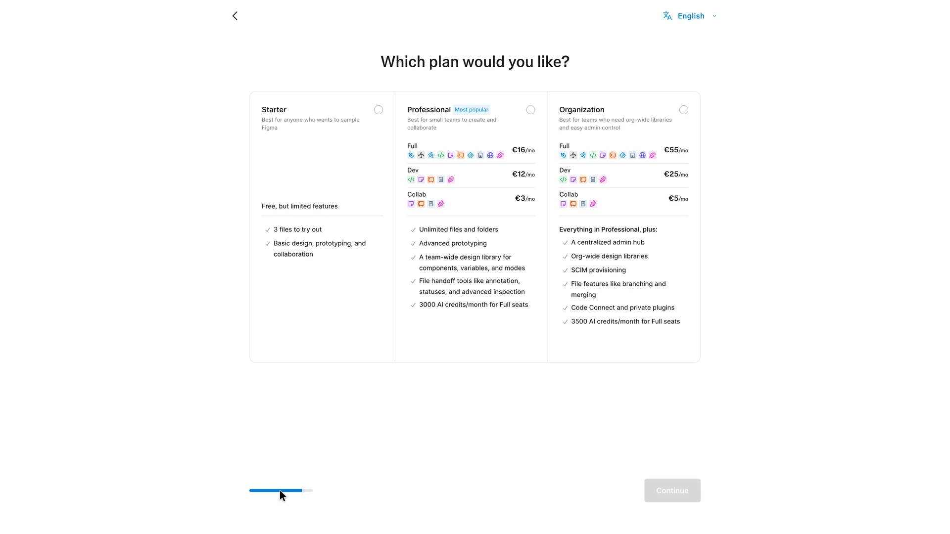
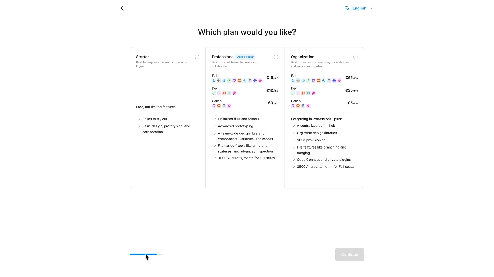
Which plan would you like, step 5 of 6
Chose Starter and pressed Continue
Why it works
Nothing is preselected, so nobody slides into a paid plan by pressing Continue, and the free plan's limit (3 files) is stated before the user commits.
What gets in the way
The free plan is described as a sample with limited features while the paid cards carry icon rows for seat types a new user hasn't met yet (Full, Dev, Collab).
What’s on this screen
The preview goes and the screen widens to three plan cards under "Which plan would you like?", none of them selected. Starter: "Best for anyone who wants to sample Figma", "Free, but limited features", 3 files to try out, basic design, prototyping and collaboration. Professional, tagged Most popular: Full seat €16/mo, Dev €12/mo, Collab €3/mo, unlimited files, advanced prototyping, a team-wide library, handoff tools, 3000 AI credits a month for Full seats. Organization: €55, €25 and €5 a month per seat type, admin hub, SCIM, branching, Code Connect, 3500 AI credits. Prices in euros. Continue stays disabled until a plan is picked. No trial is mentioned on this screen.
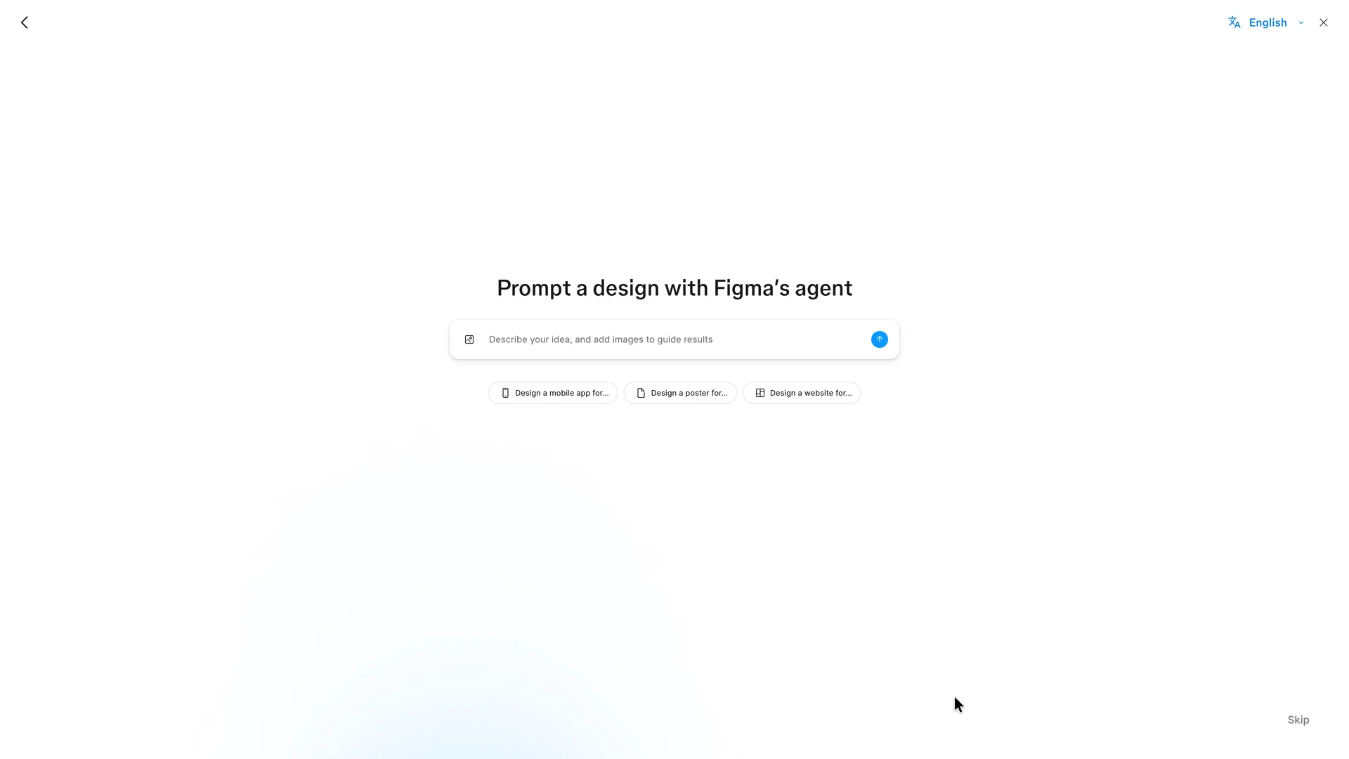
Step 11 of 15:Other
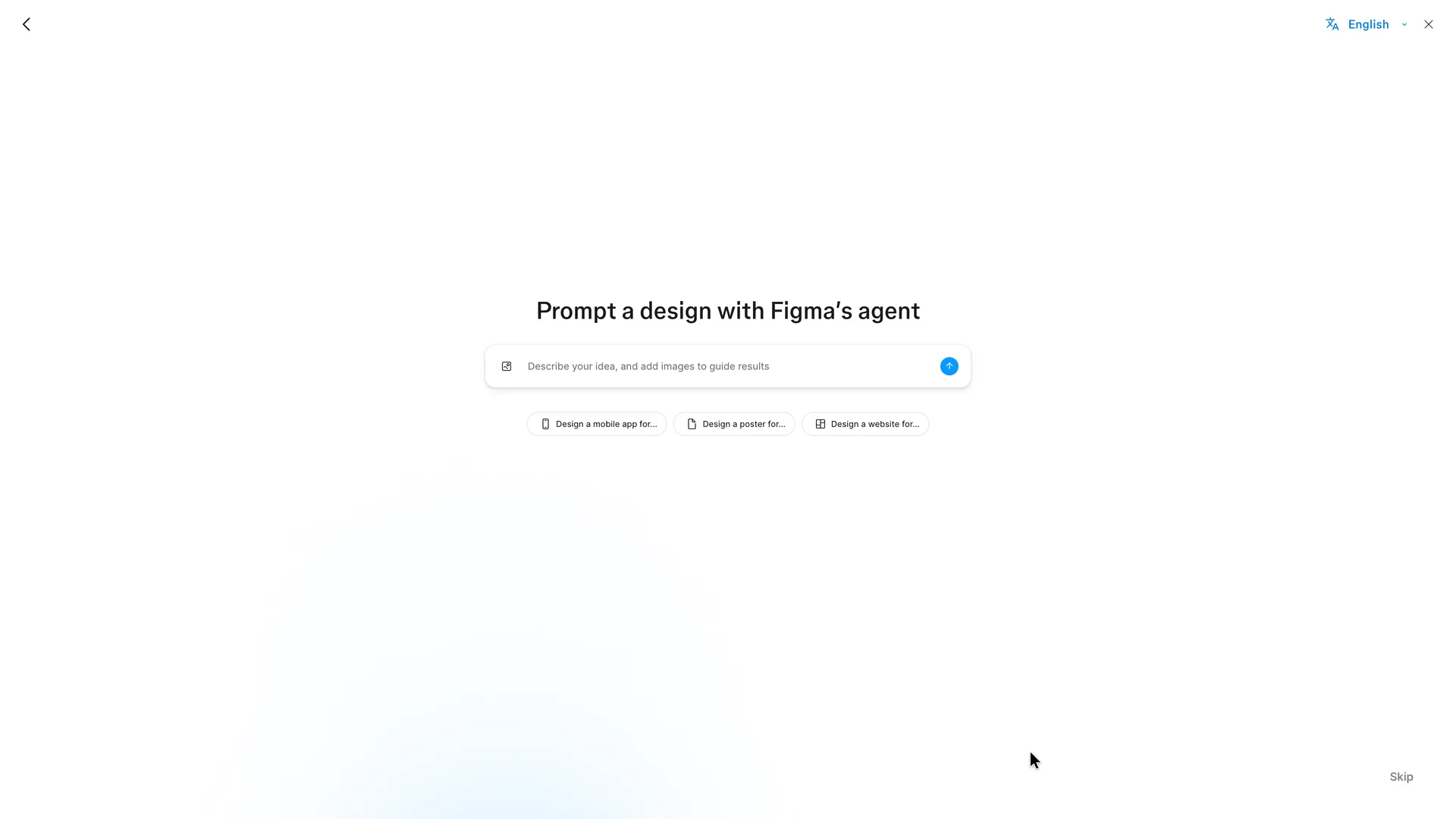
Prompt a design with Figma's agent, the last setup screen
Pressed Skip (bottom right) without writing a prompt
Why it works
The prompt is the product's newest way in, offered as an option rather than a requirement, with starters for people who don't know what to ask for.
What gets in the way
None of the three starters fits a product manager's work (flows, wireframes, a feature), the role chosen two screens earlier doesn't show up here, and Skip is small and far from the prompt.
What’s on this screen
The last setup screen is almost empty: "Prompt a design with Figma's agent" over one prompt box ("Describe your idea, and add images to guide results", an image button and a send arrow) and three starters: Design a mobile app for..., Design a poster for..., Design a website for.... A small grey Skip sits in the bottom right corner, with Back top left and a Close cross top right. No progress bar on this screen, and nothing about AI credits or which plan pays for them.
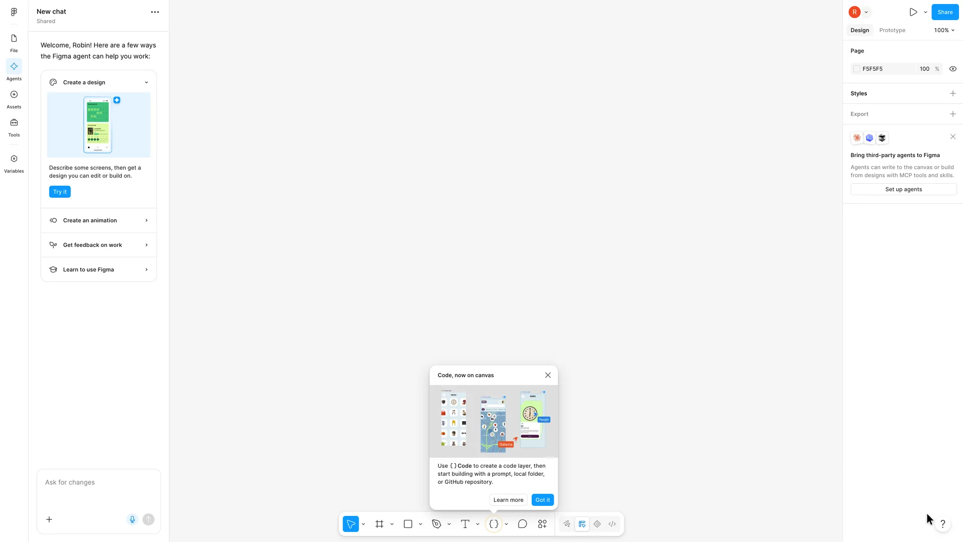
Step 12 of 15:Tooltip
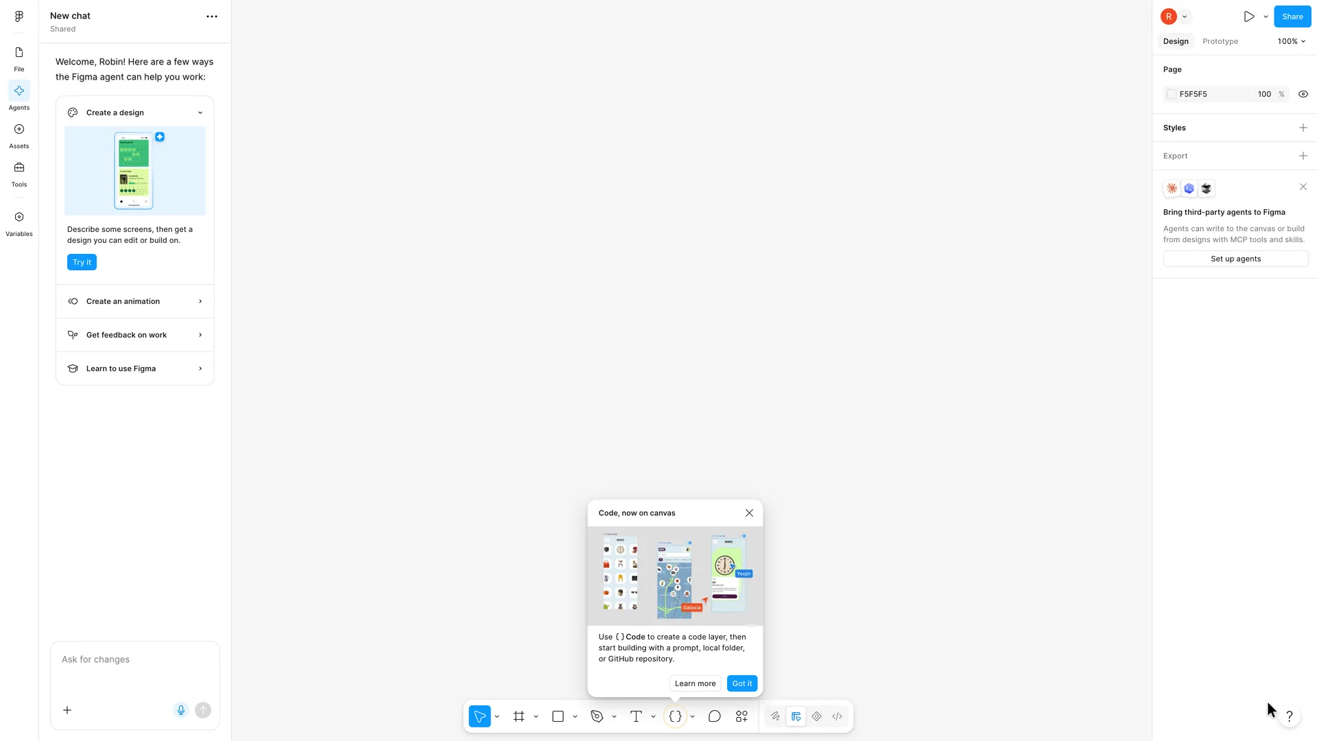
An untitled design file with the agent panel and a Code tooltip
Pressed Got it on the Code tooltip
Why it works
The user lands in a real, editable file at once, greeted by name, and the agent panel offers four concrete things to do, one of them a way to learn the basics.
What gets in the way
Three things compete on the first screen (the agent panel, a tooltip about code layers and a card about third-party agents), all about AI or code, while the canvas has no hint about drawing a first frame. The file is just called Untitled, and nothing from setup apart from the name shows up in it.
What’s on this screen
Skip opens a new Figma Design file called Untitled, not FigJam and not the file browser. Left: a chat panel, "New chat", "Welcome, Robin! Here are a few ways the Figma agent can help you work:" with Create a design opened (a phone mock-up, "Describe some screens, then get a design you can edit or build on.", Try it), then Create an animation, Get feedback on work and Learn to use Figma, and an "Ask for changes" prompt box. The canvas is empty and grey. A tooltip, "Code, now on canvas", points at the Code tool in the bottom toolbar (Learn more, Got it). Right: page colour, Styles, Export, and a card "Bring third-party agents to Figma" with Set up agents. No desktop app prompt.
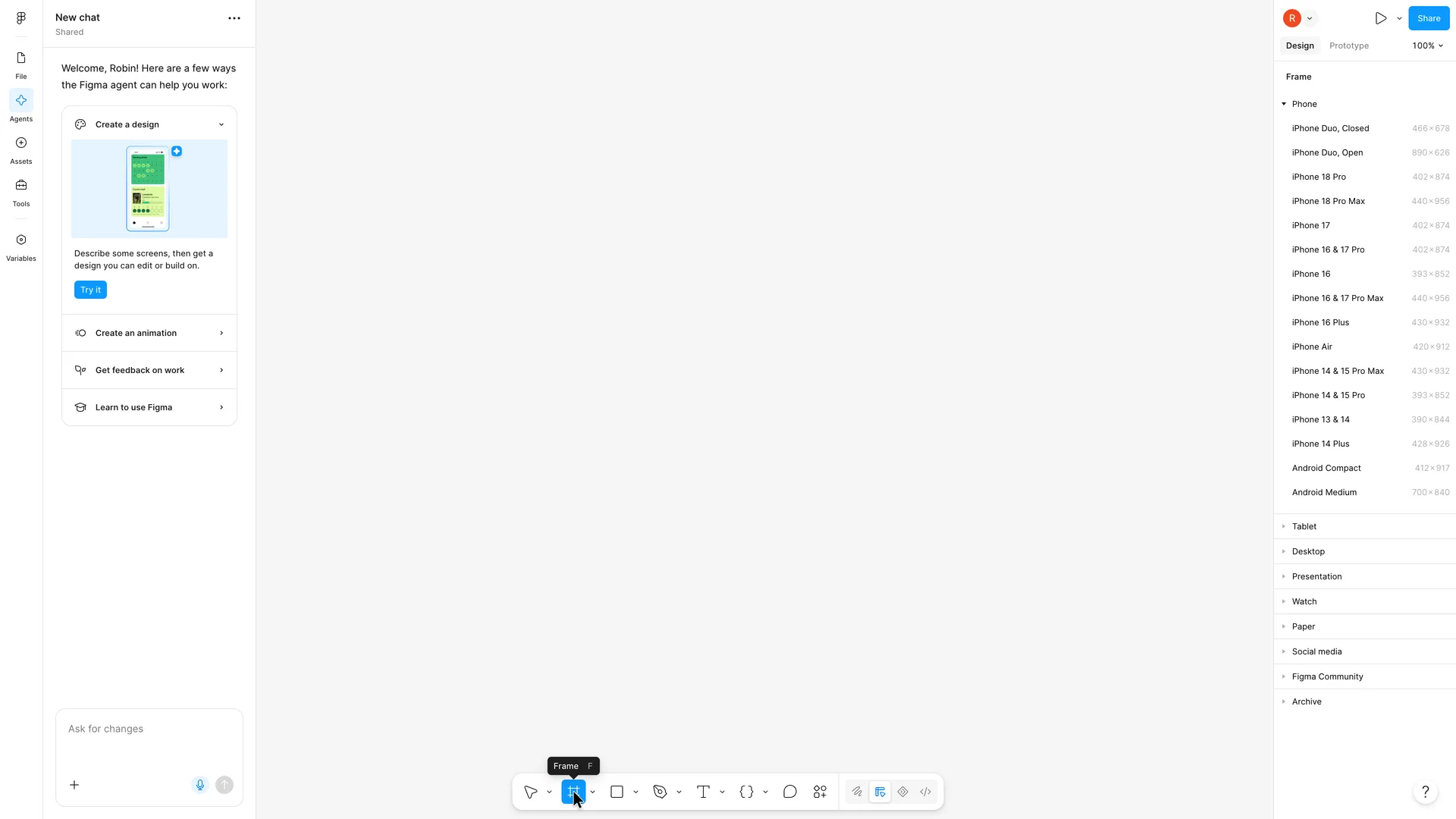
Step 13 of 15:Empty state
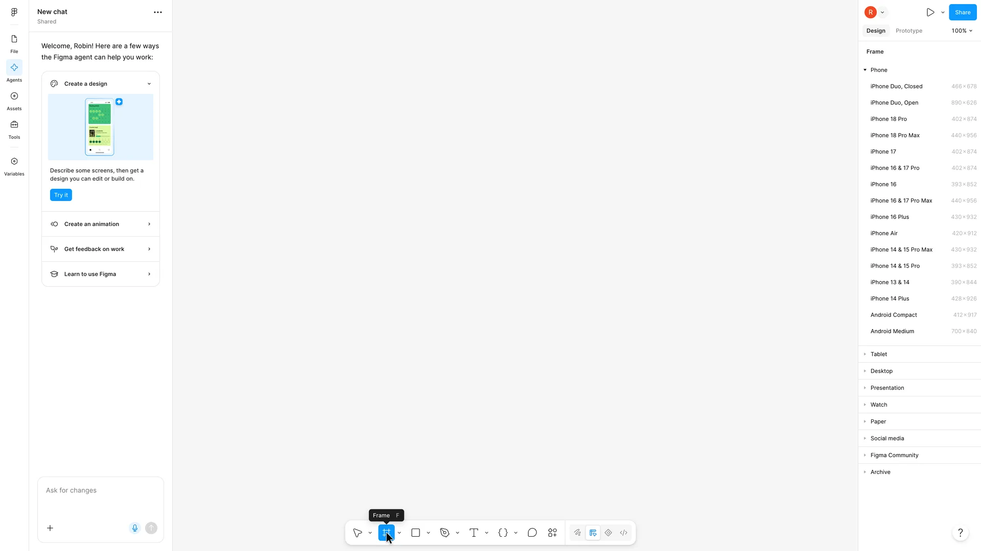
The Frame tool lists device sizes
Opened the Desktop group (MacBook Air, MacBook Pro 14" and 16", Desktop, Wireframes, …) and picked Wireframes, 1440 × 1024
Why it works
Real device sizes one click away save a new user from guessing dimensions, and the shortcut is taught on hover.
What gets in the way
The list opens on phones; a product manager sketching a desktop web feature has to know the Desktop group is further down.
What’s on this screen
With the tooltip gone the canvas is still empty and the agent panel stays open. Choosing Frame in the bottom toolbar (its tooltip shows the shortcut F) turns the right panel into a Frame list: Phone expanded first with 17 sizes from iPhone Duo to Android Medium, then collapsed groups Tablet, Desktop, Presentation, Watch, Paper, Social media, Figma Community and Archive. Nothing on the canvas or in the panel explains that you can also drag a frame of any size.
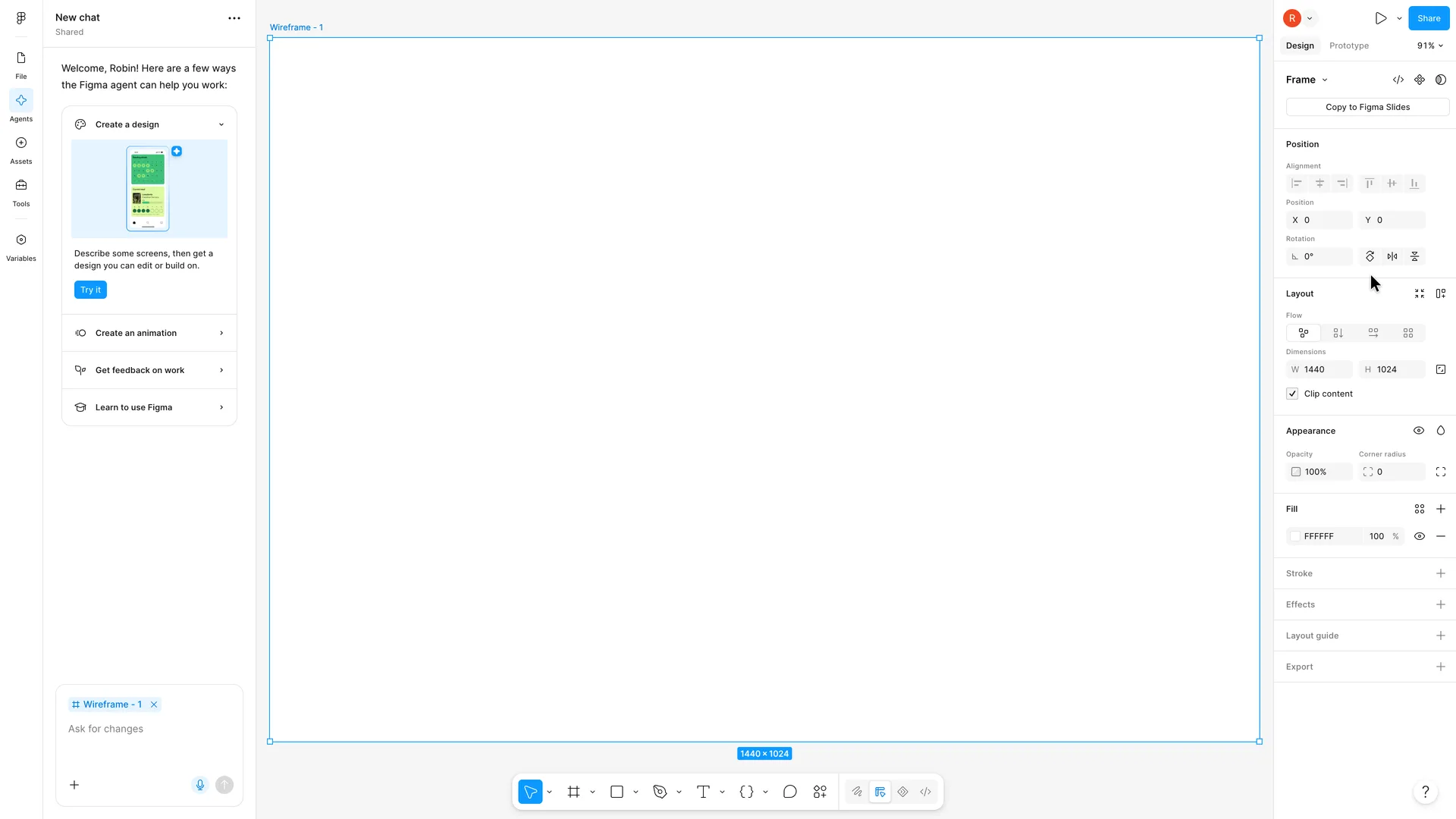
Step 14 of 15:Empty state
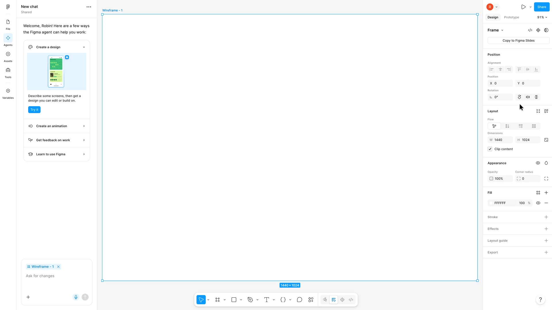
A blank Wireframe frame, already attached to the agent prompt
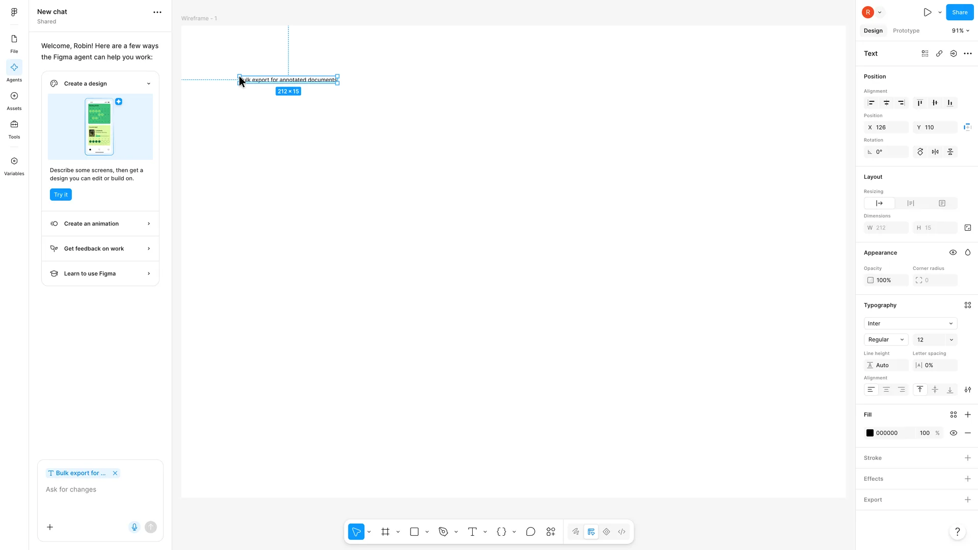
Chose the Text tool, clicked near the top left of the frame and typed "Bulk export for annotated documents", then pressed Escape
Why it works
One click gives a correctly sized, named frame and zooms to fit it, and the panel shows only the properties that apply to it.
What gets in the way
"Wireframes" promises more than it gives: the preset is the same blank frame as Desktop with another name. The agent prompt quietly picks up the selection, which a new user may not notice until they type there.
What’s on this screen
A white 1440 × 1024 frame named "Wireframe - 1" fills the canvas (zoom 91%), selected, with its size in a blue label underneath. The right panel shows Frame properties: Copy to Figma Slides, Position, Layout (W 1440, H 1024, Clip content ticked), Appearance, Fill FFFFFF, Stroke, Effects, Layout guide, Export. In the agent panel the prompt box now carries a "Wireframe - 1" chip: the new frame is attached to the next prompt without being asked. The Wireframes preset gives an empty white frame, with no grid, boxes or placeholders.
Step 15 of 15:First value
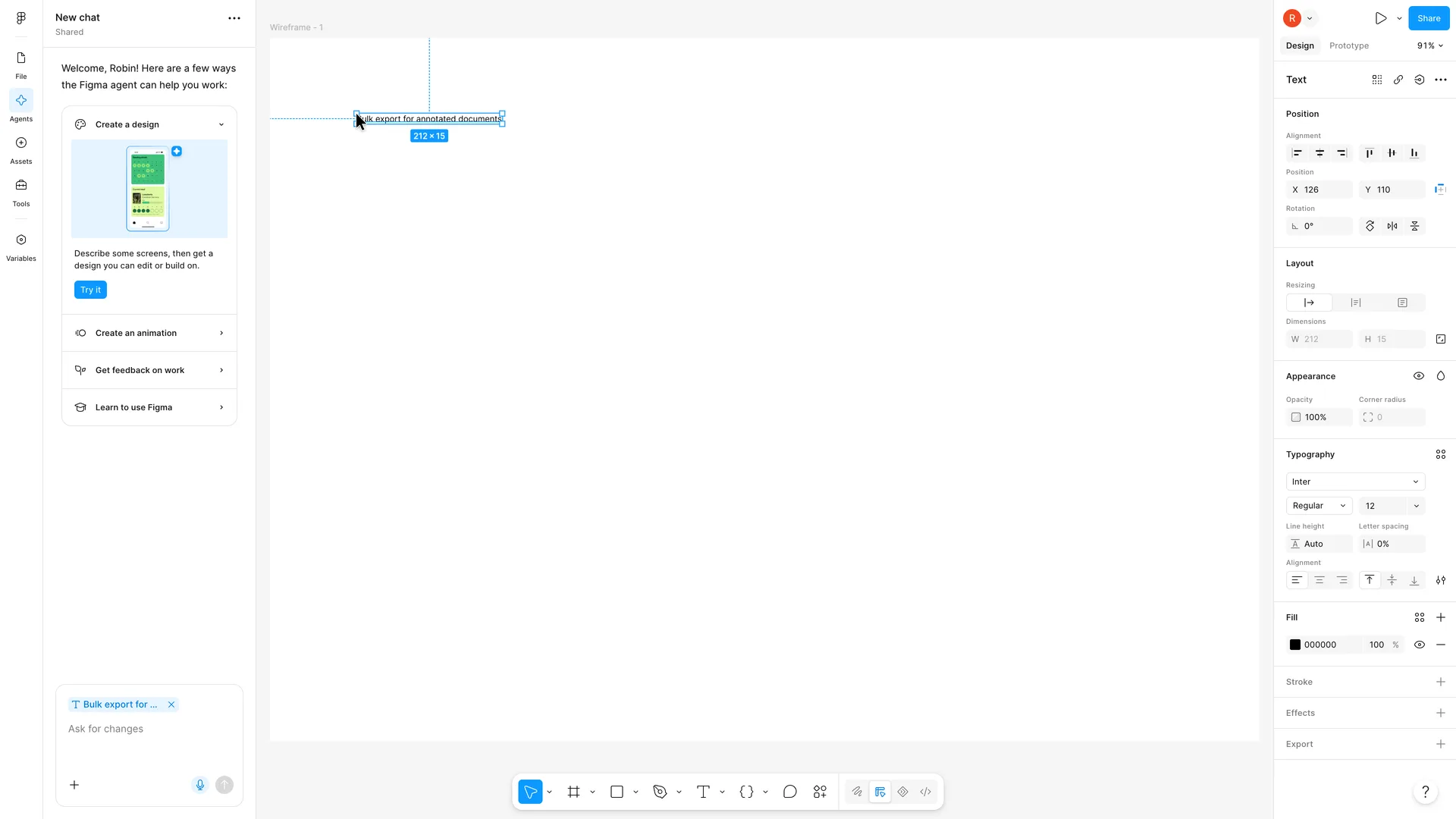
First value: Robin's first text layer in the wireframe
None: stopped here
Why it works
From the Text tool to a placed layer is one click and typing, and the panel shows straight away what can be changed about it.
What gets in the way
Default text is 12 px on a 1440 px frame, so a first heading reads as a footnote; and with the agent panel occupying the left sidebar, the layers list a new user would use to see what they made is a click away under File.
What’s on this screen
The frame now holds Robin's text, "Bulk export for annotated documents", near its top left, selected (212 × 15, X 126, Y 110), with blue guides showing its distance from the frame edges. It's set in Inter Regular 12, black, so it's small on a 1440-wide frame at 91%. The right panel switches to Text properties (Position, Layout with resizing modes, Appearance, Typography, Fill 000000). In the agent panel the prompt chip changes to "Bulk export for ...", following the selection again. The file is still called Untitled, and the left sidebar still shows the agent chat rather than layers.
Verdict
What Figma gets right
- Signup happens in a modal over the homepage and asks for an email first, then a password only once Figma knows the address is new.
- The setup screens carry a live preview: the name appears on a cursor and invitees appear as more cursors, so each question shows what it's for.
- Every optional step has a way past (Skip on the invites and on the AI prompt), the invite fields start empty, and marketing email is opt-in.
- The plan screen preselects nothing and states the free plan's limit, 3 files, before the user commits. No trial is pushed.
- Setup ends in a real, editable design file that greets the user by name, and the Frame tool offers ready sizes, including a Wireframes preset.
What we’d change
- Explain the bot check, or make it lighter: three rounds of a spatial puzzle, then a link-only verification, come before the user has seen any of the product.
- Use the role answer. A product manager is offered mobile app, poster and website starters and lands in a file called Untitled, with nothing about flows or wireframes.
- Give the first file one next step. The agent panel, a tooltip about code layers and a card about third-party agents all compete, while nothing points to drawing a first frame.
- Make the Wireframes preset a wireframe, or name it for what it is: it gives the same blank 1440 × 1024 frame as Desktop.
- Size default text for the frame it lands in. At 12 px on a 1440 px frame, a first heading looks like a footnote.
How we recorded it
- Recorded
- 5 Nov 2026
- Agent
- Claude Opus 5.5 in Claude Code
- Browser
- Chromium driven through Playwright MCP 0.0.84, a 1920 × 1080 window at 2× pixel density
- Signed up as
- Robin Hale, product manager at Quillmark (a made-up B2B SaaS company); a team of 26 to 50 people; wants user flows and wireframes for new features, reviewed with design and engineering
- Stopped at
- Placed a first text layer, the feature's name, in a Wireframes frame in a new design file
- Done by a person
- step 3, the modal adds a password and the terms and step 4, a three-round puzzle before the account exists. An agent never accepts a product’s terms or gets past a verification on its own.
The agent answered every setup question as that person and skipped anything that would connect real data or invite real people. Screenshots are cropped to the part of the screen each step is about, and personal data in them is blurred. The figures at the top count the screens up to first value; form fields count every field shown, filled in or not.
Onboarding flows change, and this one is as Figma showed it on 5 Nov 2026. Seen a different flow, or want this page corrected or removed? Write to hello@useronboarding.academy.