Onboarding teardown · Notion
Notion onboarding, screen by screen: from signup to a first doc
We had an AI agent sign up for Notion as a fictional product manager and go through onboarding until it had written a first doc. A person stepped in twice, to accept the terms and to enter the emailed code. These are the screens it saw, in order, with what each one does well and what gets in the way.
By the UserOnboarding Academy teamRecorded 3 Nov 2026How we recorded it
UserOnboarding Academy isn't owned by Notion or any onboarding tool, and Notion didn't sponsor or review this page. The account was created for this recording only.
In short
Notion takes a new user from a one-field signup to a working doc without ever asking for a password. Five setup questions tailor the workspace, and three offers (connect Gmail, a Business trial, the desktop app) each come with an easy way past. The workspace opens already filled, with a starter teamspace and a checklist page, so it never looks empty; the cost is that nothing says which of the many first steps to take.
- Screens to first value
- 14
- Setup questions
- 5
- Form fields shown
- 12
- Steps a person did
- 2
The flow at a glance
marks a step a person did
 01Sign up with a work email
 02Enter the code Notion emails you
 03Customise your profile
 04Choose how you will use Notion
 05Say how you heard about Notion
 06Pick the kind of work you do
 07Choose what you want to get done
 08Offer to connect Gmail and Google Calendar
 09Invite your team by email
 10Choose a plan: Business trial or Free
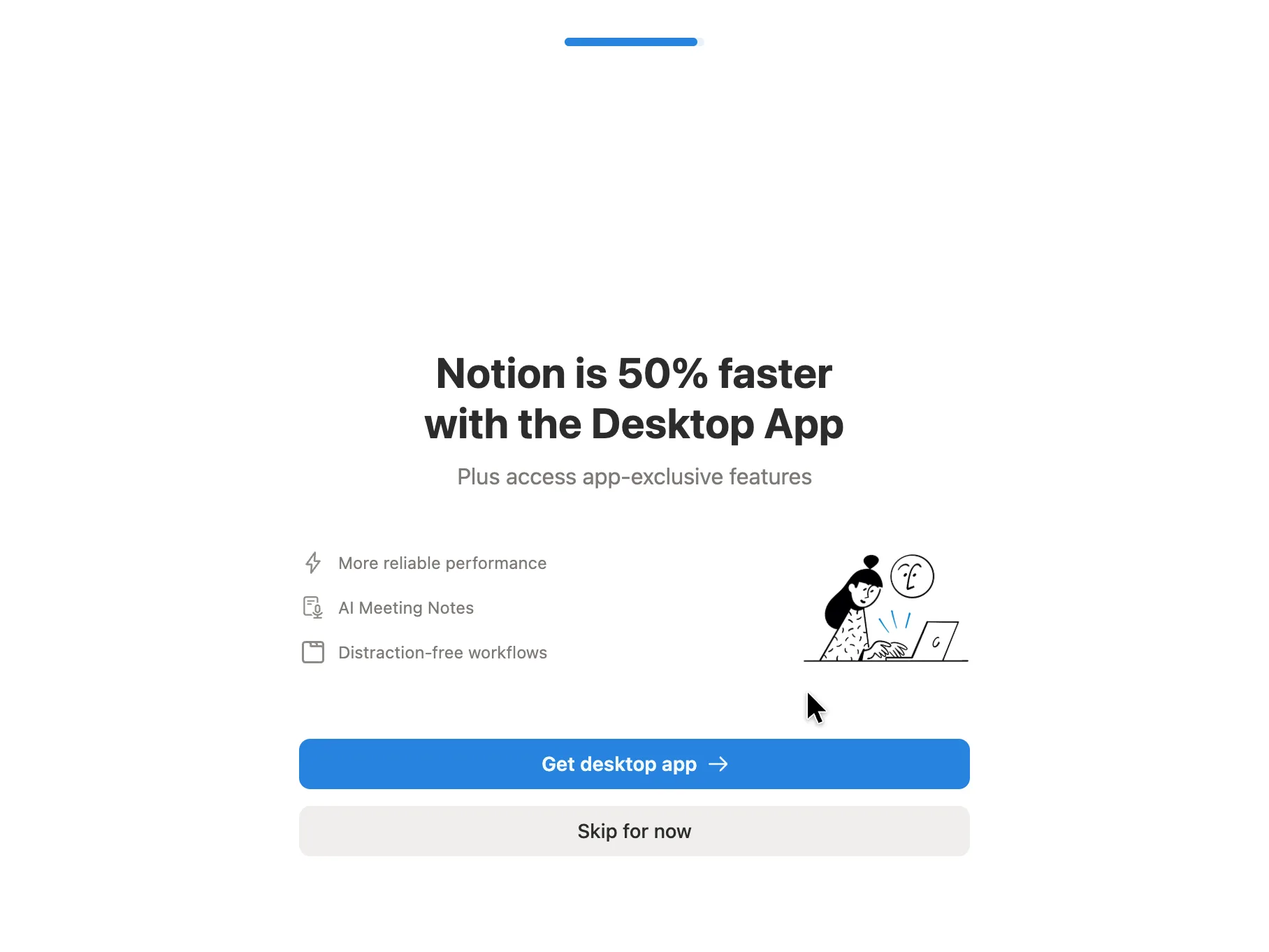 11Get the desktop app, or skip for now
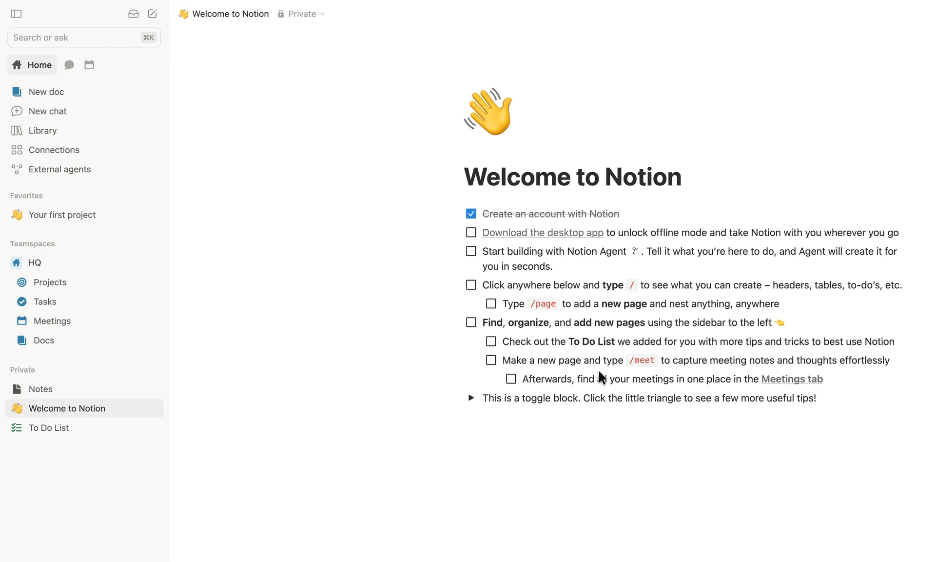 12Land on a Welcome to Notion checklist
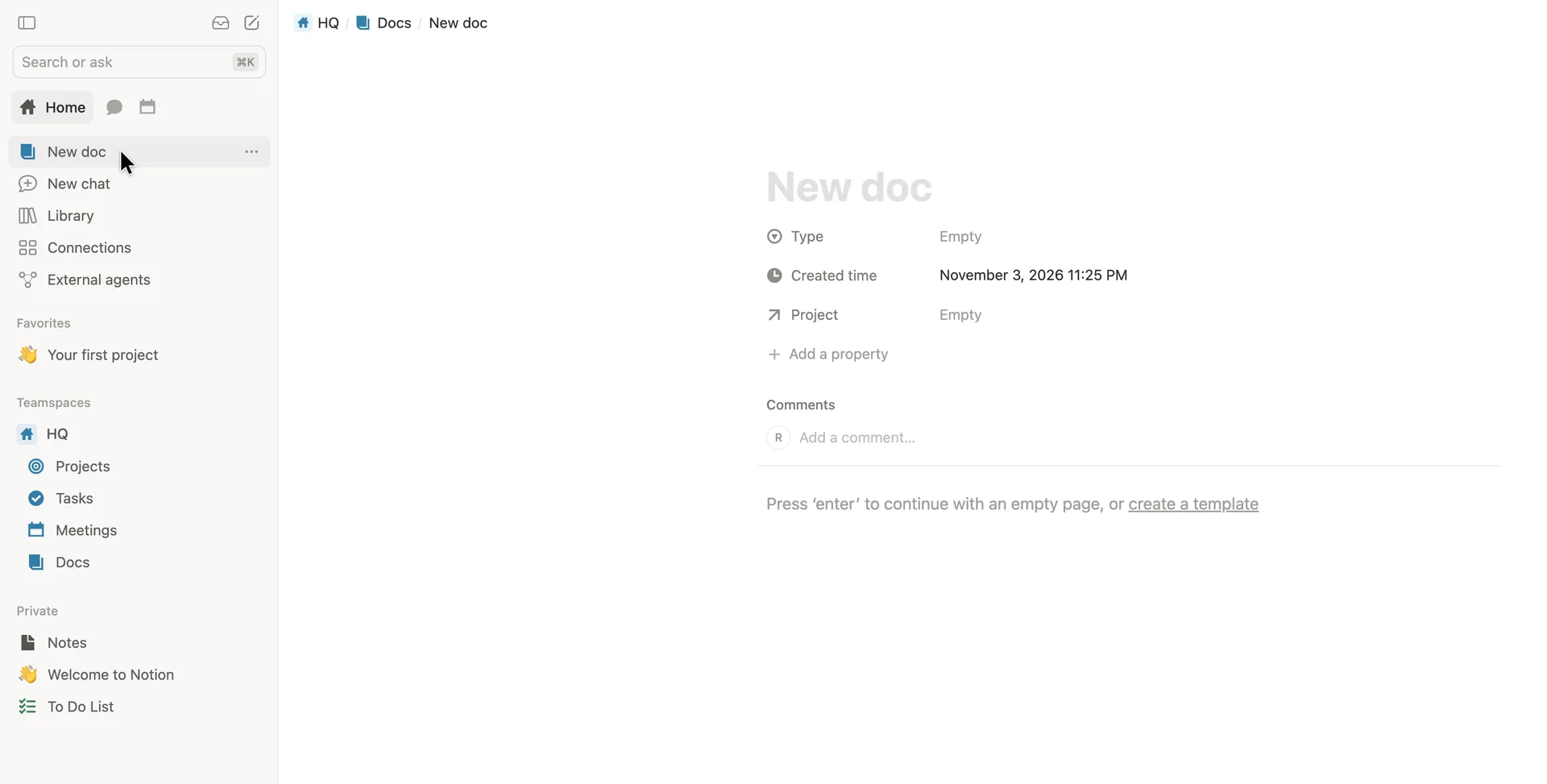 13Open a blank doc in the team's Docs database
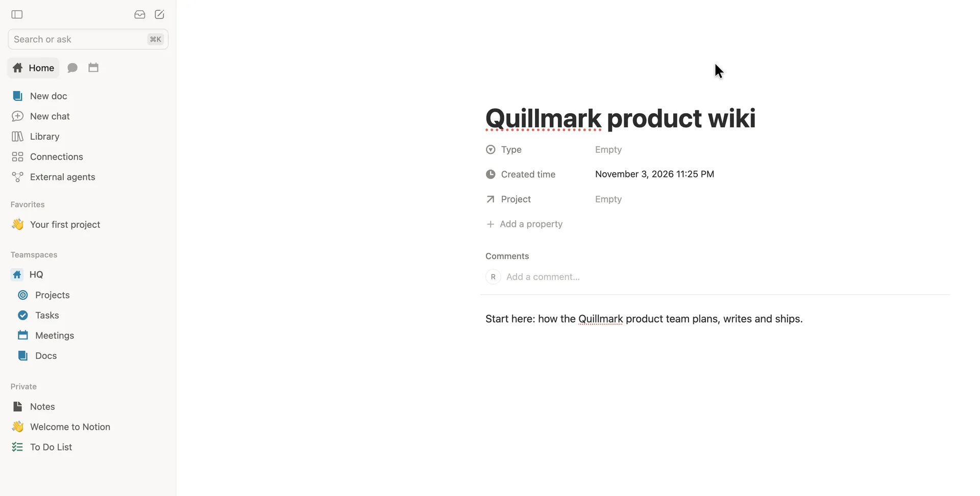 14 · first valueA first doc: the team wiki's start page
Step 1 of 14:Signup formDone by a person
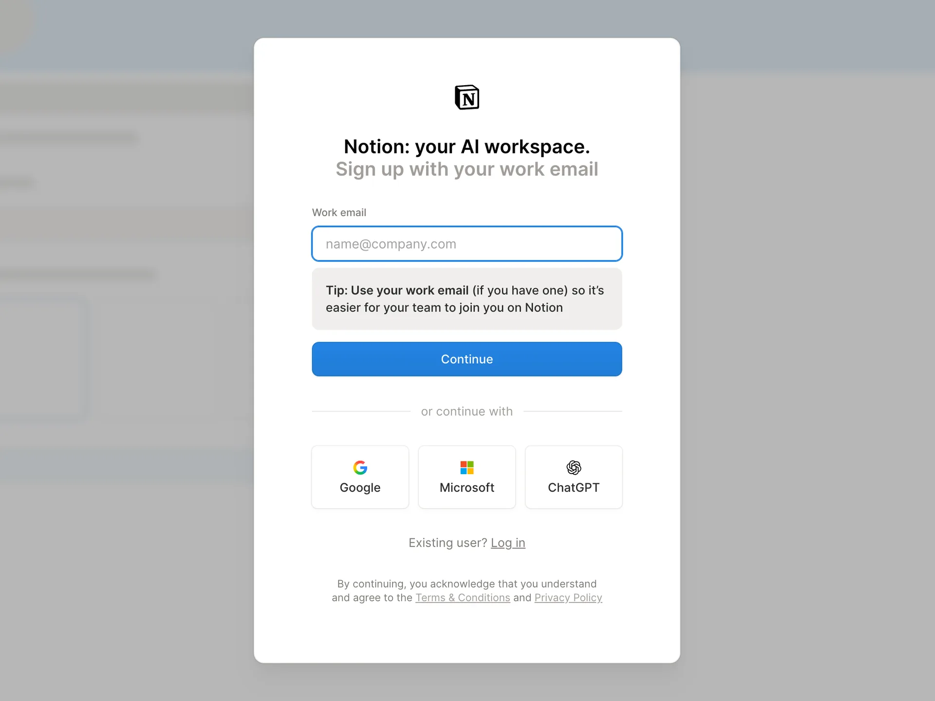
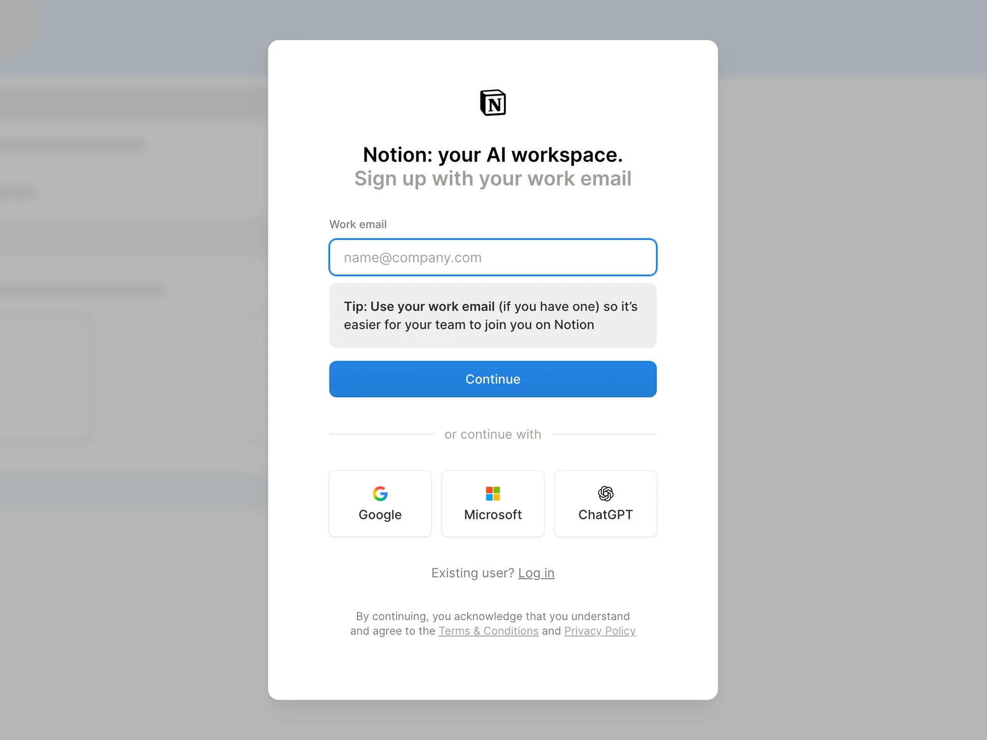
Sign up with a work email
The agent typed the email; a person pressed Continue, which accepts the terms and sends a code
Why it works
One field is the whole first screen, so there is nothing to decide before starting. The blurred workspace behind the card shows what you are signing up for before you have an account. The work-email tip explains why the choice matters instead of just demanding it.
What gets in the way
The page says 'work email' twice and the placeholder is name@company.com, which may make someone with only a personal address unsure whether they can sign up.
What’s on this screen
A single card over a blurred preview of a Notion workspace. Headline 'Notion: your AI workspace.' and 'Sign up with your work email'. One field, a grey tip box asking for a work email so teammates can join, a Continue button, then Google, Microsoft and ChatGPT sign-in. The terms line sits under everything: continuing counts as agreeing.
Step 2 of 14:Email verificationDone by a person
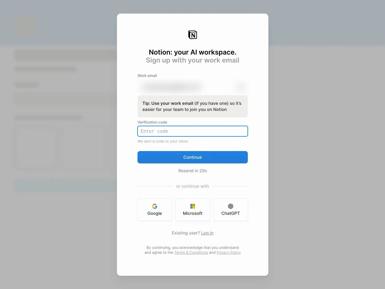
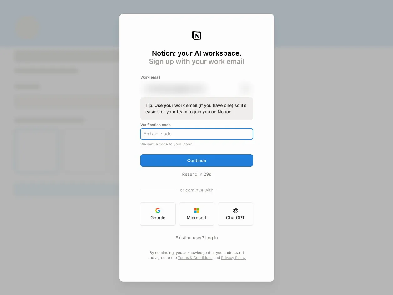
Enter the code Notion emails you
A person copied the code from the inbox into the field; Notion moved on by itself
Why it works
Verification happens inline on the same card, so there is no separate 'check your email' page and no magic link that opens a new tab. A code works on any device, and the countdown tells the user a resend is coming instead of leaving them to wonder. There is no password to invent.
What gets in the way
The user has to leave the browser for their inbox in the middle of signing up, the first point where someone can drop out. The field says only 'Enter code', not how long the code is or where to look if it hasn't arrived.
What’s on this screen
Pressing Continue doesn't leave the card: a 'Verification code' field appears under the email with 'We sent a code to your inbox', the Continue button moves down and a 'Resend in 30s' countdown starts, which later turns into a 'Resend verification code' link. Google, Microsoft and ChatGPT sign-in stay visible below. In the recording the profile screen appeared about four seconds after the code went in, with no second button press.
Step 3 of 14:Setup question
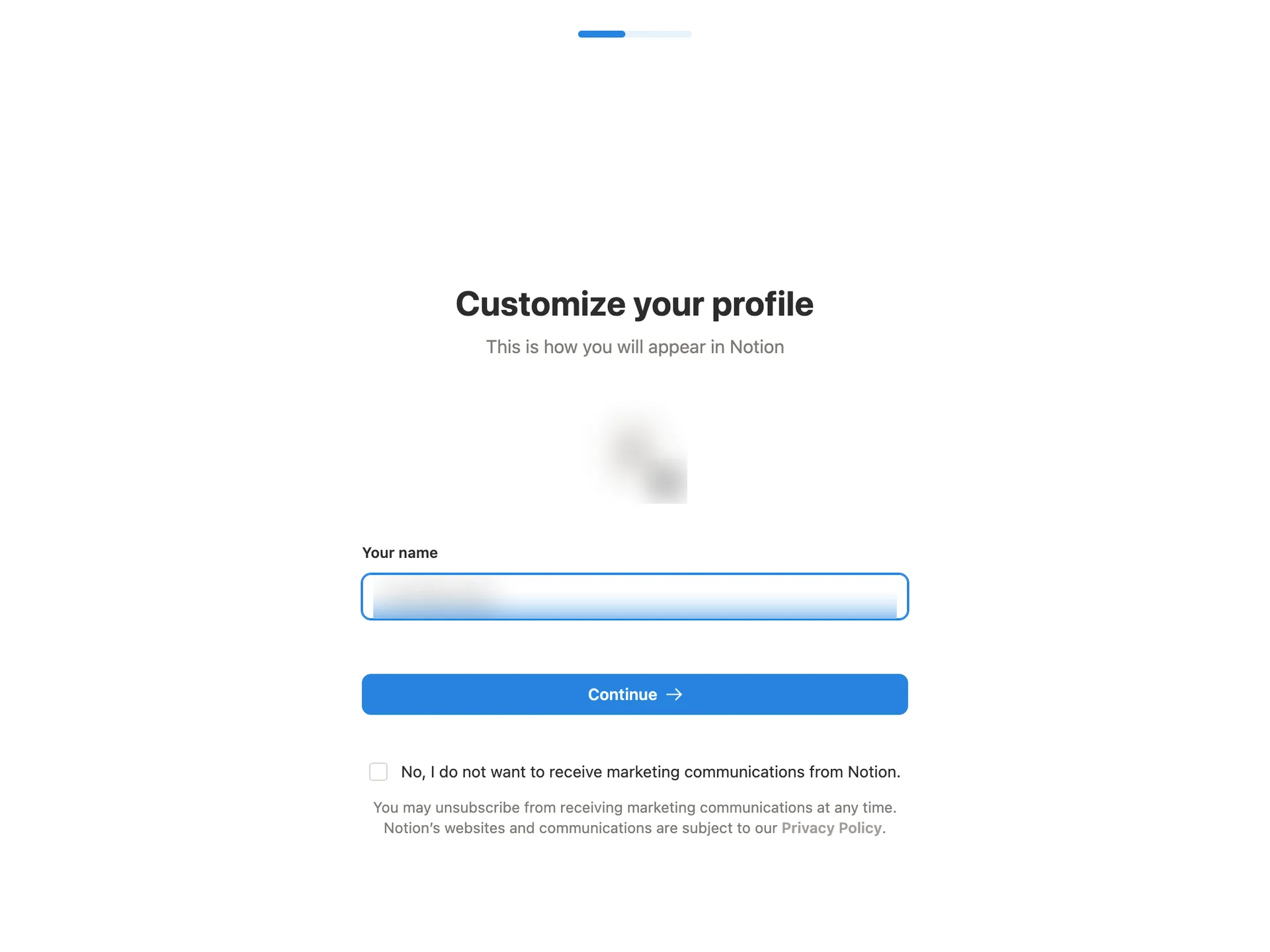
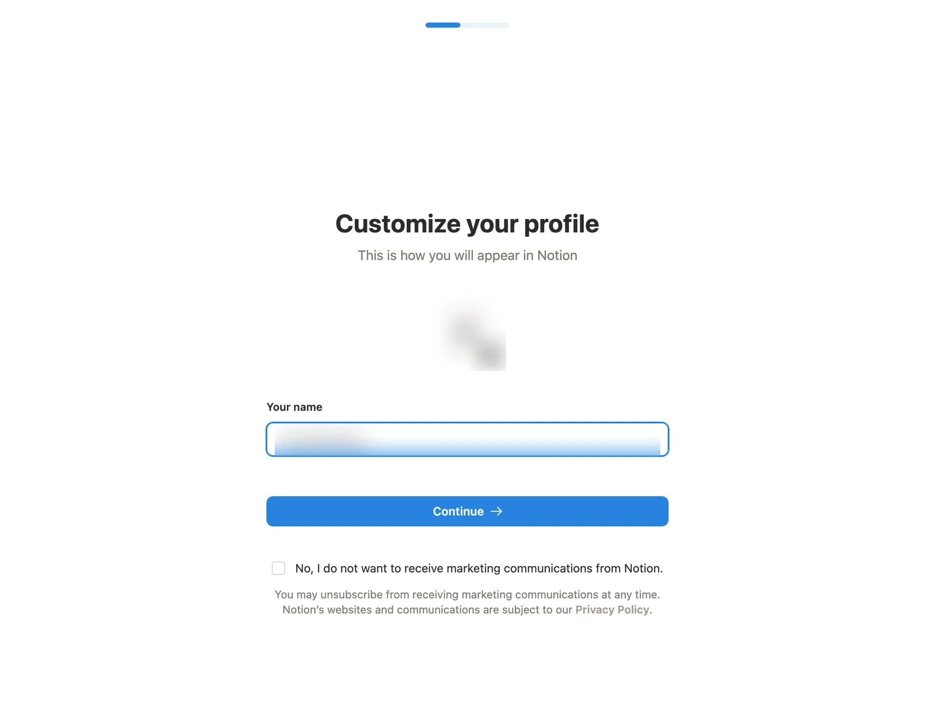
Customise your profile
Replaced the prefilled name with the persona's, ticked the marketing opt-out and pressed Continue
Why it works
The name is prefilled from the email, so a user in a hurry can press Continue without typing. The progress bar says the setup is short. The avatar shows straight away how teammates will see you, which explains why the name is asked for.
What gets in the way
The prefilled name is the email's local part, which rarely looks like a real name, so most people will have to retype it anyway. Marketing email is opt-out: you have to notice and tick a negatively worded box.
What’s on this screen
A plain white page with a short progress bar at the top. 'Customize your profile: This is how you will appear in Notion'. A round avatar showing the email's first letter with an edit badge, a 'Your name' field already filled with the part of the email before the @, and Continue. Under it, an unticked checkbox to opt out of marketing email.
Step 4 of 14:Setup question
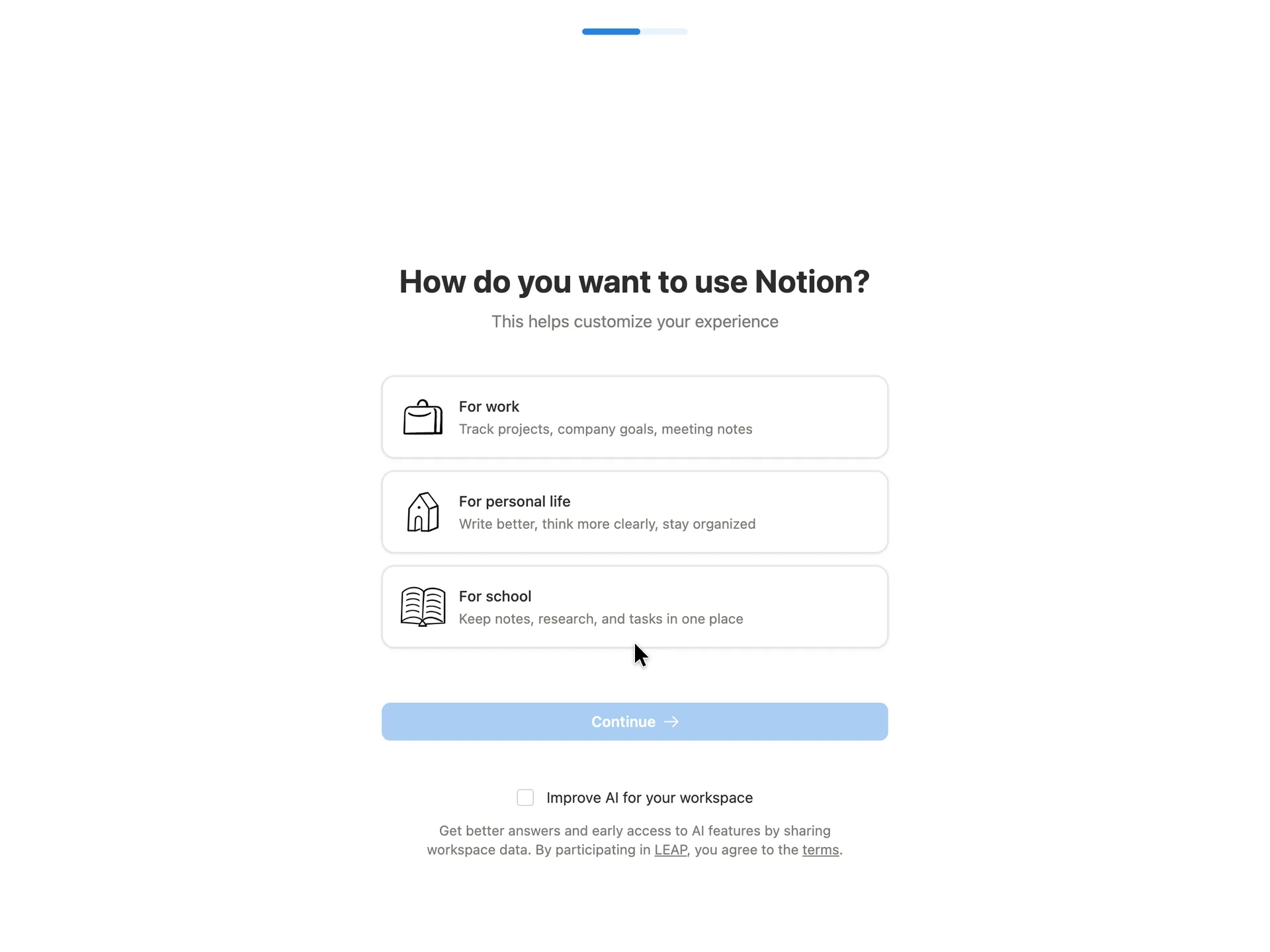
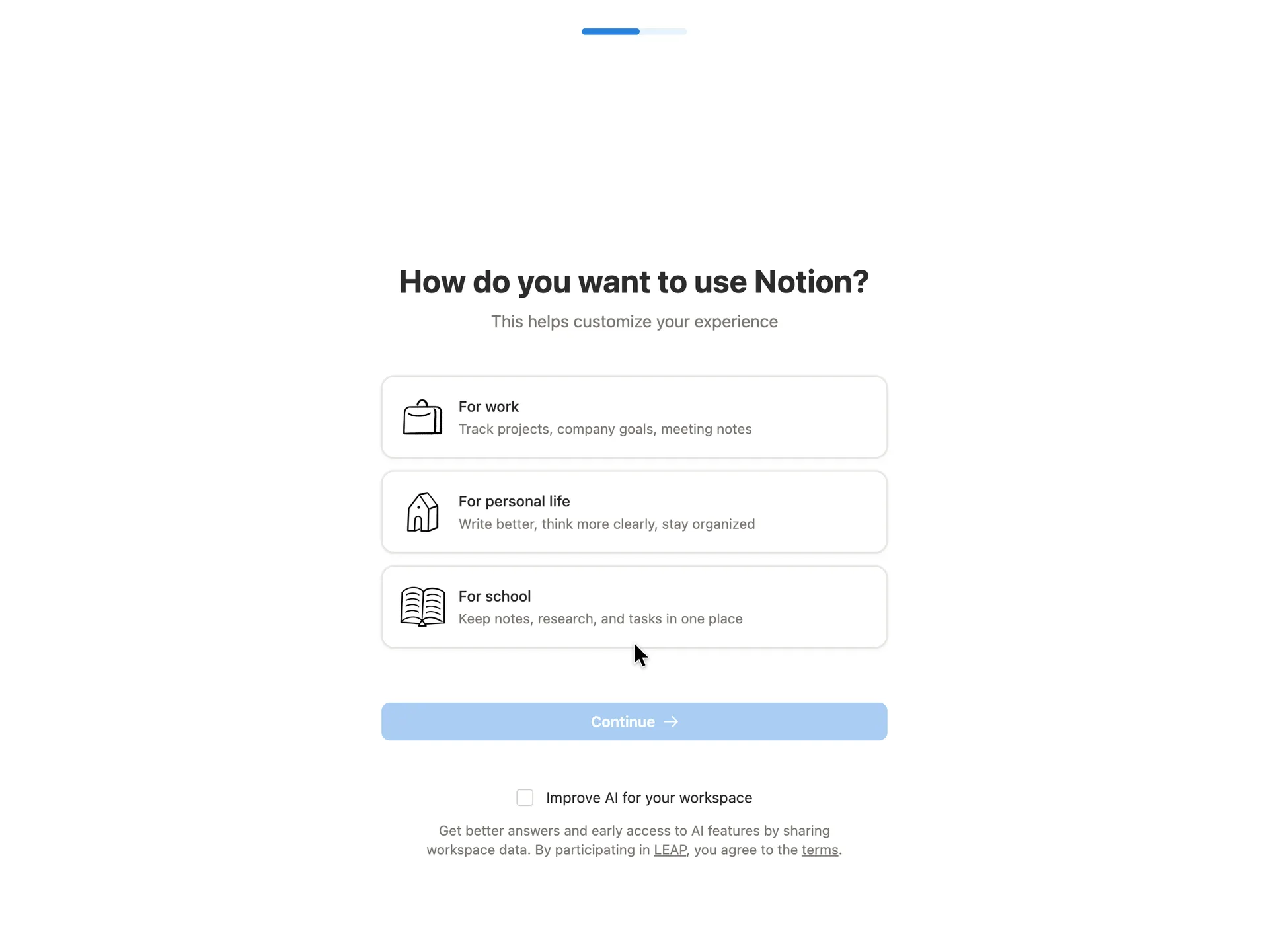
Choose how you will use Notion
Chose For work and pressed Continue
Why it works
One question with three answers anyone can place themselves in, and each card says what that path is good for, so the choice reads as help rather than a survey. The example lines double as a first pitch for each use. The AI data-sharing box is opt-in and left unticked.
What’s on this screen
'How do you want to use Notion? This helps customize your experience'. Three large cards, each with a line drawing and a one-line example: For work (track projects, company goals, meeting notes), For personal life, For school. Continue stays disabled until one is picked. Under it, an unticked 'Improve AI for your workspace' checkbox that would share workspace data through Notion's LEAP programme. The progress bar has moved on a little.
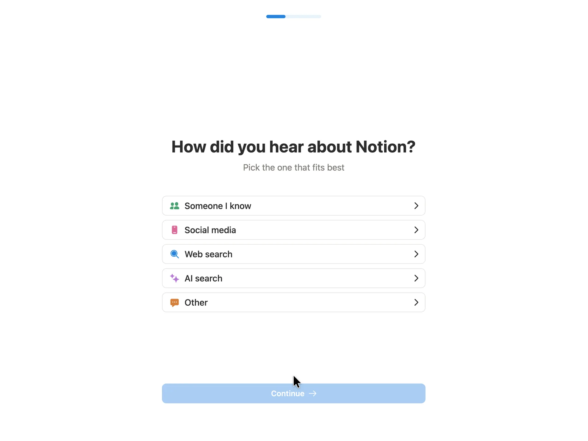
Step 5 of 14:Setup question
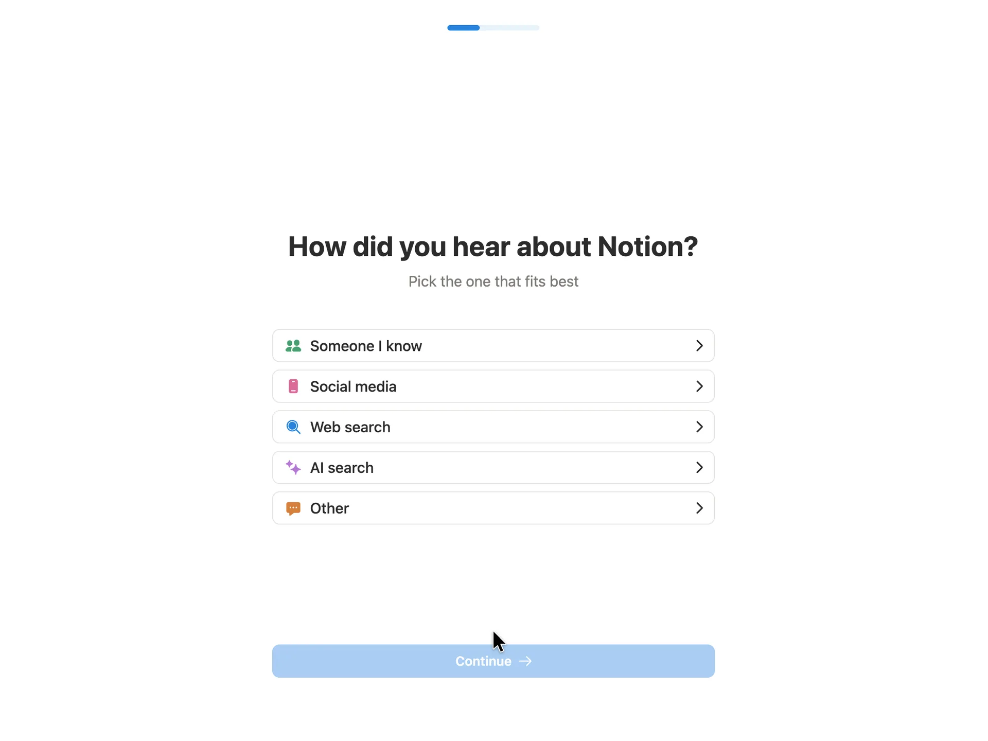
Say how you heard about Notion
Chose Web search, then Google in the follow-up, and pressed Continue
Why it works
It is a single tap, and the chevrons signal that any follow-up stays on this screen. Listing AI search separately from web search is a current touch that also tells Notion something it can act on.
What gets in the way
This question is for Notion's marketing, not for the new user, and it sits in the middle of setup. Choosing For work made the progress bar go backwards, so the user learns the setup just got longer without being told why.
What’s on this screen
'How did you hear about Notion? Pick the one that fits best'. Five rows with small coloured icons and a chevron each: Someone I know, Social media, Web search, AI search, Other. Continue is disabled until one is picked. The progress bar at the top is shorter than on the previous screen. Picking Web search opens an inline follow-up, 'Which search engine?', with Bing, Google and Other chips.
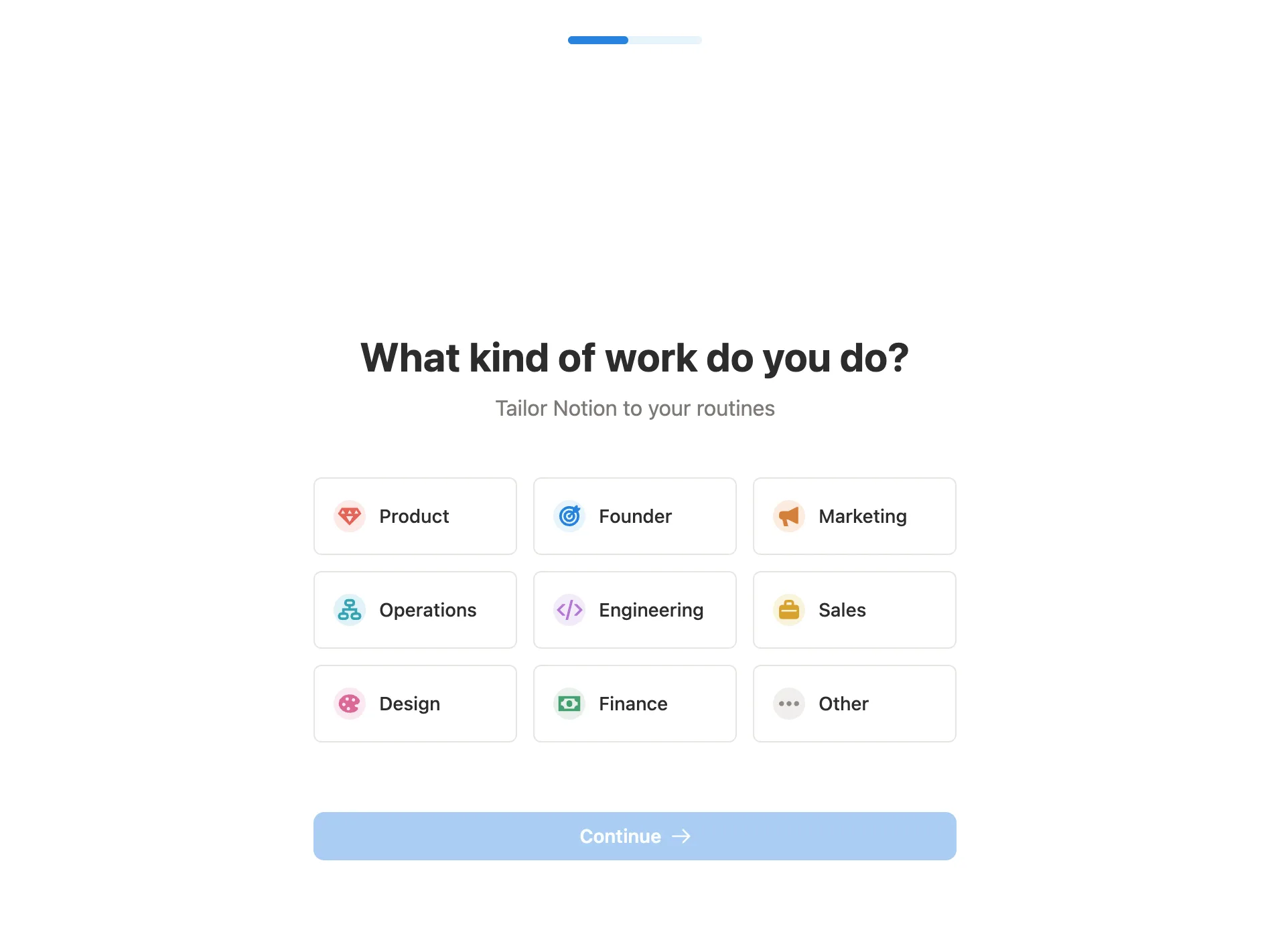
Step 6 of 14:Setup question
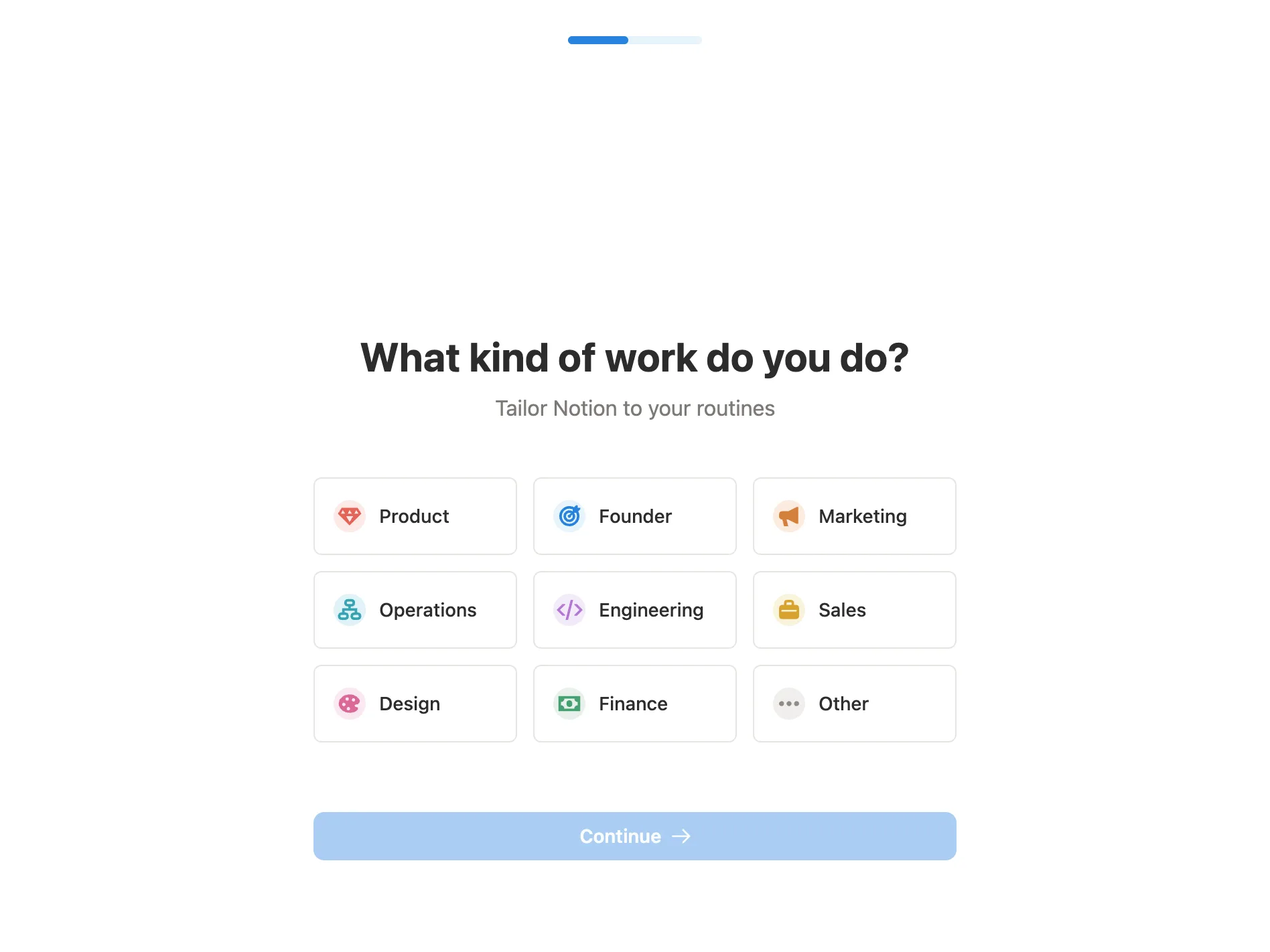
Pick the kind of work you do
Chose Product and pressed Continue
Why it works
Nine short labels cover most jobs and read in a glance; the grid makes it obvious that this is a pick-one, not a form. The subtitle promises something back ('tailor Notion to your routines') for the answer. The back arrow lets someone fix an earlier answer without starting over.
What’s on this screen
'What kind of work do you do? Tailor Notion to your routines'. A three-by-three grid of tiles, each with a small coloured icon: Product, Founder, Marketing, Operations, Engineering, Sales, Design, Finance, Other. Continue is disabled until one is picked. A back arrow now shows in the top-left corner.
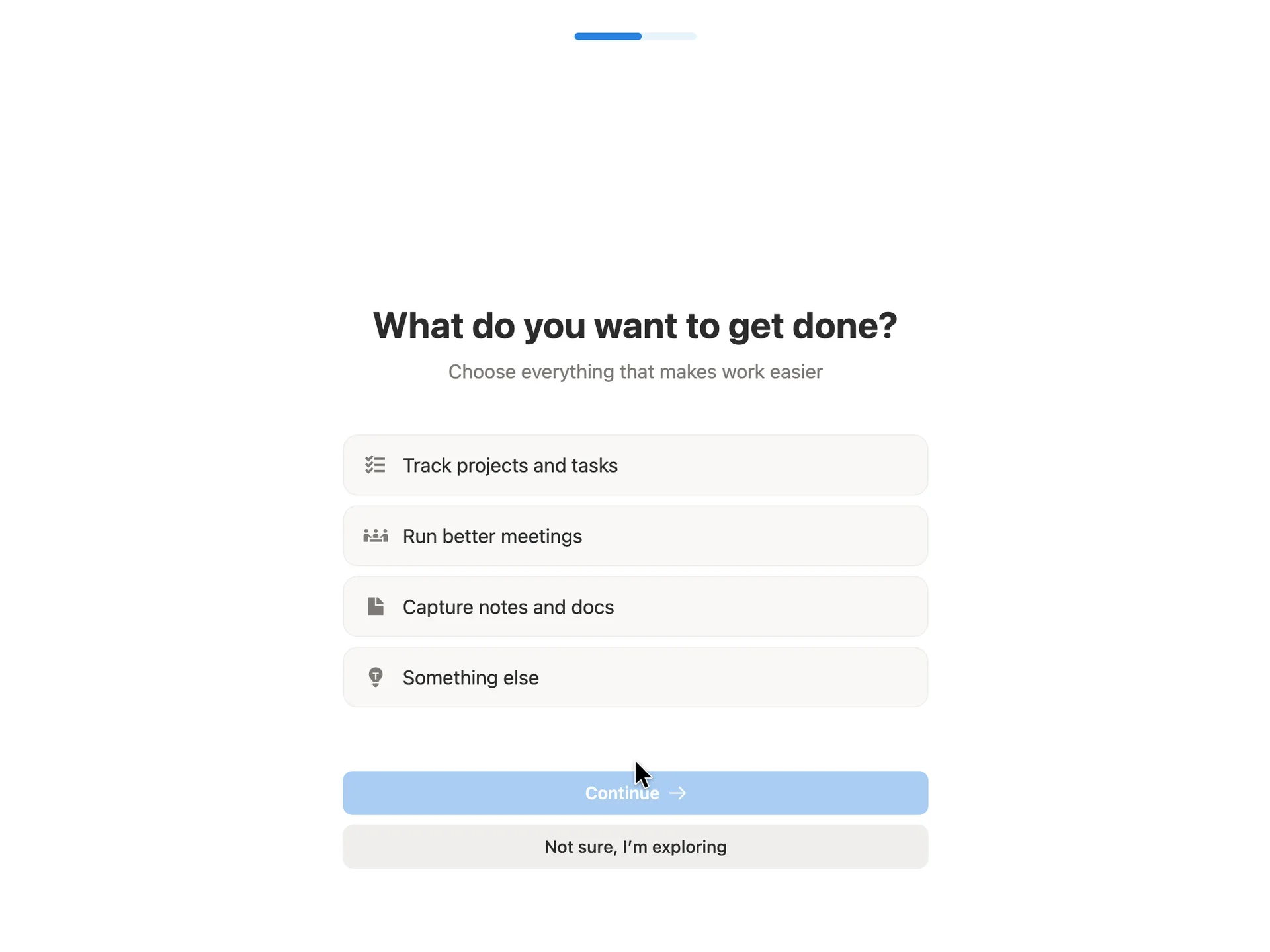
Step 7 of 14:Setup question
Choose what you want to get done
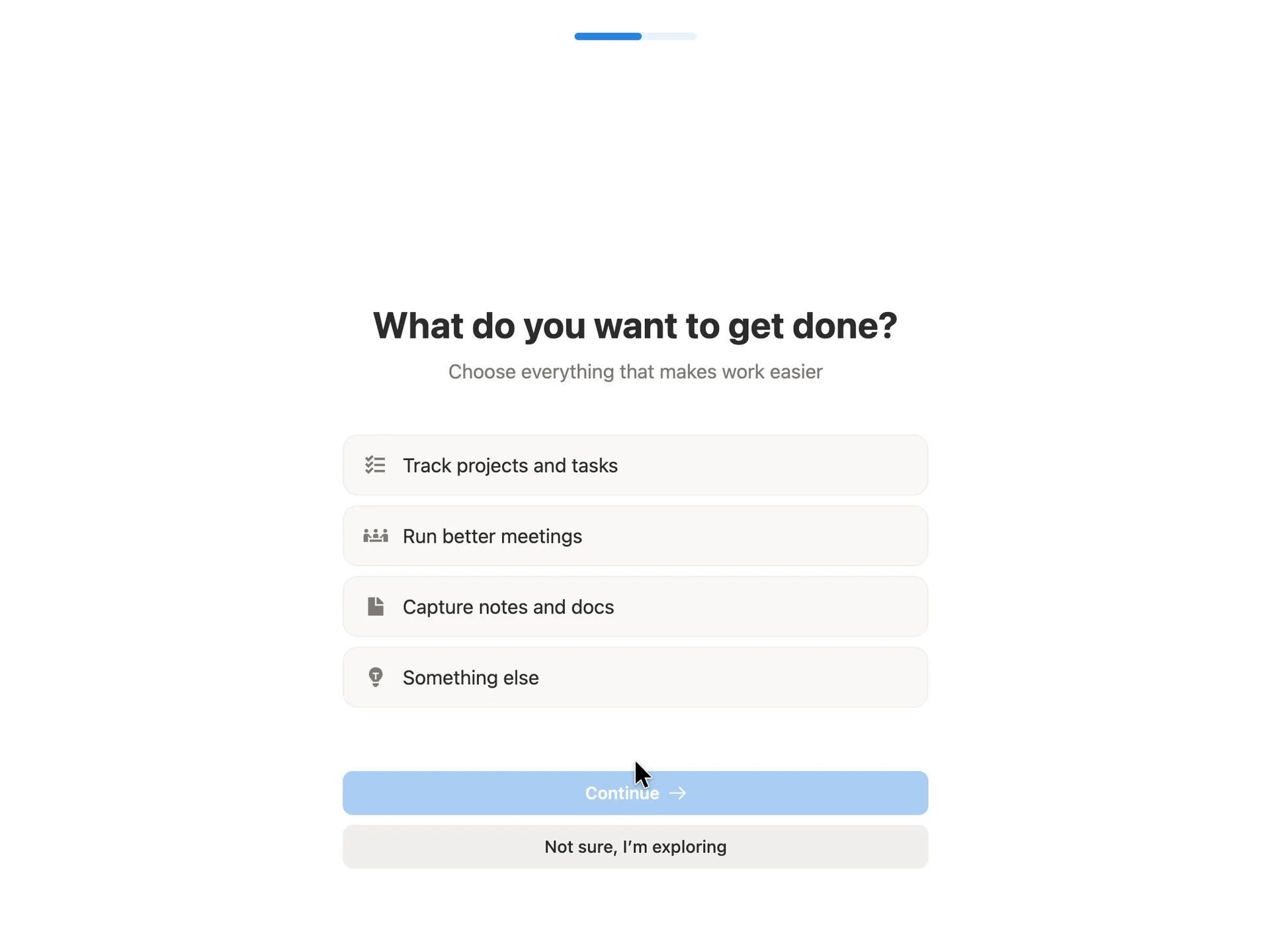
Chose Capture notes and docs and pressed Continue
Why it works
The answers are jobs, not features, so a new user can answer without knowing Notion's vocabulary. Multiple choice avoids forcing a single label on a tool people use for several things. 'Not sure, I'm exploring' is a polite exit for someone who isn't ready to commit, rather than a Skip link.
What gets in the way
Nothing on the screen says the rows can be combined other than the word 'everything' in the subtitle; they look like the single-choice rows on the earlier screens.
What’s on this screen
'What do you want to get done? Choose everything that makes work easier'. Four grey rows with line icons: Track projects and tasks, Run better meetings, Capture notes and docs, Something else. Continue is disabled until at least one is chosen, and a second button reads 'Not sure, I'm exploring'.
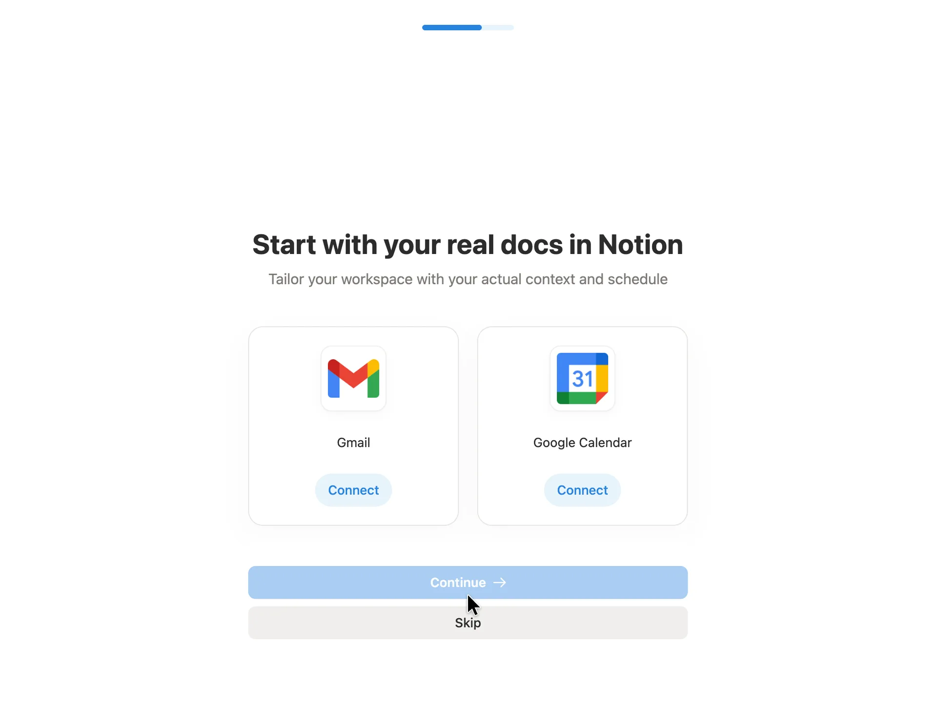
Step 8 of 14:Connect your apps
Offer to connect Gmail and Google Calendar
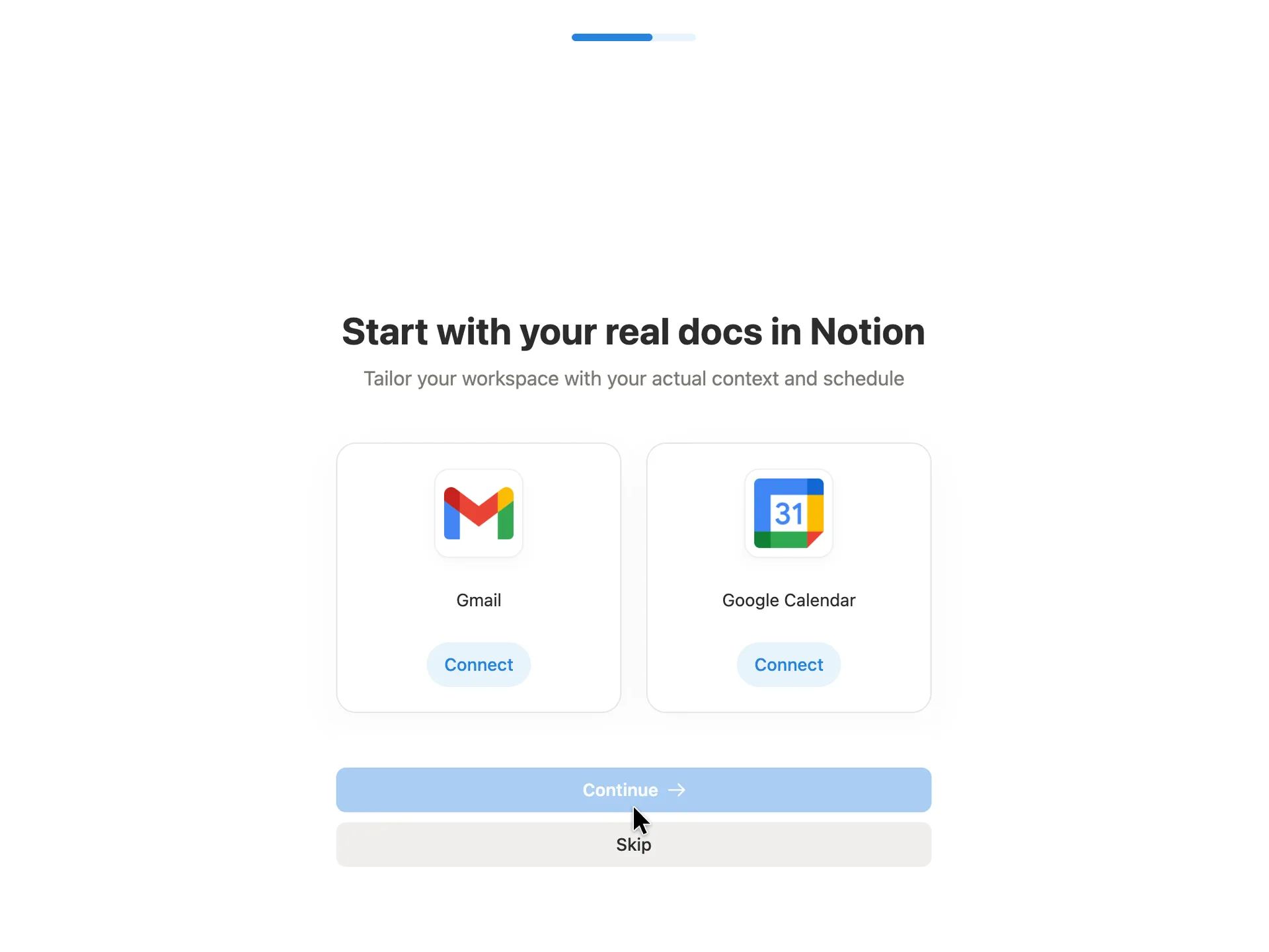
Pressed Skip (policy: no real data goes into a teardown account)
Why it works
Connecting real sources during setup means the workspace can open with your own meetings and context instead of sample content, which is the fastest route to the product feeling useful. Skip is a full-width button, not a hidden link, so nobody feels trapped.
What gets in the way
The headline promises 'your real docs' but both options are email and calendar, not documents. Asking for Gmail access before the user has seen a single Notion page is a big trust request this early.
What’s on this screen
'Start with your real docs in Notion: Tailor your workspace with your actual context and schedule'. Two cards, Gmail and Google Calendar, each with a Connect button. Continue is disabled until something is connected; Skip sits right under it in grey. The progress bar is about two-thirds full.
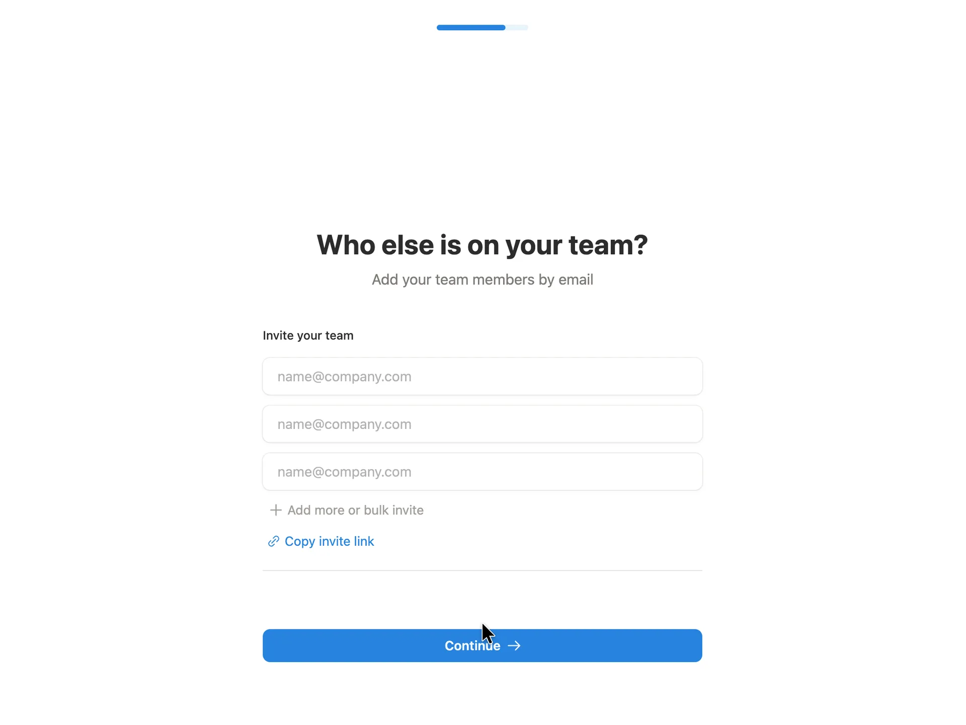
Step 9 of 14:Invite teammates
Invite your team by email
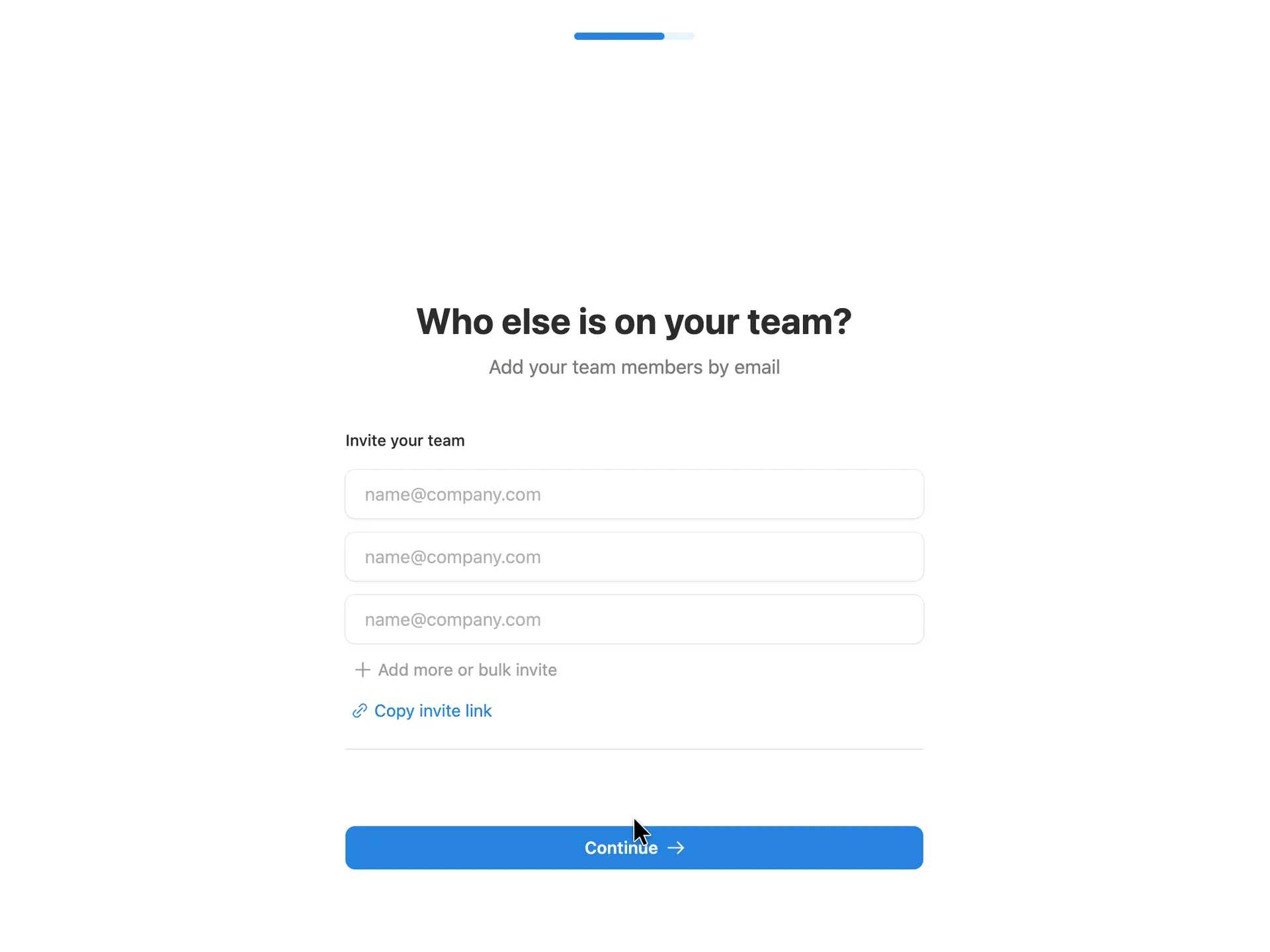
Left the fields empty and pressed Continue (policy: no invites to real people)
Why it works
Three ready fields suggest inviting a few people is normal, without demanding it. The invite link is there for people who would rather paste it into Slack than type addresses. Continue works with the fields empty, so the screen invites without blocking.
What gets in the way
There is no Skip or 'Do this later' label, so it is not obvious until you try that Continue with empty fields is allowed.
What’s on this screen
'Who else is on your team? Add your team members by email'. Under 'Invite your team', three empty email fields with the name@company.com placeholder, an 'Add more or bulk invite' link and a blue 'Copy invite link'. Continue is already enabled with the fields empty. The progress bar is nearly full. Notion never asked for team size.
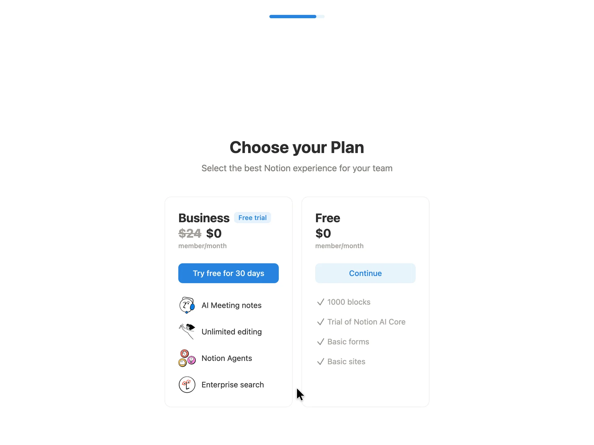
Step 10 of 14:Plan choice
Choose a plan: Business trial or Free
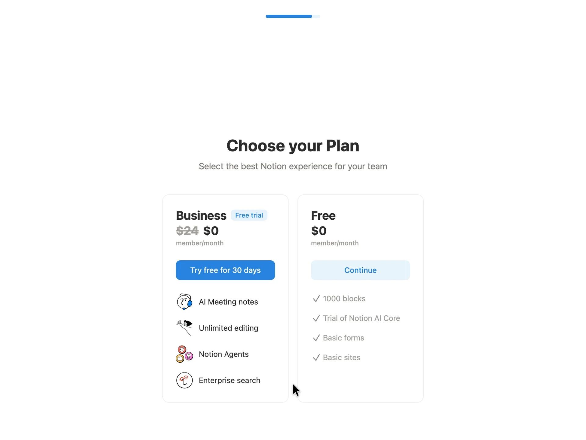
Pressed Continue on the Free plan
Why it works
The plan choice comes after the user has described their team and work, so the trial pitch lands on someone who has just said they are setting Notion up for work. Striking $24 down to $0 makes the trial read as free rather than as a purchase. The Free option stays on the same screen with a clear button, so nobody is pushed into a trial to get in.
What gets in the way
The visual weight is all on Business: illustrations and a solid button against grey text and a pale button. '1000 blocks' means little to someone who hasn't used Notion yet, so the Free plan's limit is hard to judge here.
What’s on this screen
'Choose your Plan: Select the best Notion experience for your team'. Two cards side by side. Business carries a 'Free trial' pill, shows $24 struck through next to $0 per member per month, a solid blue 'Try free for 30 days' button and four features with hand-drawn illustrations (AI Meeting notes, Unlimited editing, Notion Agents, Enterprise search). Free shows $0, a pale 'Continue' button and four grey ticked lines (1000 blocks, Trial of Notion AI Core, Basic forms, Basic sites). The progress bar is almost full.
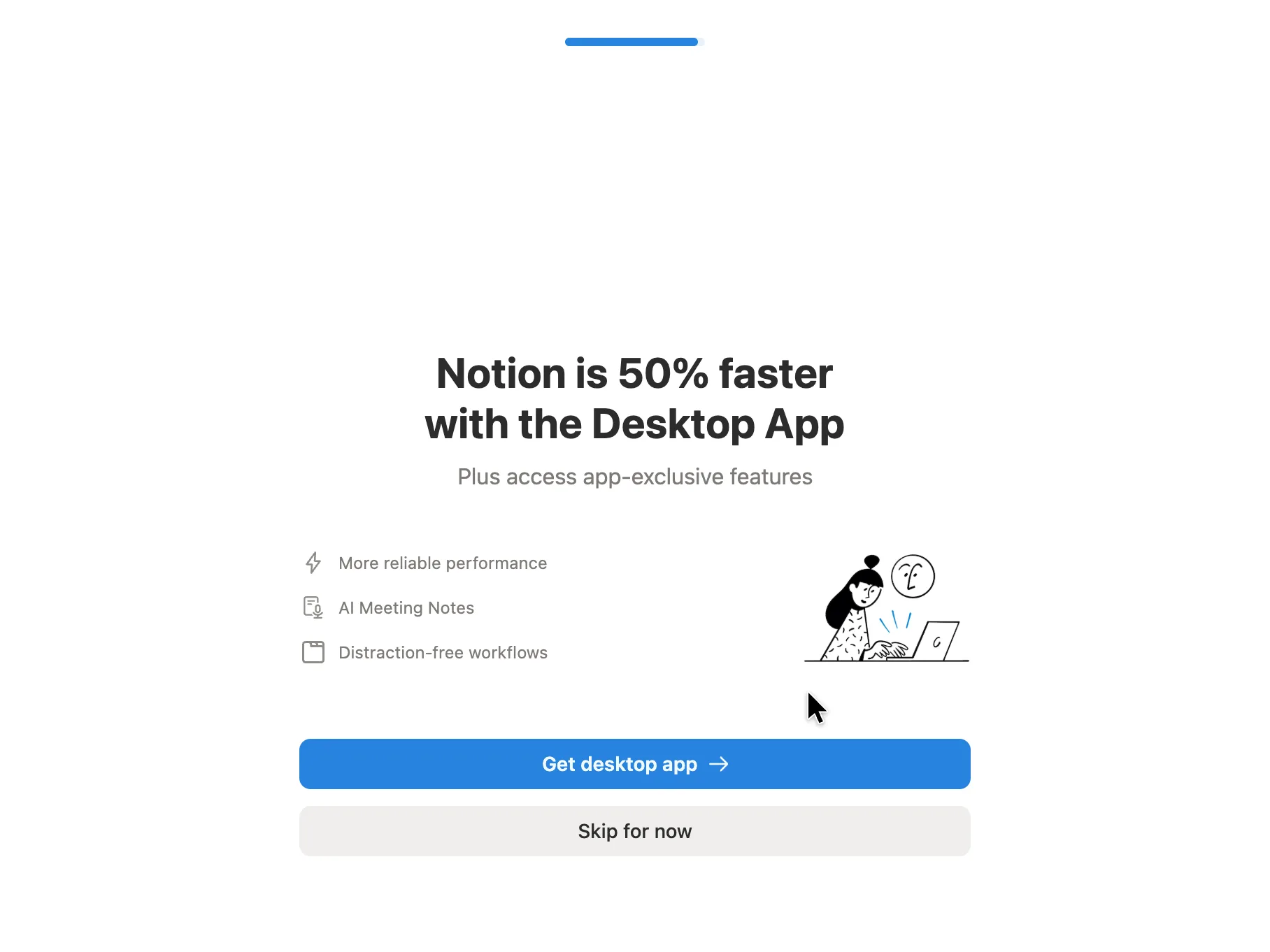
Step 11 of 14:App download
Get the desktop app, or skip for now
Pressed Skip for now
Why it works
Asking once, at the end of setup, catches people while they are committed and before they settle into the browser habit. 'Skip for now' says the offer will come back, which makes skipping feel safe rather than final.
What gets in the way
It is the last thing between the user and their workspace, after eight setup screens. The 50% figure is Notion's own claim and the screen gives no basis for it.
What’s on this screen
Headline 'Notion is 50% faster with the Desktop App', subtitle 'Plus access app-exclusive features'. Three grey lines with small icons (More reliable performance, AI Meeting Notes, Distraction-free workflows) beside a hand-drawn illustration of a person at a laptop. A blue 'Get desktop app' button and a grey 'Skip for now' under it. The progress bar is full.
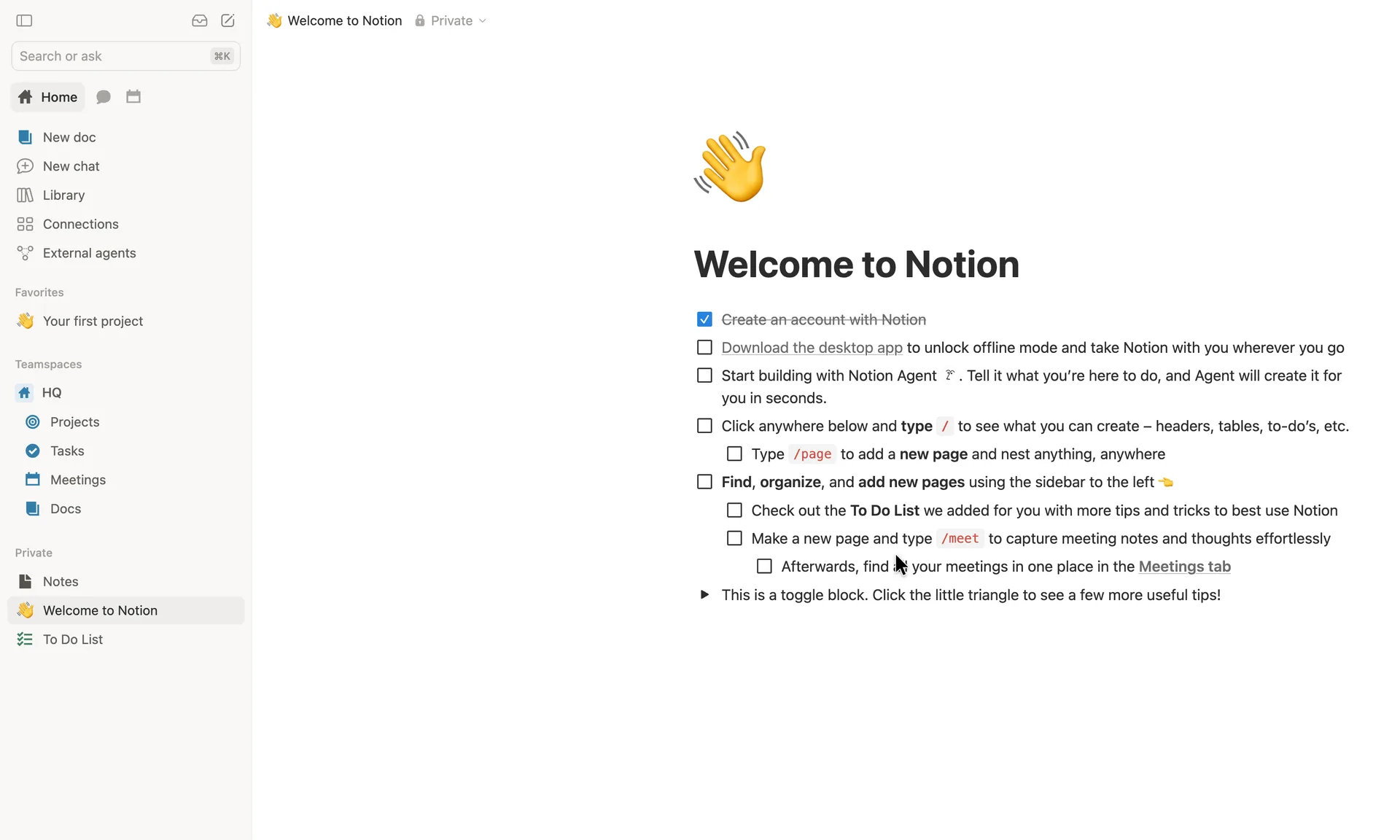
Step 12 of 14:Checklist
Land on a Welcome to Notion checklist
Pressed New doc in the sidebar
Why it works
The checklist is a real Notion page, so reading it is already using the product: every item teaches by doing, in the editor itself. Pre-ticking 'Create an account' gives a first bit of progress for free. The sidebar arrives populated with a starter teamspace, so the workspace never looks empty.
What gets in the way
There is no single next step: nine unticked items, a toggle and a full sidebar all compete for the first click. Two of the first three items repeat offers the user just turned down or skipped (the desktop app) or push the AI agent before a first page exists.
What’s on this screen
The workspace opens on a private page, 'Welcome to Notion', with a waving-hand icon. It is a to-do list: 'Create an account with Notion' already ticked and struck through, then unticked items to download the desktop app, start building with Notion Agent, type / to see what you can create, type /page to nest pages, use the sidebar, check the To Do List, type /meet for meeting notes and find them in the Meetings tab, plus a toggle block 'Click the little triangle to see a few more useful tips!'. The sidebar already holds New doc, New chat, Library, Connections, External agents; a favourite 'Your first project'; a teamspace 'HQ' with Projects, Tasks, Meetings and Docs; and private pages Notes, Welcome to Notion and To Do List. The workspace is named 'Robin Hale's Space'.
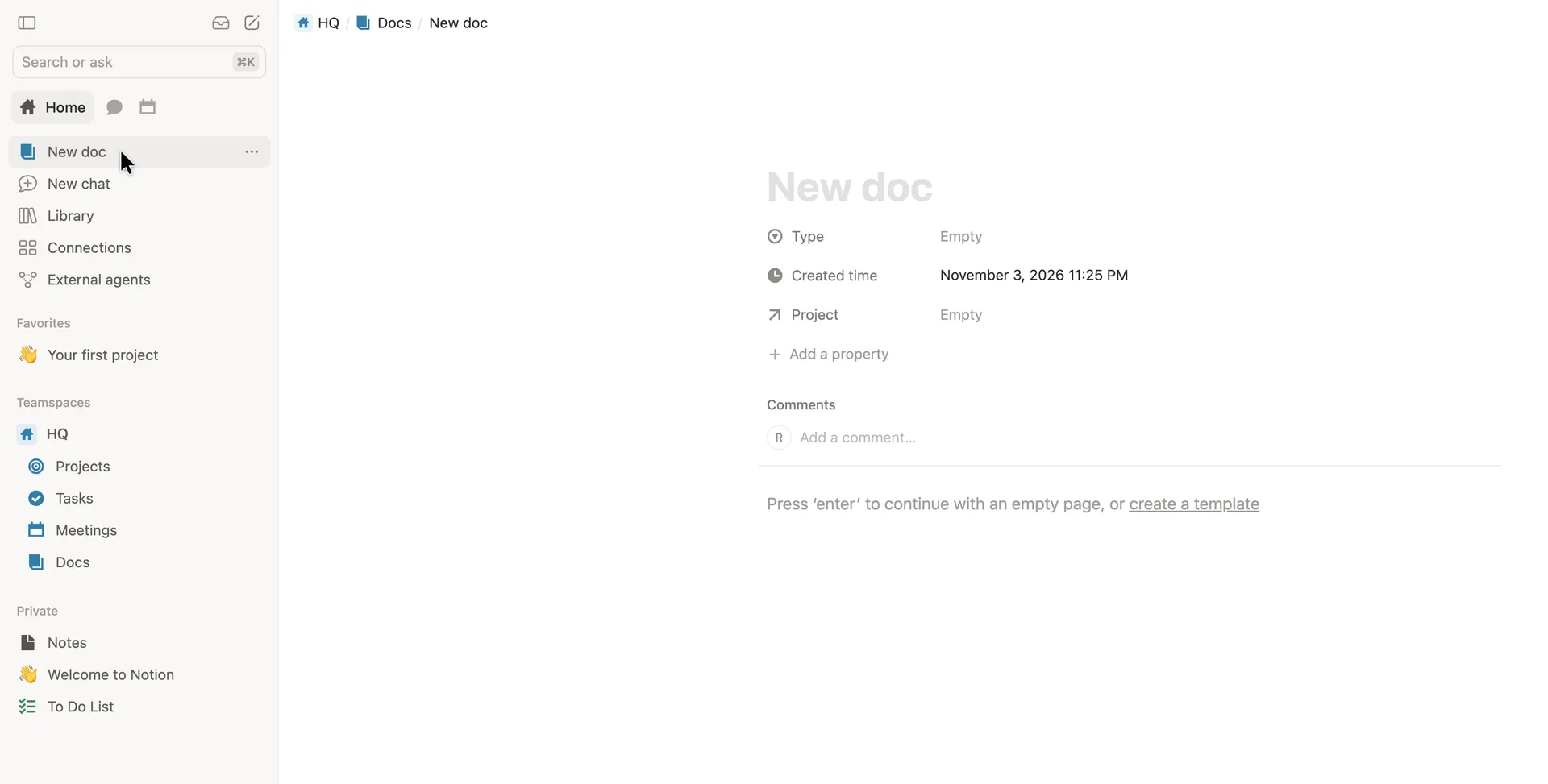
Step 13 of 14:Empty state
Open a blank doc in the team's Docs database
Typed a title, pressed Enter and wrote a first line
Why it works
The first doc lands in a shared, structured place, so a team wiki starts organised without the user deciding where things go. The empty state gives one keyboard instruction (press Enter) and one alternative (a template), instead of a blank canvas with no cue.
What gets in the way
A new user meets database properties (Type, Project) before writing a word, which makes a simple doc look like a form. Nothing explains that Docs is a database or why the page has properties.
What’s on this screen
New doc opens straight into the HQ teamspace's Docs database (breadcrumb HQ / Docs / New doc), not as a loose private page. Grey 'New doc' title placeholder, then database properties already attached: Type (Empty), Created time (filled in), Project (Empty), Add a property. A Comments box with the user's initial. Under a rule: 'Press 'enter' to continue with an empty page, or create a template'.
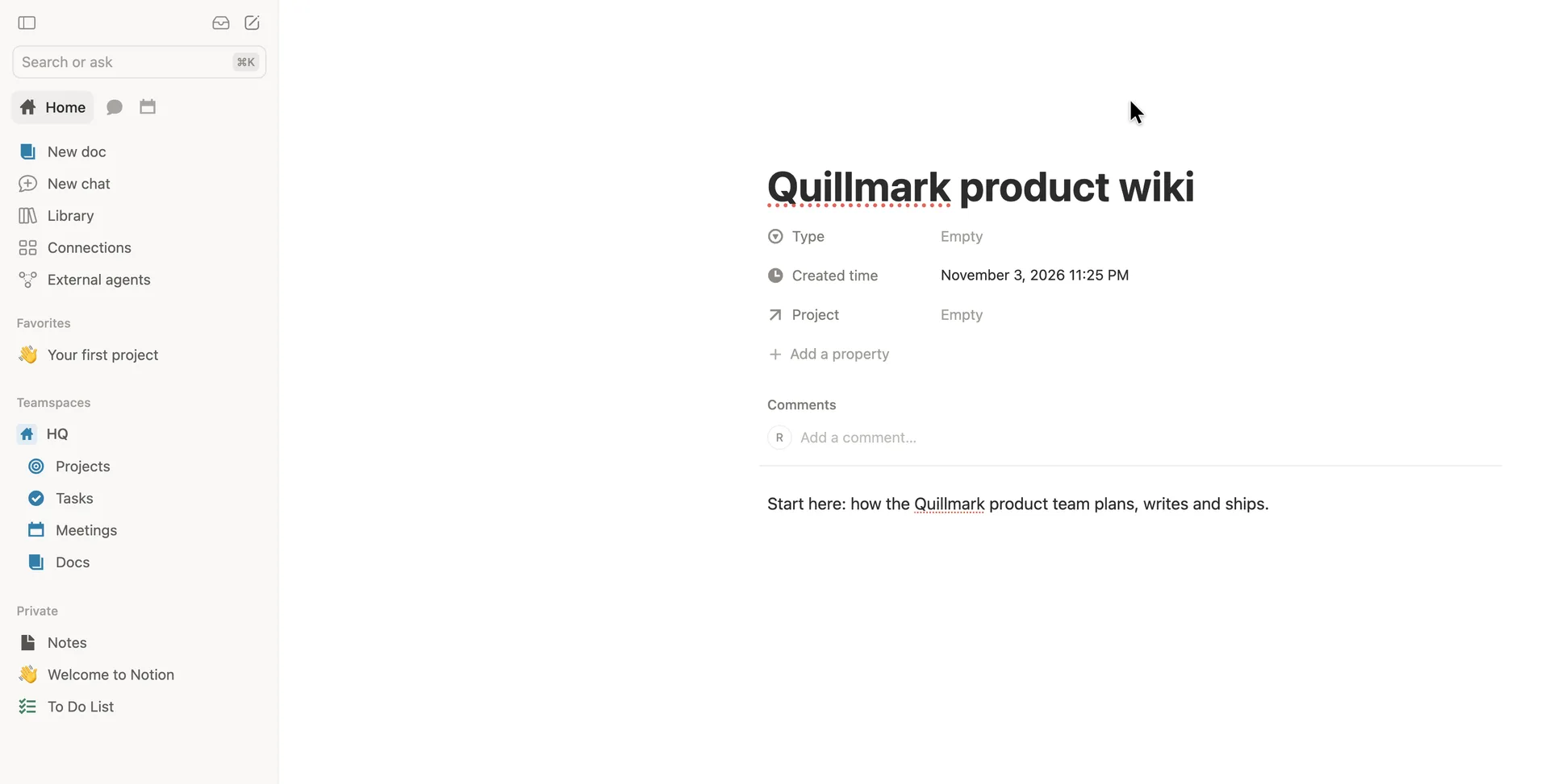
Step 14 of 14:First value
A first doc: the team wiki's start page
Why it works
Typing a title and pressing Enter is all it takes: no save button, no format picker, and the page is live and shareable straight away. Hiding the top bar while you write keeps attention on the words.
What gets in the way
Clicking New doc did not put the cursor in the title, so the first keystrokes went nowhere until the title was clicked. Nothing on this first page says what to do next (share it, add a sub-page, invite the team); the checklist that would is back on the Welcome page.
What’s on this screen
The doc now reads 'Quillmark product wiki' with one line of body text: 'Start here: how the Quillmark product team plans, writes and ships.' The page URL and browser tab took the new title as soon as it was typed. While typing, the top bar with the breadcrumb and Share button fades out, leaving only the sidebar and the page. The doc sits under HQ / Docs in the sidebar's teamspace.
Verdict
What Notion gets right
- Signup asks for one thing, an email, and verifies it with a code on the same card: no password to invent and no separate 'check your inbox' page.
- Every setup question is one tap with short, concrete answers, and each screen says what the answer is for.
- Every offer has a visible way past (Skip, Continue on the Free plan, Skip for now), so nobody has to start a trial or install anything to get in.
- The workspace opens populated: a Welcome page that is itself a Notion checklist, and an HQ teamspace with Projects, Tasks, Meetings and Docs.
- The first doc saves as you type, straight into the team's Docs, with no save button and no format to choose.
What we’d change
- Move 'How did you hear about Notion?' after the user reaches the workspace: it serves Notion's marketing, not the person setting up.
- Keep the progress bar honest. It went backwards after choosing For work, so the setup got longer without a word of warning.
- Give the Welcome page one next step. Nine unticked items, a toggle and a full sidebar all compete for the first click.
- Put the cursor in the title when New doc opens, and hide the Type and Project properties until a doc needs them, so a first doc doesn't look like a form.
How we recorded it
- Recorded
- 3 Nov 2026
- Agent
- Claude Opus 5.5 in Claude Code
- Browser
- Chromium driven through Playwright MCP 0.0.84, a 1920 × 1080 window at 2× pixel density
- Signed up as
- Robin Hale, product manager at Quillmark (a made-up B2B SaaS company); a team of 26 to 50 people; wants a team wiki and product docs
- Stopped at
- Created a first doc, 'Quillmark product wiki', with a title and a line of text, in the HQ teamspace's Docs
- Done by a person
- step 1, sign up with a work email and step 2, enter the code Notion emails you. An agent never accepts a product’s terms or gets past a verification on its own.
The agent answered every setup question as that person and skipped anything that would connect real data or invite real people. Screenshots are cropped to the part of the screen each step is about, and personal data in them is blurred. The figures at the top count the screens up to first value; form fields count every field shown, filled in or not.
Onboarding flows change, and this one is as Notion showed it on 3 Nov 2026. Seen a different flow, or want this page corrected or removed? Write to hello@useronboarding.academy.