
Tooltips are the valet service of onboarding.
They are not fully trusted, considered a burden, and are overlooked by every first-time user most of the time.
Nevertheless, simple tooltips can excessively increase the quality of a user journey, since it also takes away the burden of cherry-picking important information from app messages or modals.
And the best way to understand what differentiates an effective tooltip from a disliked standard tooltip is to see the best examples.
So, let's dive into it:
What Are Tooltips?
Tooltips are user experience (UX) elements that can be adapted to multiple purposes. The main features of a standard tooltip are being minimalistic and direct to the point. The copy on a tooltip usually shouldn't exceed 180 characters.

Tooltips are not liked by many people, and they are considered "spams." The reason behind this is the fact that tooltips are wrongly used most of the time.
- A tooltip shouldn't overlap important parts of the user interface, or shouldn't present a full-screen message.
- A tooltip can only be effective when the tooltip design is simple, the tooltip content is short and clear, and it acts as a focusable element rather than a messenger itself.
What are Tooltips used for?
Both regular tooltips and custom tooltips have the same functions. Here are the most common four of those:
- Highlighting important parts of the screen
Tooltips can be used to draw attention to the navigation menu during the user onboarding process to show them how to get the best out of your tool.
- Creating a focal point
They can also be used to create a more specific focal point than a permanent active element. For instance, by darkening or blurring the surrounding of the tooltip, you can drive the user to focus on a specific point to trigger mouse pointer movement by the user and complete key actions.
- Announcing specific changes or updates
A tooltip can be utilized to act as a less-annoying announcement banner. You can quickly grab users ' attention by placing the tooltip into a hotspot that draws attention to the change or update.
- Reminding a long unsued key feature
Instead of announcing an update, you could also use a standalone tooltip, pointing to the control panel to trigger the activation of a long-unused feature that is crucial to reach the "Aha!" moment.
How Do You Make a Tooltip?
There are three main ways to create a tooltip. Each of them has their own advantages and disadvantages.
Those ways are:
1- Code Your Own From Scratch
You can create your own native tooltips by using HTML, CSS, or JavaScript.
The advantages of coding your own tooltips are:
- You can design, place, and customize them as you wish,
- You won't have to pay for any other tool to get help.
The disadvantages of coding your own tooltips are:
- You will have to spend a lot of time and effort.
- If you don't have enough technical background, the costs of hiring a new developer can exceed third-party tool expenses.
- The maintenance and bug solving processes can be overwhelming.
2- Get Help From Open Sources
There are various open source libraries that can lift some of the weight off your shoulders. Some of those are:
The advantages of using open sources are:
- You can save more time compared to coding yourself from scratch.
- You can also save more money compared to adopting a 3rd party if you have a team that has free time to use the source.
The disadvantages of using open sources are:
- Hiring one can become more expensive than expected if you don't have a team ready.
- Open source tools are usually not customizable, so you wouldn't be able to have a good and blending design.
3- Save Time And Effort With Onboarding Software
User onboarding software mostly provides interactive elements such as individual tooltips, progress bars, checklists, and models. By adopting an onboarding software that fits your needs, you could save both time and effort while creating accessible experiences for your users.
Some of the best of those tools are:
The advantages of adopting a tool are:
- An onboarding tool usually offers a wide range of cool features along with tooltips that can help you create better interactive content.
- The provided templates can save you from starting a bad tooltip design process for nothing.
- It can also save you from the annoying process of coding twice or more for desktop and mobile devices.
The disadvantages of adopting a tool are:
- You will have to spare time for market research and finding the most compatible type of tooltip software.
- If you want more than user onboarding features, you might end up paying more than a developer's salary for a tool per month.
14 Examples of Tooltips for Your Next Design
From classic tooltips to the most original ideas, these companies managed to get the most out of the long-disliked UI pattern: Tooltips.
1- Candy Crush
Candy Crush welcomes new players with a mascot, contextual tooltips with graphic support, and a massive skip button. The user can interact with the function by pointing at the candy as the mascot does.
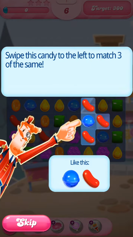
Even though the background is crowded, the worldwide loved game found a comprehensive tooltip solution by integrating simple and single tooltips on each screen.
2- Canva
This contextual tooltip example offers a distinctive overlay tooltip when altering a picture to show out other tools users may test in their projects. Despite its size, the overlay is translucent.
Canva users may close the overlay by tapping anywhere on the screen, or they can learn more by tapping on the circled element.
3- ClickUp
If you are not utilizing the tool to its full potential, ClickUp displays a tooltip showing one of its features that you may benefit from based on the features you utilize. The tooltip also presents a gif to help direct visitors.
Even though the style seems like a traditional tooltip, the fact that this small reminder can increase activation rates is a lifesaver.
4- CuePath
CuePath is a medication reminder tool. Because Cuepath's target user persona is above the age of 65, employing a hotspot aids in persuading users to read material.
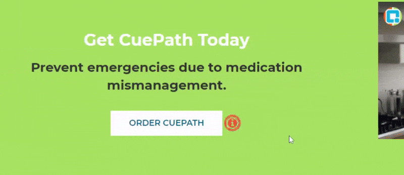
The correct usage of this tooltip functionality is catchy, and the animated tooltip makes it only easier to read.
5- Duolingo
In the initial handful of courses, Duolingo asks users to click on words or letters to see their meanings. It highlights the words and, when clicked, displays the meanings immediately away.

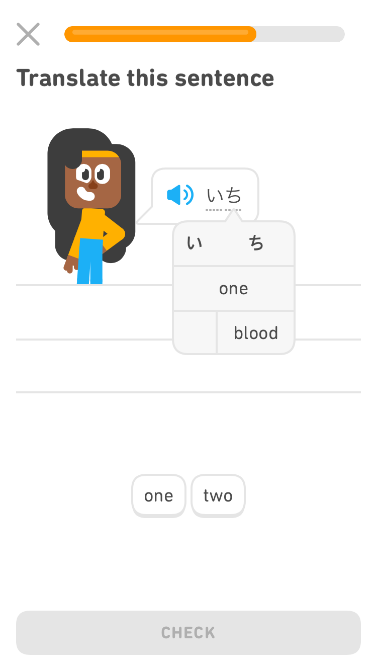
Users are expected to click on the tooltip since they have no notion what the word or sentence is. However, it is not imposed on the user, but rather a user requirement at the time.
6- Evernote
The Evernote app uses a tooltip to notify the user of a feature that they may want to utilize, and clicking on it launches a video that explains how it works.
As you might have noticed so far, tooltip options for mobile devices are as diverse as desktop.
7- Figma
Figma displays a shortcut option to users by proposing a tooltip on the appropriate feature and describing how it may be done more easily in another method.
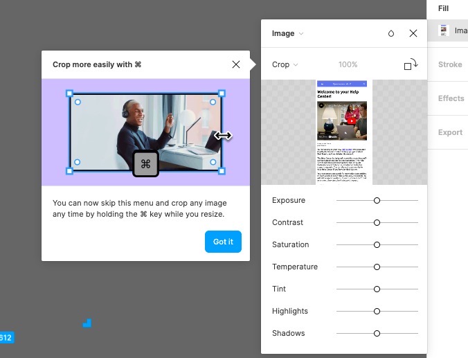
The tooltip is also accompanied by a graphic demonstrating how to use it.
Figma also doesn’t force users to give the shortcut a try, which is often not the case with other tools.
8- Flourish
Flourish greets users with a four-step welcome modal and then prompts them with an onboarding checklist.
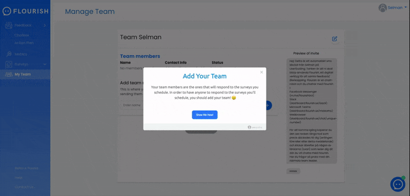
This checklist includes interactive instructions that consist of tooltips, which are activated when a user clicks on the respective step on the checklist.
9- Google Chat
Google Chat has one of the most basic app tours ever. The tour is divided into three phases, after which visitors are provided with another contextual tooltip outside the tour that outlines the options available to them.
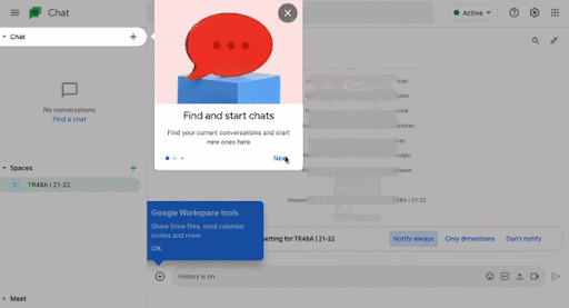
Despite the fact that there are few functions, Google does not overlook the fact that there are contextualities to the apps with the least amount of functionality. It has a contextual tooltip for when users are ready to begin conversing.
10- Heap
Heap employs a trio of onboarding UX patterns to ensure that users pay close attention and focus. They achieve this aim by combining a hotspot and a tooltip and adding a vignette shadow.
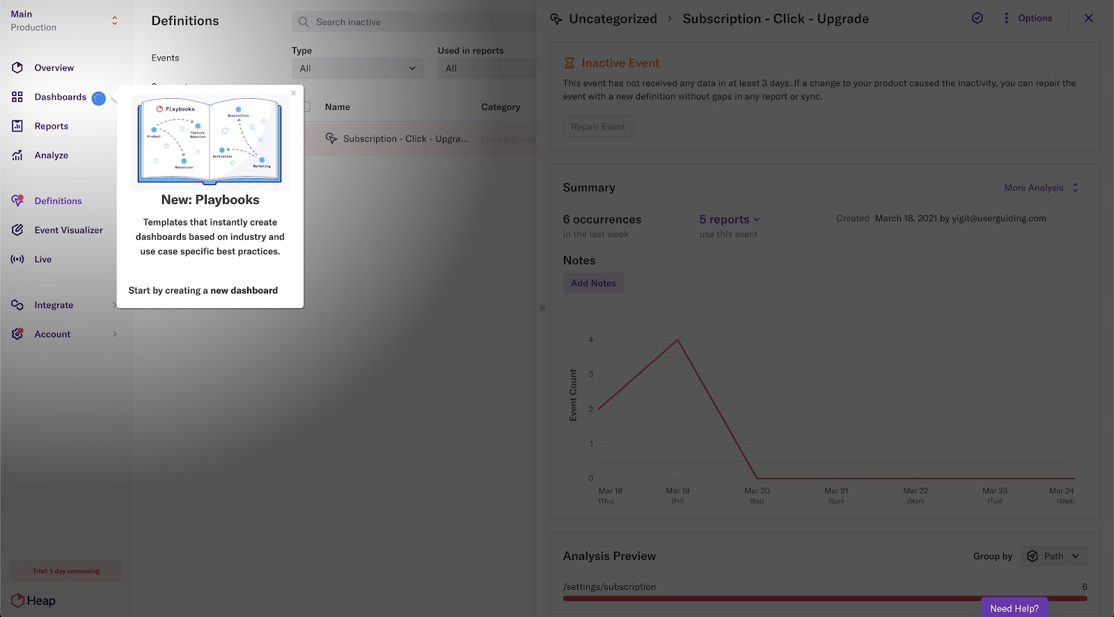
Heap maintains it low-pressure by utilizing a hotspot&tooltip combo instead of an announcement modal, and he includes a close button to allow users to avoid it.
11- Indicata
Indicata informs its users about their latest features and report using tooltips and announcement modals.
They employ a hotspot to open a tooltip with a video for the former, and an announcement modal on the right side of the screen for the latter.
12- Landbot
Landbot, their mascot of the same name, pushes consumers with a product tour offer.
With its slick design and the presence of Landbot (the mascot), the 11-step product tour seems like a breeze.
13- TimeSolv
TimeSolv has a naturally complicated interface, and this is true for individual tool functions as well.
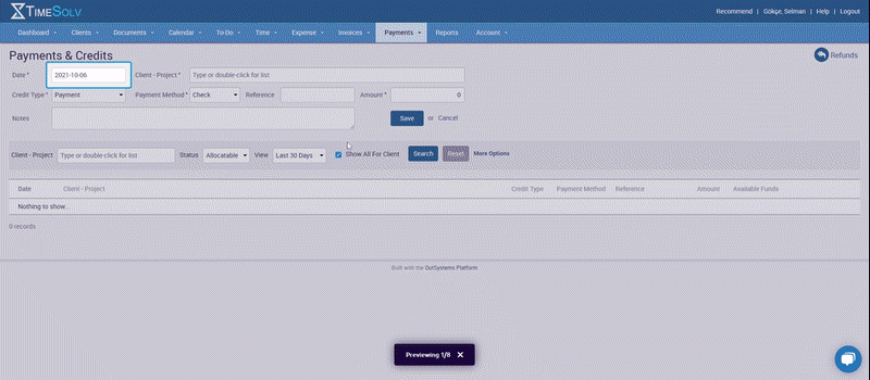
To address this, TimeSolv employs a contextual onboarding strategy that includes tooltips for each region on a page and highlights the areas for greater concentration.
14- Typeform
During the initial onboarding process, during which users learn how to utilize Typeform's capabilities, the tool prompts them with many hotspots throughout the screen.
Users learn how to utilize the tool at their own pace by clicking on everything they desire, completing only one action per tooltip to increase the learning rate.


