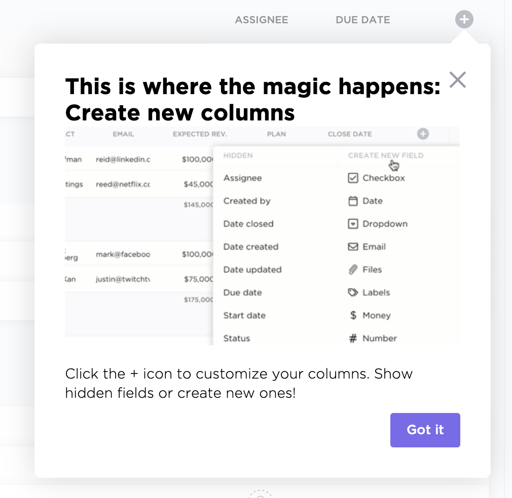
If you are not using the tool to its full extent, ClickUp prompts a tooltip showing users one of its features that you can benefit from considering the features you use. The tooltip shows a gif to direct the users better.

✅ Right choice of onboarding element - Rather than using a new feature popup or a promotional modal, it is better to use a tooltip for recommendation purposes. Because it is smaller and often fades into the background, it doesn’t annoy users.
✅ Interactive - Because the tooltip is situated right on the feature button itself, the tooltip becomes an interactive solution rather than a static copy.
✅ Gifs make it easier - ClickUp uses a gif inside the tooltip which makes it slightly less interactive but less annoying for the users since they won’t have to go through the process themselves.