
The very first impression a user has with your product can be the game-changer.
Their initial experience both on the usability and design parts determines whether or not they will purchase. Science backs this up too:
Especially for SaaS apps, eCommerce sites, and mobile apps that prioritize retention; less satisfaction can mean fewer profits. That's why a perfectly optimized, visually and functionally pleasing user onboarding is a must-have, not a nice-to-have.
In this article, I'll go over a few user onboarding experiences to help inspire you for your next design. I'll start with the least-satisfying ones and go all the way to my all-time favorites.
#1 Spotify - start with the worst
- Created: In-house
- Average Completion Time: -
- Used UX Patterns: Signup Forms
Spotify is highly notorious when it comes to UX design.
The first of these UX mistakes come in the form of a user onboarding process.
Well, actually, it doesn't come at all.
Let me explain. When you go over to Spotify's website (or download the Spotify app on your mobile device) the first thing you do is to signup for the product.
Signing up for a product, as you know, is the first step of a user onboarding process in most cases.
Their signup form looks like this for desktop:

And they don't provide one-click signup through Google, which is a fatal sin in my book.
And that's it.
The user onboarding process of Spotify is literally over at this stage. There are no in-app tutorials, no tooltips, no hotspots, no welcome modals, no nothing.
I get it, Spotify offers the UI and UX that we have been familiar with for years, from the days of old school music players and libraries. That requires no introduction, right?
Wrong.
Everyone listens to music, from your average young adult to your great-aunt who just bought her first smartphone. Why make the transition from radio cassettes to music streaming even harder by not including any user onboarding?
Why Spotify's User Onboarding is bad:
- First off, the signup form is unnecessarily crowded with fields that are not necessary for creating an account. Surveys after logging in can be used to improve conversions, to gather info about the user.
- There are no user onboarding elements that guide new users through the platform. A mobile app or a desktop platform at least requires an optional UI tour that shows users what task they can do, where.
#2 Frase.io - it's better than nothing
- Created: with Shepherd.js
- Average Completion Time: 2 minutes
- Used UX Patterns: Signup Forms, Product Walkthroughs, Tooltips
Frase is an SEO content writing platform that businesses and individuals can primarily use to write content with search engine optimizations on the spot.
It works similar to a text editor, but with a few twists that help platform's AI understand what you're trying to do in terms of SEO, and suggest additions and changes accordingly.
Although these twists are helpful, the comprehensiveness of the product adds to its complexity. Even the core features of Frase need at least a bit of introduction before you can fully utilize them.
The team of Frase, aware of this complexity, wanted to adopt a simple solution to solve this problem, which is insufficient in my opinion but we'll get to that in a bit.
Now, let's take a look at their signup form:
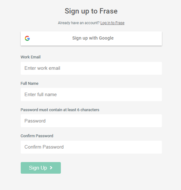
The registration form of Frase is pretty simple, and they offer the "Sign up with Google" option at the top. There aren't any sins up on the first stage of their user onboarding process.
Once you signup, you're at an empty "Documents" page (on Frase, you work on individual documents and their SEO, similar to any text editor such as Google Docs). No checklist or welcome modal tells you about what's going to happen next.
So the obvious next step is to create a document. Once you display the "document creation" page, an interactive tour pops up on your screen:
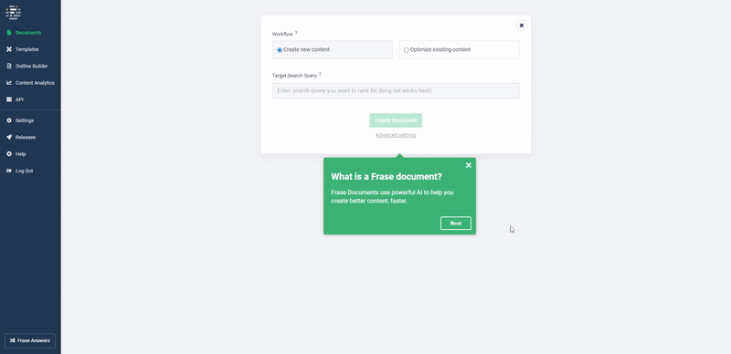
This document creation screen is the first step of improving the SEO of your content, as you enter the necessary keywords and fill out the region you want to work on, etc.
So it makes sense to include a product tour here, to help users understand this function. The product tour is ultimately simple, and it tries to educate you instead of assisting you as you complete the task.
For me, I'd prefer something like "Let's create your first document. Fill out your first keyword here:" instead of "This is where you fill out your keywords."
Once you go over this product tour, fill out the fields for your first document and enter the editor, another product tour presents itself:
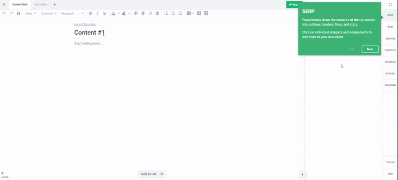
Another "UI tour", of course.
It goes over the key features of the editor one by one and briefly explains what each one does. In terms of the information given, these little tours are pretty sufficient.
But for a good user onboarding, they're far from good.
First of all, they are not even adjusted to your workflow; the tooltips come in the order of the dashboard, not in the order of your progress.
The product tour describes the elements of the UI from left to right, then top to bottom; instead of delivering the information according to the steps you're going to take on the UX in order to complete tasks.
Also, they inform you instead of assisting you as you complete the task. These product tours are far from helping users get to the aha moment because you don't progress through the user journey as you complete them; you just learn about the UI elements.
Instead, these tours should be more like walkthroughs that walk the users through their first task.
And lastly, in addition to this document editor, Frase offers some valuable product features such as real-time content analysis by integrating with your Google Search Console, and an outline builder that can help you create briefings for your content team.
But there is no user onboarding content aimed at promoting these features that are just as valuable as the core ones; users won't be aware of them unless they wanted to mess around with the tool.
Why Frase's User Onboarding is bad:
- Frase's product tours are simple and smooth, but they're poorly designed in terms of UX and don't actually help users get to the aha moment. Instead, they just provide information.
- Frase could utilize elements such as hotspots or user onboarding checklists to drawing some attention to their other features that can greatly improve the value their users get from their platform (which always means better conversion rates.)
#3 UiPath - your average software onboarding
- Created: with Userpilot
- Average Completion Time: 10 minutes
- Used UX Patterns: Signup Forms (One-click Signup), Product Walkthroughs, Tooltips
UiPath is an innovative automation platform that focuses on improving work processes and reducing repetitive tasks to save time.
Used by companies like Google, Nasa, and Autodesk; UiPath is an automation cloud that medium-sized businesses and above need.
Their user onboarding is OK, which is slightly above average compared to most platforms.
They don't have much that can be criticized, nor do they have anything good going on to make their UX outstanding.
The user onboarding flow starts with a simple signup process that primarily focuses on getting users to signup with their Google, Microsoft, or LinkedIn accounts. (As enterprise software, the more connected accounts you have, the more chances for you to do ABM.)
It looks something likes this:
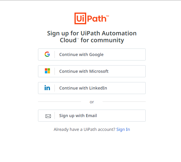
Simple and smooth. This should be the standard signup screen for every software.
Once you're logged in, you're welcomed by an empty dashboard that urges you to download their desktop software.
If you move on, you're greeted by a product tour that they call "The 6-Click Orchestrator Tour", which looks something like this:
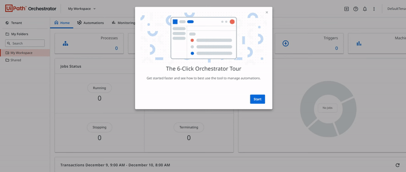
The reason this product tour is better than Frase's is that it follows the steps the user will take, instead of going from top to bottom.
And contrary to Frase, this product tour is actually optional, so you can skip it if you know your way around the platform.
They also utilize in-app modals to quickly announce changes in their UI or promote other features, which looks like this:
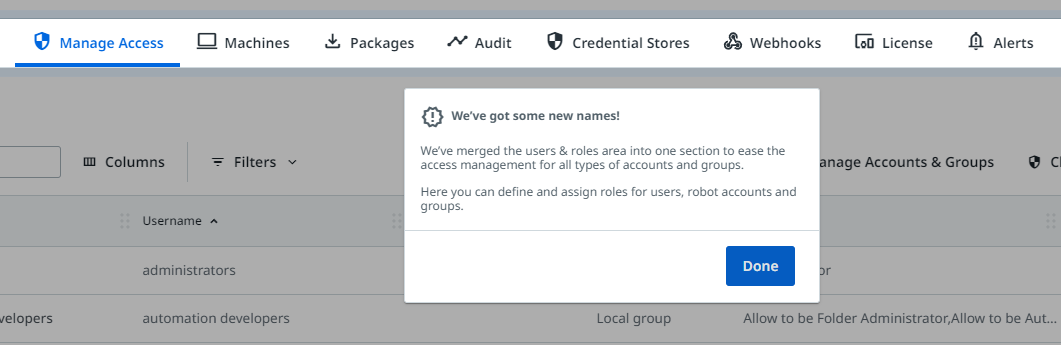
The onboarding flows in UiPath's UX feel optimized and try to help you get adjusted to the platform's features instead of telling you about them.
Why UiPath's User Onboarding is good:
- The product tours are simple and are designed around the workflow of the users, not the order of the dashboard.
- They provide the option to skip product tours, which is a plus considering not all users will want to go through your user onboarding process.
- They utilize in-app modals to promote features or announce changes in their UI which will help existing users further use the product or readjust themselves with the changes.
#4 Calendly - simple products require simpler onboarding processes
- Created: Inhouse
- Average Completion Time: 5 minutes
- Used UX Patterns: Signup Forms (One-click Signup), User Onboarding Checklists
Calendly is a simple product.
If you create a Calendly account with whatever business suite or calendar you're using, you can make scheduling meetings 10 times easier.
It provides you with a dedicated link to your own meeting-scheduling screen that displays when you're free based on real-time data from your calendar, and that's it.
No extra settings, no advanced features, no complexity.
The way that they apply this same simplicity to their user onboarding process is outstanding. It takes you under 5 minutes to sign up for the product and be done with it.
First off, the sign-up screen:
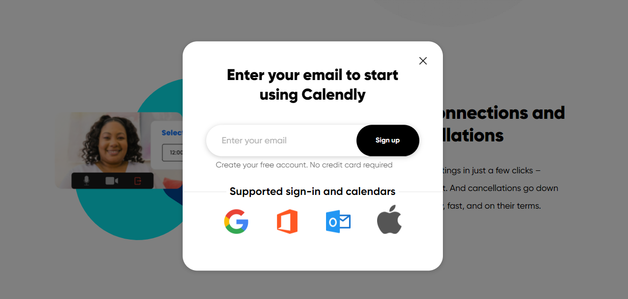
You simply enter your email first, then you can select whether or not you want to have an account with a password or an account created through Google (or other platforms). The simplified signup process greatly reduces the duration of the onboarding flow, which should result in more activations.
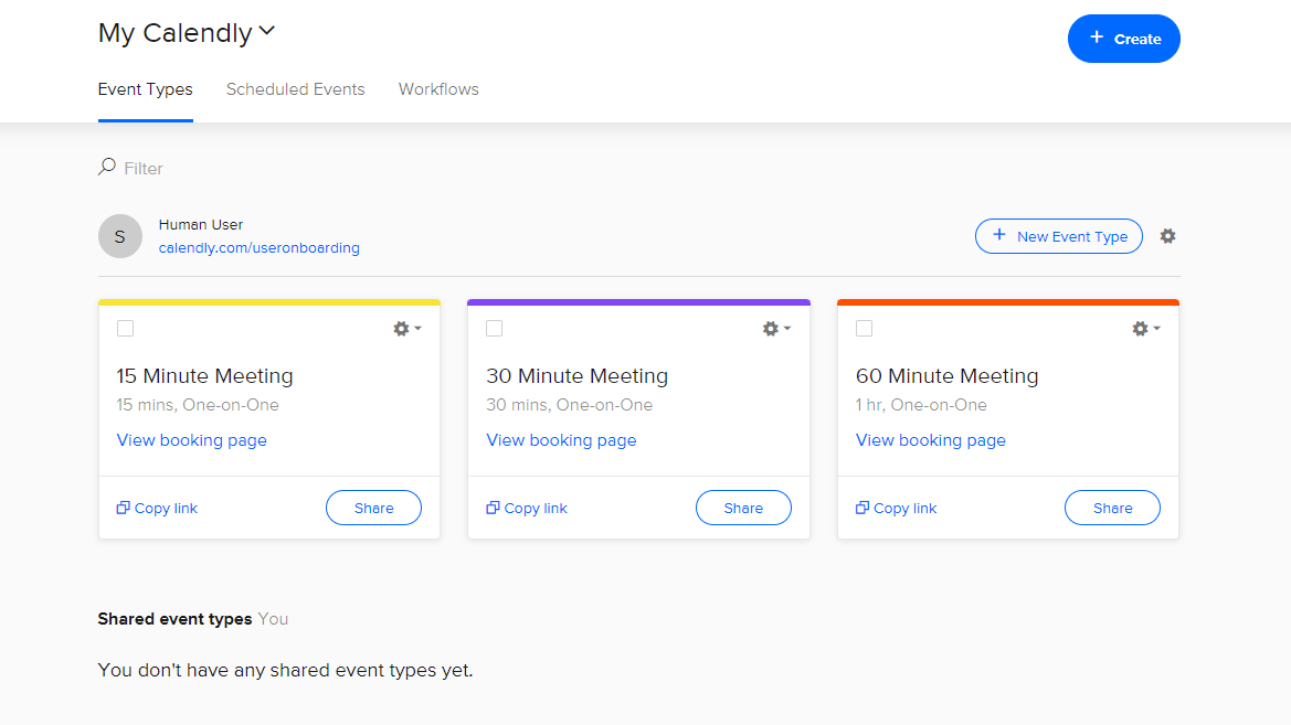
After you signup, you are introduced to your dashboard which contrary to other products on this list, is not empty.
I am sure the crushing majority of meetings we schedule online are for 15, 30, or 60 minutes. Since Calendly probably has access to the durations of the meetings their users schedule, they should know this for a fact.
And that's why they already create your personal booking links for 15, 30, and 60 minutes. I think for most people, these links would just be enough to get through a work day.
Here's what it looks like:
If Calendly went the Spotify route and had no in-product onboarding, I would not complain. But they created an in-product user onboarding experience without bothering the users who wouldn't want to go through it.
They've used a user onboarding checklist with 3 simple steps in it. Here's how it looks:
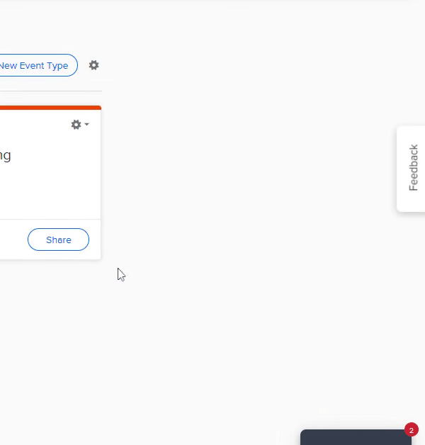
No interactive elements or guides are triggered once you click the steps, though. They just direct you to the page for creating new events, which acts as a simple form you fill out and click done to generate your new meeting link.
Once you create that event, you're of course expected to try that link to make sure it works. And that's the last step of Calendly's user onboarding experience:
You click the link to your new event and schedule a meeting with yourself; which helps you understand both sides of using Calendly (creating events and scheduling them) and grasp the value of the platform, all in under just 5 minutes.
Why Calendly's User Onboarding is great:
- Calendly welcomes users with ready-to-use meeting links for quickly getting started with the product.
- Calendly, as a simple product, understands the assignment of quickly onboarding users to their platform and uses 3 simple steps and an onboarding checklist to get users to grasp its value.
#5 Genially - everything a user can ask for
- Created: with UserGuiding
- Average Completion Time: 10 minutes
- Used UX Patterns: Product Showcase Elements, Signup Forms (One-click Signup), Progressive Profiling Surveys, User Onboarding Checklists, Interactive Guides, Tooltips
Genially is a visual media creation tool that helps you and your team create interactive and visually appealing media.
Their user experience and onboarding flow act as outstanding examples to the software space, because they have everything you need.
Let's dig in with the first step of the journey, and it's not signup for this example.
Because Genially does a great job showcasing their product and value on their homepage too.
They use interactive elements like this to bring interactivity into the first impression their users have of their product. It looks (and functions) like this:
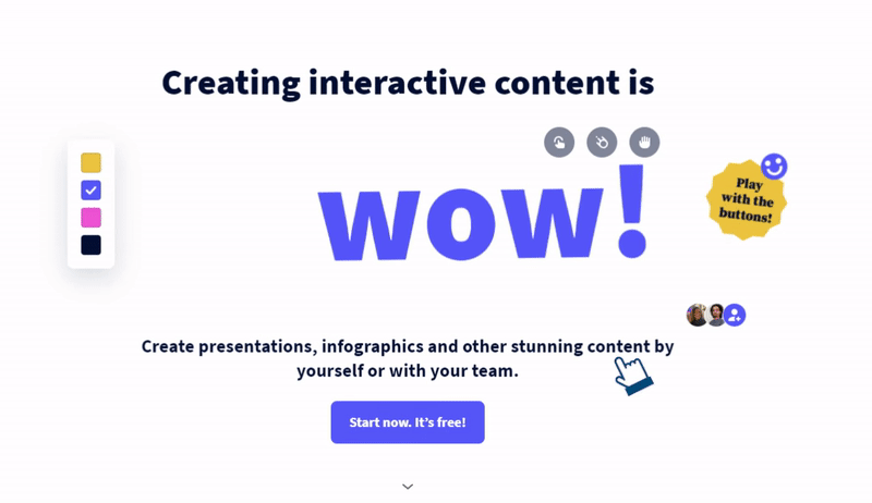
Naturally, that's not their product itself. But they've done a great job summarizing the value of their platform and boosting engagement along the way.
And when you click the big blue button under it to register for the platform, you encounter a perfect signup screen:
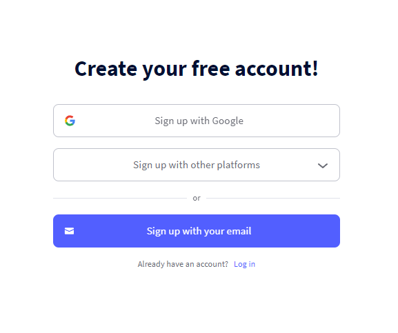
The first thing they do is ensure you enter your email or sign up with your Google account and create your Genially account. They don't ask for additional questions that will help them personalize your in-app experience.
At least not yet.
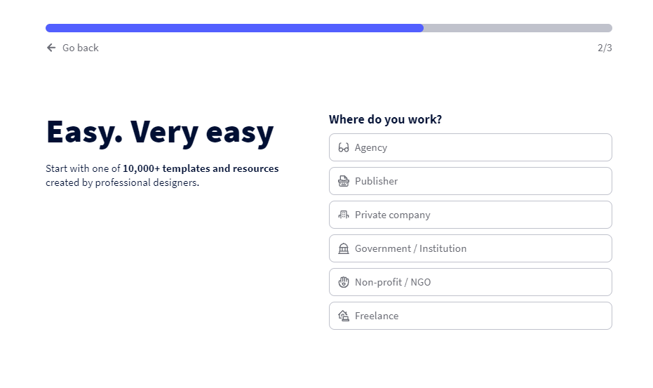
Once you create your account and log in to the platform, you're asked three simple questions. These questions would be annoying if they required "text" answers, but choosing an option with a single click reduces the time it takes you to get over this one.
Here's what it looks like:
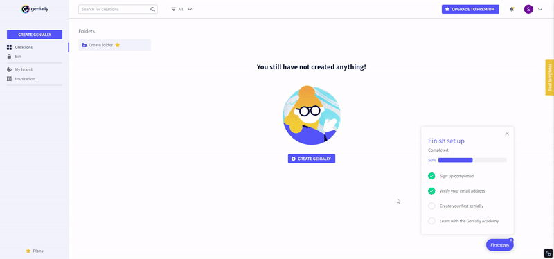
Genially doesn't utilize any welcome modals that pop up right when you log in. This could be annoying for some people, so they do something similar to what Calendly does.
They use a user onboarding checklist (that's more visually appealing):

If you signed in through Google, you've probably already completed half the steps of the checklist. This can tempt active users to finish the rest of the steps (the last thing I want to see is a full empty checklist in the middle of a workday!).
When you click the third step "Create your first genially", it triggers a tooltip to the creation section of the tool:
Once you click on the "Create Genially" button, you are shown dozens of templates (possibly based on the answers to the questions you were asked) and you select one.
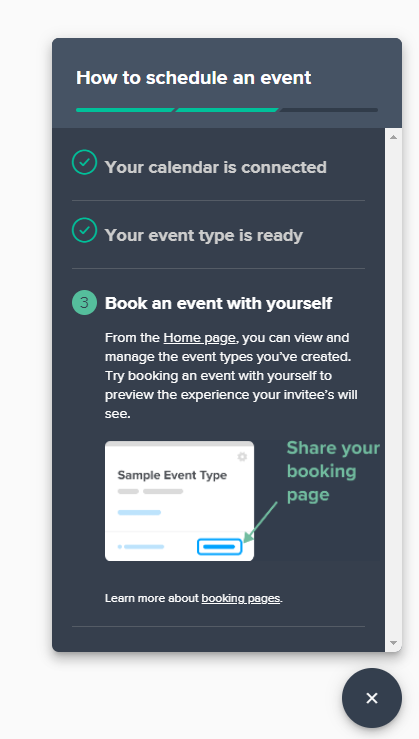
This opens up the Genially Editor, where the magic happens. You are welcomed with a product tour that looks like this:
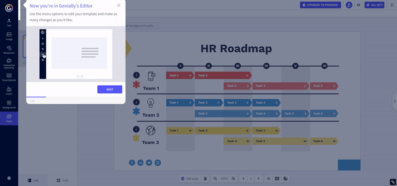
Notice how the product tour goes from the editor area to the "preview" area, then to the "share" area, and finally to the "ALL SET" button? Just like the order you would use the product; edit, preview, share, and download/publish.
Although this product tour could use a few additional steps (like adding new elements, dragging and dropping, etc.), it helps the user understand how they can get through the editor in 4 simple steps.
Why Genially's User Onboarding is perfect:
- Genially starts onboarding users before the signup process with a product demonstration, which is a difficult but rewarding task to achieve.
- Genially provides a smooth signup process with very little input from you, and asks questions about your background after you create an account.
- Genially displays a user onboarding checklist that is half-completed (since it starts from signup) which encourages users to complete the rest of the tasks.
- Genially's product tour for the editor section follows the steps of creating a genially within the product, which helps the user understand what they're supposed to do.
A Good User Onboarding is not Difficult to Achieve:
Building a good user onboarding is not a challenging task. Once you understand what your product does, who your user is, and how they proceed to use your product, you'll have a clear understanding of how you should help them.
The onboarding examples on this list can help inspire you for your next user onboarding design and make it significantly better than the competition.
However, having the "perfect" user onboarding flow that reduces the churn rate, boosts the conversion rate, and creates loyal customers is only achievable through optimizing your already "good" onboarding experience.
Good luck!


