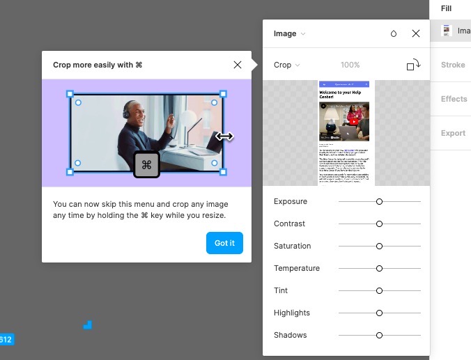
Figma shows the users a shortcut option by prompting a tooltip on the appropriate feature and explaining how it is done more easier some other way. The tooltip is also accompanied by an image showing how it’s done.

✅ Contextual - By making sure the tooltip is shown exactly when the user sees the crop option or when they interact with it, Figma uses contextual onboarding, which makes it easier for users to understand and even try the feature.
✅ Visual support - By showing a tiny explanatory image, Figma increases the chances of the feature being used. This is because users are more likely to remember the details of a shortcut when shown a visual.
✅ Dismissable - Figma doesn’t force users to give the shortcut a try, which is often not the case with other tools. Because the tooltip is dismissable, the users know that this is a tip, not another step in the onboarding flow.