Article · 6 min read
Best Product Tour Examples for Better User Experience
The best product tour examples share three mechanics: they start from something the user wants to do, keep each tour to a handful of steps, and let users leave at every step. Grammarly, Ghostwriter.ai and HubSpot show three versions, and seven of the ten in-app tours we compare below run three to seven steps.
 By Ece Cakanel
In short
Good product tours are short, hands-on and easy to leave. Grammarly teaches in a demo document full of deliberate mistakes, Ghostwriter.ai gives each tool its own short guide, and HubSpot turns a technical setup into small steps with an honest shortcut. A table of ten more tours, from 3 to 14 steps, shows what lets a longer tour work.
Many lists of product tour examples now come from interactive-demo vendors, and they mix clickable demos on marketing sites with tours that run inside a product. This list sticks to in-app tours, and for each one records the parts you can copy: what starts the tour, how many steps it takes and how users get out. The details come from our inspirations library write-ups, each based on screenshots taken at the time; the products may look different today.
What is a product tour?
A product tour is a guided walkthrough inside a product that introduces users to its features as they use it. It usually combines tooltips, modals and hotspots, and appears when a user first opens the product or a specific feature.
An interactive demo is different: it's a clickable copy of the product on a website, for people who haven't signed up. Both get called product tours, but only the in-app kind teaches people in the product they'll actually use. For how to build one step by step, see our guide to creating a product tour.
Why do product tours matter?
A well-made product tour shortens the time between sign-up and the first useful result. It helps in five ways:
- Onboarding: new users grasp the core features faster, so the learning curve feels shorter.
- Less frustration: a complex product is broken into pieces small enough to absorb and apply.
- Engagement: an interactive tour keeps attention on the parts of the product that matter.
- Feature discovery: users find features they would otherwise miss.
- Fewer support requests: questions get answered in the product before users reach for support.
None of this happens if the tour is too long, too generic or impossible to escape. Some tours annoy users enough that they abandon the product.
What makes a product tour example worth copying?
A product tour is worth copying when it gets users doing something real within the first step or two. The examples below share five traits:
- It starts from the user's goal, not from a list of features.
- It's short, or split into several short tours.
- It's hands-on: users click, type or accept a suggestion instead of reading about it.
- It shows progress and an exit on every step: a step counter and a skip or close button.
- It can be found again, from a checklist, help menu or resource centre.
Best product tour examples
1. Grammarly
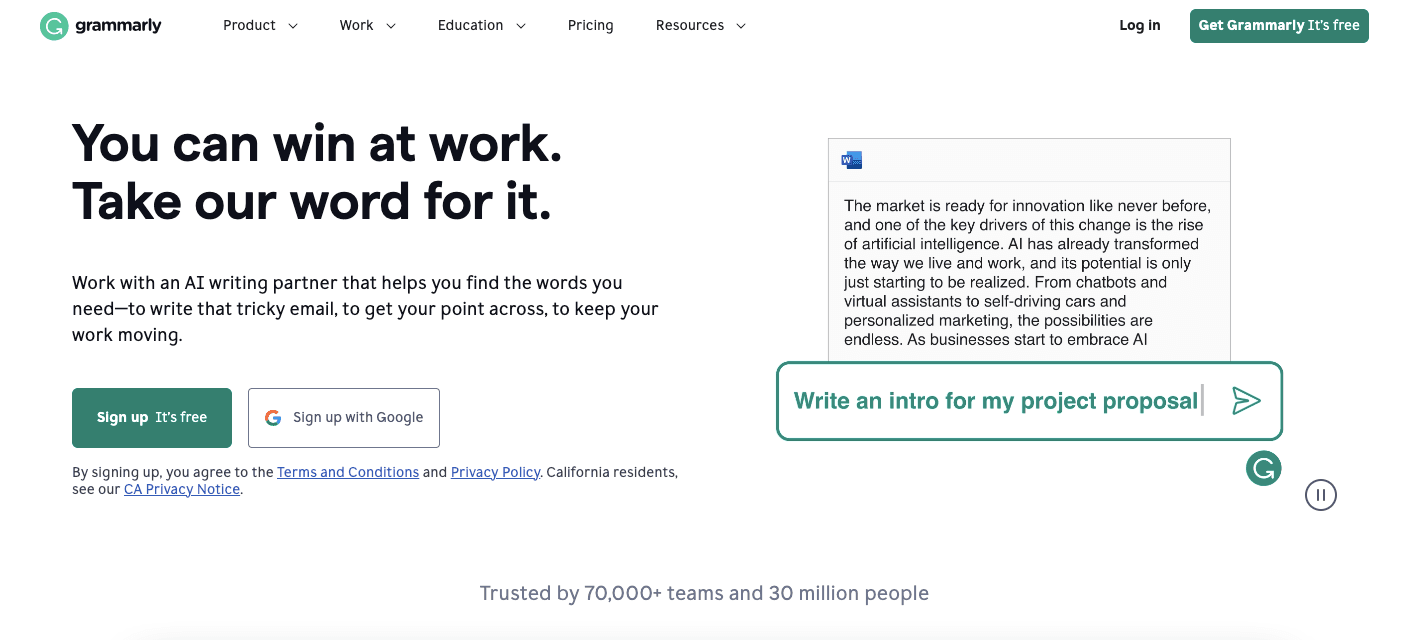
Grammarly is a writing assistant that checks grammar, spelling, clarity and tone. Its first-run product tour is a lesson in using a demo environment.
At the time of our screenshot, the tour started from a modal ("Ready to write something brilliant?") with two choices: Start a quick tour, or Skip the tour, right under it. The tour ran inside a demo document written with deliberate mistakes. Hotspots on Grammarly's suggestion cards opened tooltips such as "Click to correct your spelling", so users learned by accepting a real suggestion.
Grammarly personalises as well. A separate modal asked "I want help with:" and let users pick topics such as spelling and grammar, tone and delivery, or conciseness, with a Skip link below. When Grammarly later added email highlights to Gmail, it introduced them with a four-step tour of black tooltips inside Gmail itself, and the last step showed how to turn the feature off.
What to copy:
- A demo document shows every type of suggestion at once, which a user's own text might not.
- Hotspots let the user set the pace.
- Personalisation and skipping are both one click away.
2. Ghostwriter.ai
Ghostwriter.ai is an AI writing tool with several separate tools inside it. Instead of one long tour, it gave each tool its own interactive guide.
Each guide opened with an illustrated welcome modal, such as "Welcome to Curator tool", then moved through tooltips that highlighted one field or card at a time and dimmed the rest of the screen. Every step had Previous and Next buttons and a progress bar (the Curator guide ran to eight steps), and some steps included an animated GIF.
What to copy:
- Splitting guidance by tool keeps each tour short, even when the product is large.
- A guide appears when the user opens the tool it explains, not on day one.
- Highlighting one element at a time leaves no doubt about where to look.
3. HubSpot
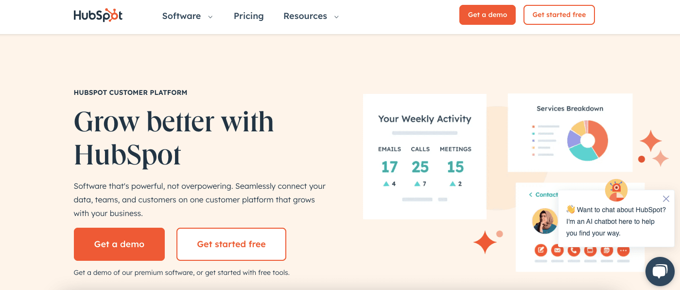
HubSpot is a CRM platform for sales, marketing and customer service. Instead of one big tour, it uses short, task-specific guidance across the product.
Connecting a domain, a task many users find technical, ran as a three-stage setup wizard at the time of our screenshot. Four numbered steps opened one at a time, each with short instructions and a checkbox to confirm it ("I'm logged in."). A line under the heading offered a shortcut for experts: "Want to skip the step-by-step instructions? View your DNS records".
Elsewhere, HubSpot used single-step guidance where it fit: a one-step tooltip introducing a new Overview tab on the company record, and a tooltip asking users to turn on browser notifications when they opened the Notifications panel, with Continue and Maybe later buttons.
What to copy:
- Only the current step is open, so there's never much to read at once.
- The skip link says exactly where it goes, so nobody skips by accident.
- One-step tooltips for small changes, a guided wizard for big tasks.
How long are good product tours? 10 more examples
Most good in-app tours run three to seven steps; longer ones work only with short copy and a visible exit. The table lists ten more tours from our library, by length.
| Product | Tour | Steps | What made it work |
|---|---|---|---|
| Upwork | Contract details, offered as "take a quick tour" | 3 | Opt-in start and a progress bar |
| Google Analytics | New Landing page report | 3 | Each tooltip asks for one click |
| Grammarly | New email highlights, inside Gmail | 4 | Black tooltips that stand out on Gmail, an off switch in the last step |
| WordPress | Block editor welcome slideshow | 4 | A small modal over a dimmed page, with a close button |
| ClickUp | Whiteboards, then in beta | 5 | A step counter, and a feedback link at the end |
| Candu | Content studio guide | 6 | A step counter, a Skip link and a GIF on every card |
| CitizenShipper | First-run tour | 7 | Start tour and Skip buttons, and a resource centre for skippers |
| Figma | Editor walkthrough | 10 | Opt-in start, an image and a Learn more link on each step |
| Landbot | Building a first bot | 11 | A mascot, Skip tour on every step, confetti at the end |
| Vieworks | Primary features | 14 | Very short tooltips, and about half the steps ask the user to act |
Seven of the ten run three to seven steps. The three longer ones all make the start optional or keep each step very short, and show a counter and an exit throughout. Tours for a single new feature sit at the short end; see our guide to new feature onboarding for how to size them.
What do the best product tour examples have in common?
The best product tour examples show the product working on the first step, not a description of it. Grammarly does it with a demo document, Ghostwriter.ai with one small guide per tool, and HubSpot with a wizard that does the task as it teaches it.
They also share personalisation, progressive disclosure and user control: users choose what to learn, see a little at a time and can leave whenever they like. Build those three into your own tour, keep it within the step counts above, and test it with real users before you add anything. For the first-run sequence around the tour, see our guide to onboarding tours.

About the author
Ece CakanelEce is a creative content writer and enjoys writing and researching about UX, design, and other topics surrounding onboarding.