Article · 6 min read
In-App Onboarding - Definition, Best Practices, and Examples
In-app onboarding is the guidance inside your product that teaches new users to use it: welcome screens, tours, tooltips, checklists and empty states. The skill is matching the pattern to the moment, such as a question when the answer changes the next screen, or a tooltip the first time someone uses a feature.
 By Hilal Yıldırım
In short
A definition of in-app onboarding, a table matching seven in-app patterns to the moment each one fits, the practical differences between web and mobile onboarding, and what three mobile apps did at the time of their screenshots. It ends with what building it takes: open-source libraries, or no-code tools whose published entry prices we read in October 2026.
Most guides to in-app onboarding list the same patterns: welcome screens, product tours, tooltips, checklists. What they rarely say is which one to use when. The answer depends on the moment: a question belongs where the answer changes the next screen, a tour where the first task spans several screens, a tooltip where someone uses a feature for the first time. Below is that mapping with real examples, plus the web and mobile differences that change it.
Think of in-app onboarding as a small map of an unfamiliar country: you want users to feel welcomed, and motivated, from their first click.
What is in-app onboarding?
In-app onboarding is the guidance users get inside your app, web or mobile, after they first launch it: what the app does, how to move around it, and what they gain from it. Emails and help articles support it from outside; in-app onboarding happens on the screen where users do the work.
The main goals of in-app onboarding are to:
- Reduce friction: make it as easy as possible to get started.
- Increase engagement: encourage users to discover the app's features.
- Improve retention: raise the chance that users come back.
- Demonstrate value: show how the app solves a problem or meets a need.
Why is in-app onboarding important?
In-app onboarding decides whether new users get far enough to see your app's value:
- First impressions: if the first experience is confusing, users are more likely to abandon the app.
- Less churn: users who understand your app are less likely to uninstall it.
- More engagement and conversion: users who find features use them, and well-designed onboarding can lift signups and purchases.
- Competitive advantage: in a crowded app market, good onboarding sets you apart.
- Feedback: onboarding is a chance to learn what confuses users and iterate.
Which in-app onboarding pattern fits which moment?
Each pattern solves one problem at one moment. Used at the wrong moment, the same pattern becomes an interruption.
| Pattern | Use it when | Skip it when | Example |
|---|---|---|---|
| Welcome screen with questions | The answers change what the user sees next | Everyone would get the same screens anyway | Headspace set the first session length from one question (screenshot below) |
| Product tour | The first task spans several screens | The tour would follow the layout instead of the task | Upwork's three-step quick tour, offered on a modal users could decline (captured in 2022) |
| Hotspots | Users should explore at their own pace | The step is required to continue | Typeform's hotspots let users pick what to learn first (captured in 2022) |
| Checklist | Setup takes several separate actions | There's only one thing to do | Asana's five-step dashboard checklist (captured in 2022) |
| Contextual tooltip | Someone uses a feature for the first time | The label already explains it | Duolingo's in-lesson tooltip on the word to tap (captured in 2022) |
| Empty state | A screen has no content yet | Never: every empty screen can teach something | Airbnb's empty Trips tab (screenshot below) |
| Permission prompt (mobile) | The feature that needs it is about to be used | At first launch, before users know why | Pinterest explained its tracking request in plain language before asking (captured in 2022) |
How does web app onboarding differ from mobile app onboarding?
The patterns are the same; the constraints aren't. Mobile screens show one thing at a time and have no hover, and mobile apps ask for permissions that web apps rarely need.
| Web app | Mobile app | |
|---|---|---|
| Screen space | Room for side panels, checklists and multi-step tours | One thing at a time: full-screen steps and short copy |
| Input | Hover works, so hover-triggered hints are possible | No hover: every hint must be tappable |
| Permissions | Mostly browser notifications | Camera, location, notifications: ask in context and explain why |
| First contact | A link and a signup form | An app store listing, then the install |
| Changing the flow | Changes ship as soon as you deploy | Changes in app code wait for a store release, unless the onboarding content loads from a server |
1. Web app onboarding
Web app onboarding happens in a browser. Make the app adapt to every screen size, map whether users arrive on a desktop or a mobile browser, and make it easy to bookmark the app or add it to the home screen.
2. Mobile app onboarding
Mobile app onboarding starts in the app store, so your listing should say clearly what the app does. Explain each permission and ask when it's needed, design a user-friendly onboarding UI for touch, and keep improving onboarding with each app update.
What are the best practices for in-app onboarding?
Good in-app onboarding starts small, teaches by doing and changes with what you learn. Seven practices:
- Keep it simple. Don't overwhelm users at once. Start with the essentials, and use plain language without jargon.
- Use progressive disclosure. Introduce features as users interact with the app, with tooltips for features that aren't obvious.
- Make tutorials interactive. Guide users through key actions, and let them practise in a safe environment.
- Personalise. Tailor onboarding to users' preferences, behaviour or role, and suggest relevant features or content.
- Use visual aids. Arrows, animations and images help users see where to go and what they gain.
- Create feedback loops. Make it easy to ask questions or report problems during onboarding, and use the answers to improve it.
- A/B test. Try different onboarding approaches, and judge them by engagement and activation, not tour completion.
What do real in-app onboarding examples look like?
The three mobile screens below show three patterns, each described as it was at the time of the screenshot (2023 or earlier).
1. Duolingo
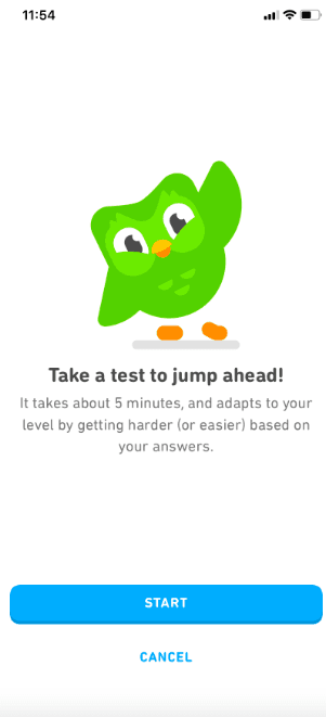
Progressive disclosure: Duolingo started with a simple language choice and introduced more complex elements, like gamified lessons, gradually. Users who already knew some of the language could take the placement test in the screenshot: about five minutes long, adapting to their level, so they could skip lessons they didn't need.
Interactive tutorials: beginners were guided through their first lesson with interactive exercises.
Feedback loops: Duolingo encouraged daily practice and gave feedback on progress.
2. Airbnb
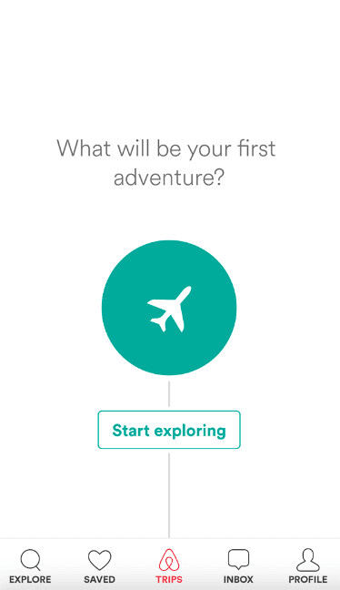
Empty state as onboarding: before a user had booked anything, Airbnb's Trips tab didn't sit blank. It asked one question, "What will be your first adventure?", and offered one button, "Start exploring", back to search.
Visual aids: a single plane icon and a line leading to the button made the next step obvious without any explanation.
3. Headspace
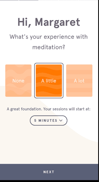
Personalisation that changes the next screen: Headspace greeted the user by name and asked about their experience with meditation (None, A little or A lot). The answer set where their sessions would start: five minutes for "A little" in the screenshot.
Keep it simple: from there, users learned meditation techniques through short guided sessions, and Headspace tracked progress to help them build a habit.
What do you need to build in-app onboarding?
You can code it or use a no-code tool. Coding it with one of the open-source tour libraries costs nothing in licences, but every change to the copy or the steps needs a developer.
No-code tools let product and marketing teams build and change the flows themselves. Among the tools we review that price by monthly active users and publish a price, the smallest plans cost from $240 to $300 a month (some billed annually) for 1,000 to 2,000 users when we read their pricing pages in October 2026. Others quote only on request, and a few have free plans with usage caps; our price table lists each plan with its limits and date. For a wider list, see our roundup of customer onboarding software. Since this post was first written, several of these tools have added AI features, so check what each plan includes.
Where should you start?
Find the screen where most new users stop, then pick the pattern from the table above that fits that moment. In-app onboarding isn't only an interface exercise: it's how you invite, teach and engage users inside your product, so keep refining it as their needs change.

About the author
Hilal YıldırımHilal is a creative content writer highly focused on growth, occasionally product, and always onboarding.