
Although onboarding UX and UI design are two intricately related realms of product design, interface design’s focus on the facade and the looks of the user experience differs from UX design’s more abstract perspective of dealing with products.
Onboarding in UI is designing how a user can feel comfortable interacting with the product for the first time.
This question at hand brings about questions related to the visual design of the process. For example, considering that the users feel unfamiliar with the product when they first step inside the world you created in your product design, UI design should aim at presenting each and every detail of it as clearly as it can be, both visually and verbally.
Also, it is crucial that every decision for onboarding UI design must be user-oriented. That’s to say, the emotions, the level of technical knowledge, past experience using similar or different products, and their aim and desires about the product should be always at the center of the onboarding UI design process.
In short, understanding the users and serving their needs is the main objective of onboarding UI design, and it delivers it through visual as well as theoretical solutions.
Different UI onboarding patterns
There are several onboarding elements you can use while designing your onboarding UI. They are appropriate to use at different points of the onboarding journey, and most of the time, you need to utilize more than one of these onboarding screens for a complete onboarding experience.
Here is the list of the basic types of onboarding patterns:
- Welcome Modal: Say hello to your new users.
- Sign-up Screen/ Account Registration: Help them create an account.
- The Nickel Tour: Show them a few quick screens introducing your product.
- Product Walkthrough/ Guided Tours: Take them on a tour to show them around.
- Tooltips and Coachmarks: Let them know about the core functionalities of your product.
- Checklists/ Progress Bars: Inform them about the onboarding process.
- Self-segmentation Modal: Gather information about them to lead them into separate onboarding flows.
- Blank Slate: Assist them in inputting data to your product to start using it.
- Inline Hints: Use embedded messages in your product to onboard users.
Keeping all these in mind, let’s take a look at successful onboarding user interface designs together.
7 Examples of Great Onboarding UI
1. Metafy’s Nickel Tour and Sign-up Screen
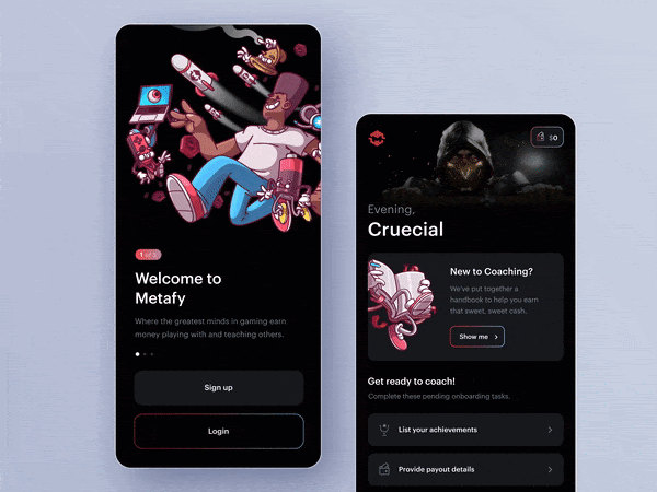
Metafy’s both mobile and desktop onboarding designs are perfect in terms of usability and visual elements.
The slides in the mobile app nickel tour clearly show the app's functionalities. The 3D illustrations accompanying them reflect the app's playful vibe and its value proposition. When you sign-up or login, a modal offers a product tour with the “show me” button. And it is totally discreet as you can go on with directly using the app via the panel below.
The desktop version follows the same visual pattern as the mobile. A hotspot on the left bottom corner asks if you are new here and takes you to a modal with the login and sign-up form fields. It is totally a frictionless user experience.
2. Figma’s Shortcut Tooltips
Figma is one of the number one design tools for UI and UX designers. The tooltips show you the shortcuts for the actions you take in the app, which is genius.
The photo makes the tooltip more attractive and pushes you to master the tool. The exit and confirmation buttons exist simultaneously but are not distractive.
3. Trello’s Blank Slate
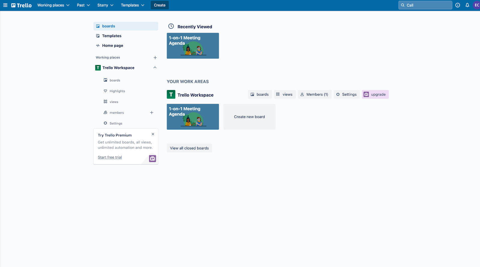
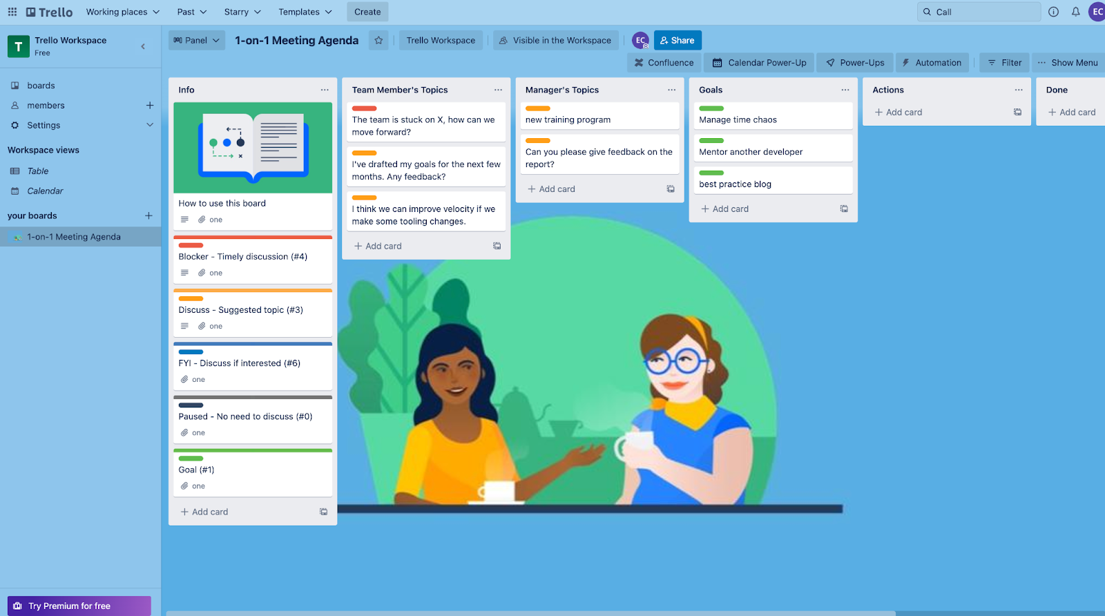
Trello finds a fun way of welcoming its new users to its dashboard. The blank slates are boring and disorienting for first-time visitors but adding some gamification would provide an efficient onboarding experience.
It is full of prompts to get you going.
The colorful categorization of the examples inside the grids makes the user understand its key features.
Also, instead of an empty background, the dashboard is fancied up with an appealing illustration.
4. Kahoot’s Self-Segmentation Screen

Kahoot’s mobile app onboarding design asks you questions about your aim of using the product. In this way, it opens the way for the persona-based user onboarding flow.
Your answers to the questions shape the entire onboarding process and onboard you with to-the-point tasks and forms.
Plus, the energetic color palette and the illustration cheer you up while taking key actions to start using the product.
5. BeerOrCoffee’s Tooltip Video
BeerOrCoffee uses a video tutorial starring a professional for using the product.
The video shows up as a part of the tooltip during the product tour. Seeing a face on the screen makes the user feel comfortable and familiar with the product easily.
It is also great that the tooltips are highly interactive. In each step, you are asked to click on the orange button, the main color of the product's design palette, to continue with the tour.
6. Anchor’s Progress Bar
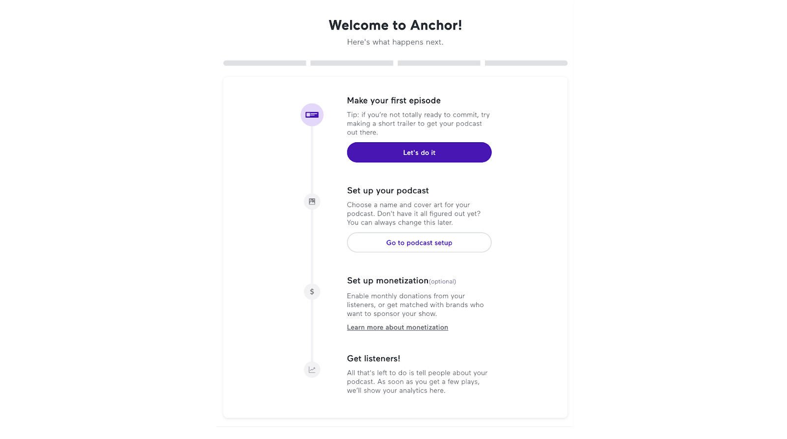
Instead of a checklist, Anchor, Spotify’s product for creating podcasts, welcomes you with a progress bar. It is encouraging to see how easy it is to record and publish a podcast with the product.
The button that takes you to the related page is designed according to the step you are in. Your step’s button and the next step’s button are colored as exact opposites. It makes you realize where you are at the onboarding process and helps you distinguish between your task at hand and the upcoming task.
In each step of the process, the details of the task are explained by a short and clear copy.
It’s a basic onboarding UI design without images or visual additions, and it works well.
7. Calendly’s Onboarding Checklist
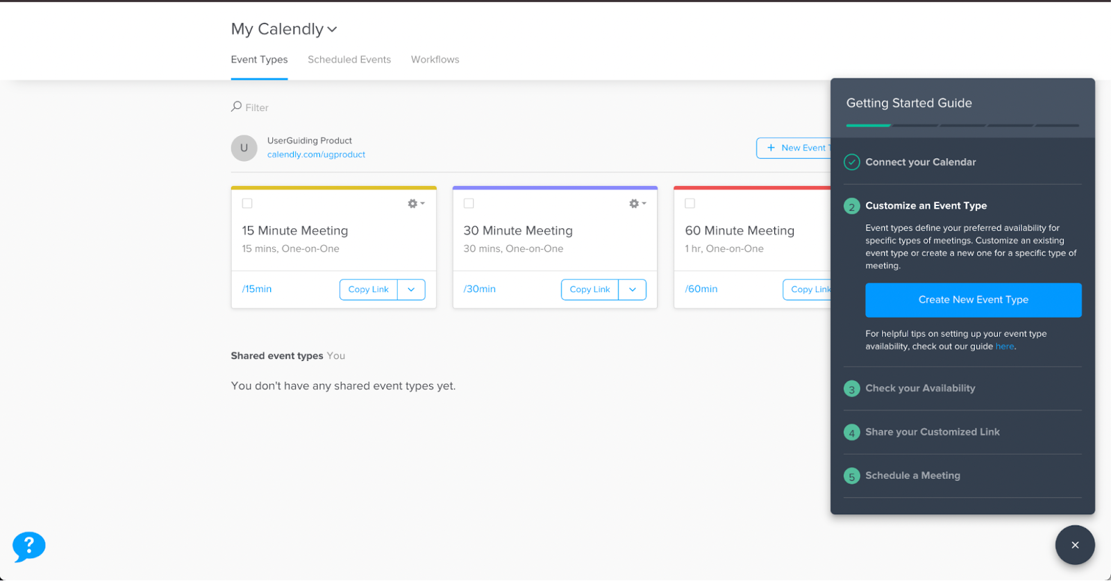
Onboarding users with simple and quick tasks is a great way to provide them with a good level of product experience.
Calendly uses this opportunity and assigns some tasks to its users to get them going with product features. While completing the tasks, the ticks make the user feel accomplished. Also, it shows how much time and energy is needed from the user’s side to dive into the value-rich world of the product.
It’s a successful piece of UI design with contrasting colors with the background. Plus, using green and blue on confirmation and checking elements gives off the vibe of validation.
4 Tips for Creating a Great User Onboarding UI
1. Know your users
Onboarding user journeys are reciprocal processes. It is vital that you get to know your users while they are trying to explore your product. Personalizing these journeys will save time and energy for your users and will definitely increase your product adoption rates.
2. Interaction is the key
Allow your users time and opportunities for self-education. Let them interact with your product as much as possible via product walkthroughs and tutorial screens. It is the best way to onboard your users and make them feel self-confident about using the features of your products as pro users.
3. Cheer them up
Don't be afraid to seem frivolous when it comes to onbaording your users. Gamification and funny elements such as colorful illustrations and animated gifs in your modal designs or tooltips would take the edge off.
Users prefer them to the boring and overwhelming user onboarding experiences.
4. Let them know how long it will take
Nobody has time for reading pages of instructions to learn how to benefit from your product, and that's why you need onbaording elements. So, besides keeping them short and to the point, let your users know the length of the onboarding process.
You can involve a screen indicator in your onboarding steps for that.
Conclusion
Designing onboarding interfaces is not an easy task. However, you can create wonderful onboarding screens for your digital product with enough research and inspiration.
Keeping the aim of onboarding design, which is increasing feature adoption and user retention rates, you can go in the right direction in this process.


