Article · 7 min read
Best SaaS Onboarding Tooltip Examples That You Can Learn From
The best SaaS onboarding tooltip examples point at one element, explain it in a sentence and offer one action: HubSpot's "Meet the overview tab", Amplitude's "This chart could be a Data Table", Slack's "These are your channels". Many tooltip round-ups also list welcome modals and checklists as tooltips.
 By Aysenur Zaza
In short
Of the ten older screenshots in this guide, only Slack's shows a tooltip; the rest show welcome modals, segmentation questions, checklists and templates. This version labels each one for what it is, explains why a tooltip would have done that job badly, and adds nine verified SaaS tooltip screens from our inspirations library, with their copy and buttons.
Search for SaaS tooltip examples and many of the screens you'll find aren't tooltips. Of the ten older screenshots in this guide, only Slack's shows one. The others are welcome modals, segmentation questions, checklists and templates, which are good patterns doing different jobs.
So this version does two things. It shows SaaS tooltips we can verify from real screenshots, with the copy and buttons they used, and it labels the other screens for what they are, with the reason a tooltip would have done that job worse. For how to build and write a tooltip, see what tooltips are and how to set one up.
What is a SaaS onboarding tooltip?
A SaaS onboarding tooltip is a small message a software product shows next to one element of its interface to explain it, usually to a new user or after a feature launch. It has an arrow pointing at the element, a short title, a sentence or two and one button, and it closes without blocking the rest of the screen.
Onboarding tooltips do five jobs:
- Give context: explain what a feature is for at the moment the user sees it.
- Reduce friction: shorten the first steps by pointing at the next thing to click.
- Highlight features: bring forward features users would otherwise miss.
- Prompt action: ask the user to try something now, with a button that does it.
- Build confidence: remove doubt about what a control does.
What are the different types of onboarding tooltips?
Tooltips differ mainly in what triggers them. Pick the trigger first, then write the copy:
| Type | Triggered by | Best for | Example below |
|---|---|---|---|
| Hover tooltip | The cursor resting on an element | Naming icons and controls | |
| Click tooltip | A click on an element or a hotspot | Optional detail the user asks for | Userflow |
| Tour tooltip | The previous step of a guided tour | Teaching a workflow in order | Memsource, Ideta |
| Contextual tooltip | The user's action or the app's state | Suggesting a better way at the right moment | Amplitude, HubSpot |
Which SaaS products use onboarding tooltips well?
These are tooltips we can check against screenshots, from this post and from our inspirations library. Products change their onboarding often, so each describes the screen at the time it was captured.
1. Slack: "These are your channels"
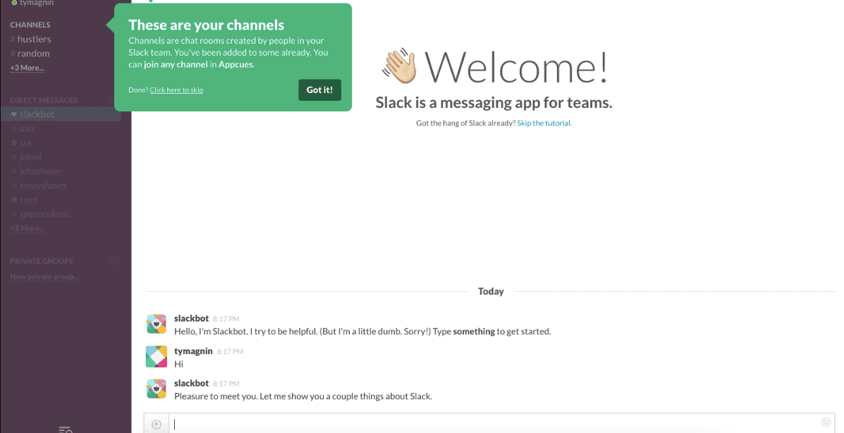
An older version of Slack's first-run tutorial pointed a green tooltip at the channel list. The title said "These are your channels", the body explained that channels are chat rooms and that the user had already been added to some, and a "Got it!" button moved on. A "Done? Click here to skip" link sat in the same box, so skipping the tutorial never meant hunting for an exit.
2. HubSpot: a one-step new feature tooltip
HubSpot introduced the Overview tab on its company record page with a new feature tooltip. The tab was outlined in blue and the tooltip read "Meet the overview tab: Now there's more space on the record page to quickly get the relevant info that matters most to you." It was a one-step tour ("1 of 1") with a single Got it button: one sentence, one click back to work.
3. Amplitude: a suggestion at the moment it's useful
While a user worked on a bar chart, Amplitude showed a contextual tooltip beside the chart controls: "This chart could be a Data Table", with one line on why. The two buttons were a clear choice, No thanks or Convert this chart to a data table, and the main button did the conversion in one click. Our library lists this example as built with Userflow.
4. HubSpot: a permission request in context
HubSpot asked users to turn on browser notifications with a tooltip shown when they opened its Notifications section, with the background dimmed. Asking for a permission at the moment the user is looking at notifications is far more persuasive than asking on first login.
5. Slack: a new feature tooltip with a gif
To introduce a new feature, Slack used a single-step new feature tooltip opening with "want a simpler bar?", a gif of the change and a two-option preference. The gif showed the feature, so the copy only had to ask the question.
6. Notion: long copy, split in two
Notion announced a feature with a contextual tooltip signed "David from Notion". The copy was long for a tooltip, so Notion split it into two steps and used formatting and emojis to make it easy to scan. It's the exception that shows the rule: if the message needs more than two sentences, break it up or move it.
7. Memsource: a five-step feature tour
On first use, Memsource ran a five-step feature tour made of tooltips, between a welcome modal and a closing "that's it" modal. The tooltips had their own progress indicator, and gifs explained a step that needed items the new user didn't have yet.
8. Ideta: a six-step tour that highlights help
Ideta's product tour mixed modals and tooltips over six steps. It also highlighted the help button during the tour, so users who got stuck didn't have to leave the tour to find support.
9. Userflow: a tooltip with a hotspot
Inside its own flow builder, Userflow combined a tooltip and a hotspot: the tooltip explained, the pulsing hotspot showed where to click when the screen got busy. The tooltip was dismissible, because users didn't need it to carry on.
What do the other screenshots show?
Nine of the ten screenshots this post has carried since 2023 show other onboarding patterns. Each is still a useful example of a job a tooltip would do badly.
Dropbox: a setup panel
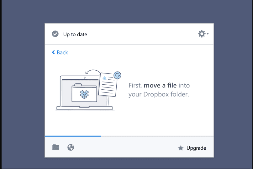
The Dropbox screenshot shows a step in its desktop app's setup panel: "First, move a file into your Dropbox folder", with an illustration and a progress bar. The action happens outside the panel, in the computer's file system, where a tooltip can't point.
Canva: a segmentation question
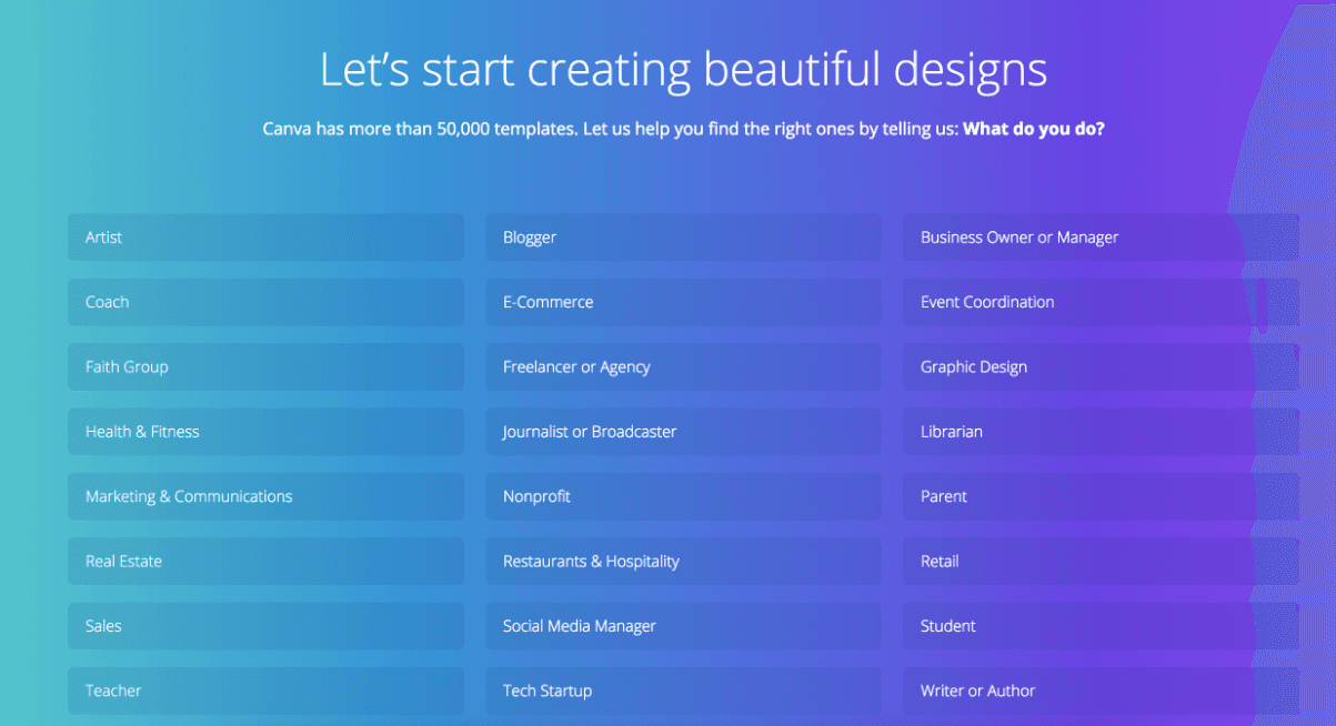
Canva's screenshot is a sign-up question, "What do you do?", with 24 roles to choose from so Canva can suggest templates. A question that shapes the whole experience needs a full screen, not a bubble.
Asana: a welcome modal
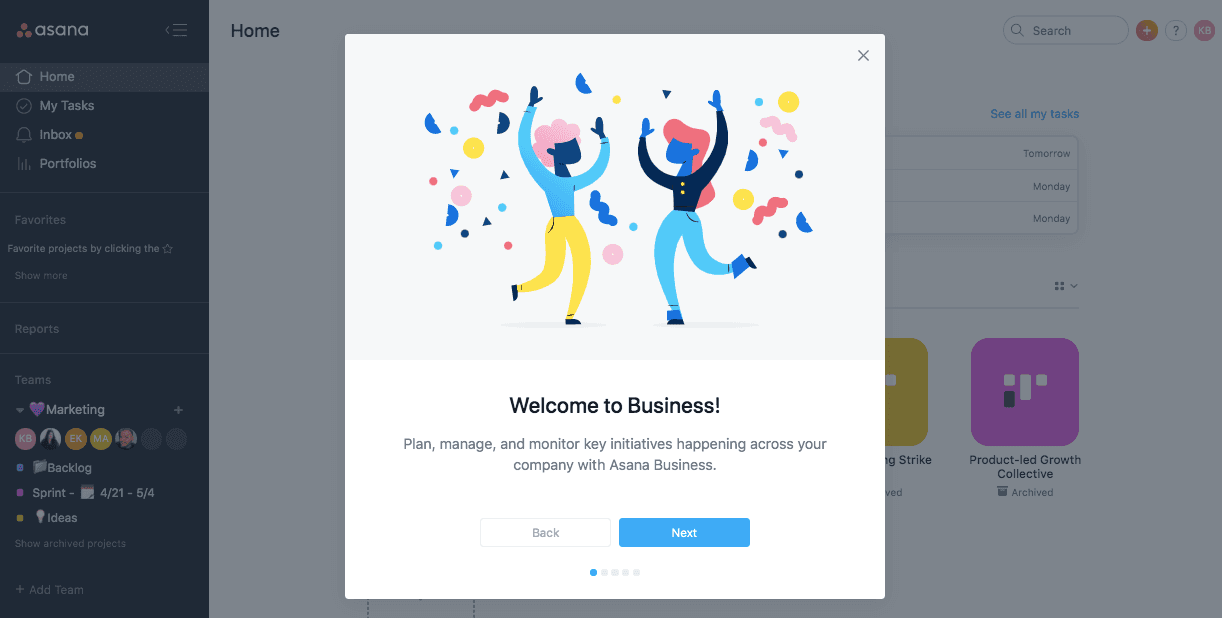
Asana's screenshot is a five-step welcome modal, "Welcome to Business!", with Back and Next buttons. It introduces a plan, not an element on the screen, so there's nothing for a tooltip to point at. For tooltips' quieter alternative, see how Asana later used empty states instead of tooltips.
Trello: a template board
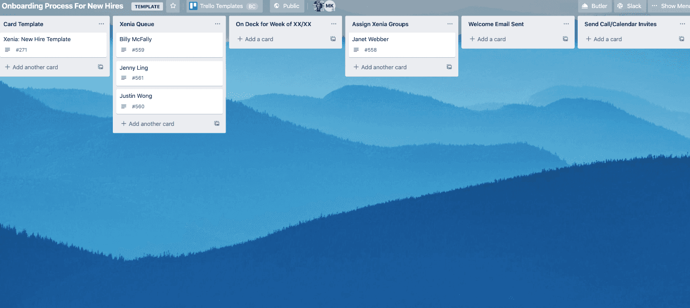
Trello's screenshot is a template board, "Onboarding Process For New Hires", already filled with lists and sample cards. No tooltip is visible. Templates teach by example: the user sees a working board instead of reading how to build one.
HubSpot: an annotated dashboard
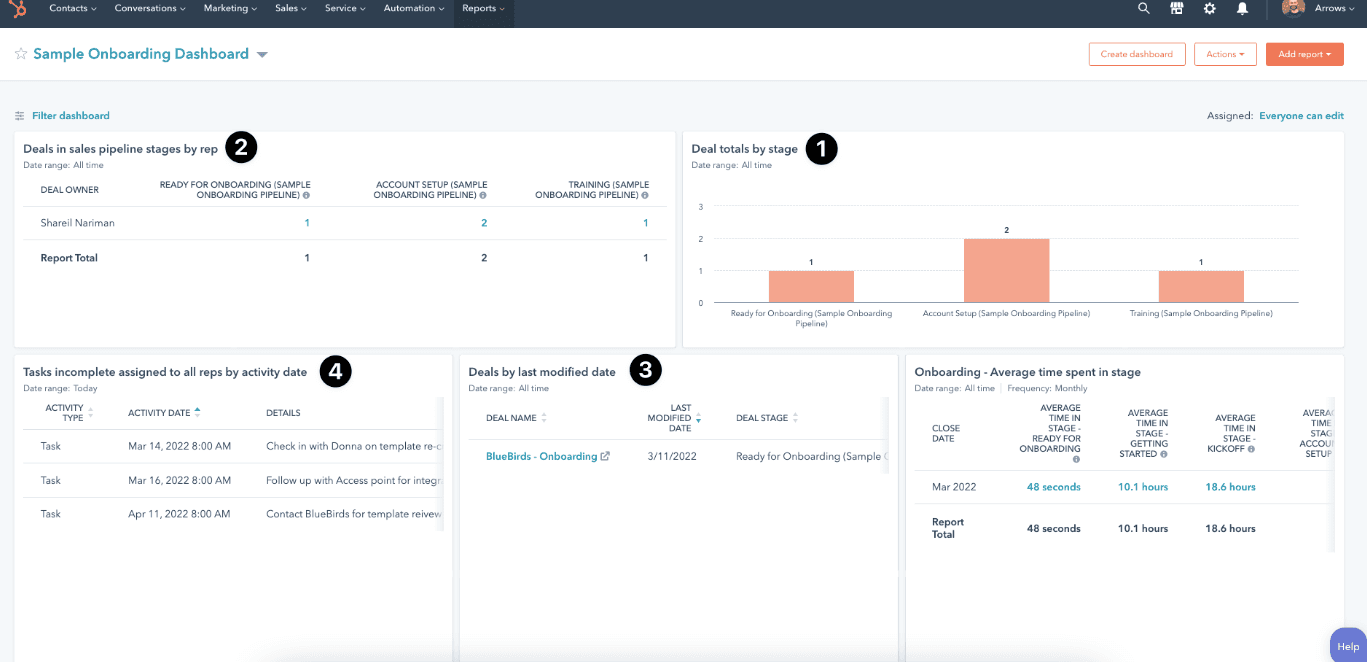
This HubSpot screenshot shows a sample onboarding dashboard with four reports marked 1 to 4. The numbers are annotations on a screenshot, the static cousin of a tour: fine in a help article, but in the product each number would be a tooltip step.
A template picker
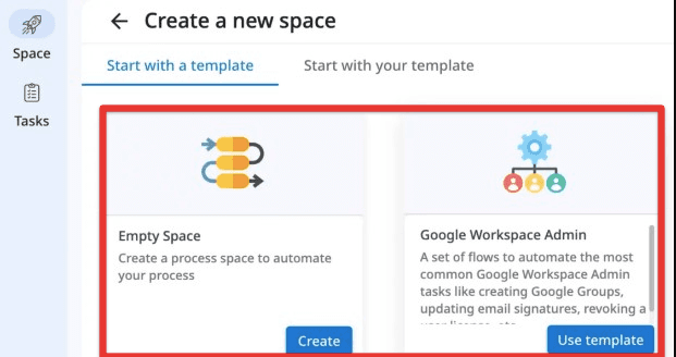
This screenshot ran under the heading "Google Workspace", but it shows a "Create a new space" screen in a process-automation tool, offering an Empty Space or a "Google Workspace Admin" template. Choosing between starting points is a decision, and decisions belong on a screen of their own.
Zendesk: the work itself
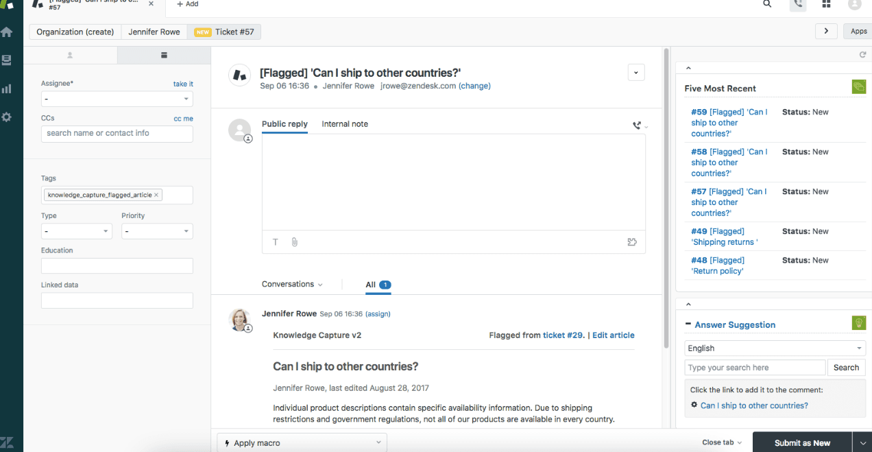
The Zendesk screenshot shows a ticket view with a reply box and an Answer Suggestion panel, and no tooltip. It's a reminder that the ticket statuses and views a new agent must learn are a lot to explain one bubble at a time; a short tour, plus tooltips on the few controls that confuse people, is the usual answer.
Mailchimp: a sign-up question
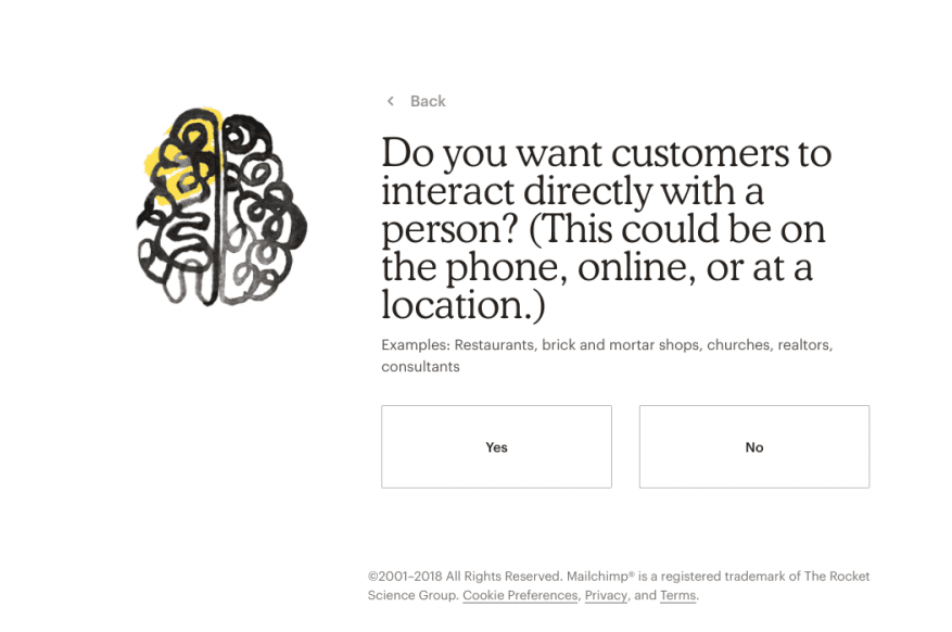
Mailchimp's screenshot, from 2018 judging by its footer, is a sign-up question: "Do you want customers to interact directly with a person?", with examples and Yes and No buttons. Like Canva's, it collects information, which a tooltip can't do well.
Shopify: a setup checklist
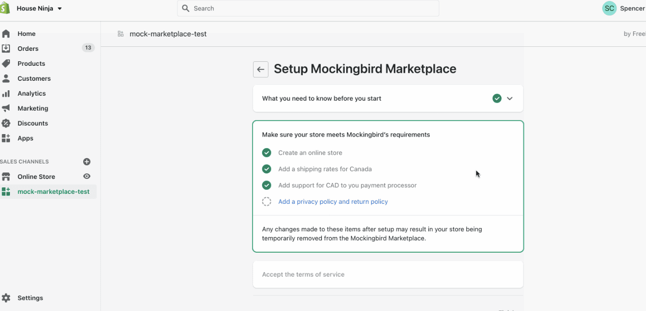
The Shopify screenshot shows an app's setup checklist inside the Shopify admin: four store requirements, three ticked. Tasks that take several sessions need a list the user can come back to, which is what onboarding checklists are for.
When is a tooltip the wrong choice?
A tooltip is the wrong choice when there's no single element to point at, when the user has to make a decision, or when the task takes longer than one sitting. The screens above show the usual replacements:
| If the job is to... | Use | Example above |
|---|---|---|
| Welcome users or introduce a plan | A welcome modal | Asana |
| Learn who the user is | A sign-up question | Canva, Mailchimp |
| Get a multi-step setup done | A checklist | Shopify |
| Show what a finished result looks like | A template or sample data | Trello |
| Guide an action outside the product | A setup panel or email | Dropbox |
| Explain one control, or suggest a better way | A tooltip | Slack, HubSpot, Amplitude |
The examples that work share three habits: they appear next to what they describe, they say one thing, and they offer one way forward and one way out.

About the author
Aysenur ZazaAysenur Zaza is a creative content writer and an avid researcher when it comes to product, growth and everything SaaS.