
If you want potential customers to become paying and loyal supporters, your user onboarding process must be sticky and seamless.
So today, I'm going to be talking about the 14 best practices for user onboarding that is more likely to increase your conversion rates in 2022.
1- Define Your Goal
If you don't have a clear goal of user onboarding, then it won't become anything but an unwanted burden.
Here's what I mean: Your first-time users are not willing to pay you. They are testing you to see if you can fulfill their expectations. That's why onboarding without a clear user journey map will only confuse them.
What is your product's “Aha!” moment?
What are your product's key features? How can you highlight them?
What value does your product serve? How do you prove it to people?
Take those questions into consideration, and have a clear goal about why you created that product in the first place. Then, set your goal to highlight that value while onboarding users.
2- Define Your Target Audience
It's not only the product and the goal of onboarding that determines its effectiveness.
Your audience is what makes it a successful onboarding.
Not knowing your specific target audience, or aiming for a more significant mass than you can only lower your adoption rates. That's because you might miss the actual gems while trying to focus on a few people who won't actually benefit you.
Unless you are Facebook.

Facebook clearly states that it's for everyone from around the world.
So unless you are aiming for the whole world, you should also design your onboarding steps according to your target audience and their demands.
3- Good UX Will Pay Back
User experience is the #1 factor that determines if you will be a leader or a second choice.
And below are the most essential software onboarding UX patterns:
- Checklists:
Onboarding checklists help users track their onboarding tasks progress, give them usage tips, and let them guess how long it could take to get fully on board with tour products.

- Progress bars:
Whether or not on the checklist, Progress bars help users feel the accomplishment whenever the bar moves. Having a progress bar in the signup process could also help you increase the number of signups.
- Tooltips:
Tooltips are one of the most misused UX elements, even though they are highly important. Especially in mobile onboarding. That's because tooltips can be hidden into hotspots and save you a lot of space while still providing the necessary information.
Even though many customers don't have a positive experience with tooltips, correctly using them can affect customer experience positively.

- In-app messages:
In-app messages are quick announcement modules or bars that let you communicate with the real-time user, without bugging them with a conversation.
- Live chat:
4- Visuals Will Increase In-App Experiences
People are disgusted by long chunks of texts.
Even the boring release notes are filled with fun visuals nowadays.
Showing people what they need is more effective than telling them about the product features.

Unlike using standard small tooltips, Genially did a great job, including a clear visual that shows the process.
Also, basing your product design on visuals rather than texts will make it easier to become a habit-forming product.
5- Keep Texts Short And Simple
Key takeaway: visuals are important.
Great.
But if you don't support your visuals with texts, your users might not understand everything, let alone advanced features.
So here is how long and dense each kind of text should be:
- Tooltip content: Depending on the size of your tooltip, the text should be no longer than 240 characters.

- Email content: As long as the email contains visuals, the user onboarding emails can be as long as 400 words.
- Release Notes content: Release notes are meant to be informative, therefore, can be extended. Instead of writing less, you can use more white space to make the reading length seem less.
6- Adopt User Onboarding Tools
As I said, digital onboarding is easy.
As long as you leave the details to the onboarding specialists.
There are cloud-based software products that are easy to use and implement.
These tools help you learn more about the onboarding trends and create a fail-proof customer journey that will improve your conversion rates.
And if you don't know where to start, here are the top user onboarding tools out there.
7- Prioritize Interactive Elements
When I say that self-serve onboarding is getting more popular, I mean that people want to get things done quickly, and they would rather watch an onboarding video rather than schedule a demo or wait for an email reply.
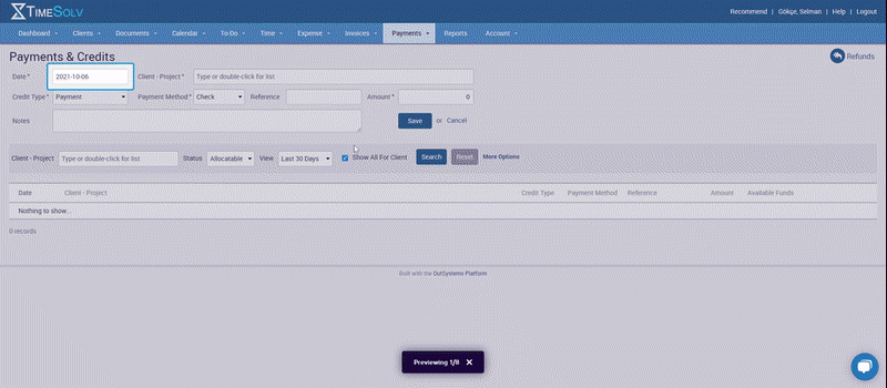
TimeSolv is a time tracking tool itself, no wonder why they would automate their customer onboarding.
Also, did you notice how much easier it is to follow tooltips than following a speaking person?
8- Guide Them To The “Aha!” moment
The whole point of having an onboarding flow is to convert a curious visitor or an unsure trier into a loyal customer.
And for that, you have to make sure that they get to your product's “Aha!” moment.
But, what is the ”Aha!” moment?
It's the point where the user understands your value and decides to stick with the product.
Twitter is best known for having mastered the “Aha!” moment.
By making users connect with other people, Twitter eliminates the possibility of being a boring app with no users.
9- Analyze Every Step
How do you improve user experience without knowing what they want?
Users don't fill support tickets or send emails to let you know they are unsatisfied.
They churn.
To prevent that, you should always keep track of the product success metrics such as product adoption rates, customer retention rates, user activation rates, and churn rates.

Here are the three most important things you want to keep in mind while going over the data:
- Try not to focus on more than one metric (or two) at a time. Most of them have similar reasons but different solutions, and trying to increase all of them simultaneously can turn into a burden you can't comprehend.
- Get help from a professional while interpreting the numbers and deciding on a strategy. If you don't have the budget, adopt an analytics tool that can help you. Sticking to proven methods will be much more beneficial for you than declaring yourself a growth hacker (if you aren't one).
- Don't only analyze numbers; take real user feedback into account as well. If a customer took the time to provide you feedback, it means that they are willing to adopt your product, but need you to solve a few issues in advance. That feedback can be your starting point.
10- Gather Feedback
Companies could prevent 67% of churn if the customers' problems are solved after the first interaction.
While that's the case, it's no surprise that knowing what the customer wants before it becomes a severe problem can save you hundreds of dollars in revenue.
Ask your users:
- What brought them to your product?
- What problem do they want to solve?
- How do they expect your product to help them?
- What their experiences with such problems have been like in the past?
- What do they like/dislike the most?
- What do they think needs improvement?
And also, don't make them fill out ten-page long surveys.
Because they won't.
Instead, ask questions every three log-ins, or put a question into your emails rather than the website interface.
You can even turn giving feedback into a game. Here's an example:

In summary, make your users want to give feedback, don't force them. And listen to their voices, so you know how actually to increase user adoption.
11- Create a Cycle
Converting a new customer can be up to 25x more expensive compared to retaining one.
And to keep your retention rates high, you have to have a constant cycle of engaging elements such as updates, new releases, a newsletter, a webinar, or design changes.
But changing things will be meaningless unless you let your customers and end-users know about them.
That's why you should add onboarding elements related to those changes - even before they go live.

Slack provides a continuous user onboarding environment through the resource center, where it lets you experiment with side features you might not have tried yet and acts as a shortcut to guides you might need more than once. This way, Slack keeps users informed, engaged, and satisfied simultaneously.
12- Gamify The Process
Another way to keep the users focused and interested is to include UX Gamification elements.
Just like keeping the onboarding process going throughout the whole customer journey, gamification also creates a new layer of stickiness to the product.
Making the product walkthrough interactive, sending in-app messages once in a while, asking for three-option satisfaction feedback, and keeping your design alive are the simplest things you can do in these terms.
Also, you can get help from different gamification tools to get both help and ideas, but that's only if you have the budget for it.
13- Personalize The Experience
Personalization can be done in many different ways. For instance, you can create different segments, and onboarding flows for those segments, have a different design for different languages, or have higher accessibility than your competitors.

Pinterest provides a perfect example by getting new users started with only the topics they are interested in.
14- Keep An Eye On Your Competitors
Your competitors create a perfect environment to do fail-proof research about new trends and what doesn't work anymore.
The market leaders of your field have probably tested most of your ideas already. That's why knowing how they do things can save you money, time, and effort.
User Onboarding Experiences Matter More Than You Think
Although user onboarding experiences are often overlooked, they are as important as pawns in chess.
Moreover, since it's not the most scalable relation, many don't even realize how much impact the onboarding quality has over activation rates.
Not only that, but the onboarding quality also plays a great role in terms of customer retention.
To top it all: creating, analyzing, and maintaining an onboarding process is the easiest part of any project - or product.


