Product Tour · 7 min read
6 Steps to Create a Product Tour to Perfect User Onboarding
A product tour is a short in-app walkthrough that takes new users from sign-up to the product's first real value. Build one in six steps, starting from your aha moment, and keep it short: in nine tours from our inspirations library, length runs from 3 steps to 14, and six of the nine stay at seven or fewer.
 By Selman Gökçe

In short
A product tour guides users through the few steps between sign-up and the aha moment, and nothing else. This guide gives six build steps with concrete rules: keep interactive tours under eight steps and videos under two minutes, fire the tour once users are inside the product, offer it instead of forcing it, and decide what skipping, resuming and replaying do. Six real tours show the rules at work.
How long should a product tour be? Of the nine tours from our inspirations library compared in step 3, six run seven steps or fewer, and the three longer ones (10, 11 and 14 steps) get away with it only through short copy, a step counter and a visible way out on every step. That's the evidence behind the six steps below, which also cover when to fire a tour and what should happen when a user skips it.
What is a product tour?
A product tour is an in-app walkthrough that guides users through the basics and necessary features of a product. A good one is definitive, clear and simple, so the user reaches the "Aha!" moment quickly without being overwhelmed.
The term now covers two things: an in-app tour runs inside the real product after sign-up, while an interactive demo is a clickable copy of the product on a marketing site. This guide is about the first kind. Walkthroughs come in several formats:
- Written walkthroughs are old-school user manuals, rarely enough on their own.
- Video walkthroughs are video guides you can embed in any product.
- Interactive product tours are step-by-step guides users follow at their own pace, with analytics on where they drop off.
- Real-time product demo tours are live tours for specific customers, common at enterprise companies.
- Hybrid interactive guides mix video and interactivity, and can differ by user segment.
How do you make a product tour? (6 steps)
Making a product tour comes down to six steps: define the aha moment, decide where the tour sits in your onboarding, keep it short, add visuals, make it interactive, and let users skip, resume and replay it.
1- Define your "Aha!" moment
The "Aha!" moment is the key action at which users understand the true value of your product. Read more in our guide to the aha moment.
The main purpose of a product tour is to lead users straight to that moment. During initial onboarding, every step that doesn't point there is a distraction, and distracted users are lost users. Write the aha moment down as one action ("sends the first invoice", "publishes the first form"), then cut every tour step that doesn't move the user toward it.
2- Decide where the tour sits in your onboarding
The product tour and the rest of your onboarding overlap, so plan them together so they don't get in each other's way. If you use a user onboarding checklist, for example, the tour can be one item on it that walks users through a task.
Then decide when the tour fires. Three rules cover most products:
- Fire the first-run tour inside the product, once the user lands on the screen where the first task happens, not on the sign-up page or an empty dashboard.
- Offer it, don't force it. Typeform opened with a modal whose buttons read "Show me the highlights" and "No thanks"; Upwork offered "take a quick tour" before its 3-step tour of contract details.
- Fire feature tours on first use of the feature. Figma offered its 10-step editor walkthrough ("Take a quick tour of Figma?") when users opened a new design file, not on the file browser.
3- Keep it definitive, clear and simple
Whether your product is simple or extensive, the tour shouldn't be long. Keep videos shorter than two minutes and interactive walkthroughs shorter than eight steps. The tours in our library mostly follow that rule:
| Tour | Steps | What made the length work |
|---|---|---|
| Google Chat (first use) | 3 | Gifs and a dimmed background, then a separate tooltip when users start chatting |
| Upwork (contract details) | 3 | Opt-in start and a progress bar |
| Memsource (Jobs feature) | 5 | A progress indicator and gifs, between a welcome and a "that's it" modal |
| Ideta | 6 | Highlights the help button during the tour |
| Candu (content studio) | 6 | A step counter, a Skip link and a GIF on every card, dimmed background |
| CitizenShipper | 7 | Start tour and Skip buttons on the welcome modal, Previous and Next on each step, a resource centre for skippers |
| Figma (editor walkthrough) | 10 | Opt-in start; two or three sentences and an image per step, a step counter, a close icon and Learn more links |
| Landbot | 11 | Opt-in start from a mascot, a step counter and Skip tour link on every step, confetti at the end |
| Vieworks | 14 | Very short tooltips, and about half the steps ask the user to do something |
Step counts are from our write-ups of each tour at the time of the screenshot. The pattern: past seven steps, the tours that work make the start optional, keep each step to a few sentences, and show a step counter and an exit on every step.
Keep the copy simple, too: short sentences or bullet points, and no fancy words during setup.
4- Include visuals
Video tooltips, modals with visuals, and a consistent colour palette do more than long copy. According to Crazy Egg, visitors take less than 15 seconds to decide whether to leave a page, so a tour has to earn attention in its first step.
5- Make it interactive
People like to be in control, and not everyone learns at the same speed. An interactive tour lets users act in the product while the tour runs. Ways to build that in:
- Use a hotspot or two to draw attention without blocking the screen.
- Embed step-by-step modals and tooltips in the initial onboarding.
- Highlight one area and dim the rest of the screen to create a focal point.
- Offer a demo environment where users can try the product before committing their own data.
Vieworks is the clearest case in our library: about half of its 14 steps asked users to click a button or fill in a field.
6- Promote self-serve exploring: skip, resume and replay
A self-serve tour lets users explore on their own terms, with videos, tooltips and hotspots available when they want them. That only works if you decide three behaviours in advance:
- Skip: every step has a visible way out, and a skipped tour doesn't start again by itself.
- Resume: a user who leaves halfway picks up at the step they left, once, instead of starting from step 1.
- Replay: the tour can be launched again from a checklist, help menu or resource centre, as CitizenShipper did for users who skipped its onboarding.
6 product tour examples to inspire your next design
These six tours were captured in 2022; each product may show something different today.
1- Typeform
When you began using the product, Typeform greeted you with a tour modal: a small doodle, the headline "Take a moment to get comfortable" and the promise "it'll be fast".
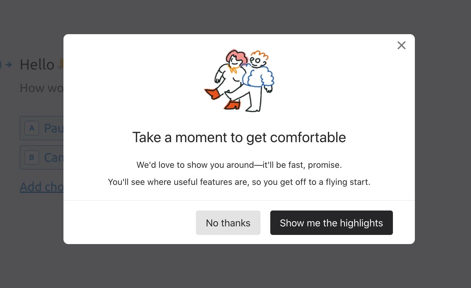
- "Show me the highlights" tells users the tour is short.
- "No thanks" sits next to it, as large as the main button.
2- Medium
When users began editing, Medium displayed a slideshow along the bottom of the screen with the editor's shortcuts and capabilities, each with a visual.
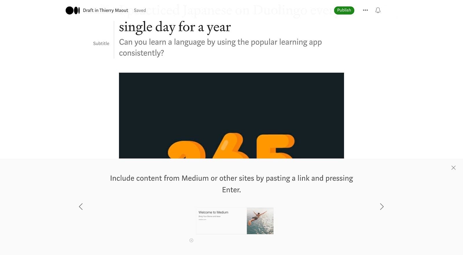
- It teaches advanced features, such as keyboard shortcuts, on the page where they're used.
- It doesn't dim or block the editor, so users can keep writing.
3- Grove HR
Grove HR put video inside its welcome modal for users who learn by watching, and used the same in-modal videos in later promotion modals.
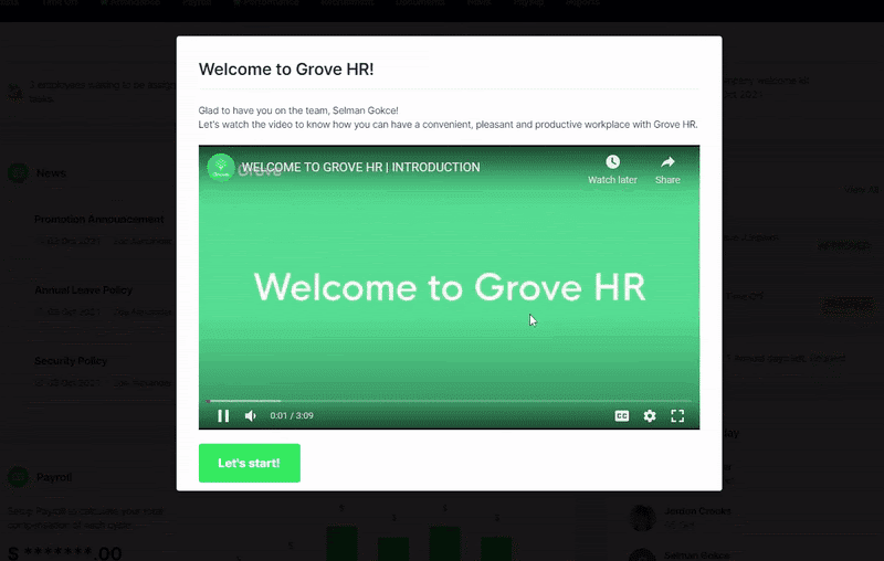
- The welcome copy uses the user's name.
- One caveat: the introduction video ran 3:09, past the two-minute guideline in step 3. A shorter cut would fit the modal better.
4- CitizenShipper
CitizenShipper kept onboarding brief: a welcome window, then highlighted tooltips through the basics of the platform, 7 steps in all. A resource centre helped users who skipped the tour and needed help later.
- The skip button on the welcome modal is clear.
- The tours can be triggered again, so help is always available.
5- ClickUp
ClickUp introduced its whiteboard, then in beta, with a 5-step tour ("Whiteboard tour, 1 of 5"). At the end, a tooltip asked for feedback through a link.
- The step counter ("1 of 5") tells users how long it will take.
- Asking for feedback suits a feature still in beta.
6- WordPress
In the block editor, WordPress showed a 4-step slideshow ("Welcome to the block editor") that introduced the feature briefly, then left users to try it.
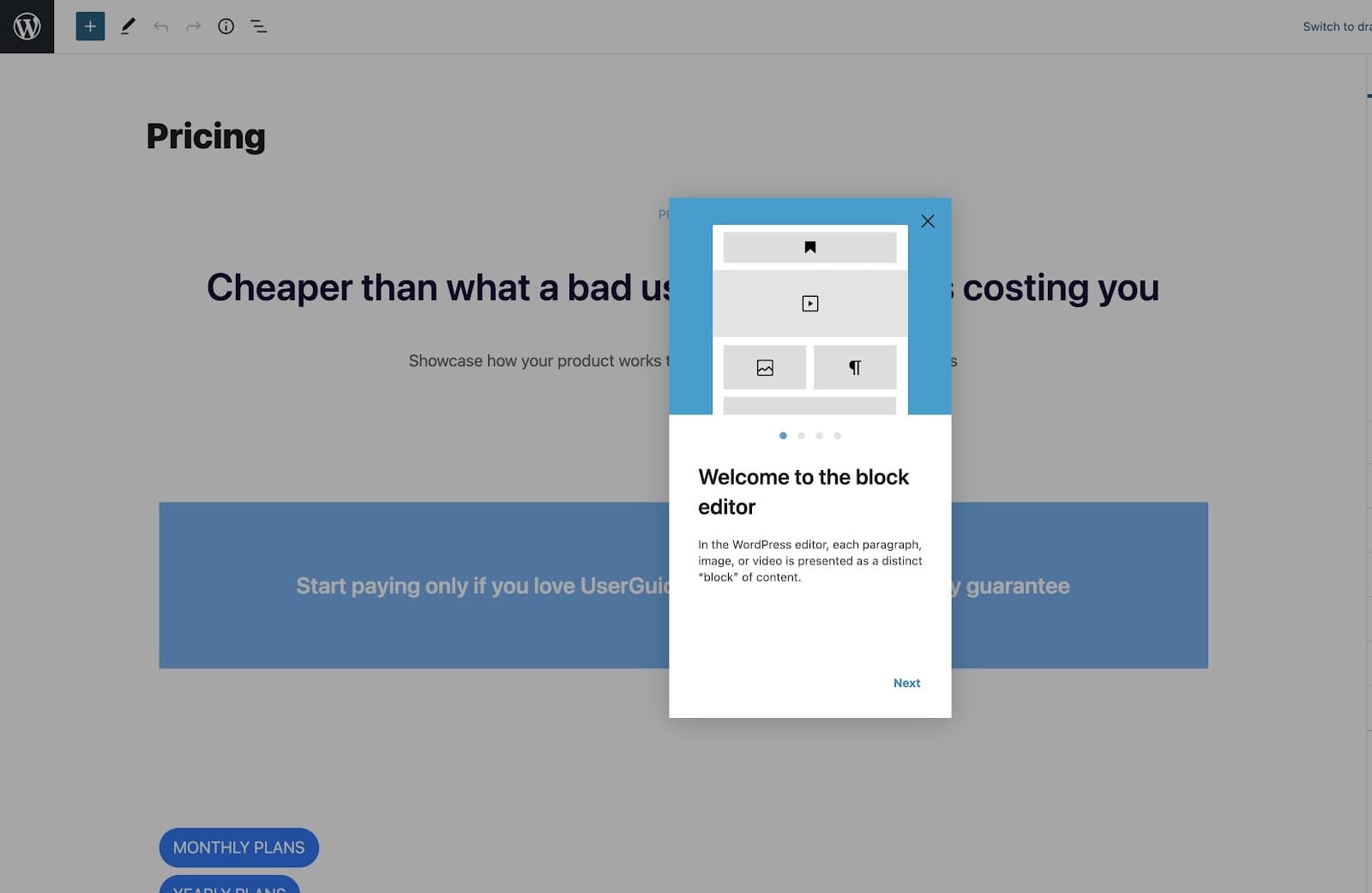
- The modal is small, but the dimmed page behind it draws the eye.
- A close button lets users who already know the editor leave at once.
How do you know your product tour works?
A product tour works if the users who finish it reach the aha moment more often than the users who skip it. Three numbers tell you whether yours does: the share of users who start the tour, the step where most of them drop off, and how many finishers complete the key action afterwards. If one step loses most users, rewrite or cut that step before touching the rest.
For where the first tour fits in the whole first-run sequence, and whether to build it in code or with a no-code tool, see our guide to onboarding tours.

About the author
Selman GökçeSelman is a creative content writer with a full focus on onboarding and everything it entails including UX, product, growth, and more.