Article · 5 min read
User Onboarding Examples and Best Practices To Get Inspired By
The best user onboarding examples are useful only if you can tell which practice each one shows and check your own flow against it. Below, ten common practices each come with an example from a real product and a quick test, such as counting your signup fields or the steps before the first useful action.
 By Hilal Yıldırım
In short
Ten user onboarding best practices, each paired with a real example and a check you can run on your own flow in a few minutes. Then five products (Toggl, Bubble, Hotjar, Notion and Trello) and the practice each one showed when this post was first written in November 2023.
Galleries of onboarding examples show what other products did, but not how to tell whether your own flow does the same. This post pairs each common best practice with one example you can look at, mostly screens captured in our onboarding inspirations library, and a check you can run on your own onboarding in a few minutes.
If you want a teardown of flows that worked and flows that didn't, read 5 great (and awful) user onboarding experiences. For what five well-known products ask new users to do first, read best product onboarding examples.
What is user onboarding?
User onboarding is how you guide new users into your product until they can use it productively on their own. It's the first experience you offer, and it's often where users decide whether to continue or leave. Our full definition of user onboarding covers the rest.
It works when clear interface design, instructional content and interactive features lead users to the benefits they came for, leaving them comfortable and confident.
Which user onboarding best practices matter, and how do you check yours?
Ten practices come up in almost every onboarding guide. Each below has an example and a check, so you can test your flow instead of agreeing in principle.
1. Understand your users
Who are your users, and what are their needs, pain points and goals? Run user research, build personas and tailor the onboarding to them.
Example: Evernote's signup asked two three-option questions, one about the user's use case and one about the first document they wanted to create (captured in 2022).
Check: for every question in your signup, name what changes in the flow for each answer. If nothing changes, cut the question.
2. Keep it simple
Don't show everything at once. Introduce the basic features first, then the advanced ones.
Example: Pinterest's signup, captured in 2022, had three steps: an email address, a gender question and a choice of interests.
Check: count the fields on your signup form and the screens between signup and the first useful action. Every one of them needs a reason.
3. Provide clear guidance
Use tooltips, pop-ups and walkthroughs for key actions. Keep instructions easy to understand and back them with visuals, so users never need a manual.
Example: in Duolingo's first lessons, a tooltip highlighted the word to tap and darkened the rest of the screen, so users knew exactly what to do (captured in 2022).
Check: read your tour step by step. Does each step ask the user to do something, in the order they'd do it? A step that only names a part of the screen is a candidate to cut.
4. Set milestones and goals
Clear milestones show users your product's value and give them a sense of accomplishment. Celebrate when they reach one.
Example: Asana's dashboard had a five-step onboarding checklist that ended with a congratulations message (captured in 2022).
Check: can a new user finish your checklist in one session? Is there a moment where you mark that they've done it?
5. Personalisation
Use what you know about users to customise their journey, from the content you show to the features you recommend.
Example: Grammarly showed a modal (captured in 2022) where users picked which writing tasks to prioritise, with a GIF showing the feature next to the options.
Check: pick two different user segments and go through your onboarding as each. If they see the same screens, you've collected data without using it.
6. Feedback loops
Ask for feedback during onboarding and after it to learn which challenges users face. Acting on it builds trust.
Example: Notion's survey slideout (captured in 2022) invited users to "take the 20 second survey", telling them the cost up front.
Check: do you ask for feedback after a milestone rather than before the user has done anything? Does someone read the answers every week?
7. A/B testing
A/B tests show which parts of your onboarding convert users and keep them engaged. Keep refining based on the results.
Check: is your success measure activation (users reaching the action that shows them value), not tour completion? Change one thing per test, or you won't know what worked.
8. Mobile optimisation
Many people use your product on several screens, including phones and tablets, so onboarding has to work on all of them.
Example: Notion's mobile app opened with a four-step guide of one or two sentences per step, each with a GIF (captured in 2022).
Check: go through your whole flow on a phone. Can every step be done with one thumb, and does any tooltip cover the button it describes?
9. Analytics and monitoring
Track drop-off points, completion rates and the time users take to finish onboarding, and base changes on that data.
Check: can you see, for last month's sign-ups, how many users left at each step? If not, add the tracking before you redesign anything.
10. Continuous improvement
Onboarding is a never-ending process that grows with your product and your users.
Check: when did someone on your team last sign up as a brand-new user? Do it after every release that touches the first-run screens.
Which products show these practices?
Each screenshot below is the product's homepage as it looked in November 2023, where onboarding starts with the signup button. The flows behind them are described as they were then, so check the current product before you copy a detail.
1. Toggl
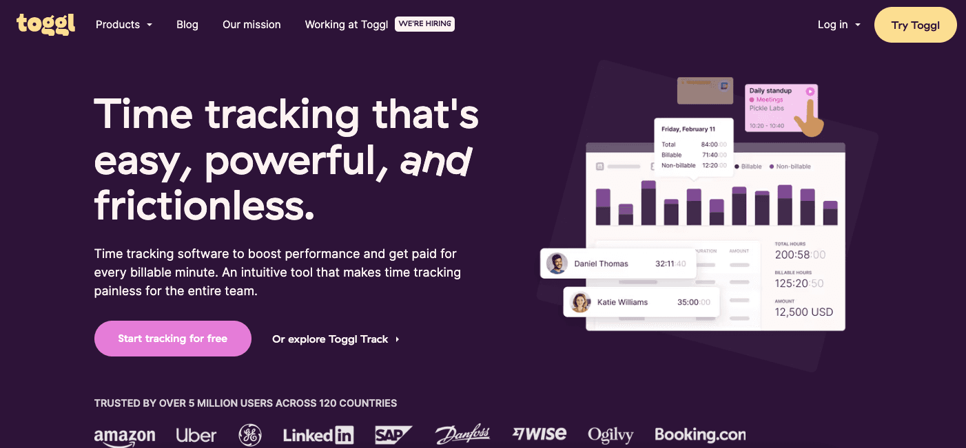
Toggl, a time-tracking app, asked new users to complete a short questionnaire about their work habits and goals, then gave them tailored recommendations and tips.
Practices it showed: understand your users (1) and personalisation (5).
2. Bubble
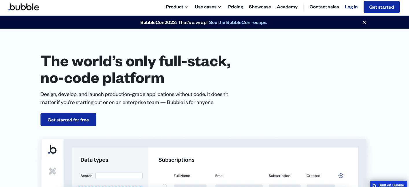
Bubble, a no-code app builder, offered tutorials, a manual and video classes, and the Bubble Community gave customers a place to share what they'd learned.
Practices it showed: clear guidance (3) outside the product, and a feedback loop (6) through the community.
3. Hotjar
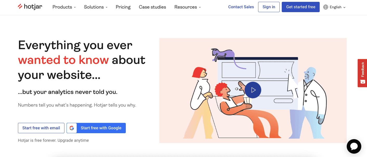
Hotjar, a suite of UX analytics tools, let new users learn through a guided tour or video tutorials, and offered templates for analysing user data.
Practice it showed: clear guidance (3) in more than one format, so users could pick how they learn.
4. Notion
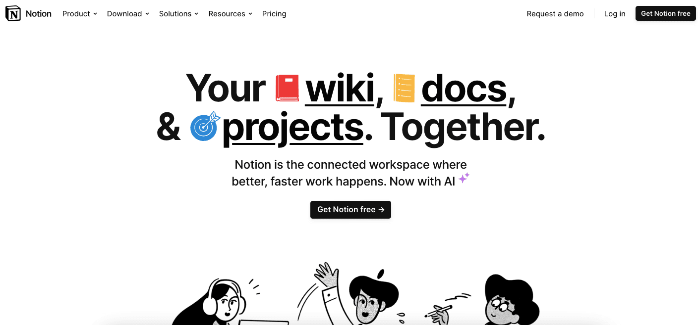
Notion let new users choose between a blank page and many ready-made templates, with tips and tutorials on its features.
Practice it showed: keep it simple (2), by letting users start from a template instead of an empty page.
5. Trello
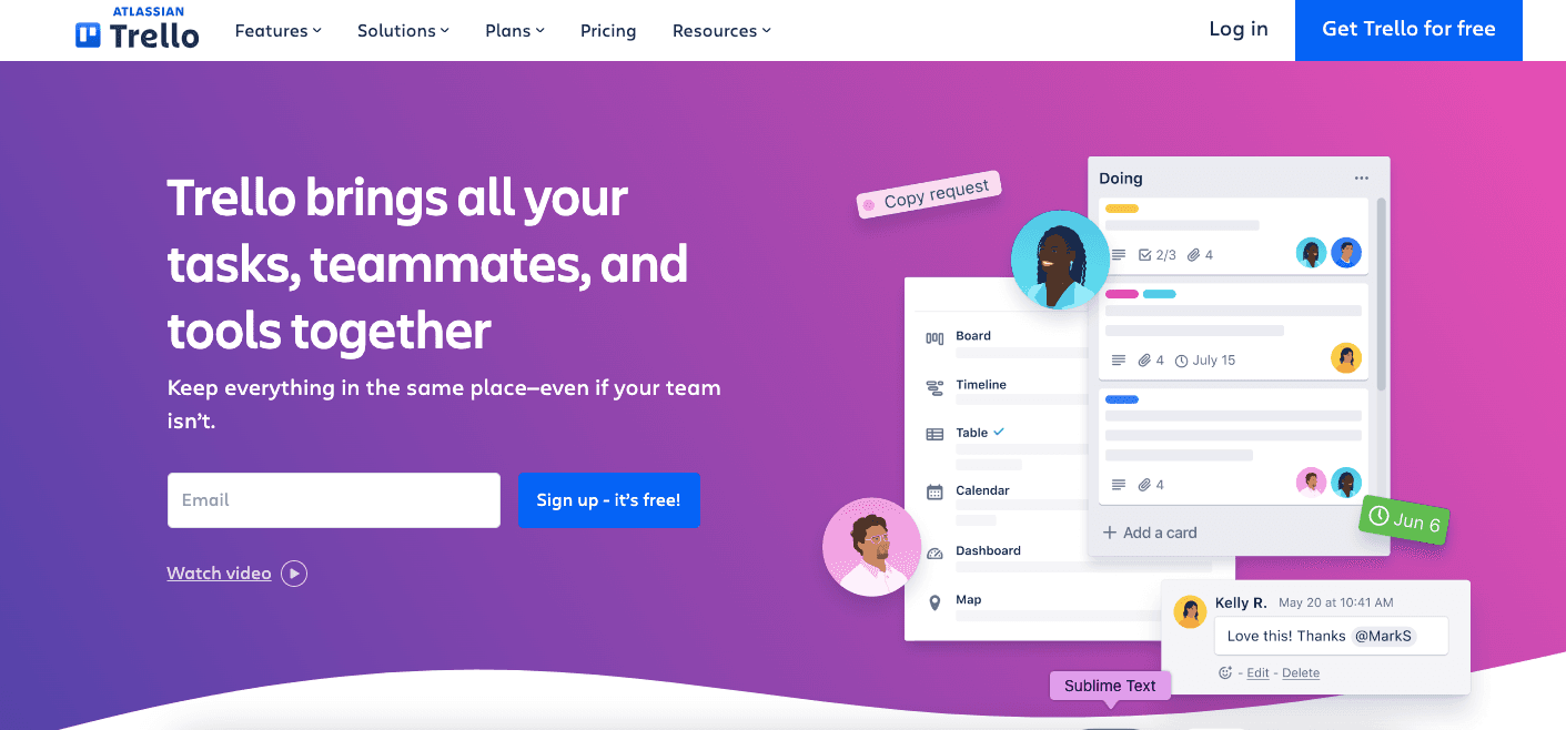
Trello's interactive tutorial introduced boards, lists and cards, and encouraged users to create their first board, so they saw the tool's practical use right away.
Practice it showed: milestones and goals (4), with the first board as the first milestone.
What should you do after reading the examples?
Run the ten checks on your own flow, pick the two or three it fails, and fix those first. Onboarding is never finished, so keep listening to users and adapt to their changing needs.

About the author
Hilal YıldırımHilal is a creative content writer highly focused on growth, occasionally product, and always onboarding.