Article · 6 min read
User Onboarding Checklists - Best Practices, Examples, and Best Tools
A user onboarding checklist means one of two things: the in-app task list new users tick off, or the list of work a product team finishes before onboarding ships. This one is the second: 12 items, each with an owner and a done-when test, from defining the activation event to testing with real users.
 By Aysenur Zaza
In short
Most onboarding checklists online describe the widget users see; this one lists the work behind it, with an owner and a done-when test for each item so nothing stays half-finished. Duolingo, Headspace and Robinhood show what several items looked like in shipped products. The in-app checklist itself is item 6, and the tools that build it are compared with October 2026 prices.
Search for a user onboarding checklist and you'll mostly find advice on the widget users tick off: keep it short, add a progress bar, personalise it. What those articles don't give you is the checklist your team needs before that widget exists, with someone's name against each item and a test for when it's finished. That's what this page is.
If you came for the in-app widget, our guide to product onboarding checklists covers task count, completion rules and four real examples.
What should be on a user onboarding checklist?
A user onboarding checklist for a product team should cover everything between a stranger signing up and that person reaching your activation event. The 12 items below are in the order they usually get done; the owners are typical roles, so swap in whoever does that work on your team.
| # | Item | Owner | Done when |
|---|---|---|---|
| 1 | Define the activation event | Product manager, with data | One event with a time window is written down (for example "created a project and invited a teammate within 7 days") and tracked |
| 2 | Map the path from signup to activation | Product manager and designer | Every screen between signup and the activation event is listed, and each one has a reason to exist |
| 3 | Cut the signup form | Designer and engineer | Every field has a named use (login, billing, segmentation or legal); the rest are gone or asked later |
| 4 | Add one to three segmentation questions | Product manager | Each answer changes what the user sees next: a template, a checklist or a tour |
| 5 | Design the first-run screens and empty states | Designer | No screen a new user can reach is blank without a next action, on the smallest screen you support |
| 6 | Build the in-app checklist | Designer and product manager | Four or five tasks, each ticked by a product event, one done at the start, dismissable |
| 7 | Write the onboarding copy | Content designer or UX writer | Every button starts with a verb and every step says why it matters |
| 8 | Set up emails for users who stall | Lifecycle marketer | A user who hasn't activated by your chosen day gets a message about the step they stopped at |
| 9 | Instrument every step | Engineer and data analyst | The funnel from signup to activation shows each step, with checklist tasks as events |
| 10 | Add one feedback point | Product manager | A one-question survey runs at a set moment, such as checklist completion |
| 11 | Test with people who've never seen the product | Researcher or product manager | You've watched new users try the flow and fixed what blocked them |
| 12 | Plan the first experiment and a review date | Product manager | One A/B test with a hypothesis tied to item 1, and a date in the calendar to read it |
Why does each item need an owner and a done-when test?
A user onboarding checklist without owners turns into a list of good intentions. "Simplify signup" never closes, because nobody can say when it's simple enough; "every field has a named use" can be checked in five minutes. Onboarding also crosses teams (product, design, engineering, marketing, support), which is why our piece on who owns user onboarding argues there's rarely one owner for all of it.
The done-when column is what makes the list reusable. Run it again before every major redesign, and the items that fail tell you where onboarding has drifted. Items 1 and 9 matter most: without an activation event and step-by-step tracking, you can't tell whether any other item worked. Our list of user onboarding metrics covers what to track once item 9 is done.
How should the in-app checklist itself work?
The in-app checklist (item 6) is where the original version of this post spent its best practices, and they still hold. In short:
- Keep it simple. Four or five tasks, each in plain words; more than that, split the list.
- Show progress. A bar or percentage, starting above zero.
- Personalise by segment. Use the answers from item 4 to pick which checklist a user gets.
- One clear call to action per task. An action verb that opens the right screen.
- Ask for feedback at the end. Completion is a natural moment for item 10; pick the right format with our guide to in-app survey types.
- Make it work on mobile. Check it on the smallest screen you support.
- Test variations. Task order and wording are cheap to A/B test (item 12).
- Use light gamification. Progress bars, a short celebration at 100% and, where they fit the product, badges or rewards.
How did Duolingo, Headspace and Robinhood handle these items?
The three apps below each show a few checklist items done well. The screenshots ran with the original post in November 2023, so read them as each flow at the time of the screenshot, not necessarily today.
1. Duolingo: segmentation questions that change the course
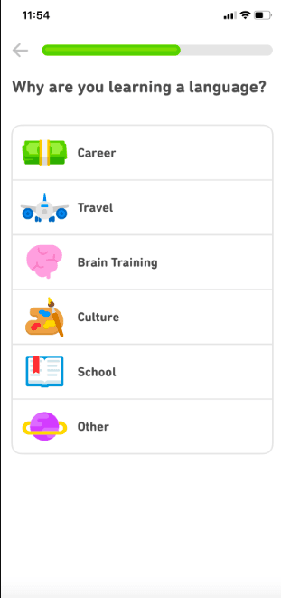
Duolingo, the language-learning app, ran its onboarding as a short series of questions under a progress bar (items 4 and 5). New users picked a language, said why they were learning it (career, travel, brain training, culture, school or other) and set how much time they wanted to spend each day. The app then explained how lessons, scores and levels worked, and offered a short test to place users at the right level.
The language, the daily goal and the test result each set something the user saw next: the course, the daily target and the starting level. That's the done-when test for item 4.
2. Headspace: one goal, easy to change
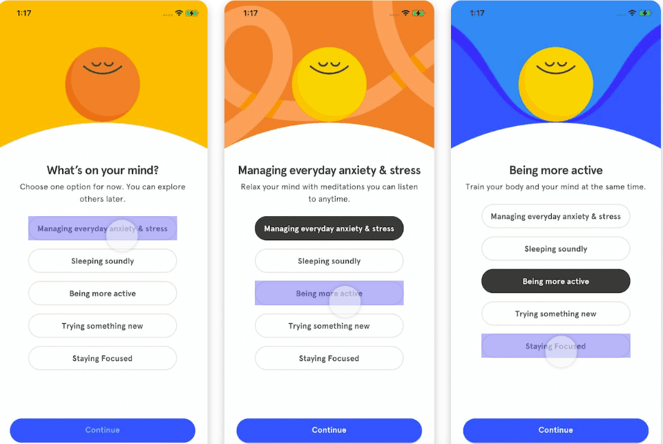
Headspace, the meditation app, asked new users to register, then to pick one goal from five, such as managing everyday anxiety and stress or sleeping soundly. The screen said "Choose one option for now. You can explore others later", which takes the pressure off a segmentation question (item 4).
After that, users got an introduction to starting a session and tracking progress, and a short guided mindfulness exercise. The first session doubled as the first result, which is the shortest possible path for item 2.
3. Robinhood: a learning checklist with an exit
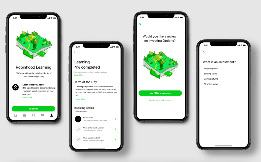
Robinhood, the investing app, paired signup with education. In the screenshot, its Robinhood Learning screens worked as an in-app checklist (item 6): an overall "4% completed" figure, an "Investing Basics" module at 25% with lessons such as "Why invest?" and "What is the stock market?", and short quizzes.
One screen offered a review of investing options with a "No, take me to trading menu" link beside it. That's the dismissable part of item 6 done properly: users who already know the basics skip straight to the product.
Which tools can build the in-app part of onboarding?
Onboarding tools can cover items 6 and 10 (checklists and surveys) and part of item 5 (welcome screens and tours) without engineering work; the rest of the list is yours whichever tool you pick. The three tools named in the original version of this post compare like this, from their pricing pages on 19 October 2026:
| Tool | Checklists | Entry price | Free trial | G2 rating |
|---|---|---|---|---|
| Appcues | Task-based activation lists, all plans | $3,600 a year (Spark, up to 1,000 MAUs, plus a $250 one-time implementation fee) | Yes, no credit card; starts with a sales call | 4.6/5 (359 reviews) |
| UserGuiding | All plans; 1 active checklist on Starter | $249 a month billed yearly (Starter, up to 2,000 MAUs) | 14 days, no credit card | 4.7/5 (781 reviews) |
| WalkMe | Onboarding tasks listed in the WalkMe Menu | Custom quote | None listed | 4.5/5 (583 reviews) |
1. Appcues
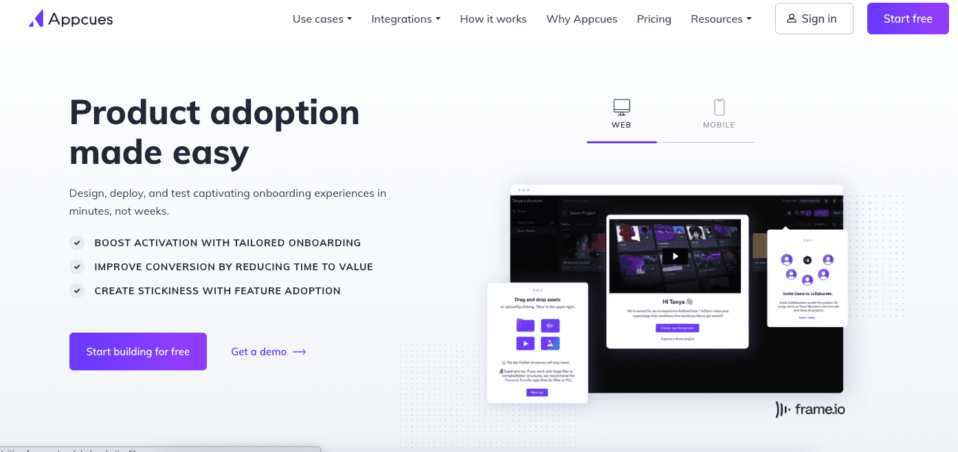
Appcues is a no-code tool for in-app onboarding: checklists, product tours, surveys (NPS, rating scales and open questions) and analytics on how users move through them. Of the 294 G2 reviews of Appcues we read, 186 praised ease of use and 86 mentioned missing features.
2. UserGuiding
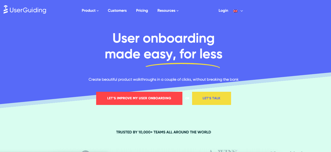
UserGuiding is a no-code onboarding tool for web products, with checklists, product tours, hotspots and in-app surveys on every plan. The Starter plan allows one active checklist, so segment-specific checklists (item 4) need a higher plan. Of the 299 G2 reviews of UserGuiding we read, 164 praised ease of use and 61 mentioned missing features.
3. WalkMe
WalkMe is a digital adoption platform sold in two versions, one for employees using internal software and one for customers. Onboarding tasks sit in the WalkMe Menu alongside step-by-step guidance and search, and surveys can run in-app, by email or by link. Of the 300 G2 reviews of WalkMe we read, 136 praised ease of use and 82 mentioned a learning curve or hard-to-find settings.

About the author
Aysenur ZazaAysenur Zaza is a creative content writer and an avid researcher when it comes to product, growth and everything SaaS.