Article · 6 min read
Onboarding UX Writing - 10 microcopy examples from top onboarding flows
Onboarding UX writing is the microcopy that guides new users: welcome lines, tooltip text, button labels, error and empty-state messages. Good onboarding copy names the action, says what happens next and, where it helps, how long it takes, like Notion's "Take the 20 second survey" button. Every example below is quoted from a screenshot.
 By Suay Çakırca

In short
Onboarding microcopy works when it is short, specific and honest about what happens next. This post maps six places microcopy appears in onboarding, gives ten writing rules, and quotes ten real lines from product screenshots, from Mailchimp's username error to Life360's safety tooltip. It also covers the risks: typos, broken merge fields and copy that papers over poor design.
Lists of fun onboarding microcopy are full of witty lines that are hard to find in any real product. Every example here is quoted from a screenshot, either in this post or in our inspirations library.
The real lines turn out to be more useful than the invented ones. They're less jokey and more specific: they name the action, say what happens next and, surprisingly often, say how long it will take.
Where does microcopy appear in onboarding?
Onboarding microcopy is the short text that guides new users through a product: headlines, instructions, button labels and messages. It appears in six places, and each has a different job:
| Where | What the copy must do | Real example |
|---|---|---|
| Welcome messages | Set the tone and say what comes first | Trello: "Find your work even faster…" |
| Tutorials and tours | Explain one step and name the action | Plandisc: "Give your Plandisc an exciting name for this special occasion." |
| Error messages | Say what went wrong and how to fix it | Mailchimp: "If it's you, log in." |
| Tooltips | Explain one element in a sentence | HubSpot: "Meet the overview tab" |
| Confirmation messages | Confirm the action and offer the next one | Canva: "If your download hasn't started, click here." |
| Empty states | Explain the blank screen and give one action | Duolingo: "Try a lesson while you wait!" |
Welcome messages set the tone for the rest of onboarding. Tutorials guide users through each step of a feature, which matters most in complex products. Error messages tell users what went wrong and how to fix it, which keeps frustration down. Tooltips explain what an element does. Confirmation messages tell users an action worked. Empty states appear when there's no data yet, and the copy there tells users what to add first.
How do you write effective onboarding microcopy?
Write onboarding microcopy around the user's next action: say what to do, what happens when they do it, and nothing else. Writing it well takes thought about the user's needs and the product's tone, so here are ten rules for designers, writers and developers.

1. Keep it concise
Users don't read paragraphs while they're trying to finish a task. Give only the essential information. In the 11 onboarding tooltips we transcribed for our tooltip guide, the body text ran from 33 to 106 characters, one idea each.
2. Use simple language
Avoid technical jargon and internal names. Write the way you'd explain the feature to a new colleague: plain, conversational and friendly.
3. Test and iterate
Test variations of key lines, such as the first button or the sign-up error, and change them based on what users do and say. See how to test onboarding with users.
4. Use the active voice
Active voice says who does what: "We'll call and text your Circle" is clearer than "Your Circle will be contacted". Passive voice sounds impersonal and takes longer to understand.
5. Make buttons say what happens
Instructions should be easy to follow, and the button is the most important instruction. Start it with a verb and name the result: "Take the 20 second survey" (Notion), "Show Instant Book Listings" (Airbnb), "Create New Event Type" (Calendly). "Submit" and "OK" make users guess.
6. Use humour and personality where it fits
Humour makes onboarding more memorable, but it has to suit the moment. Duolingo jokes on its streak screen; Life360 writes plainly on its safety button. Joke when the user is relaxed, never when they're worried or blocked.
7. Be consistent
Use the same words for the same things everywhere, and keep the tone in line with your brand. If the button says "Space", the tooltip shouldn't say "Room".
8. Give context
Tell users why something matters, not only what it is. HubSpot's tooltip didn't just name the new tab; it said there was "more space on the record page to quickly get the relevant info that matters most to you."
9. Use visual hierarchy
Put the most important line in the largest type. Use colour, size and spacing so users can read the headline and the button and skip the rest, as ClickUp's downgrade modal does with its offer.
10. Avoid negative language
Blaming language ("Invalid input", "You failed to…") makes onboarding feel like a test. Reframe the problem and offer the fix, as Mailchimp does when a username is taken.
10 examples of good onboarding microcopy
These ten lines are transcribed from screenshots. Products change their copy often, so each is quoted as it was at the time of the screenshot.
1. Duolingo: a streak celebration
Duolingo's streak screen reads "1096-day streak!" above "You're on fire! Keep the flame lit every day!"
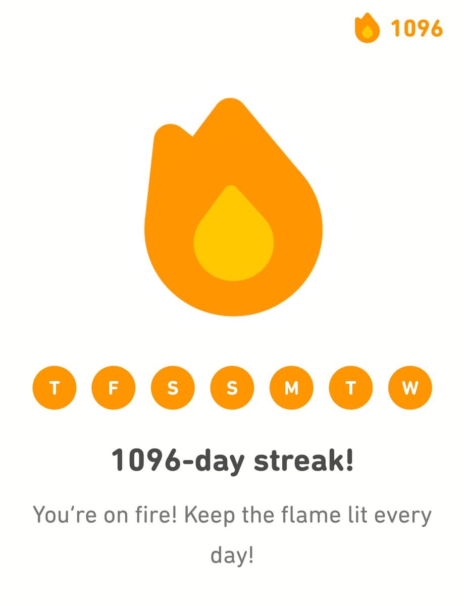
The headline states the achievement with a number, and the second line turns it into tomorrow's goal. It celebrates and asks the user to come back in one short line.
2. Mailchimp: an error that offers a way out
When a new user picked a username that was taken, Mailchimp's sign-up form said: "Great minds think alike - someone already has this username. If it's you, log in."
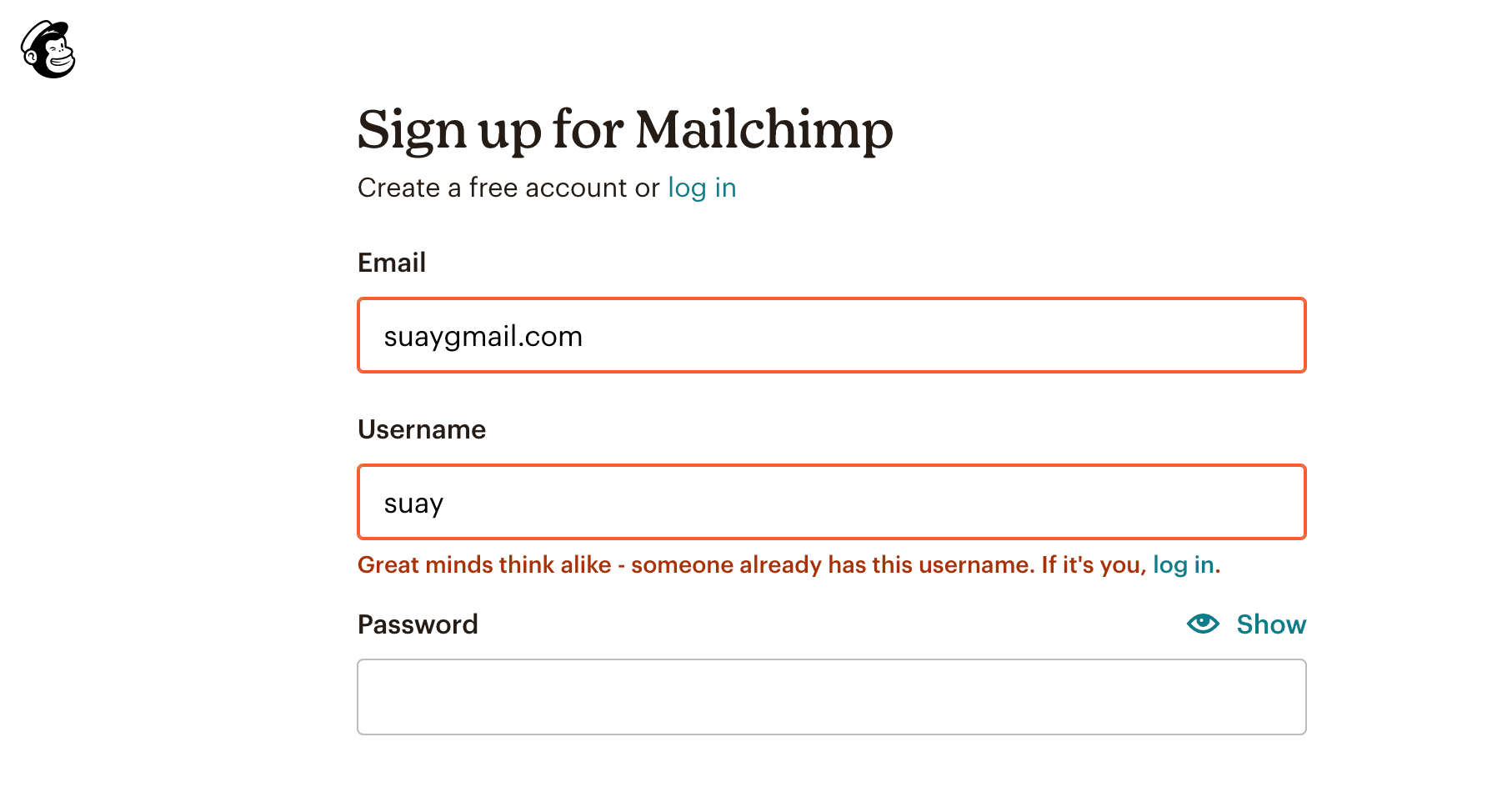
The first half softens the error with a compliment; the second half solves the most likely reason for it, with a link. It's rule 10 in one sentence.
3. Canva: a confirmation that anticipates a worry
After a download, Canva's panel said "Completed" and, underneath, "If your download hasn't started, click here." It then suggested the next step: "Share your designs with others. Anyone with the link can view this design (no sign-in required)".
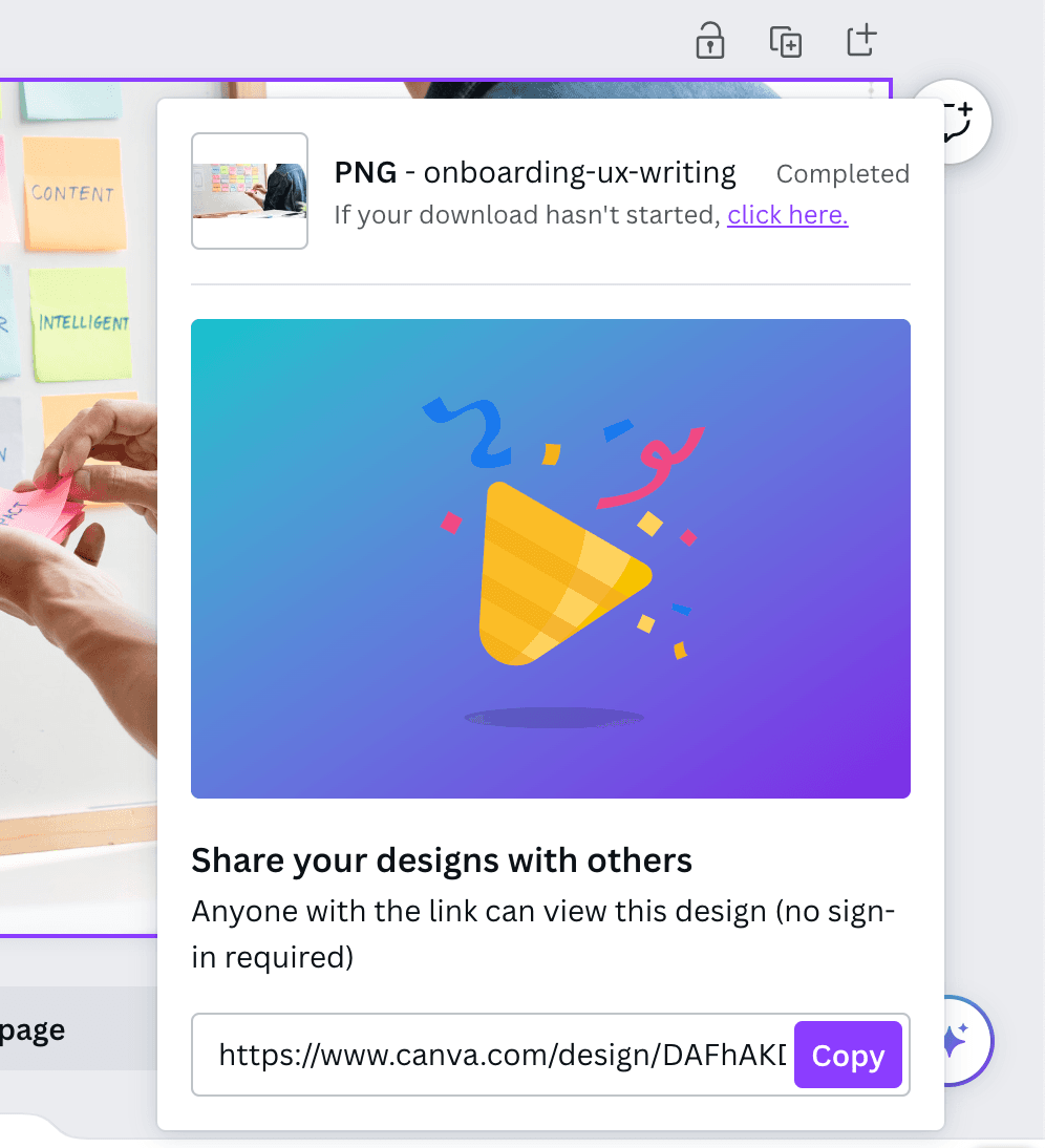
The fallback line answers the user's next question before they ask it, and "(no sign-in required)" removes the main worry about sharing a link.
4. Asana: a time estimate on an empty state
A new Asana project's empty Workflow tab said "Start building your workflow in two minutes". See Asana's empty state.
It proposes something achievable and says how long it takes, instead of giving an order.
5. Notion: an honest survey button
Notion's in-app survey asked users to "Tell us more about yourself" with one button: "Take the 20 second survey". See Notion's survey slideout.
The button says what happens and what it costs, so users can decide in a moment whether 20 seconds is worth it.
6. Duolingo: an outage turned into a nudge
When Duolingo's Feed was unavailable, the empty state said "The Feed is currently unavailable!" and then "Check back again later. Try a lesson while you wait!" See Duolingo's empty state.
An error became a reason to do the product's core task.
7. Letterboxd: humour where nothing is at stake
Letterboxd's empty reviews tab said "No reviews." followed by a film line that changed between visits, such as "Goodbye, Mr. Bond." See Letterboxd's empty states.
An empty tab is a safe place for a joke: nothing is broken and the user isn't waiting on anything.
8. ClickUp: buttons in the user's voice
When users clicked Downgrade, ClickUp asked "Would you like to stick around if we gave you 3 free months?" The buttons were "Yes, please!" and a text link, "Downgrade anyway". See ClickUp's downgrade modal.
Both labels are things the user would say, and the way out is honest about what it does.
9. Pinterest: a system permission explained like a person
Before iOS showed its tracking prompt, Pinterest explained it on its own screen, then changed tone: "OK, uh, that sounds intimidating. But here's the thing…" See Pinterest's permission pop-up.
Admitting the system message sounds scary makes the explanation that follows easier to trust.
10. Life360: plain words for a serious moment
Life360 pointed a tooltip at its help alert button: "Tap this button if you ever feel unsafe. We'll call and text your Circle after 10 seconds." See Life360's tooltips.
No jokes, one instruction, and the exact consequence, including the timing. This is rule 6 the other way round.
What are the risks of relying on microcopy?
Microcopy can't fix a confusing interface, and small mistakes in it are very visible. Three risks show up in real screenshots:
- Typos in short copy. Landbot's welcome bubble read "You've be given a 5-day PRO trial" (see our tooltip examples). In a 15-word message, every word gets read.
- Broken personalisation. BacklinkManager's welcome modal greeted users with "Hey {{name}}!" because the merge field didn't fill in (see UI modals). Set a fallback for every variable.
- Copy that compensates for design. If a button needs a tooltip to explain it, rename or redesign the button first. Microcopy should complement good design and navigation, not stand in for them.
Write the copy, then read every line in the product, at real size, with real data. That catches all three.

About the author
Suay ÇakırcaSuay is a creative content writer focusing on UX design, growth, and product with a main focus on onboarding.